Embed presentation
Download to read offline


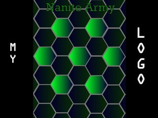
Nathan shares that he created a green-blue gradient design because those are his two favorite colors and they represent him in some unknown way. He also discusses using shapes that are powerful, technological, represent togetherness and unity, fit well, and look plainly awesome with squiggles. Nathan describes using a calming, intellectual, and deep color. He comments on choosing a font that looks technological, is pretty dame awesome, and is easy to read. He closes by requesting that Nick give him a cookie.


