Download to read offline

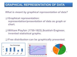
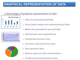
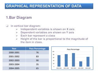
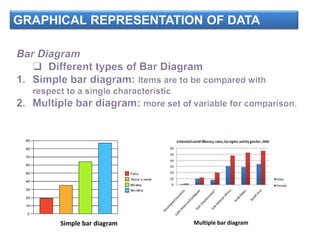
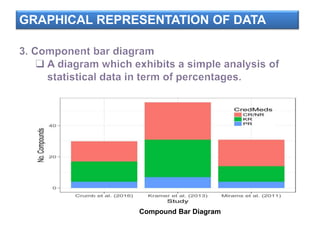

This document discusses graphical representation of data. It provides examples of simple bar diagrams, multiple bar diagrams, and compound bar diagrams to visualize pass percentage data from 2000-2001 to 2004-2005. A table shows the pass percentages for each year, and bar diagrams illustrate this data to compare the percentages across years.


