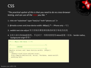
CSS
“The practical upshotof this is that you need to do no cross-browser
testing, and can use all the CSS3 you like. “
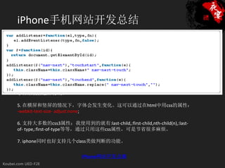
1. <link rel="stylesheet" type="text/css" href=“iphone.css” />
2. @media screen and (max-device-width: 480px){ /*--- iPhone only ---*/ }
3. -webkit-text-size-adjust 用于控制在横竖频切换的时候字体是否改变
4. 支持大部分的CSS3新特性,不过对于一些特效要使用-khtml前缀(比如:border-radius,
background-origin等等)
HTML
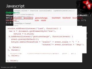
viewport的声明的作用:tells Safari thatthe viewport should be the same size
CSS3媒体查询
<html>
as the iPhone screen。
对于CSS3的媒体(media)查询,iPhone和iPad是不同的。通过这个技术,可以对设备
<head>
不同的握持方向应用不同的样式,增强功能和体验。
<title>iPhone 3G S</title>
1. <meta name="viewport" content="width=780" />
<meta name="viewport" content="width=device-width; initial-
2. <meta name="viewport" content="width=device-width,initial-scale=1,
iPhone是通过屏幕最大宽度来侦测的。是这样:
scale=1.0; maximum-scale=1.0;">
user-scalable=no" />
<link rel="stylesheet" media="screen and (max-width: 320px)" href="portrait.css" />
3.<link … name="viewport" content="height=device-height,width=device-width" />
<meta />
<link rel="stylesheet" media="screen and (min-width: 321px)" href="landscape.css" />
</head>
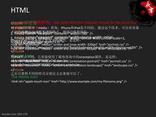
<body> Links
Special
而iPad有点不同,它直接使用了媒体查询中的orientation属性。是这样:
<!-- content here -- >
<a href="tel:12345678900">Call me</a> (orientation:portrait)" href="portrait.css" />
<link rel="stylesheet" media="screen and
<a href="sms:12345678900">Send me a text</a>
</body>
<link rel="stylesheet" media="screen and (orientation:landscape)" href="landscape.css" />
</html>
之后只要将不同的样式分别定义出来就可以了。
The Home Icon
<link rel="apple-touch-icon" href="http://www.example.com/my-filename.png" />
10.
Resource List:
Tutorial: Buildinga website for the iPhone
iPhone Development: 12 Tips To Get You Started
10条小代码开发 iPhone友好的网站
iPhone CSS—tips for building iPhone websites
CSS3 Previews
iPad的CSS3媒体查询
iPhone网站开发点滴


