Recommended
PPT
PPTX
2.1 frequency distributions for organizing and summarizing data
PPTX
Descriptive Stat numerical_-112700052.pptx
PPT
PPT
Probability and statistics
PPT
Probability and statistics
PPT
Probability and statistics(exercise answers)
PPT
PPT
Probability and statistics
PPT
PPTX
Statistics Based On Ncert X Class
PPTX
Biostatistics mean median mode unit 1.pptx
PPT
Probability and statistics(assign 7 and 8)
PPTX
Statistics in Physical Education
PDF
Continuous Bivariate Distributions 2nd N Balakrishnan Chindiew Lai
PDF
PDF
2020-2021 EDA 101 Handout.pdf
PDF
PDF
Statistics and statistical methods pdf.
PPTX
PDF
Lesson 1.pdf probability and statistics.
DOCX
Quantitative techniques in business
PDF
Ronald_E_Walpole,_Raymond_H_Myers,_Sharon_L_Myers,_Keying_E_Ye_Probability.pdf
PDF
statistics and Probability Analysis for beginners
PPTX
PDF
Probability_and_Statistics_for_Engineers.pdf
PDF
1.1 course notes inferential statistics
PDF
1.1 Course notes_inferential statistics.pdf.pdf
PDF
Microeconomics Made Easy: Concepts, Markets & Real-World Applications
PDF
India Economic Survey 2025-26 Economic Survey.pdf
More Related Content
PPT
PPTX
2.1 frequency distributions for organizing and summarizing data
PPTX
Descriptive Stat numerical_-112700052.pptx
PPT
PPT
Probability and statistics
PPT
Probability and statistics
PPT
Probability and statistics(exercise answers)
PPT
Similar to Keating_Chapter_2_The_Forecast_Process.pptx
PPT
Probability and statistics
PPT
PPTX
Statistics Based On Ncert X Class
PPTX
Biostatistics mean median mode unit 1.pptx
PPT
Probability and statistics(assign 7 and 8)
PPTX
Statistics in Physical Education
PDF
Continuous Bivariate Distributions 2nd N Balakrishnan Chindiew Lai
PDF
PDF
2020-2021 EDA 101 Handout.pdf
PDF
PDF
Statistics and statistical methods pdf.
PPTX
PDF
Lesson 1.pdf probability and statistics.
DOCX
Quantitative techniques in business
PDF
Ronald_E_Walpole,_Raymond_H_Myers,_Sharon_L_Myers,_Keying_E_Ye_Probability.pdf
PDF
statistics and Probability Analysis for beginners
PPTX
PDF
Probability_and_Statistics_for_Engineers.pdf
PDF
1.1 course notes inferential statistics
PDF
1.1 Course notes_inferential statistics.pdf.pdf
Recently uploaded
PDF
Microeconomics Made Easy: Concepts, Markets & Real-World Applications
PDF
India Economic Survey 2025-26 Economic Survey.pdf
PDF
India Budget_Speech India Budget_Speech.pdf
PDF
Best Online Resources for Buying Old Gmail Accounts in Bulk
PDF
Union Budget 2026-27: Key Highlights and Economic Reforms | CA Suvidha Chaplo...
PDF
Monitoring implementation of the IMF program and EU assistance (January 2026)
PDF
Valkea Corporate Presentation February 2026
PDF
"Union Budget 2026-27: A Strategic Vision for India's Economic Growth and Dev...
PPTX
Union_Budget_2026_27_Defence_Presentation.pptx
PDF
TRADE AGREEMENTS, PETROLEUM AND ENERGY POLICIES.pdf
PDF
Український ВВП у 2026 році зросте на 2,1% — прогноз ІЕД та GET
PDF
Step-by-Step Guide to Securely Buy Verified Payeer Accounts in 2026
PDF
"India Budget 2026-2027 Key Features & Fiscal Reforms | Comprehensive Breakdo...
DOCX
How to Choose the Best Site to Buy Facebook Ads Accounts.docx
PPTX
LKS Session - GST Appellate Tribunal. PPT explains the nuances of the newly f...
PPTX
ONS Economic Forum Slidepack - 2 February 2026 (SlideShare).pptx
PDF
"India Budget 2026-2027 Infographic: Key Features, Fiscal Reforms, and Econom...
PDF
Silver One Corporate Presentation February 2026
PDF
"Mastering Excel: 20 Essential Tips to Boost Your Efficiency" CA SUVIDHA CHAPLOT
PDF
Where to Buy Verified Wise Accounts Safely in 2026.pdf
Keating_Chapter_2_The_Forecast_Process.pptx 1. Chapter 2
The Forecast Process, Data Considerations, and Model Selection
© 2019 McGraw-Hill Education. All rights reserved. Authorized only for instructor use in the classroom. No reproduction or further distribution permitted without the
prior written consent of McGraw-Hill Education.
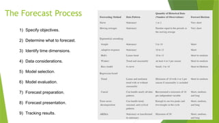
2. The Forecast Process
1) Specify objectives.
2) Determine what to forecast.
3) Identify time dimensions.
4) Data considerations.
5) Model selection.
6) Model evaluation.
7) Forecast preparation.
8) Forecast presentation.
9) Tracking results.
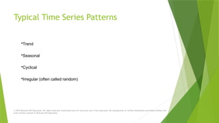
3. Typical Time Series Patterns
•Trend
•Seasonal
•Cyclical
•Irregular (often called random)
© 2019 McGraw-Hill Education. All rights reserved. Authorized only for instructor use in the classroom. No reproduction or further distribution permitted without the
prior written consent of McGraw-Hill Education.
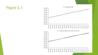
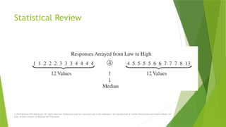
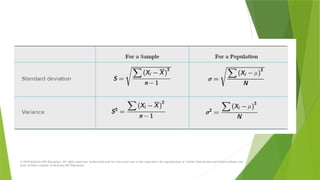
4. 5. 6. 7. Statistical Review
© 2019 McGraw-Hill Education. All rights reserved. Authorized only for instructor use in the classroom. No reproduction or further distribution permitted without the
prior written consent of McGraw-Hill Education.
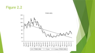
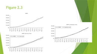
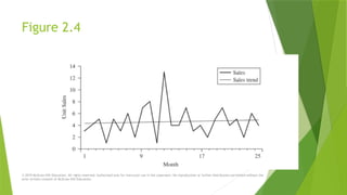
8. Figure 2.4
© 2019 McGraw-Hill Education. All rights reserved. Authorized only for instructor use in the classroom. No reproduction or further distribution permitted without the
prior written consent of McGraw-Hill Education.
9. © 2019 McGraw-Hill Education. All rights reserved. Authorized only for instructor use in the classroom. No reproduction or further distribution permitted without the
prior written consent of McGraw-Hill Education.
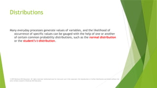
10. Distributions
Many everyday processes generate values of variables, and the likelihood of
occurrence of specific values can be gauged with the help of one or another
of certain common probability distributions, such as the normal distribution
or the student’s t-distribution.
© 2019 McGraw-Hill Education. All rights reserved. Authorized only for instructor use in the classroom. No reproduction or further distribution permitted without the
prior written consent of McGraw-Hill Education.
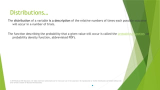
11. Distributions…
The distribution of a variable is a description of the relative numbers of times each possible outcome
will occur in a number of trials.
The function describing the probability that a given value will occur is called the probability function (or
probability density function, abbreviated PDF).
© 2019 McGraw-Hill Education. All rights reserved. Authorized only for instructor use in the classroom. No reproduction or further distribution permitted without the
prior written consent of McGraw-Hill Education.
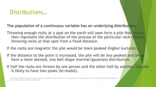
12. Distributions…
The population of a continuous variable has an underlying distribution.
Throwing enough rocks at a spot on the earth will soon form a pile that would
then represent the distribution of the process of the particular rock thrower
throwing rocks at that spot from a fixed distance.
If the rocks are magnetic the pile would be more peaked (higher kurtosis).
If the distance to the point is increased, the pile will be less peaked and likely
have a more skewed, less bell shape (normal/gaussian) distribution.
If half the rocks are thrown by one person and the other half by another, the pile
is likely to have two peaks (bi-modal).
© 2019 McGraw-Hill Education. All rights reserved. Authorized only for instructor use in the classroom. No reproduction or further distribution permitted without the
prior written consent of McGraw-Hill Education.
13. © 2019 McGraw-Hill Education. All rights reserved. Authorized only for instructor use in the classroom. No reproductio
n or further distribution permitted without the prior written consent of McGraw-Hill Education.
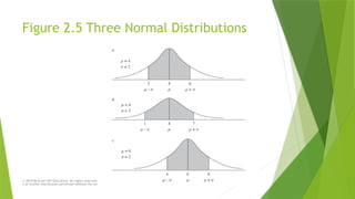
Figure 2.5 Three Normal Distributions
14. © 2019 McGraw-Hill Education. All rights reserved. Authorized only for instructor use in the classroom. No reproductio
n or further distribution permitted without the prior written consent of McGraw-Hill Education.
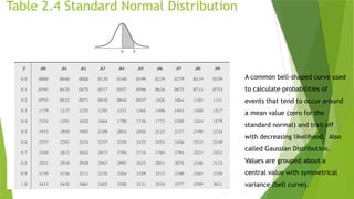
Table 2.4 Standard Normal Distribution
A common bell-shaped curve used
to calculate probabilities of
events that tend to occur around
a mean value (zero for the
standard normal) and trail off
with decreasing likelihood. Also
called Gaussian Distribution.
Values are grouped about a
central value with symmetrical
variance (bell curve).
15. © 2019 McGraw-Hill Education. All rights reserved. Authorized only for instructor use in the classroom. No reproductio
n or further distribution permitted without the prior written consent of McGraw-Hill Education.
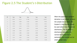
Figure 2.5 The Student’s t-Distribution
When the population standard
deviation is not known, or when
the sample size is small, the
Student’s t-distribution should
be used rather than the normal
distribution. The Student’s t-
distribution resembles the
normal distribution but is
somewhat more spread out for
small sample sizes.
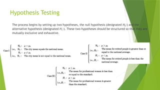
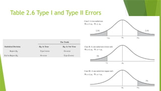
17. Hypothesis Testing
The process begins by setting up two hypotheses, the null hypothesis (designated H0:) and the
alternative hypothesis (designated H1:). These two hypotheses should be structured so that they are
mutually exclusive and exhaustive.
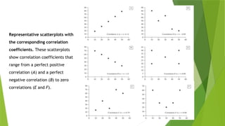
18. 19. 20. Representative scatterplots with
the corresponding correlation
coefficients. These scatterplots
show correlation coefficients that
range from a perfect positive
correlation (A) and a perfect
negative correlation (B) to zero
correlations (E and F).
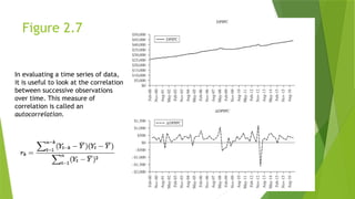
21. Figure 2.7
In evaluating a time series of data,
it is useful to look at the correlation
between successive observations
over time. This measure of
correlation is called an
autocorrelation.
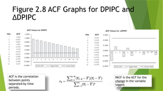
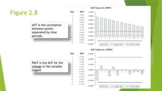
22. Figure 2.8 ACF Graphs for DPIPC and
∆DPIPC
PACF is the ACF for the
change in the variable
lagged.
ACF is the correlation
between points
separated by time
periods.
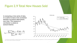
23. Figure 2.9 Total New Houses Sold
© 2019 McGraw-Hill Education. All rights reserved. Authorized only for instructor use in the classroom. No reproduction or further distribution permitted without the
prior written consent of McGraw-Hill Education.
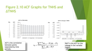
In evaluating a time series of data,
it is useful to look at the correlation
between successive observations
over time. This measure of
correlation is called an
autocorrelation.
24. Figure 2.10 ACF Graphs for TNHS and
∆TNHS
PACF is the ACF for the
change in the variable
lagged.
ACF is the correlation
between points
separated by time
periods.
25. Figure 2.8
PACF is the ACF for the
change in the variable
lagged.
ACF is the correlation
between points
separated by time
periods.


![]
)
(
][
)
(
[
)
)(
(
2
2
Y
Y
X
X
Y
Y
X
X
r
)
2
/(
)
1
(
0
2
n
r
r
t
The Correlation Coefficient and its
Significance
© 2019 McGraw-Hill Education. All rights reserved. Authorized only for instructor use in the classroom. No reproduction or further distribution permitted without the
prior written consent of McGraw-Hill Education.](https://image.slidesharecdn.com/keatingchapter2theforecastprocess-250318065439-d513c0dd/85/Keating_Chapter_2_The_Forecast_Process-pptx-19-320.jpg)