The document analyzes and compares the contents pages of two music magazines, Q and NME. Both magazines use a three-column design that is vertically balanced and easy to read. They also follow a consistent color scheme of red, white, and black. However, Q uses more large images in its contents page to showcase stories, while NME only includes one small image and focuses more on listing band names in text. Overall, the contents pages of both magazines effectively attract their target audiences through their distinct approaches to layout, imagery, and text usage.
Josh robinson audience research questionnaire analysisJoshrob
The document summarizes market research conducted to help determine the target audience and content for a new music magazine. The research found that the majority of respondents were males aged 16-25 who preferred pop and dubstep music. Most earned under £50 per week and would pay under £3 for a magazine. Based on this, the summary concludes the magazine should target unemployed males aged 16-25 and focus on pop and dubstep artists while keeping the price below £3.
Josh Robinson used a bright color scheme of red, black, and white to make the magazine attractive and familiar to their target young adult audience. The magazine focuses on the latest music phenomenon and uses photos of popular indie and pop artists to appeal to both the primary and wider audience. The magazine follows a consistent house style throughout to seem professional and inform the audience they are reading a formal publication. Phrases like "TOP 50" and highlighted words on the cover are intended to attract any audience while contrasting text colors make those words stand out. The formal but not boring text aims to inform readers while emotionally connecting them to stories.
Para incluir una imagen de internet en una presentación de diapositivas, se debe descargar la imagen, guardarla en la carpeta Descargas y luego copiarla y pegarla en la diapositiva deseada.
The document discusses image editing done for a band magazine. The editor used auto contrast to make colors more vivid and cropped actors out of images using the lasso tool. For the cover image, the editor also added a drop shadow. Another image was left unedited as the lighting already made it look professional. The final image had its contrast increased and was made black and white to portray the artist as experienced in the indie music genre.
This document discusses how companies can pave the path to digital transformation. It introduces Global Digital Services, which helps companies unite people, business and technology. The challenges of digitization are described, such as how it will impact business more than the internet. Four core domains for companies to focus on are identified: customer experience, operational excellence, trust and compliance, and business reinvention. Specific strategies and services within each domain are outlined, such as building customer-centric ecosystems and harnessing data through content platforms.
Hybrid cloud & orchestration - a critical success factor in your digital tran...Atos
The document is comprised of copyright notices from 2014-2015 attributed to Bull and EMC Corporation. It includes multiple repetitive copyright notices and sections labeled "Our Solution" without further details.
The magazine represents young adults through a mature tone informed by market research. Images aim to positively portray masculinity for the target male audience in a way that follows indie/pop conventions without intimidation. All social groups including ethnicity and gender are shown positively without targeting a particular class so the magazine can be understood by readers of any background.
The magazine aims to appeal to young adults through a mature tone informed by market research. Images depict masculinity in a positive but not intimidating way, following indie/pop conventions. As the main target is males, representations of males and all social groups, including ethnicity and females, are shown positively without aiming at any particular class.
The target audience for the media product, a music magazine, is young adult males based on market research showing males listen to and follow music news more. While primarily aimed at young adult males, some elements like color scheme are intended to also appeal to young adult females. Feedback from a focus group showed the magazine appeals to both audiences interested in informal content as well as those preferring a more professional layout and design.
The student learned several key lessons from their preliminary college magazine task to their final music magazine product. Their photography skills improved, allowing them to use higher quality, more professional images that followed magazine conventions. Their knowledge of Photoshop also increased, making it easier to remove backgrounds and create a cleaner layout aligned with design principles. Direct address, or directly engaging the target audience, was incorporated into the final cover after research revealed it was important for magazines.
The student learned several key lessons from their preliminary college magazine task to their final music magazine product. Their photography, layout, and Photoshop skills improved to make the images and cover more professional. Specifically, they learned to use a plain white background with a single dominant artist on the cover. Their knowledge of removing backgrounds and adjusting lighting and contrast made the images higher quality. Directly addressing the target audience was also more important for appeal compared to the first magazine.
Taylor Boardman has become a global music sensation with over 20 million albums sold in just 2 months. He began posting covers on YouTube as a teenager and gained over 1 million subscribers before being signed by Sony Records. While some criticize comparisons to Justin Bieber, Taylor says he just wants fans to listen before judging. He vowed to use his music success to help his mother who became ill before his fame. Though his father works in the music industry, Taylor insists he pursued music independently and his father only helped edit his music videos. Taylor announced a world tour will begin in September 2013.
The document is a music magazine questionnaire that asks respondents about their age, gender, occupation, income, preferred music genre, brand of music magazine purchased, amount willing to pay for a magazine, how they get music, where they download music if applicable, and their favorite magazine masthead. It collects demographic and music preference information through multiple choice and open-ended questions.
This double page magazine spread features an article about artist Jay-Z. The design follows conventions like using the rule of thirds and Gutenberg design principles. Jay-Z's image is on the left page with text on the right to draw the reader in. The color scheme matches Jay-Z's style and music genre. The masthead covers much of the right page with Jay-Z's initial in a large, contrasting font. While the image dominates, the formal text discusses insights into the artist. Overall the balanced, symmetrical layout enhances readability and engagement with the topic.
1. Josh Robinson
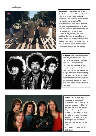
The Beatles –This band image of the
Beatles is very successful as it follows the
rule of thirds and contains formal
symmetry. The use of this makes it very
memorable and because of the
placement of the band makes it one of
the most iconic band photos of all time,
with lots of copies of the same style with
more recent bands such as One
Direction. They are all in the same
position, there are two members on
either side of the frame and the street is
equal on both sides. From this image you
can see that the genre of music is pop
because of the way they are dressed.
Jimi Hendrix- This image has slight
formal symmetry based on the
position of all the band members,
this is also shown by them all
having the same hairstyles, but
there is a slight sign of informal
balance as the man on the left has
a larger afro and different clothing
to the other two. From the image it
is clear from the colour scheme of
the photo and the clothing that
they are wearing that the genre of
this band.
Journey- This image has no
symmetry, so therefore it
contains informal symmetry. The
band members are in different
positions and different heights,
they are all wearing different
clothing but despite this they are
still using direct address which is
common in band photos. From
the image it can be told that
because of the colours, it is too
bright for the band to be classed
as a rock band, so it is a Soft
Rock Band.
2. Josh Robinson
Queen – This is an iconic picture
of the band, and the reason it is
so popular is because of the way
it has been taken. From the
lighting on the face, the positions
of the hands, the spacing in the
frame, it is clear that this uses
formal balance. It can be split
vertically and horizontally and it
follows the rule of thirds. Straight
away from the colour scheme, of
black and white it follows the rock
genre as these are the colours
often associated with that genre.
The Saturdays – This band
photo has even balance
because it can be split
evenly down the middle but
because of the clothing it
has informal symmetry.
From the positions and look
of the group, it can be told
that these are a girl group
which most commonly
follows the pop genre.
3. Josh Robinson
Maroon 5 – All of the artists
in this band photo are using
direct address which appeals
to the audience, and is often
used in most band images.
This picture has informal
symmetry as the people are
placed equally on both sides,
but each of them, are wearing
different clothes. From this
image the band looks like it is
from a pop rock genre.
Jessie J – This image follows
the rule of thirds and uses
perfect formal symmetry, she
has been positioned to look
identical on both sides of the
image, making it a very
successful image. From this
picture, it can be told that she
is a British artist and from her
hairstyle she may follow the
pop/ R ’n’ B genre.
4. Josh Robinson
Katy Perry – This photo of Katy
Perry has symmetry except for the
slightly crooked crown and hair
position. Like most photos this one
uses direct address and her lips and
crown have been made the
dominant contrast of the image, to
make her stand out. Her music
follows the pop genre which can be
seen by her Candy crown.