The document analyzes the front covers of three different music magazines: NME, Kerrang!, and Mojo. It describes the typical layout elements found on the front covers of each magazine, including the masthead, coverlines, images, and barcodes. It also provides details on the target audiences for each magazine, including their typical ages, music tastes, and social classes. The NME targets younger readers interested in genres like indie and rock. Kerrang! targets teenagers interested in rock and metal. Mojo targets an older, higher social class audience interested in classic rock.
The document analyzes several music magazines, describing their target audiences, layouts, and content. It finds that NME is the most popular magazine, readers prefer a mixture of pictures and text on double page spreads, and they expect to see the UK Top 40 chart. Research shows the target reader is interested in R&B, spends £2-3 on magazines, and is attracted to magazines based on their front covers.
The document provides details about various music magazines, including their target audiences, layouts, and content. It analyzes the covers, contents pages, and double page spreads of magazines like Vibe, Kerrang, NME, Blender, Rolling Stone, and FHM. Key findings are that NME is the most popular magazine, readers prefer a mixture of pictures and text on double page spreads, and covers and content most attract readers to buy a magazine.
The document discusses the front covers of different magazines aimed at different audiences. It then provides details on the development process for a magazine draft for Henley College students. The draft magazine cover includes images from festivals to appeal to college-aged students during the summer. The document evaluates the draft magazine cover and how it compares to conventions from researched magazines while targeting Henley College students.
The tour poster uses contrasting colors and images of nature to match the theme of the artist's summer tour. It features trees and the sun to coincide with the summer season. Exaggerating the tour dates through contrasting colors highlights the information while maintaining a professional, high quality design that ties all the promotional materials together cohesively.
A teenage boy is grieving the death of a loved one. Throughout the video, which follows the boy on a journey through nature, the changing weather and scenery represent the boy's fluctuating emotions as he works through his grief. Shots of the boy walking are intercut with images of nature to convey the passage of time. Eventually the boy arrives at a memorial, where he is finally able to accept his loss and find closure. The open-ended structure is meant to leave room for personal interpretation by the audience.
The covers are critiqued for their amateur quality, with images stretched from video lacking authentic design. While the text design is good, the overall quality lacks professional look. Contrasting day and night images show two sides of a story but different text on covers separates the products instead of representing them as a whole.
The document discusses the use of shots in a video about a teenage boy grieving the death of a loved one. It analyzes the establishing shot, wide shots, long shots, close ups, tracking shots, over-the-shoulder shots, isolated shots, and closing shots used to represent the character's feelings and journey to terms with loss. Nature shots are used to exaggerate the character's emotions through pathetic fallacy. The video concludes with the character smiling, representing overcoming grief.
The document analyzes and discusses several CD covers that the author finds interesting and inspiring. In 3 sentences:
The document discusses several CD covers that have inspired the author, focusing on designs that are clever, simple yet effective, and involve interacting with the disc itself rather than just having a picture. One cover shows a character eating the center of the disc, making it stand out from plain designs. Another uses an ashtray photo directly applied to the disc to give it a lifelike feel rather than a simple color scheme.
There are multiple concepts discussed in the document. It briefly touches on a few topics but does not go into detail about any single one. In just a few words, the document mentions that there are various ideas it could cover, but leaves the reader without any in-depth exploration of what those may specifically include.
This document discusses several CD covers that the author finds interesting and inspiring. While some of the CDs may not be the author's preferred genre, they still find the covers to be clever and simplistic designs that are well done. The author wants to draw inspiration from these covers to design their own.
This risk assessment document outlines potential risks for an outdoor video shoot, including low risks like paper cuts and trip hazards, and higher risks such as drowning, serious falls that could cause broken bones, injuries from falling branches, or a dog attack. It notes that outdoor locations present more risks than indoor shoots and cautions that extra precautions will need to be taken to film safely.
The document outlines plans for a music video including:
- The chosen song is "Atlas Hands" by Benjamin Francis Leftwich.
- The main actor, Jake Faulkner, will portray an upset boy in love and his emotions will reflect the lyrics.
- Filming locations will include a forest setting to portray nature as well as crossing water and walking through grass.
- Clothing for the actor includes dark colors like brown and green to reflect moods.
- Lighting will be natural to allow the weather to portray the actor's feelings through pathetic fallacy.
- Shots include close-ups, wide shots, slow motion, and effects like sepia and black and
The document outlines plans for a music video including:
1) The chosen song is "Atlas Hands" by Benjamin Francis Leftwich and includes lyrics about love and nature.
2) The main actor, Jake Faulkner, will portray an upset boy in love through his dress in dark colors and emotive acting.
3) Filming locations will include forest and coastal settings to reflect the natural themes in the song lyrics through shots of trees, water, and landscapes.
The document outlines plans for a music video including:
1) The chosen song is "Atlas Hands" by Benjamin Francis Leftwich and includes lyrics about love and nature.
2) The main actor, Jake Faulkner, will portray an upset boy in love through his dress in dark colors and emotive acting.
3) Filming locations will focus on nature, including sand dunes, forests, and a location known as Knypersley Pool, to reflect the song's themes and the character's emotions through pathetic fallacy.
The poster advertises an upcoming concert tour by a band. It prominently features the band members and establishes the lead singer as the front man. Key information like tour dates and ticket suppliers are clearly listed. The simple yet professional design highlights the band's success and popularity, encouraging audiences both old and new to attend.
The album cover for Arctic Monkeys' 4th album "Suck It and See" features a plain white background with the album title written in black capital letters, giving it a simple yet intriguing design. The simplicity draws the audience's attention to wonder what the music on the album will be like. Similarly, The Pigeon Detectives' debut album "Wait for Me" has a plain red background that makes the image of two fighting stags stand out, representing a theme of male competition over a female on the songs. Oasis' final album before splitting up "Dig Out Your Soul" contains various random powerful images that together convey a strong message, even if the individual meanings are unknown. The hands depicted holding dramatic events can
According to a questionnaire of 10 people about an indie rock magazine:
90% thought the magazine looked professional, 80% thought the images were effective for indie rock and professional, and 100% thought the colors appealed to the target audience. However, only 60% said they would consider buying the magazine.
The document analyzes and discusses several CD covers that the author finds interesting and inspiring. In 3 sentences:
The document discusses several CD covers that have inspired the author, focusing on designs that are clever, simple yet effective, and involve interacting with the disc itself rather than just having a picture. One cover shows a character eating the center of the disc, making it stand out from plain designs. Another uses an ashtray photo directly applied to the disc to give it a lifelike feel rather than a simple color scheme.
There are multiple concepts discussed in the document. It briefly touches on a few topics but does not go into detail about any single one. In just a few words, the document mentions that there are various ideas it could cover, but leaves the reader without any in-depth exploration of what those may specifically include.
This document discusses several CD covers that the author finds interesting and inspiring. While some of the CDs may not be the author's preferred genre, they still find the covers to be clever and simplistic designs that are well done. The author wants to draw inspiration from these covers to design their own.
This risk assessment document outlines potential risks for an outdoor video shoot, including low risks like paper cuts and trip hazards, and higher risks such as drowning, serious falls that could cause broken bones, injuries from falling branches, or a dog attack. It notes that outdoor locations present more risks than indoor shoots and cautions that extra precautions will need to be taken to film safely.
The document outlines plans for a music video including:
- The chosen song is "Atlas Hands" by Benjamin Francis Leftwich.
- The main actor, Jake Faulkner, will portray an upset boy in love and his emotions will reflect the lyrics.
- Filming locations will include a forest setting to portray nature as well as crossing water and walking through grass.
- Clothing for the actor includes dark colors like brown and green to reflect moods.
- Lighting will be natural to allow the weather to portray the actor's feelings through pathetic fallacy.
- Shots include close-ups, wide shots, slow motion, and effects like sepia and black and
The document outlines plans for a music video including:
1) The chosen song is "Atlas Hands" by Benjamin Francis Leftwich and includes lyrics about love and nature.
2) The main actor, Jake Faulkner, will portray an upset boy in love through his dress in dark colors and emotive acting.
3) Filming locations will include forest and coastal settings to reflect the natural themes in the song lyrics through shots of trees, water, and landscapes.
The document outlines plans for a music video including:
1) The chosen song is "Atlas Hands" by Benjamin Francis Leftwich and includes lyrics about love and nature.
2) The main actor, Jake Faulkner, will portray an upset boy in love through his dress in dark colors and emotive acting.
3) Filming locations will include forest and coastal settings to reflect the natural themes in the song lyrics through shots of trees, water, and landscapes.
The document outlines plans for a music video including:
1) The chosen song is "Atlas Hands" by Benjamin Francis Leftwich and includes lyrics about love and nature.
2) The main actor, Jake Faulkner, will portray an upset boy in love through his dress in dark colors and emotive acting.
3) Filming locations will include forest and coastal settings to reflect the natural themes in the song lyrics through shots of trees, water, and landscapes.
The document outlines plans for a music video including:
1) The chosen song is "Atlas Hands" by Benjamin Francis Leftwich and includes lyrics about love and nature.
2) The main actor, Jake Faulkner, will portray an upset boy in love through his dress in dark colors and emotive acting.
3) Filming locations will focus on nature, including sand dunes, forests, and a location known as Knypersley Pool, to reflect the song's themes and the character's emotions through pathetic fallacy.
The poster advertises an upcoming concert tour by a band. It prominently features the band members and establishes the lead singer as the front man. Key information like tour dates and ticket suppliers are clearly listed. The simple yet professional design highlights the band's success and popularity, encouraging audiences both old and new to attend.
The album cover for Arctic Monkeys' 4th album "Suck It and See" features a plain white background with the album title written in black capital letters, giving it a simple yet intriguing design. The simplicity draws the audience's attention to wonder what the music on the album will be like. Similarly, The Pigeon Detectives' debut album "Wait for Me" has a plain red background that makes the image of two fighting stags stand out, representing a theme of male competition over a female on the songs. Oasis' final album before splitting up "Dig Out Your Soul" contains various random powerful images that together convey a strong message, even if the individual meanings are unknown. The hands depicted holding dramatic events can
According to a questionnaire of 10 people about an indie rock magazine:
90% thought the magazine looked professional, 80% thought the images were effective for indie rock and professional, and 100% thought the colors appealed to the target audience. However, only 60% said they would consider buying the magazine.
The Midnight Sculptor.pdf writer by Ali alsiadali345alghlay
The city of Ravens burg was known for its gothic architecture, fog-covered streets, and an eerie silence that seemed to hang over the town like a shroud.
Unlocking the Secrets of IPTV App Development_ A Comprehensive Guide.pdfWHMCS Smarters
With IPTV apps, you can access and stream live TV, on-demand movies, series, and other content you like online. Viewers have more flexibility and customization of content to watch. To develop the best IPTV app that functions, you must combine creative problem-solving skills and technical knowledge. This post will look into the details of IPTV app development, so keep reading to learn more.
Tom Cruise Daughter: An Insight into the Life of Suri Cruisegreendigital
Tom Cruise is a name that resonates with global audiences for his iconic roles in blockbuster films and his dynamic presence in Hollywood. But, beyond his illustrious career, Tom Cruise's personal life. especially his relationship with his daughter has been a subject of public fascination and media scrutiny. This article delves deep into the life of Tom Cruise daughter, Suri Cruise. Exploring her upbringing, the influence of her parents, and her current life.
Follow us on: Pinterest
Introduction: The Fame Surrounding Tom Cruise Daughter
Suri Cruise, the daughter of Tom Cruise and Katie Holmes, has been in the public eye since her birth on April 18, 2006. Thanks to the media's relentless coverage, the world watched her grow up. As the daughter of one of Hollywood's most renowned actors. Suri has had a unique upbringing marked by privilege and scrutiny. This article aims to provide a comprehensive overview of Suri Cruise's life. Her relationship with her parents, and her journey so far.
Early Life of Tom Cruise Daughter
Birth and Immediate Fame
Suri Cruise was born in Santa Monica, California. and from the moment she came into the world, she was thrust into the limelight. Her parents, Tom Cruise and Katie Holmes. Were one of Hollywood's most talked-about couples at the time. The birth of their daughter was a anticipated event. and Suri's first public appearance in Vanity Fair magazine set the tone for her life in the public eye.
The Impact of Celebrity Parents
Having celebrity parents like Tom Cruise and Katie Holmes comes with its own set of challenges and privileges. Suri Cruise's early life marked by a whirlwind of media attention. paparazzi, and public interest. Despite the constant spotlight. Her parents tried to provide her with an upbringing that was as normal as possible.
The Influence of Tom Cruise and Katie Holmes
Tom Cruise's Parenting Style
Tom Cruise known for his dedication and passion in both his professional and personal life. As a father, Cruise has described as loving and protective. His involvement in the Church of Scientology, but, has been a point of contention and has influenced his relationship with Suri. Cruise's commitment to Scientology has reported to be a significant factor in his and Holmes' divorce and his limited public interactions with Suri.
Katie Holmes' Role in Suri's Life
Katie Holmes has been Suri's primary caregiver since her separation from Tom Cruise in 2012. Holmes has provided a stable and grounded environment for her daughter. She moved to New York City with Suri to start a new chapter in their lives away from the intense scrutiny of Hollywood.
Suri Cruise: Growing Up in the Spotlight
Media Attention and Public Interest
From stylish outfits to everyday activities. Suri Cruise has been a favorite subject for tabloids and entertainment news. The constant media attention has shaped her childhood. Despite this, Suri has managed to maintain a level of normalcy, thanks to her mother's efforts.
Explore Treydora's VR economy, where users can trade virtual assets, earn rewards, and build digital wealth within immersive game environments. Learn more!
Morgan Freeman is Jimi Hendrix: Unveiling the Intriguing Hypothesisgreendigital
In celebrity mysteries and urban legends. Few narratives capture the imagination as the hypothesis that Morgan Freeman is Jimi Hendrix. This fascinating theory posits that the iconic actor and the legendary guitarist are, in fact, the same person. While this might seem like a far-fetched notion at first glance. a deeper exploration reveals a rich tapestry of coincidences, speculative connections. and a surprising alignment of life events fueling this captivating hypothesis.
Follow us on: Pinterest
Introduction to the Hypothesis: Morgan Freeman is Jimi Hendrix
The idea that Morgan Freeman is Jimi Hendrix stems from a mix of historical anomalies, physical resemblances. and a penchant for myth-making that surrounds celebrities. While Jimi Hendrix's official death in 1970 is well-documented. some theorists suggest that Hendrix did not die but instead reinvented himself as Morgan Freeman. a man who would become one of Hollywood's most revered actors. This article aims to delve into the various aspects of this hypothesis. examining its origins, the supporting arguments. and the cultural impact of such a theory.
The Genesis of the Theory
Early Life Parallels
The hypothesis that Morgan Freeman is Jimi Hendrix begins by comparing their early lives. Jimi Hendrix, born Johnny Allen Hendrix in Seattle, Washington, on November 27, 1942. and Morgan Freeman, born on June 1, 1937, in Memphis, Tennessee, have lived very different lives. But, proponents of the theory suggest that the five-year age difference is negligible and point to Freeman's late start in his acting career as evidence of a life lived before under a different identity.
The Disappearance and Reappearance
Jimi Hendrix's death in 1970 at the age of 27 is a well-documented event. But, theorists argue that Hendrix's death staged. and he reemerged as Morgan Freeman. They highlight Freeman's rise to prominence in the early 1970s. coinciding with Hendrix's supposed death. Freeman's first significant acting role came in 1971 on the children's television show "The Electric Company," a mere year after Hendrix's passing.
Physical Resemblances
Facial Structure and Features
One of the most compelling arguments for the hypothesis that Morgan Freeman is Jimi Hendrix lies in the physical resemblance between the two men. Analyzing photographs, proponents point out similarities in facial structure. particularly the cheekbones and jawline. Both men have a distinctive gap between their front teeth. which is rare and often highlighted as a critical point of similarity.
Voice and Mannerisms
Supporters of the theory also draw attention to the similarities in their voices. Jimi Hendrix known for his smooth, distinctive speaking voice. which, according to some, resembles Morgan Freeman's iconic, deep, and soothing voice. Additionally, both men share certain mannerisms. such as their calm demeanor and eloquent speech patterns.
Artistic Parallels
Musical and Acting Talents
Jimi Hendrix was regarded as one of t
SERV is the ideal spot for savory food, refreshing beverages, and exciting entertainment. Each visit promises an unforgettable experience with daily promotions, live music, and engaging games such as pickleball. Offering five distinct food concepts inspired by popular street food, as well as coffee and dessert options, there's something to satisfy every taste. For more information visit our website: https://servfun.com/
The Evolution and Impact of Tom Cruise Long Hairgreendigital
Tom Cruise is one of Hollywood's most iconic figures, known for his versatility, charisma, and dedication to his craft. Over the decades, his appearance has been almost as dynamic as his filmography, with one aspect often drawing significant attention: his hair. In particular, Tom Cruise long hair has become a defining feature in various phases of his career. symbolizing different roles and adding layers to his on-screen characters. This article delves into the evolution of Tom Cruise long hair, its impact on his roles. and its influence on popular culture.
Follow us on: Pinterest
Introduction
Tom Cruise long hair has often been more than a style choice. it has been a significant element of his persona both on and off the screen. From the tousled locks of the rebellious Maverick in "Top Gun" to the sleek, sophisticated mane in "Mission: Impossible II." Cruise's hair has played a pivotal role in shaping his image and the characters he portrays. This article explores the various stages of Tom Cruise long hair. Examining how this iconic look has evolved and influenced his career and broader fashion trends.
Early Days: The Emergence of a Style Icon
The 1980s: The Birth of a Star
In the early stages of his career during the 1980s, Tom Cruise sported a range of hairstyles. but in "Top Gun" (1986), his hair began to gain significant attention. Though not long by later standards, his hair in this film was longer than the military crew cuts associated with fighter pilots. adding a rebellious edge to his character, Pete "Maverick" Mitchell.
Risky Business: The Transition Begins
In "Risky Business" (1983). Tom Cruise's hair was short but longer than the clean-cut styles dominant at the time. This look complemented his role as a high school student stepping into adulthood. embodying a sense of youthful freedom and experimentation. It was a precursor to the more dramatic hair transformations in his career.
The 1990s: Experimentation and Iconic Roles
Far and Away: Embracing Length
One of the first films in which Tom Cruise embraced long hair was "Far and Away" (1992). Playing the role of Joseph. an Irish immigrant in 1890s America, Cruise's long, hair added authenticity to his character's rugged and determined persona. This look was a stark departure from his earlier. more polished styles and marked the beginning of a more adventurous phase in his hairstyle choices.
Interview with the Vampire: Gothic Elegance
In "Interview with the Vampire" (1994). Tom Cruise long hair reached new lengths of sophistication and elegance. Portraying the vampire Lestat. Cruise's flowing blonde locks were integral to the character's ethereal and timeless allure. This hairstyle not only suited the gothic aesthetic of the film but also showcased Cruise's ability to transform his appearance for a role.
Mission: Impossible II: The Pinnacle of Long Hair
One of the most memorable instances of Tom Cruise long hair came in "Mission: Impossible II" (2000). His character, Ethan
HD Video Player All Format - 4k & live streamHD Video Player
Discover the best video playback experience with HD Video Player. Our powerful, user-friendly app supports all popular video formats and codecs, ensuring seamless playback of your favorite videos in stunning HD and 4K quality. Whether you're watching movies, TV shows, or personal videos, HD Video Player provides the ultimate viewing experience on your device. 🚀
The cats, Sunny and Rishi, are brothers who live with their sister, Jessica, and their grandmother, Susie. They work as cleaners but wish to seek other kinds of employment that are better than their current jobs. New career adventures await Sunny and Rishi!
From Teacher to OnlyFans: Brianna Coppage's Story at 28get joys
At 28, Brianna Coppage left her teaching career to become an OnlyFans content creator. This bold move into digital entrepreneurship allowed her to harness her creativity and build a new identity. Brianna's experience highlights the intersection of technology and personal branding in today's economy.
Taylor Swift: Conquering Fame, Feuds, and Unmatched Success | CIO Women MagazineCIOWomenMagazine
From country star to global phenomenon, delve into Taylor Swift's incredible journey. Explore chart-topping hits, feuds, & her rise to billionaire status!
Sara Saffari: Turning Underweight into Fitness Success at 23get joys
Uncover the remarkable journey of Sara Saffari, whose transformation from underweight struggles to being recognized as a fitness icon at 23 underscores the importance of perseverance, discipline, and embracing a healthy lifestyle.
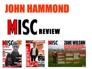
2. 1. In what ways does your media product use, develop or challenge forms and conventions of real media products? My magazine front cover is typical of a music magazine for the genre. The corner of the title is covered by the main image. This allows the image to stand out from the text. The front cover only contains one image so the main focus is on the image. Other headlines and text are in front of the image to allow the titles to contrast the image, therefore allow the image to stand out. The structure is very similar to most magazines, the positions and angles creates a professional feel. The position of the headlines are very similar which almost create a border around the artist featured. The red and white contrast of colours allow the text to grasp the audiences attention and is a common theme throughout ‘MISC’ magazine, which becomes common with the readers. The unconventional style of my magazine is the all white background, this could be seen very plain if not in the right context. As a result of using a plain white background this enhances the image, text and colours on the front cover. The red banner is similar to popular music magazines, It is a good feature as it allows the audience to see what bands are featured which draws there attention. The bold font emphasises the headline, allowing the audience to be interested in the magazine at first glance. The different colour of each article/word draws the attention to the headline. This emphasises the image. The grasping pose of the artist Zane Lowe enhances the audiences vision and connects due to his friendly pose.
3. In what ways does your media product use, develop or challenge forms and conventions of real media products? ‘ MISC’ contains the masthead in the contents page this is the same as ‘NME’ and ‘Q’ music magazines, this allows the name of the magazine to stick with the audience. The image of the artist is in front of all the headlines which emphasises the artist’s present on the page. The ‘Artist’s Featured’ section is adapted from ‘NME’s ‘Band Index’. It is a really great feature it allows the audience to spot which artists are in the magazine. The images which represent headlines is an alternative idea to the standard music magazine which is usually with text. Using images gives the audience an immediate insight and the page in which the image is featured. The ‘MISC’ contents page sticks to the same colour theme throughout the magazine which represents the ‘MISC’ Theme. MISC is more basic magazine, the primary colour red contrasts with the gold to give a professional feel and emphasises the remaining colours of the other text. The image of Zane Wilson is not featured with a musical instrument or not in action which is a bad point of the image as it could be hard to tell what type of musician he actually is. I could of possibly added advertising/tokens on the contents of the magazine to gain larger interest to the audience to buy the next issues to make it look more authentic
4. In what ways does your media product use, develop or challenge forms and conventions of real media products? The MISC magazine colours of the text enable the audience to define the questions and answers at first glance. The images used are very different, The image of ‘The Vaccines’ is very personal and shows all the band close together, whereas ‘MISC’ magazine shows the journey of Zane Wilson and portray he is alone. The graphics on the double page spread of ‘The Vaccines’ almost creates a border around the image, MISC magazine lacks an emphasising image to draw in the audience. The text in the article of ‘The Vaccines’ does not stand out and it is not spread out, it seems like there is a lot of text which could potentially put the reader off. The size of the text is small for compact writing but is still easy to read.
5. 2.How does your media product represent particular social groups? The images used are of a 18 year old solo artist. This is appealing to many ages due to the factor of music for the older generations. Girls would be attracted to the artists and for teenage boys they would be inspired at what he has achieved and his style. The images and stories can be directed at mainly working class/middle class. Middle class are most likely to buy the magazine and visit concerts. The higher class could possibly attracted to the magazines The people who read the magazine would obviously be interested in music and common trends. If they were to see the new artists on the covers they would obviously listen to the artist’s music as they have read the magazine to see upcoming music. Fashion and style is also a big influence on the audience who buy the magazine.
6. 3.What kind of media institution might distribute your media product and why? Facebook is currently the most popular social network in the world with over 500 million members. To advertise on Facebook would be a great opportunity. 17% of all magazines are published digitally and all music magazines are accessible through the internet. Some even have a subscription service where the whole magazine can be viewed via the internet. Also through social networks such as twitter and groups on Facebook to keep there customers updated Magazines are often given away free at clothes shows and music shops, which is a great way to advertise your magazine whilst starting up. Shop shelf is the obvious way to distribute magazine and majority of magazines are seen in the shop. It is then up to the magazine’s front cover to draw in the customers. Magazines can advertise in other magazines similar to there kind although this would be unlikely due to the obvious competition between leading magazines. T-shirts is a new and stylish way to advertise the music magazine My magazine could be advertised through music websites such as ITunes. A market for music and where a lot of customers will use the website
7.
8. 5.How did you attract/address your audience? The colours used in the front cover are an obvious contrast there for emphasising text used to describe articles to attract readers. If I were to advertise my magazine I would use t-shirts with a front cover of a well established artist, this links to fashion in music which would advertise the magazine as people would wear the t-shirts in many places which works similar to ‘word of mouth’ I would also advertise my magazine at music festivals possibly giving a sample of the magazine to increase interest. The festival would be obviously linked to the theme of the magazine to direct it at the correct target audience. The front cover would attract the audience immediately due to the professional look. The guitar shows the relation to music so people instantly know its music related. The banner at the bottom which features band names will appeal to the audience and it is a great way to include artists without creating an individual article. The character on the front of the magazine known as ‘Zane Wilson’ is set in a dramatic pose with direct eye contact. This is purposely done to connect to the audience. By putting the artist in front of the text it means the authors are confident that it is a well established magazine. The face of the artist is clear, which outlines his eyes therefore interacting with the audience. The products have been written/constructed to address my audience due to the indie/rock musical scene which is the main audience. The questions in the interview ask what the audience want to know which will appeal to the audience The red, white and black text contrasts with the grey which the artist is. This defines the text from the image yet links it to the audience. The way the beginning of the text is a different colour from the remaining text gives the articles definition and obviously attracts the audience.
9. 6. What have you learnt about technologies from the process of constructing this product? I used Photoshop to turn my image grey, it learnt me very basic skills which are very beneficial. All my projects were edited on fireworks. From cropping to editing text, it greatened my skills and I would feel comfortable to create another Magazine. I published all my work to Blogger, it allowed me to keep track on what was updated, it can also be viewed by other people. Which also means I can view others. I can also previous my other posts on a timeline. Slide share allows you to upload presentations on to blogger. Which you can view with ease. This enables me to sort my blogger page out so my products can be viewed easily and stress free. Taking the images your self with a digital camera allows a high definition image which allowed me to take the image with the angles which would grasp the audiences attention greater. The mise-en-scene I used was an open field with a guitar, this was my first idea and it worked well due to the open, musical feel. Light was very important and I took several images and effects to get greater front cover images.
10. Looking back at your preliminary task, what do you feel you have learnt in the progression from it to the full product? Technology: I have learnt to use technologies such as Blogger, Fireworks and Photoshop. I have increased my skills on taking photos. Learnt how to upload power points in a greater form (slideshare). I also know how to download fonts from the internet. How To Attract a Target Audience: My target audience was 16-30 males. To direct the magazine at these is used music which men of this age are generally into, directed the price at middle class (yet available for every class) and used masculine fonts to interest the audience How to Create an authentic magazine I learned how to create an authentic magazine through much research of similar magazines to my products. Simple things like text, and colours. Not to make the page to fancy and keep things simple to give of a realistic feel. Other techniques include positioning of images and titles such as putting the image in front of the title so the magazine seems like a well established product. How to communicate I have learnt to connect to the audience through interviews by addressing them directly. Also by using images which reach out to the audience by eye contact. Another technique is to use informal language to communicate more direct. Conventions of typical magazines Conventions of a typical ‘Indie’/’Rock’ magazine is colours. Keep the same theme throughout. Include a band list and insert as many band names as possible to interest the audience. I learnt this through wide research by researching many music magazines of this genre such as ‘NME’ and ‘Q’ where colours are a main theme which keeps the magazine together through a series of fonts and colours.