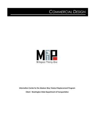
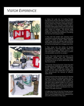
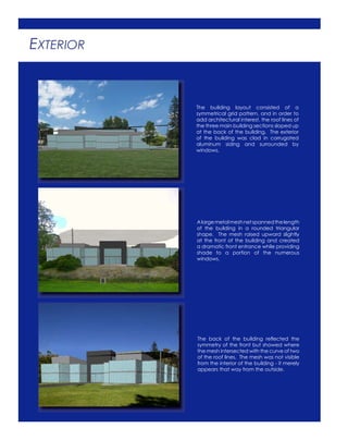
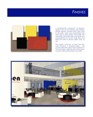
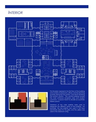
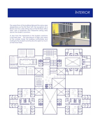
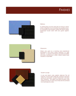
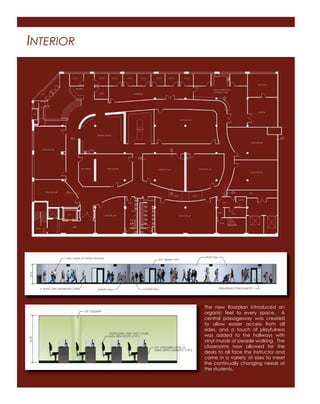
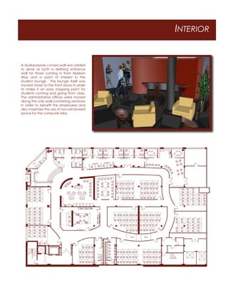
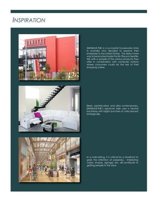
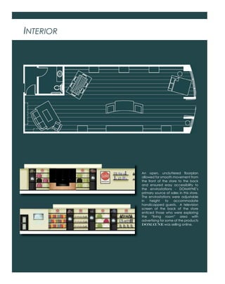
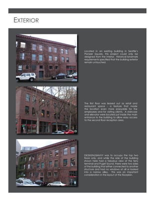
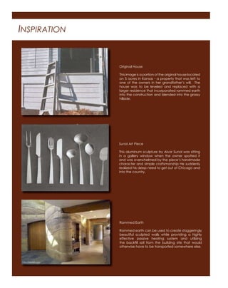
This document provides details about a project to design an information center for the Alaskan Way Viaduct Replacement Program in Seattle. Key details include:
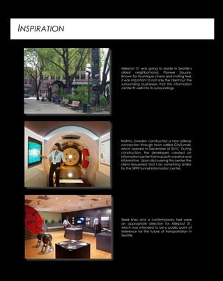
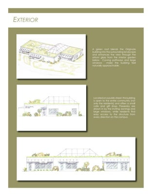
- The center aimed to fit in with the surrounding Pioneer Square neighborhood and provide information about the history and future of transportation in Seattle.
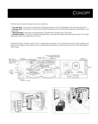
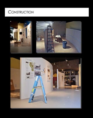
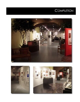
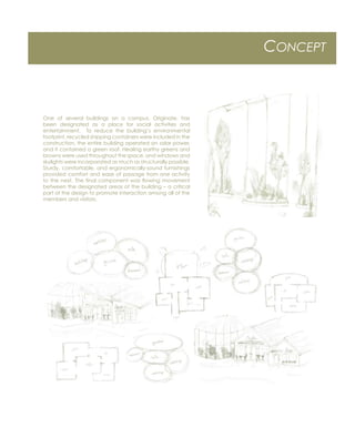
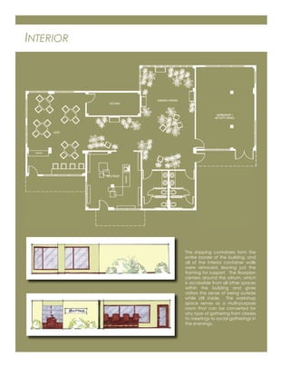
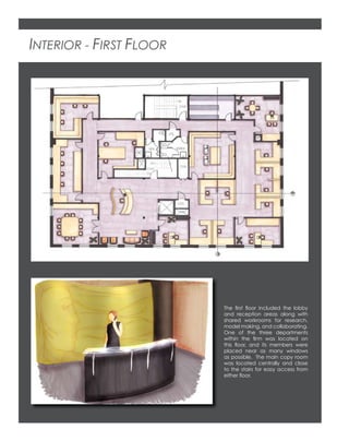
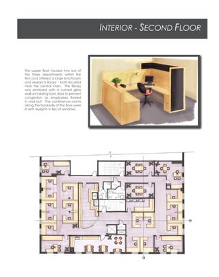
- The design broke the center into four sections covering the history of the landscape, transportation, and the future tunnel project.
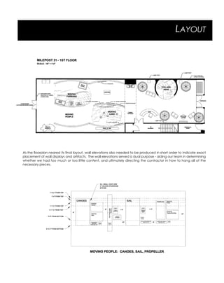
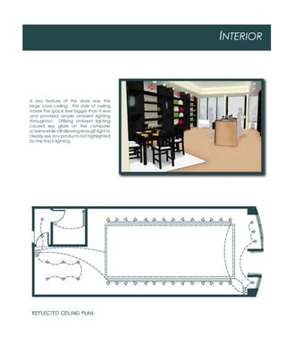
- Drawings and diagrams show the layout, visitor experience, and construction process.
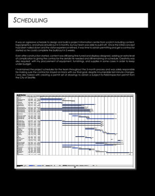
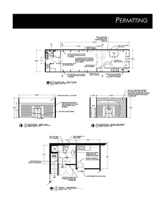
- The aggressive 5-month schedule required coordination between design, content development, and construction.


![[Suriano & Perry] [Library Design: Community Transformation] IFLA LBES 2016](https://cdn.slidesharecdn.com/ss_thumbnails/surianoperryfinal-160913205919-thumbnail.jpg?width=640&height=640&fit=bounds)

