This document provides an analysis and review of a music magazine promotion. It summarizes key elements of the promotion's design and layout that are effective, including the positioning of the band's name in different lines to make it unique, the use of consistent white font, and dividing the page according to the rule of thirds. It also notes design elements the reviewer aims to incorporate in their own magazine promotion, such as natural colors, unusual positioning of text, and a simple, organized layout.
- The document represents the pop music genre through images of male pop artists and the author's brother modeling pop-inspired clothing.
- The images portray stereotypical representations of males in pop music through their fashionable but revealing clothing, hair styles, ages ranging from 15-30, and photos taken at concerts or showing passion for music.
- All the images have a positive, fun feel and are intended to appeal to the target audience of female teenagers.
Reception Theory focuses on how readers interpret texts based on their individual circumstances like gender, age, and ethnicity. It emphasizes that a text's meaning depends on how it is received and decoded by its audience rather than just how it was encoded by its producer. Stuart Hall was a key proponent who argued that a text is encoded by its producer but decoded by readers, and that the producer's preferred reading may align with audience expectations using recognized codes.
This double page spread features an interview with Justin Bieber about being bullied. The main image shows Bieber looking seriously at the camera. Another smaller image depicts him dressed as a schoolboy. Quotes and headlines from the interview stand out in bold text or black boxes to draw readers in. Contact information for anti-bullying resources is also provided. The color scheme is blue, black and white to appeal to both male and female readers. Overall, the layout persuasively summarizes Bieber's sensitive discussion of being bullied through large eye-catching images and text.
The music video tells a narrative story through its imagery and location shots. It follows a singer hoping his ex-girlfriend will return to him. Scenes show her leaving on a train and struggling without him, while he performs in a dark room with empty chairs. Shots of the girl walking down a hallway and entering a room with chairs connect her story to his. The video uses dark colors and lighting to represent the singer's emotions of missing her. While open-ended, it suggests the potential for her to reunite with him by the ending shot of spinning a chair to invite her back.
The document discusses how a band called Lawson promoted their debut album 'Chapman Square' and provides examples and analysis of different promotional materials and products they used. This includes analyzing the album cover design and discussing elements like the natural setting, props, font styles, and color palette. It also examines a tour poster that featured the same album image and used consistent fonts and colors. Details are given on things like layout, tour dates and ticket information to help promote the Chapman Square Tour. The goal is to learn from Lawson's promotional strategies and apply similar techniques to promote an upcoming music video.
The document discusses gaining feedback from a target audience of teenagers aged 14-20 on a video project. The author created polls to get feedback on the song and storyline, talked to friends and peers, and shared a rough cut on social media. The feedback was mostly positive but suggested some timing and editing improvements. The author made changes like adding transitions and adjusting video quality. Showing the final video to classes of different ages provided further feedback that confirmed the intended messages were received.
Our music video uses some conventions of the alternative rock genre but also challenges some conventions. We used natural locations, Jonny playing guitar, close-ups showing intimacy between characters, and drama in the storyline. However, we did not include alcohol use or close-up kissing that are seen in some music videos. We developed conventions by including many fun times between the couple and different natural locations. Overall, the video uses some conventions to appeal to audiences but also challenges conventions to make it unique.
The document describes the process of creating ancillary products like a digipak and posters to promote an album. Key steps include:
1) Editing images to add a sepia/brown tone to create consistency across products.
2) Designing the digipak layout and adding cover art, tracklist, and background images.
3) Creating tour posters with the artist name, album info, and tour dates.
4) Ensuring similar fonts, effects, and promotional elements are used to clearly link the different products together.
This document discusses editing various images of a musician named Jonny. It describes taking original photos of Jonny playing guitar or looking out at sea, then cropping the images to focus on Jonny and remove backgrounds. The images were also edited by adjusting brightness, contrast, colors, adding filters like sepia or blurring backgrounds to emphasize Jonny and experiment with different artistic effects for potential album covers.
This document summarizes and provides feedback on a music magazine promotion. It notes several positive aspects of the promotion's design, including the unique positioning of the band's name in different lines, the use of natural colors that connote the environment, and the consistent use of white font. It also comments that dividing the content with black lines and positioning elements according to the rule of thirds makes the layout organized and professional. The summary highlights these design choices as positive aspects to consider for the reader's own magazine promotion.
The student learned several new technologies through creating their media product. They used a Pentax K-r camera and tripod to take high quality images, gaining experience with features like shutter speed and aperture. They also used an Apple Mac computer, initially finding it difficult but learning new skills quickly. Photoshop was used to create the pages, where the student explored various tools and editing features. Blogger was utilized to display work online through blog posts. Google was relied on for research, and slideshare was employed to showcase presentations. Other programs like Photobucket, Prezi, Word, and Excel supplemented different aspects of the project, while a memory stick facilitated file storage and transport.
The document summarizes changes made to three pages of a magazine:
1) The front cover image was changed to feature a model dressed in boyband style clothing to better indicate the genre as pop music.
2) The masthead was moved to a pink box with white writing to look better and be more eye-catching based on feedback.
3) Yellow was added to the front cover to make it more eye-catching and link it to the other two interior pages, which also featured yellow.
- The document represents the pop music genre through images of male pop artists and the author's brother modeling pop-inspired clothing.
- The images portray stereotypical representations of males in the pop industry through their fashionable clothing, ages ranging from 15-30, and positive, fun demeanors.
- Throughout the 3 pages, only males are represented to target the intended female teenage audience. The images and clothing are meant to attract this demographic.
This document summarizes how the media product challenges and uses conventions of real magazine covers and contents pages. Key conventions used include a model with direct eye contact, varied colorful cover lines, lures to encourage buying, and headings to separate contents. Conventions challenged include a unique masthead design, non-sequential page numbers, and excessive use of images and font variations to make the pages more eye-catching. The product aims to attract its target audience while putting an original spin on standard magazine formatting.
Spotify is a Swedish music streaming service founded in 2006 that offers over 15 million songs from major and independent labels. It gained one million paying users in Europe by 2011 and can now be accessed worldwide on computers and smartphones via apps. Spotify is funded by $10 monthly subscriptions and allows users to not only stream music but also purchase tracks and sync with iTunes.
Napster was an early peer-to-peer file sharing service founded in 1999 that allowed users to freely share MP3 music files, gaining up to 25 million users and 80 million available songs at its peak. However, it faced legal issues and was shut down in 2001 for copyright infringement. After paying a $26 million settlement, Napster re-launched
The document discusses the four major music producers (Universal Music Group, Sony Music Entertainment, Warner Music Group, and EMI) that control about 70% of the worldwide music market. It provides details on their business operations, including production, distribution, consumption, artists, record labels, and headquarters.
The document outlines the demographics and content of different youth-oriented pop music magazines. It shows that the target audience is 16-20 year old females and includes details like typical magazine names, cover designs, color schemes, layouts, main attractions, popular artists covered, and the type of content readers expect to find like concerts, reviews, interviews, profiles, competitions and posters.
➒➌➎➏➑➐➋➑➐➐ Satta Matka Dpboss Matka Guessing Indian Matka
KALYAN MATKA | MATKA RESULT | KALYAN MATKA TIPS | SATTA MATKA | MATKA.COM | MATKA PANA JODI TODAY | BATTA SATKA | MATKA PATTI JODI NUMBER | MATKA RESULTS | MATKA CHART | MATKA JODI | SATTA COM | FULL RATE GAME | MATKA GAME | MATKA WAPKA | ALL MATKA RESULT LIVE ONLINE | MATKA RESULT | KALYAN MATKA RESULT | DPBOSS MATKA 143 | MAIN MATKA
➒➌➎➏➑➐➋➑➐➐ Satta Matka Dpboss Matka GuessingKALYAN MATKA | MATKA RESULT | KALYAN MATKA TIPS | SATTA MATKA | MATKA.COM | MATKA PANA JODI TODAY | BATTA SATKA | MATKA PATTI JODI NUMBER | MATKA RESULTS | MATKA CHART | MATKA JODI | SATTA COM | FULL RATE GAME | MATKA GAME | MATKA WAPKA | ALL MATKA RESULT LIVE ONLINE | MATKA RESULT | KALYAN MATKA RESULT | DPBOSS MATKA 143 | MAIN MATKA
Kalyan chart DP boss guessing matka number➑➌➋➑➒➎➑➑➊➍
Satta Matka Kalyan Main Mumbai Fastest Results
Satta Matka ❋ Sattamatka ❋ New Mumbai Ratan Satta Matka ❋ Fast Matka ❋ Milan Market ❋ Kalyan Matka Results ❋ Satta Game ❋ Matka Game ❋ Satta Matka ❋ Kalyan Satta Matka ❋ Mumbai Main ❋ Online Matka Results ❋ Satta Matka Tips ❋ Milan Chart ❋ Satta Matka Boss❋ New Star Day ❋ Satta King ❋ Live Satta Matka Results ❋ Satta Matka Company ❋ Indian Matka ❋ Satta Matka 143❋ Kalyan Night Matka..
➒➌➎➏➑➐➋➑➐➐ Satta Matka Dpboss Matka Guessing Indian Matka KALYAN MATKA | MATKA RESULT | KALYAN MATKA TIPS | SATTA MATKA | MATKA.COM | MATKA PANA JODI TODAY | BATTA SATKA | MATKA PATTI JODI NUMBER | MATKA RESULTS | MATKA CHART | MATKA JODI | SATTA COM | FULL RATE GAME | MATKA GAME | MATKA WAPKA | ALL MATKA RESULT LIVE ONLINE | MATKA RESULT | KALYAN MATKA RESULT | DPBOSS MATKA 143 | MAIN MATKA
➒➌➎➏➑➐➋➑➐➐ Satta Matka Dpboss Matka Guessing Indian Matka
KALYAN MATKA | MATKA RESULT | KALYAN MATKA TIPS | SATTA MATKA | MATKA.COM | MATKA PANA JODI TODAY | BATTA SATKA | MATKA PATTI JODI NUMBER | MATKA RESULTS | MATKA CHART | MATKA JODI | SATTA COM | FULL RATE GAME | MATKA GAME | MATKA WAPKA | ALL MATKA RESULT LIVE ONLINE | MATKA RESULT | KALYAN MATKA RESULT | DPBOSS MATKA 143 | MAIN MATKA
➒➌➎➏➑➐➋➑➐➐ Satta Matka Dpboss Matka Guessing Indian Matka KALYAN MATKA | MATKA RESULT | KALYAN MATKA TIPS | SATTA MATKA | MATKA.COM | MATKA PANA JODI TODAY | BATTA SATKA | MATKA PATTI JODI NUMBER | MATKA RESULTS | MATKA CHART | MATKA JODI | SATTA COM | FULL RATE GAME | MATKA GAME | MATKA WAPKA | ALL MATKA RESULT LIVE ONLINE | MATKA RESULT | KALYAN MATKA RESULT | DPBOSS MATKA 143 | MAIN MATKA
A Brief Introduction About Hanying Chen_Hanying Chen
Vancouver-based artist Hanying Chen boasts extensive skills in writing, directing, producing, and singing, reflecting her diverse talents in the performing arts. As she looks ahead, Hanying is driven to craft a fulfilling career path that harmonizes with her deep passion for artistic expression. In the coming years, she envisions cultivating a balanced life, blending her professional aspirations with her desire to foster meaningful connections in her vibrant urban community.
➒➌➎➏➑➐➋➑➐➐ Satta Matka Dpboss Matka Guessing Indian Matka
KALYAN MATKA | MATKA RESULT | KALYAN MATKA TIPS | SATTA MATKA | MATKA.COM | MATKA PANA JODI TODAY | BATTA SATKA | MATKA PATTI JODI NUMBER | MATKA RESULTS | MATKA CHART | MATKA JODI | SATTA COM | FULL RATE GAME | MATKA GAME | MATKA WAPKA | ALL MATKA RESULT LIVE ONLINE | MATKA RESULT | KALYAN MATKA RESULT | DPBOSS MATKA 143 | MAIN MATKA
➒➌➎➏➑➐➋➑➐➐ Satta Matka Dpboss Matka Guessing Indian Matka Satta Matta Matka KALYAN MATKA | MATKA RESULT | KALYAN MATKA TIPS | SATTA MATKA | MATKA.COM | MATKA PANA JODI TODAY | BATTA SATKA | MATKA PATTI JODI NUMBER | MATKA RESULTS | MATKA CHART | MATKA JODI | SATTA COM | FULL RATE GAME | MATKA GAME | MATKA WAPKA | ALL MATKA RESULT LIVE ONLINE | MATKA RESULT | KALYAN MATKA RESULT | DPBOSS MATKA 143 | MAIN MATKA
SATTA MATKA SATTA FAST RESULT KALYAN TOP MATKA RESULT KALYAN SATTA MATKA FAST RESULT MILAN RATAN RAJDHANI MAIN BAZAR MATKA FAST TIPS RESULT MATKA CHART JODI CHART PANEL CHART FREE FIX GAME SATTAMATKA ! MATKA MOBI SATTA 143 spboss.in TOP NO1 RESULT FULL RATE MATKA ONLINE GAME PLAY BY APP SPBOSS
KALYAN MATKA | MATKA RESULT | KALYAN MATKA TIPS | SATTA MATKA | MATKA.COM | MATKA PANA JODI TODAY | BATTA SATKA | MATKA PATTI JODI NUMBER | MATKA RESULTS | MATKA CHART | MATKA JODI | SATTA COM | FULL RATE GAME | MATKA GAME | MATKA WAPKA | ALL MATKA RESULT LIVE ONLINE | MATKA RESULT | KALYAN MATKA RESULT | DPBOSS MATKA 143 | MAIN MATKA
Mr. Brainwash ❤️ Beautiful Girl _ FRANK FLUEGEL GALERIE.pdfFrank Fluegel
Mr. Brainwash Beautiful Girl / Mixed Media / signed / Unique
Year: 2023
Format: 96,5 x 127 cm / 37.8 x 50 inch
Material: Fine Art Paper with hand-torn edges.
Method: Mixed Media, Stencil, Spray Paint.
Edition: Unique
Other: handsigned by Mr. Brainwash front and verso.
Beautiful Girl by Mr. Brainwash is a mixed media artwork on paper done in 2023. It is unique and of course signed by Mr. Brainwash. The picture is a tribute to his own most successful work of art, the Balloon Girl. In this new creation, however, the theme of the little girl is slightly modified.
In Mr. Brainwash’s mixed media artwork titled “Beautiful Girl,” we are presented with a captivating depiction of a little girl adorned in a summer dress, with two playful pigtails framing her face. The artwork exudes a sense of innocence and whimsy, as the girl is shown in a dreamy state, lifting one end of her skirt and looking down as if she were about to dance. Through the use of mixed media, Mr. Brainwash skillfully combines different artistic elements to create a visually striking composition. The vibrant colors and bold brushstrokes bring the artwork to life, evoking a sense of joy and happiness. The attention to detail in the girl’s expression and body language adds depth and character to the piece, allowing viewers to connect with the young protagonist on a personal and emotional level. “Beautiful Girl” is a testament to Mr. Brainwash’s unique artistic style, blending elements of street art, pop art, and contemporary art to create a visually captivating and emotionally resonant artwork.
The use of mixed media in “Beautiful Girl” adds an additional layer of complexity to the artwork. By combining different artistic techniques and materials, such as stencils, spray paint, and collage, Mr. Brainwash creates a dynamic and textured composition that grabs the viewer’s attention. The juxtaposition of different textures and patterns adds depth and visual interest to the piece, while also emphasizing the artist’s eclectic and experimental approach to art-making. The inclusion of collage elements, such as newspaper clippings and torn posters, further enhances the artwork’s urban and contemporary feel. Overall, “Beautiful Girl” is a visually captivating and thought-provoking artwork that showcases Mr. Brainwash’s talent for blending different artistic elements to create a truly unique and engaging piece.
➒➌➎➏➑➐➋➑➐➐ Satta Matka Dpboss Matka Guessing Indian Matka Satta Matta Matka KALYAN MATKA | MATKA RESULT | KALYAN MATKA TIPS | SATTA MATKA | MATKA.COM | MATKA PANA JODI TODAY | BATTA SATKA | MATKA PATTI JODI NUMBER | MATKA RESULTS | MATKA CHART | MATKA JODI | SATTA COM | FULL RATE GAME | MATKA GAME | MATKA WAPKA | ALL MATKA RESULT LIVE ONLINE | MATKA RESULT | KALYAN MATKA RESULT | DPBOSS MATKA 143
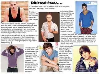
1. Different Poses....
If I decided to have a guy on the front cover of my magazine,
here are a few poses I could consider...
In this pose, Olly is
Direct eye
pulling down his top
contact is vital
and revealing his
and has been
chest. I could
used in all
consider revealing a
these images.
bit of skin in order to
help persuade my
I like the fact Max is in a vest, which is revealing his target audience to
arms and chest. I could consider getting a guy to wear buy my magazine.
a vest as this will help to draw the attention of my He is also in a shirt,
target audience of teenage girls. He is looking very which I could
relaxed and staring directly at the camera, and we are possibly consider.
automatically wanting to find out more.
I quite like this pose, and think it could work well as a
I like the fact he is in a hoody as this sort of reflects my
front cover image. Aston is wearing a ‘v’ neck, slightly
target audience of teenagers. I like the positioning,
showing off his chest and this could also be a subtly
and think that I could possible have someone stood
way of being able to attract some teenage girls. He is
similar to Justin, like holding headphones against their
positioned in the centre, so cover lines can easily fit
ears possibly.
around the outside.
I think this pose is
I think this pose may quite good, and by
be quite good, it sort having his finger
of gives readers the pointing directly at
impression, that if the camera, it could
they read on, they help draw the
will find out more and readers attention
Liam will be more, and makes it
‘revealed’. I could a bit more personal.
also possibly Justin also has
consider getting the direct eye contact
guy to wear chinos, with the camera,
as they are very which makes this
popular amongst quite a persuasive
teenagers. pose.
2. Different Poses....
If I decided to have a girl on the front cover of my
magazine, here are a few poses I could consider...
I like the fact her body is at a slant, with her arms
positioned different places on her body. In this
image, kelly is revealing some of her stomach,
which helps to appeal to guys. I like the
contrasting colour clothing of black and white, and
may consider this for when I come to taking my
images.
I quite like this pose and could possibly do something
I like the pose and like the fact her hand is similar but interpret a microphone into it instead of a
raised to her face. I could possibly have necklace. I would need it to be not as close up, but I
someone doing a similar pose but with a quite like the fact of having her arms raised, it could
microphone in their hand possibly. I also like make it look more symmetrical and organised.
the fact her hair is blowing backwards, and
could experiment with doing something similar
if I decide to have a girl on my front cover.
I like the positioning of tulisa, with her hand on her hips and
think that this could work quite well as a front cover image. Her
dress is very revealing, and if I did something similar it could
help to draw males as well as my target audience to my
magazine.
I like the fact the colour of her clothing, nail varnish, lipstick and
eyes are all matching, and will consider this if I decide to have a
girl on my cover. I think the pose is quite good, however it would
need it to be zoomed out slightly in order to have cover lines
around it.
3. Different Fonts....
Here are some fonts that I found on dafont.com, these are the few that stood out the most to me. I want my masthead to stand out so want
a bold, strong font. I like the sort of ‘curly’ and rounded fonts, and think these would work well with the genre of my magazine being pop. I
quite like the top, right hand side font, this is similar to the masthead on ‘paper’ magazine, I think this one could work quite well. I also
quite like the third one down in the centre, it is very bold and clear, and would be able to stand out against the image and cover lines.
When I come to making my front cover, I am going to experiment with using a variation of these different fonts.
4. Lures....
Here are some of the lures I found on a variation of
different music magazines. Most of which I found
mention ‘free things’, I think this is quite persuasive
and even if readers don’t like the bands featured
they are still able to buy the magazine to get free
gifts/music downloads. I also think that by
mentioning free posters on my cover, it could help
persuade my target audience of teenage girls to
buy the magazine as some of them may wish to
cover their bedroom walls with them. I also think
that by mentioning the word ‘exclusive’ on the
cover, readers automatically know that it is new,
never seen before gossip, which could be helpful in
persuading them to buy it. Finally, by having
competitions where you can win something,
readers are persuaded to buy the magazine to
enter the competitions and win some amazing
prizes.
5. Covers...
I like the colour scheme of
this magazine cover, and am
I like the masthead of this considering using black,
magazine, it is very white and pink on my cover. I
colourful, easy to read and like the fact that the main bits
stands out a lot. I like the of the cover lines have been
fact that there is only a little done in pink, making them
amount of cover lines, stand out more, and showing
making it look organised the audience the main
and not overcrowded. I features. I don’t really like the
don’t want my cover to fact that her head is covering
look crowded and really the masthead, and when I
busy. I also like the fact it’s come to making my cover I
a medium-close-up shot. don’t really want anything
over or under my masthead
as I feel it makes it less eye
catching and harder to read.
I like the colour scheme of
this cover, and could do I think this magazine is quite
something similar for my eye catching, and I like the
magazine cover. I like the fact that the colour of her hair
fact that her clothing is matching the colour of the
matches the colour main cover line. I don’t like
scheme and am going to the fact that the masthead is
consider this when I come over the image though, as it
to making my magazine. I makes it more difficult to read
also quite like the position from a distance. There are
that taylor swift is in, I like only a few cover lines which I
the slanted body position think makes it look more
and if I decide to have a organised and I prefer it to
girl on my cover could there being lots of cover lines
consider a pose similar to all crowded onto a page.
this.
6. Covers... I like how the colour of the
masthead is matching the
colour of the kiss marks
I like the positioning of and think this looks quite
taylor lautner in this good. I like the white
cover, and could background, and the
consider doing contrasting black and white
something similar if I tie. I think the cover lines
were to have a guy on are slightly too long, which
my front cover. I like the makes it seem a bit
fact the masthead crowded. The fact he is
matches the colour of pulling on his tie, helps to
the main cover line. I attract females, so if I have
also quite like the image a guy on my cover, I need
being set at the sea, as to find a way to get them to
it is very unique and appeal to the female target
different, which I could audience.
also consider.
I like how this cover is
I like the colour scheme really simple with only a
of this cover, and think it few cover lines. I also like
looks quite good. I also the fact he is wearing a
like the positioning of the hoody, and could consider
man, it gives the sense this if I choose to have a
that by reading on, more guy on my cover. He is
will be ‘revealed’ as he is revealing his chest which
kind of covering himself helps to appeal to females,
with his arm. I think the so if I get the person on my
fact that he is in a vest cover to reveal a bit of skin
with skin being shown it could be a good way in
makes the cover more attracting people to the
attracting and appeals magazine. I don’t like the
more to the girls, so I fact that in this cover, his
need to consider this if I head is covering the
end up having a guy on masthead as it makes it
my cover. difficult to read.
7. Mastheads...
This masthead is very colourful, reflecting the genre of
pop. It is very bold, however I don’t think it really stands
out that much. I don’t like the fact that there is an image
underneath the masthead and will consider this for when I think that this masthead is okay. I think that
I come to creating my magazine. all the colours work well together, and it is
overall quite eye catching. I like the sort of
bubble writing effect of the masthead and
think it makes it stand out more.
This masthead is very iconic,
and well known. It stands out
and people easily know the I like this masthead, it is very bright and you can easily
magazine name. I want my tell it is reflecting the genre of pop. The font is quite curly
magazine masthead to be and kind of childish. The bright pink helps to highlight the
able to become well known, I like this masthead and think it stands out yellow writing and makes it stand out more. However, on
and want my audience to a lot. I like the fact that the masthead is in most of the totp magazine covers, there are images either
automatically know that it is a a separate box, which divides it from the underneath or on top of the masthead which I don’t like.
pop magazine. image. It is very clear and easily read. It is
in capital letter, is very bold and sharp.
This masthead is very
iconic and it stands out a
This masthead is okay, lot. It is very bold, and
but I do think it looks sharp, reflecting the genre
quite plain and boring. I of rock. The red is very
want my masthead to bright, which is then
be colourful, simple, outlined with a white and
and easy to read. This black which contrast
font is very bold, and against each other and
really easy to read. look quite good.
8. Props/ clothing I could
consider...
If I were to have a guy, I could have them wearing some big
headphones. The audience then will automatically know that it is a
music magazine, and hopefully my colour scheme and masthead
will easily show that its a pop magazine.
If I were to have a girl, I could interpret a microphone in the image
somewhere. I want to make it obvious to the reader that its a music
magazine and I think that by having either headphones or a
microphone, this will easily show that it is a music magazine.
Guy... Girl...
Here is some of the clothing that I could consider if I were to have Here is some of the clothing that I could consider if I were to have a girl
a guy on my front cover. I quite like the ‘fabulous’ cover on the on the front cover. I think that I want my clothing to match my colour
previous slide with harry posing with his hood up and this gave me scheme so could have my model in black shorts or skirt, with a bright
the idea of the hoody. In the first slide, liam is wearing chinos in his crop top, the colour dependant on the colour scheme I decide to
image, and this gave me the idea that I could possibly get my choose. I could possibly have my model in a smart dress. This would
model to wear them. Also, in some of the magazine covers, they also have to match my chosen colour scheme and could help to make
are in white tops/shirts, so I could have my model posing in a shirt. my magazine come across as more realistic and sophisticated.