How to Create KPIs WITHOUT Data?
•
0 likes•115 views

KPIs (Key PRocess Indicators) are basically graphs that ceated from data analysis. They like the car dashboard, where we see how much fuel the car has, what is the oil status, engine temperature and even if we have a flat tier. But how do you handle a situation when you have no data to analize and no resources to even begin to ccollect data? Check out this tip for creating graphs WITHOUT data, and what do you gain with that.

Recommended
More Related Content
Similar to How to Create KPIs WITHOUT Data?
Similar to How to Create KPIs WITHOUT Data? (20)
Recently uploaded
Recently uploaded (20)
How to Create KPIs WITHOUT Data?
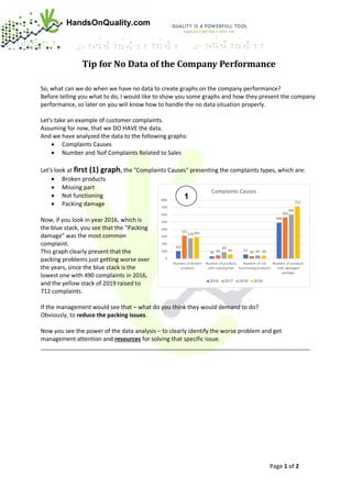
- 1. Page 1 of 2 HandsOnQuality.com Tip for No Data of the Company Performance So, what can we do when we have no data to create graphs on the company performance? Before telling you what to do, I would like to show you some graphs and how they present the company performance, so later on you will know how to handle the no data situation properly. Let's take an example of customer complaints. Assuming for now, that we DO HAVE the data. And we have analyzed the data to the following graphs: • Complaints Causes • Number and %of Complaints Related to Sales Let's look at first (1) graph, the "Complaints Causes" presenting the complaints types, which are: • Broken products • Missing part • Not functioning • Packing damage Now, if you look in year 2016, which is the blue stack, you see that the "Packing damage" was the most common complaint. This graph clearly present that the packing problems just getting worse over the years, since the blue stack is the lowest one with 490 complaints in 2016, and the yellow stack of 2019 raised to 712 complaints. If the management would see that – what do you think they would demand to do? Obviously, to reduce the packing issues. Now you see the power of the data analysis – to clearly identify the worse problem and get management attention and resources for solving that specific issue. ___________________________________________________________________________________ 1
- 2. Page 2 of 2 HandsOnQuality.com Now to the second (2) graph, the "Number and %of Complaints Related to Sales" graph. In this graph you can see the percentage of complaints in relation to the number of sales that year. So, in 2017 we have 13% complaints and in 2019 only 7%, which is great, but this graph does not reveal a major problem! ___________________________________________________________________________________ Which you can see in the third (3) graph, the complaints cost is raising – which is the red line with the cost of the complaints in US$. Now we learned that when analyzing data, we must look in several angels to reveal the problems. _____________________________________________________________________________________ OK, we done with reviewing how to conclude the company performance from the graphs. So, now you understand the power of data analysis (graphs). And now to the big question; What do you do without any data? Or with inaccurate data? For More: http://www.handsonquality.com/clear-practical/quality-saves-money/ 2 3