How Drawing Postcards Helped Me learn Tableau
•Download as PPTX, PDF•
2 likes•792 views

A presentation about Dear Data Two and Tableau from the January 2016 London Tableau User Group

Recommended
More Related Content
Viewers also liked
Viewers also liked (9)
More from Andy Kriebel
More from Andy Kriebel (10)
Recently uploaded
Recently uploaded (20)
How Drawing Postcards Helped Me learn Tableau
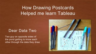
- 1. How Drawing Postcards Helped me learn Tableau Dear Data Two Two guy on opposite sides of the pond getting to know each other through the data they draw
- 5. Giorgia Lupi Dear Data Stefani Posavec
- 6. Jeffrey Shaffer Dear Data TWO Andy Kriebel
- 7. Why Dear Data Two? The Project A year-long, analog data drawing project
- 8. Why Dear Data Two? And a Bit of Tableau Challenge ourselves to build the postcards in Tableau
- 9. The Process
- 10. 1 Pick a Topic Each week is a different topic about something in our lives
- 11. 2 Collect the Data Gathering the date is often the biggest challenge
- 12. 3 Analyse with Tableau Use Tableau to understand the stories hidden in the data
- 13. 4 Design a Tableau Postcard This is where the creative process begins.
- 14. 5 Draw a Postcard Sketch the patterns found in the data
- 15. 6 Send it to America Don’t forget the stamp!
- 16. The London Pigeon dear Data Two | Week 34: Urban Wildlife Source: Getty Images
- 27. ” “ — Jeffrey Shaffer It came! Even with no stamp!
- 28. Be Intentional! dear Data Two | Week 31: Positive Feelings
- 32. I need to fix this!
- 36. How Colourful is my Town? dear Data Two | Week 24: Doors
- 41. The Donut Monsters dear Data Two | Week 26: Workspace
- 48. Why YOU should Do this?
- 49. DATA-CHAIN.COM
- 50. Thank yoU!
- 51. Q & A
Editor's Notes
- We started this project on April 6th, 2015 and it runs for 52 weeks. Only 12 more weeks until we’re done! Jeff approached me with the idea when I was in a weak moment. I had just moved to London. I was alone. I had nothing else to do. Seemed like a great way to pass the time. Little did I know the time suck it would become.
- We are trying to capture the life around us through sketching the hidden patterns found within our data. We’re having a lot of fun learning about each other - though I’m fairly certain Jeff is pretty terrified by now. I’ve also noticed that this project has consciously changed my behaviour. For example, when I was tracking negative emotions, I felt pretty sad all week. No matter the topic, this project has helped bring those bits of my life to the forefront of my mind each week, moving them from the subconscious to the conscious part of my brain. Surely this effects the data collection.
- For me, I want to push the boundaries of what I know about Tableau. I’ve done things in Tableau that I never thought were possible and I now see Tableau more as a drawing canvas than a charting tool.
- Each week we pick the same topic that the ladies did for the same week. Each week is about a particular type of data about our lives. The topic range from what we wear to what we drink. From our positive emotions to our negative thoughts. And sometimes it’s as simple as listening to what you hear around you.
- I try to automate as much of the data collection process as possible. This requires me to look ahead to the topic for the next week to get the data collection methods ready. However, much of the time I end up recording data manually on my phone. A story about this later.
- I look at all of the dimensions and measures. I slice and dice them as many ways as I can. I tend to use lots of bar charts, line charts and maps.
- Every week, I look at what Giorgia and Stefanie created to get ideas for how I might draw my postcard. After doing the analysis, I combine what I learned, the stories in the data, and the design ideas from the postcard, and try to emulate in Tableau what my final postcard might look like. This is where the learning happens. It helps me see Tableau as a drawing canvas.
- After doing my best to create the postcard in Tableau, I have to draw the actual postcard. After all, this is an analogue data visualisation project.
- Once I’m done with the card, I write up a blog post then drop the card in the postbox to send to Jeff. Usually 1-2 weeks later it arrives at his door. Come to think of it, we should have been tracking shipping times all along. Ok, so let’s look at a few examples that I found particularly fun and learned a bit of Tableau along the way.
- I have this fear that one day, the mighty London Pigeons will turn on all of us.
- First, let's set a baseline by looking at my daily walk from Waterloo to The Data School using my Moves data. Notice that on Friday I deviated because I wanted to get some warm croissants at Sainsbury's.
- Combining my fear and my daily commute, I decided to track where I saw pigeons. This clearly shows that the pigeons like to hang out around Millennium Bridge.
- Adding weekday to the view shows me that I I didn't see them every day in the same places.
- Let’s look at the number of pigeons by weekday. I was more conscious of the pigeons on Tuesday; I think this is why I tracked more of them.
- So how did the pigeons react to me? We all know how mean they can be. The London Pigeon is clearly not afraid of humans. Does anyone doubt that they think they're superior to us?
- The front of the postcard includes my data collection method and instructions for reading the card.
- The back of the card show my my depiction of the pigeons for the week.
- I included a map overlay via transparency paper to help interpret the pigeon locations. Since I had this overlay, I needed to mail this together with the postcard in an envelope.
- Like every other week, when I drop the card in the postbox I take a picture. This week was no different. I took the picture, and dropped the card in the postbox. Oh shit! Remember the front of the postcard? No stamp! I guess I’ll have to wait for Royal Mail to send it back.
- But wait!!! Only 8 days later, I get an email from Jeff. He got it!
- After the Tableau conference in Vegas, I had a great conversation with Paul Banoub about the project and the opportunity it’s providing me to learn about myself. In week 31, I tracked all of the positive feelings I had, and I assumed this I would see nothing but great results. After all, I have a great family, a great job, we live in an amazing place. But this is why we track the data - to bring out the reality that we might not see otherwise.
- I started by looking at how many positive feelings I experienced each day. I wanted to look at both the number each day as well as the running total.
- Then I wanted to look at the distribution by day before and after noon. I included the grand total because it helped me see that there were many more after 12pm.
- Now that I understand when I was having positive feelings, it’s important to look at who I’m having them with. To do that, let’s look at the % of positive feelings with each person.
- It was great to see 67% of my positive feelings were with my family. But the data showed I'm not having enough positive feelings with the twins. If I hadn’t look at the data this way, I would have never known that I wasn’t having enough positive feelings with them.
- My idea for the final postcard was a hub & spoke diagram for each member of my family. In this view, I want to have an inner circle that is sized by the number of positive feelings with that person. Outside each circle, I want a series of dots for each instance, evenly spread around. I found a formula for this on the internet, and it was easiest to just add those formulas in Excel. So how did I build this?
- My idea for the final postcard was a hub & spoke diagram for each member of my family. In this view, I want to have an inner circle that is sized by the number of positive feelings with that person. Outside each circle, I want a series of dots for each instance, evenly spread around. I found a formula for this on the internet, and it was easiest to just add those formulas in Excel. So how did I build this?
- Replicating this onto the postcard was pretty straight forward, except computers are much better at precisely placing the dots around the circles. Even without a legend on this side of the card, you can clearly see the disparity in the number of positive feelings I had with my family members. This is the power that this little project has brought into my life. It has helped me recognise areas where I can improve. For that, I’ll be forever grateful.
- Ok, that was pretty depressing. Let’s look at a more uplifting experience I’ve had. I’m going to take you back to week 24. This is definitely one of my favourite postcards so far and Jeff said it was his favourite too. When I saw the topic was doors, I immediately knew what I wanted to create. In California, our neighbourhood was managed by a homeowner’s association, which meant uniformity everywhere, including every house door being black. One of the first things I noticed upon moving to our home in Kingston was how colourful the doors are around us.
- Since there are so many homes on each street, it was going to take quite some time to document all of the door colours. I saw this as an opportunity to spend some time with my wonderful daughter. She walked me with to help with the survey; I wrote down the door colours while she told me what they were. We got a few bizarre looks from people. Given that I was writing in a notebook as we looked at each house, it wasn’t too surprising. From there, I manually entered the data into Excel and suddenly realised I didn't write down the house numbers. So out we went again, though my daughter gave up after about half of the first street. Some of my neighbours noticed me again, so I got a few more WTF looks. I then used Batch Geocoder to get the latitude and longitude for each house.
- The first thing I wanted to build in Tableau was a map of all of the houses soI could see how colourful my neighbourhood is. Building the map was super easy. I created a custom black and white Mapbox map for use in Tableau. I initially used a house shape for each house, but when I was showing this to people at the Data School, they thought it looked to cluttered, so I stuck with circles. I then wanted a summary for each street to combine with the map. Notice that I had to add the borders around the squares so that I could see the white doors.
- I wanted to see a summary of the distribution of the colours on each street. I did this by first building sort of a heat map. Then I wanted a summary of all streets, so I removed the streets from the view, changed the metric and added a % of total quick table calculation. I knew that the charts wouldn’t align when I put them on the dashboard because the first one has a header and then 2nd on doesn’t. To fix that, I build a dummy header. Then putting them on the dashboard they line up nice and neatly.
- Lastly, I got to the fun part…the postcard. I felt a bit like a city planner or a civil engineer creating this card. I really, really like the clean look of it. I added a bit of context on the map so that Jeff would have an idea of the orientation of where I live.
- Ok, one more story. The first group of consultants to go through the Data School loved their donuts. They were not bashful about reminding me to bring them every Friday, particularly Damiana. And they’re also creatures of habit. A week after they started, I made them switch seats. I didn’t want them sitting in the same seat every day. Some of them took to this better than others. Pablo, for example, like to sit close to the TV, which was fine by me because he would make me coffee. Damiana liked to sit on the opposite side, close to the TV as well. To say she didn’t like sitting anywhere else would be a bit of an understatement. I once asked Pablo to sit in her seat. He reluctantly obliged before he got threatened and ratted me out. But one of the things they didn’t realise was that I had been tracking where they sat every day. So when the topic of workspace came around, I knew exactly what I was going to do.
- I started by creating a mock up in PowerPoint. This provided a few good uses: I could save the images of each of the consultants as an shape. I could save the table as an image. I could use the rulers in PPT to get the positions that I needed for drawing them in the right spot in Tableau.
- Based on the values PowerPoint, I simply created a calculated field for the X and Y positions.
- Now that I had the table as a background image and the X/Y positions, all I need to do was build the viz. For this, I built a donuts chart to represent the % of time they spent in their favourite seat, you know, since they love donuts. But instead of leaving the middle white, I used shapes to incorporate their pictures. Lastly, I labelled them for clarity.
- This is how the final dashboard looked in Tableau. Now I had to take this and convert it to the postcard.
- Creating the postcard turned out to be an absolute pain! First, I had the table backwards, so I ripped that card up. Second try, the colours I chose for the donuts didn’t work, so I ripped up that card. Finally, I got the card completed, using Information Lab colours and pasted on their little pictures, only to realise I had the table backwards again. WTF! I decided to heck with it; good enough is good enough and this project is about learning from the mistakes we make along the way anyway. Lastly, I added little chocolate donuts under each picture to show how many they typically eat.
- I would encourage you to take on a similar project for two reasons: First, you’ll learn a heck of a lot about yourself and your life. Second, you’ll start using Tableau in ways you never thought you would. If you follow my method and try to build all of your postcards in Tableau first and get as close as you can to what you can do with pen and paper. You’ll often not be able to make it exactly the same, but I bet you can get close.
- If you want to do the project every week, find a partner, hopefully across the world, and get started. Or if you don’t want to commit to a weekly project, join the Data Chain project. There are currently 20 members, but there’s no limit to the number of people they’re accepting.