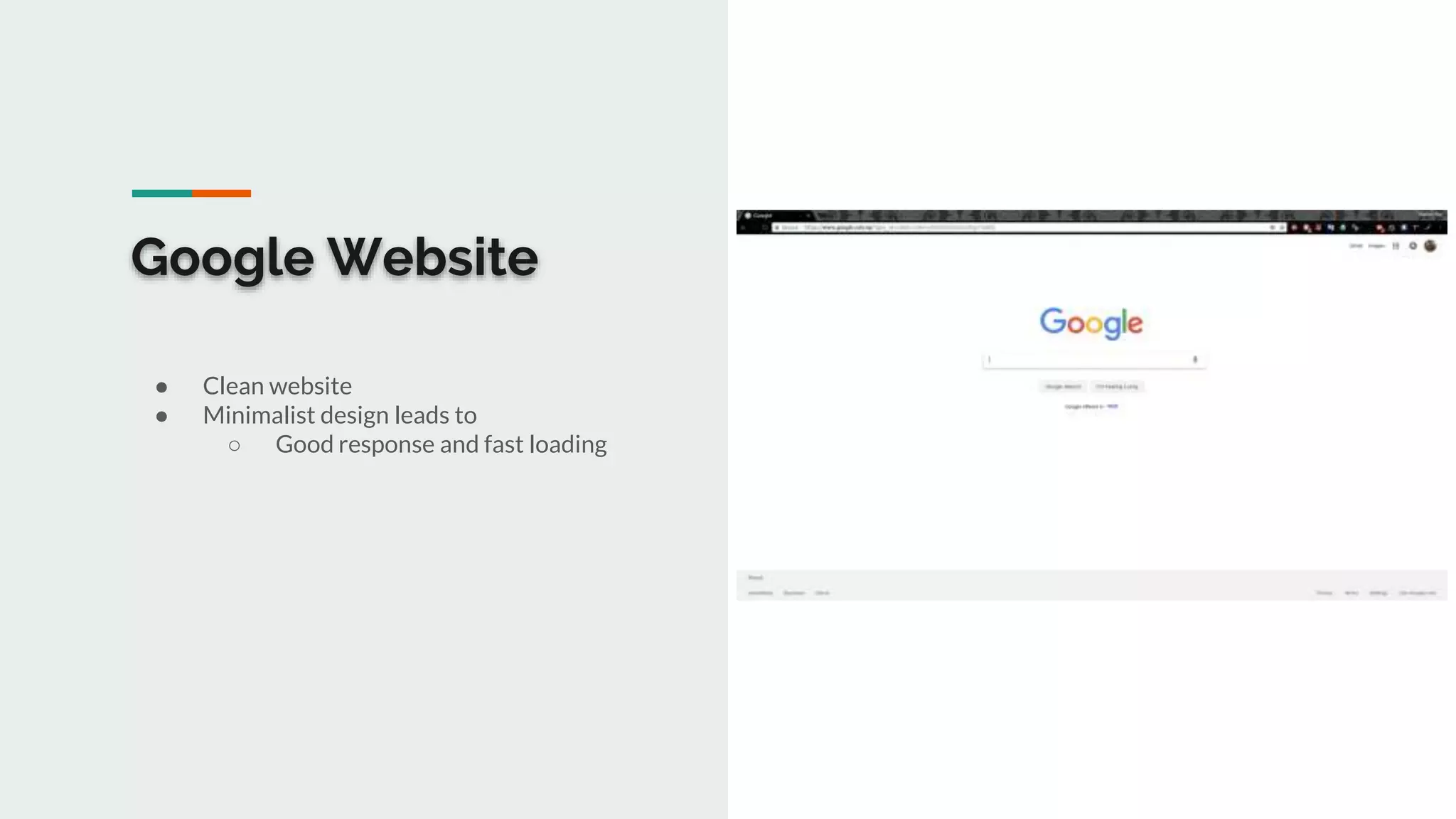
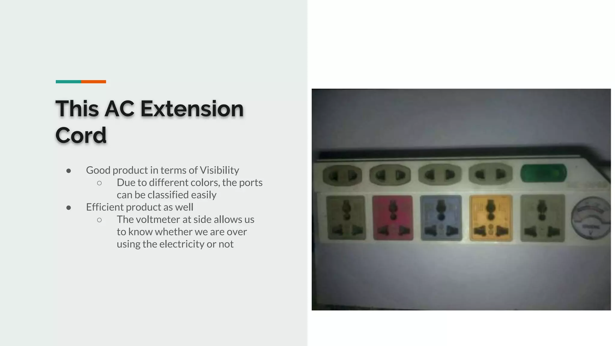
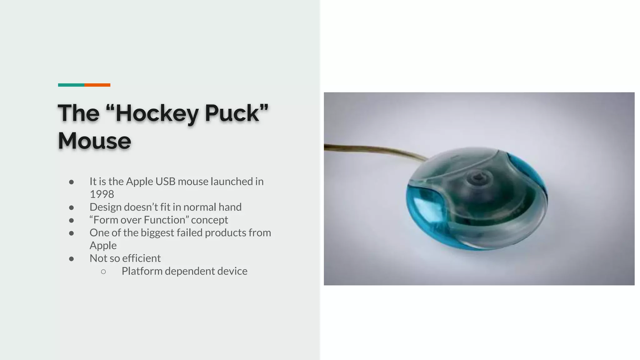
Human Computer Interaction
(HCI)
Good Design and Bad Design
Suman Dhakal (05)
Dipesh Khadka (11)
Manish Raj Silwal (21)
Good Designs
Google Website
● Clean website
● Minimalist design leads to
○ Good response and fast loading
This AC Extension
Cord
● Good product in terms of Visibility
○ Due to different colors, the ports
can be classified easily
● Efficient product as well
○ The voltmeter at side allows us
to know whether we are over
using the electricity or not
This Visiting Card
● Visiting card of Abdul Kohar, General
Affair Officer of Yayasan Cipta Mandiri,
Indonesia
● A very good visiting card in terms of
visibility perspective
● Efficient visiting card
○ User can get information easily
due to good visibility
This Soldering Iron
● Good affordance
○ The plastic insulator will let us
know it is handle
● Efficient product
○ The light glows upon connecting
the iron to the electricity
○ The light (so the product) turns
off when it is overheated
Bad Designs
The “Hockey Puck”
Mouse
● It is the Apple USB mouse launched in
1998
● Design doesn’t fit in normal hand
● “Form over Function” concept
● One of the biggest failed products from
Apple
● Not so efficient
○ Platform dependent device
Door of Dipesh’s
Room
● Affordance problem
○ User won’t know how to put the
key at first glance
● It is hard to tell whether the door is
locked or not only by looking at it
MGBD Website
● Visibility Issues
○ Side navigation bar is not visible
○ Very big fonts
● Less Efficiency
○ Too many photos make the site
to load slower
Moto G4 Plus
Fingerprint
Scanner
● Affordance Issue
○ Not a button, only a fingerprint
scanner
○ Locks the device upon pressing it
when the device is awake
○ User gets confused and take this
as a button and eventually goes
on to lock device
Thank You

HCI Good designs and Bad designs.

  • 1.
    Human Computer Interaction (HCI) GoodDesign and Bad Design Suman Dhakal (05) Dipesh Khadka (11) Manish Raj Silwal (21)
  • 2.
  • 3.
    Google Website ● Cleanwebsite ● Minimalist design leads to ○ Good response and fast loading
  • 4.
    This AC Extension Cord ●Good product in terms of Visibility ○ Due to different colors, the ports can be classified easily ● Efficient product as well ○ The voltmeter at side allows us to know whether we are over using the electricity or not
  • 5.
    This Visiting Card ●Visiting card of Abdul Kohar, General Affair Officer of Yayasan Cipta Mandiri, Indonesia ● A very good visiting card in terms of visibility perspective ● Efficient visiting card ○ User can get information easily due to good visibility
  • 6.
    This Soldering Iron ●Good affordance ○ The plastic insulator will let us know it is handle ● Efficient product ○ The light glows upon connecting the iron to the electricity ○ The light (so the product) turns off when it is overheated
  • 7.
  • 8.
    The “Hockey Puck” Mouse ●It is the Apple USB mouse launched in 1998 ● Design doesn’t fit in normal hand ● “Form over Function” concept ● One of the biggest failed products from Apple ● Not so efficient ○ Platform dependent device
  • 9.
    Door of Dipesh’s Room ●Affordance problem ○ User won’t know how to put the key at first glance ● It is hard to tell whether the door is locked or not only by looking at it
  • 10.
    MGBD Website ● VisibilityIssues ○ Side navigation bar is not visible ○ Very big fonts ● Less Efficiency ○ Too many photos make the site to load slower
  • 11.
    Moto G4 Plus Fingerprint Scanner ●Affordance Issue ○ Not a button, only a fingerprint scanner ○ Locks the device upon pressing it when the device is awake ○ User gets confused and take this as a button and eventually goes on to lock device
  • 12.