This document evaluates a media product, Brit Asian magazine, and how it uses conventions of real magazines. It discusses how the magazine's title, masthead, imagery, costumes, props, people, fonts, layout, and written content follow conventions. The target audience is identified as young Asian teenagers. The magazine aims to represent Asian culture and music to an audience with few other options. Technologies like Photoshop and online editing tools were learned in creating the professional-looking product.
This magazine cover analysis summarizes two college magazine covers. The first magazine cover uses a sky blue masthead and logo with the strapline "High Quality Learning for All" printed below. It features two smiling girls in bright dresses. The second magazine cover uses a dark purple background with a messy, handwritten masthead that suggests a focus on the school. However, several key details on both covers like dates, cover lines, and fonts are too small and unclear, making the magazines look unprofessional. Overall, the analysis examines design elements like colors, images, and text placement on the covers.
The document provides an analysis of 4 preliminary horror movie posters. For each poster, it identifies what is good and bad about the design, as well as how it affects the audience and uses conventions of the horror genre. Poster 1 uses dark red and black colors and dripping font to grab attention. Poster 2 features an overlapping title and frightened children to convey the plot and psychological horror. Poster 3 uses direct eye contact and a symbolic image to immediately make audiences uncomfortable. Poster 4 layers text over an image and uses transparency effects to create an unsettling and psychopathic atmosphere.
The document discusses notes from a national president's meeting held in Toronto, Ontario in July 2011. It covers topics around emotional intelligence, including identifying different personality types based on one's primary energy (blue, red, green, or yellow). For each type, it lists positive and negative perceptions, as well as how one's mood could impact behaviors. The main takeaway is that understanding emotional intelligence can help interpret behaviors in different situations and people.
This document proposes a new magazine called "Brit Asian" that would focus on Asian music genres like Bhangra. It would have a monthly distribution in shops, door-to-door, and online at a cover price of £2.50. The target audience is males and females over 16, mostly Asian people. The magazine would follow conventions of layout and design from similar publications. A featured article would include an exclusive interview with an up-and-coming female star, Alisha, about her personal life and contributions to the music industry. The unique selling point is there is less competition covering Asian music genres.
1) A group of 6th form students decide to sneak back into their school at night to play the "knife game" in their classroom and see if rumors of a ghost are true.
2) While in their classroom playing the game, one of the girls notices blood on the table and screams, wanting to leave. However, the door slams shut, trapping them inside.
3) A creepy noise comes from the teacher's office and when they investigate, they see the ghost of a child sitting in the chair, confirming the school is haunted.
This document provides an analysis of the front cover, contents page, and a double page spread from Billboard magazine.
The front covers follow a consistent house style with the logo and masthead placement. Photos are usually close-ups of well-known artists to appeal to readers. Fonts are sans serif to look modern.
The contents page is well-organized with charts on the left and features on the right. It uses various font sizes and styles to attract readers. Images of artists are grouped together.
The double page spread features an article on Rihanna with her quote in hot pink font. Photos break up the text across three columns. Sans serif font and a pink/black/white color
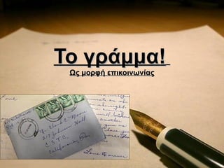
2. Ταχυδρομειο – Τι είναι
• Η υπηρεσία που παραλαμβάνει,
μεταφέρει και
παραδίδει επιστολές και δέματα .
• Η υπηρεσία αυτή χρησιμοποιείται
για την επικοινωνία των
ανθρώπων .
4. ιστορική αναδρομή
Στις 24 Σεπτεμβρίου
1828 ο Κυβερνήτης Ι
ΚΑΠΟΔΙΣΤΡΙΑΣ
υπογράφει ψήφισμα
"περί συστάσεως
τακτικής ταχυδρομικής
συγκοινωνίας"
ιδρύοντας το "Γενικόν
Ταχυδρομείον "
5. ιστορική αναδρομή
Η γεωγραφική ιδιομορφία και
ποικιλία της χώρας, και η
παντελής έλλειψη
συγκοινωνιακής υποδομής
κάνει το ταχυδρομικό έργο
ιδιαίτερα δύσκολο.
6. Γέννηση γραμματοσήμου
Το γραμματόσημο
γεννήθηκε το 1840
στην Αγγλία και
νόμιμος πατέρας
του είναι ο Άγγλος
Sir Rowland Hill
(1795-1879).
7. Η αξία του γραμματοσήμου
• Στην αρχή δεν του έδιναν σημασία
• Με το πέρασμα του χρόνου έπαιρνε
διαρκώς και μεγαλύτερη αξία
• Ο δυναμισμός του γραμματοσήμου δεν
αμφισβητείται, γιατί είναι ισχυρό μέσο
επηρεασμού της κοινής γνώμης και
προβολής εθνικών διεκδικήσεων.
8. Το ελληνικό γραμματόσημο
Το 1860 τίθεται σε ισχύ ο
νόμος περί
γραμματοσήμων και
τυπώνεται στο
Νομισματοκοπείο του
Παρισιού το πρώτο
ελληνικό γραμματόσημο
που έχει σαν παράσταση -
συμβολικά- την κεφαλή
του Ερμή.
9. Το ελληνικό γραμματόσημο
• Το 1896 εκδίδεται η πρώτη
παγκοσμίως σειρά
αναμνηστικών γραμματοσήμων
με αθλητικό θέμα.
• Μέρος των εσόδων από την
πώληση αυτών των
γραμματοσήμων διατίθεται για
να ενισχυθεί οικονομικά η
Ολυμπιακή επιτροπή.
• τα ελληνικά ταχυδρομεία
γίνονται οι πρώτοι επίσημοι
χορηγοί των σύγχρονων
Ολυμπιακών Αγώνων.
17. Πιστεύτε ότι μετά απ ό μια δεκαετία
θα στέλνει ο άνθρωπ ος γράμμα?
Αρκετά Πολύ
12% 0%
Λίγο
29% Κ αθόλου
59%
18. Με π οιο τρόπ ο ενημερώνεστε για τους
λογαριασμούς σας?
20
15
10
5
0
Μέσω e-mail Μέσω γράμματος
19. Άν ενημερώνεστε με γράμμα
σκέφτεστε να το αλλάξετε στο
μέλλον? Ναι
31%
Όχι
69%
20. Με το γράμμα τι άλλα αντικείμενα
λαμβάνετε?
25
20
15
10
5
0
Διαφημιστικά Μικροαντικείμενα Χρήματα
21. συμπέρασμα
Σ ’αυτήν την έρευνα το τελικό
συμπέρασμα που μπορούμε να εξάγουμε
είναι πως η χρήση του διαδικτύου και των
υπηρεσιών του , έχουν σαφέστατα
επηρεάσει τη χρήση του γράμματος ως
μέσου επικοινωνίας ωθώντας το σε
φθίνουσα πορεία