Graficos (practica 3)
•Download as PPTX, PDF•
0 likes•121 views

This bar graph compares three series of data, with each series represented by a different color bar. Serie 1 shows a steady decline from 100% to 0% in evenly spaced increments. Serie 2 plateaus at 80% for the first several increments before declining to 0% at a faster rate than Serie 1. Serie 3 rises to 70% before declining to 0% at the slowest rate of the three series.
Report
Share
Report
Share
Recommended
Gi
This chart shows the performance of three different series over time in percentages from 0% to 100%. Series 1 started lower than the others but ended higher than Series 2 and 3. While Series 2 performed consistently in the middle, Series 3 had the highest performance early on but tapered off later.
Presentation1
The document is a chart showing the progress of three different series over time from 0% to 100% in 10% increments. Series 1 reached 100% the fastest while Series 2 and 3 progressed at a slower rate with Series 3 being the slowest to reach completion.
Test
The document contains a bar chart comparing three data series. Series 1 represents the lowest values, Series 2 is higher than Series 1 but lower than Series 3, which shows the highest values ranging from 0% to 100%.
Sam hard
This document contains two data series plotted on a graph. Series 1 shows increasing values from 0% to 100% in 20% increments. Series 2 is not labeled and does not contain any data points, showing that it is an empty data series. The graph compares the two series but does not provide any other context or labels.
Test
This chart shows the progress of three different series over time, with percentages ranging from 0-100% on the y-axis. Serie 1 starts at 0% and rises steadily to 100% by the end. Serie 2 follows a similar pattern but levels off around 80%. Serie 3 fluctuates more but ultimately reaches 100% like the first series.
Tpa 002
This bar graph compares the performance of three different series across five categories, with series 1 performing the best in categories 1 through 3, series 2 performing the best in category 4, and series 3 trailing the other two series in all categories.
Sample
The document is a bar chart showing the progress of 3 series across 4 categories. Series 1 has the lowest percentages across all categories, peaking at 30% in Category 3. Series 2 is higher than Series 1 in all categories and peaks at 60% in Category 4. Series 3 is the highest overall, reaching 100% in Category 4.
Aniket
This chart shows the distribution of 4 categories across 3 data series. Category 1 makes up 0-10% for Series 1, Category 2 is 10-30%, Category 3 is 30-60%, and Category 4 is 60-100%. The y-axis shows the percentage allocation for each category across the 3 data series.
Zeroormax
This bar chart compares three data series across four categories. Series 1 is the lowest across all categories, peaking at around 60% in Category 3. Series 2 exceeds Series 1 in every category, reaching a high of 90% in Category 2. Series 3 towers over the other two series, hitting 100% in Category 1 and remaining at or above 80% in the other three categories.
Icdl
The document is a bar chart with 4 categories on the x-axis and percentages on the y-axis. It contains 3 data series which show the breakdown of data across the 4 categories. Series 1 is the highest for Category 1 and lowest for Category 4, while Series 2 and 3 show different breakdowns across the categories.
Gfyygjhgjh
This document appears to contain random characters and symbols with no discernible meaning or context. It includes some percentages listed without labels or explanation. No clear main ideas, topics or essential information could be understood from the content provided.
Template2
The document contains several charts and graphs:
- A bar chart with 3 data series showing values for 4 categories.
- Three pie charts comparing the same 3 data series across the same 4 categories.
- A line chart tracking sales for 4 quarters.
- A bar chart comparing the first 3 data series for 4 categories.
- A scatter plot showing a relationship between x and y values.
- A line chart showing stock price and volume data over 5 days.
foka miki-ego
The graph shows the percentage of goals scored by different players in a soccer game. Miki scored the most goals at around 40%, while asysty assisted on the most goals at around 30%. The other players miki2, miki3 and miki4 scored progressively less goals, with miki4 scoring the least at about 10%.
Slideshare test
This bar graph compares sales figures across four categories for three different time periods. Series 1 shows the lowest sales across all categories, while Series 3 shows the highest sales. The line graph depicts sales figures for each quarter, with the highest sales in the 4th quarter and lowest in the 1st quarter.
The DoNation Social Impact report 2014
A report which looks into our social impact in 2013
For more information please see:
https://www.wearedonation.com/
The DoNation Social Impact Report 2014
An overview of The DoNation's social impact report, published in January 2014.
For more info see https://www.wearedonation.com/
Best buddies
This chart shows the test scores of 5 students - Mridul, Aadi, Lalit, Piyush and Tanya - across 3 test series. Mridul scored the highest overall with 100% in the final series, while Tanya scored the lowest across all 3 series in the 30-50% range.
Kdoc
This document appears to be a progress bar showing the completion percentage of a task that has reached 50% completion. It lists percentages from 0% to 100% in increments of 10% and includes labels for "Unit Price" and "Quantity" but does not provide any further details or context about the task.
Vanesa
This document contains percentages listed from 0% to 100% in increments of 10%. It shows the progression from nothing to completion in predefined steps marked by increasing percentages. The percentages serve as a simple indicator of progress towards a full 100% completion over regular intervals.
Graph
This document appears to be a bar graph showing percentages ranging from 100% to 10% in decrements of 10%. It does not contain any labels for the x or y axis or provide any other context to explain what is being measured on the graph.
Template4
This document contains sales data presented in bar graphs and line graphs. The bar graphs show sales percentages by quarter for four categories, with category 1 having the highest sales each quarter and category 4 the lowest. The line graphs show a downward trend in sales percentages from the 1st to 4th quarter for each category.
Dia internacional de agua
This bar graph compares two individuals, Wendy and Nicolas, and shows their performance levels in Column 1. Wendy achieved 100% performance in Column 1, while Nicolas achieved a lower performance level of around 60% in the same column. The graph provides a visual comparison of the two individuals' performance levels in a single measured column or category.
El enfoque de las organizaciones
El documento describe las características de las escuelas que aprenden. Estas incluyen monitorear constantemente el contexto, tratar las fallas como oportunidades para aprender mediante experimentación e investigación, y fomentar la comunicación, colaboración y desarrollo profesional continuo entre maestros, alumnos y liderazgo.
Chemotherapy lecture
This document discusses cancer, including how it forms, signs and symptoms, screening and detection methods, and different treatment types like chemotherapy. It focuses on chemotherapy by describing cytotoxic drugs, compounding procedures for chemotherapy medication that pharmacy technicians must follow, and why pharmacy technicians need to wear protective equipment like in a vertical laminar flow hood when working with hazardous chemotherapy drugs. The document emphasizes the importance of pharmacy technicians being knowledgeable about chemotherapy due to the risks of exposure when preparing these toxic medications.
Las Apps
Este documento describe las aplicaciones móviles o "apps", incluyendo su definición, orígenes del término, características principales, requisitos para descargar y usarlas, y costos. También revisa 5 apps útiles para arquitectura: Buildings, AutoCAD 360, Photo Measures, myPATONE y Clinometer.
Slides o que é teologia
O documento discute a teologia como o estudo de Deus através da exegese bíblica, sistemática e missões. Ele também apresenta os conceitos fundamentais da teologia como a revelação de Deus, a criação e a queda do homem.
Grupo 6 inf
Este documento describe los buses de datos en un ordenador. Explica que un bus transfiere datos entre los componentes de una computadora o entre computadoras, y permite la conexión lógica entre subsistemas enviando datos. Describe los buses paralelo y serial, señalando que el paralelo transmite datos por bytes al mismo tiempo usando varias líneas, mientras que el serial los transmite bit a bit. Finalmente, indica que los buses de datos, dirección y control se usan para transmitir datos, direccionarlos y conducir interrupciones.
Arquitectura barroca
El documento presenta información sobre varias obras arquitectónicas y artísticas representativas del estilo barroco. Describe características clave del barroco como el uso de formas dinámicas y onduladas en lugar de líneas rectas, fuertes contrastes de luz y sombra, figuras en movimiento y con gestos exagerados, y temas que enfatizan las emociones humanas. También provee detalles históricos sobre obras emblemáticas como la cúpula de Santa María del Fiore y Éxtasis de Santa
More Related Content
What's hot
Zeroormax
This bar chart compares three data series across four categories. Series 1 is the lowest across all categories, peaking at around 60% in Category 3. Series 2 exceeds Series 1 in every category, reaching a high of 90% in Category 2. Series 3 towers over the other two series, hitting 100% in Category 1 and remaining at or above 80% in the other three categories.
Icdl
The document is a bar chart with 4 categories on the x-axis and percentages on the y-axis. It contains 3 data series which show the breakdown of data across the 4 categories. Series 1 is the highest for Category 1 and lowest for Category 4, while Series 2 and 3 show different breakdowns across the categories.
Gfyygjhgjh
This document appears to contain random characters and symbols with no discernible meaning or context. It includes some percentages listed without labels or explanation. No clear main ideas, topics or essential information could be understood from the content provided.
Template2
The document contains several charts and graphs:
- A bar chart with 3 data series showing values for 4 categories.
- Three pie charts comparing the same 3 data series across the same 4 categories.
- A line chart tracking sales for 4 quarters.
- A bar chart comparing the first 3 data series for 4 categories.
- A scatter plot showing a relationship between x and y values.
- A line chart showing stock price and volume data over 5 days.
foka miki-ego
The graph shows the percentage of goals scored by different players in a soccer game. Miki scored the most goals at around 40%, while asysty assisted on the most goals at around 30%. The other players miki2, miki3 and miki4 scored progressively less goals, with miki4 scoring the least at about 10%.
Slideshare test
This bar graph compares sales figures across four categories for three different time periods. Series 1 shows the lowest sales across all categories, while Series 3 shows the highest sales. The line graph depicts sales figures for each quarter, with the highest sales in the 4th quarter and lowest in the 1st quarter.
The DoNation Social Impact report 2014
A report which looks into our social impact in 2013
For more information please see:
https://www.wearedonation.com/
The DoNation Social Impact Report 2014
An overview of The DoNation's social impact report, published in January 2014.
For more info see https://www.wearedonation.com/
Best buddies
This chart shows the test scores of 5 students - Mridul, Aadi, Lalit, Piyush and Tanya - across 3 test series. Mridul scored the highest overall with 100% in the final series, while Tanya scored the lowest across all 3 series in the 30-50% range.
Kdoc
This document appears to be a progress bar showing the completion percentage of a task that has reached 50% completion. It lists percentages from 0% to 100% in increments of 10% and includes labels for "Unit Price" and "Quantity" but does not provide any further details or context about the task.
Vanesa
This document contains percentages listed from 0% to 100% in increments of 10%. It shows the progression from nothing to completion in predefined steps marked by increasing percentages. The percentages serve as a simple indicator of progress towards a full 100% completion over regular intervals.
Graph
This document appears to be a bar graph showing percentages ranging from 100% to 10% in decrements of 10%. It does not contain any labels for the x or y axis or provide any other context to explain what is being measured on the graph.
Template4
This document contains sales data presented in bar graphs and line graphs. The bar graphs show sales percentages by quarter for four categories, with category 1 having the highest sales each quarter and category 4 the lowest. The line graphs show a downward trend in sales percentages from the 1st to 4th quarter for each category.
Dia internacional de agua
This bar graph compares two individuals, Wendy and Nicolas, and shows their performance levels in Column 1. Wendy achieved 100% performance in Column 1, while Nicolas achieved a lower performance level of around 60% in the same column. The graph provides a visual comparison of the two individuals' performance levels in a single measured column or category.
What's hot (15)
Viewers also liked
El enfoque de las organizaciones
El documento describe las características de las escuelas que aprenden. Estas incluyen monitorear constantemente el contexto, tratar las fallas como oportunidades para aprender mediante experimentación e investigación, y fomentar la comunicación, colaboración y desarrollo profesional continuo entre maestros, alumnos y liderazgo.
Chemotherapy lecture
This document discusses cancer, including how it forms, signs and symptoms, screening and detection methods, and different treatment types like chemotherapy. It focuses on chemotherapy by describing cytotoxic drugs, compounding procedures for chemotherapy medication that pharmacy technicians must follow, and why pharmacy technicians need to wear protective equipment like in a vertical laminar flow hood when working with hazardous chemotherapy drugs. The document emphasizes the importance of pharmacy technicians being knowledgeable about chemotherapy due to the risks of exposure when preparing these toxic medications.
Las Apps
Este documento describe las aplicaciones móviles o "apps", incluyendo su definición, orígenes del término, características principales, requisitos para descargar y usarlas, y costos. También revisa 5 apps útiles para arquitectura: Buildings, AutoCAD 360, Photo Measures, myPATONE y Clinometer.
Slides o que é teologia
O documento discute a teologia como o estudo de Deus através da exegese bíblica, sistemática e missões. Ele também apresenta os conceitos fundamentais da teologia como a revelação de Deus, a criação e a queda do homem.
Grupo 6 inf
Este documento describe los buses de datos en un ordenador. Explica que un bus transfiere datos entre los componentes de una computadora o entre computadoras, y permite la conexión lógica entre subsistemas enviando datos. Describe los buses paralelo y serial, señalando que el paralelo transmite datos por bytes al mismo tiempo usando varias líneas, mientras que el serial los transmite bit a bit. Finalmente, indica que los buses de datos, dirección y control se usan para transmitir datos, direccionarlos y conducir interrupciones.
Arquitectura barroca
El documento presenta información sobre varias obras arquitectónicas y artísticas representativas del estilo barroco. Describe características clave del barroco como el uso de formas dinámicas y onduladas en lugar de líneas rectas, fuertes contrastes de luz y sombra, figuras en movimiento y con gestos exagerados, y temas que enfatizan las emociones humanas. También provee detalles históricos sobre obras emblemáticas como la cúpula de Santa María del Fiore y Éxtasis de Santa
Curr ing margarita_glz_badillo
Este documento es un currículum vitae resumido de María Margarita González Badillo, profesora en el Colegio de Educación Profesional Técnica del Estado de Tamaulipas. Se incluye su información personal, educación y experiencia laboral. Actualmente trabaja como profesora en el Conalep Tampico impartiendo asignaturas como Programación Básica y Programación para Equipo Móvil.
Rio's Pact
Rio's Pact is a collaborative governance initiative that aims to promote the integrated and sustainable development of Rio de Janeiro. It brings together representatives from academia, nonprofit organizations, government agencies, private sector companies, communities, and international groups to coordinate policies and programs. The Pact operates through working groups focused on issues like security, economic opportunities, and communication. It seeks to transition from a centralized model of governance to one that is more distributed and participatory. The ultimate goals are to improve connections between actors, foster greater social inclusion, and integrate communities across the city.
Pimp my course
Using free and low-cost resources from libraries, online repositories, and creative commons licensing can help students learn while saving money. Instructors can access open courseware and pre-built course materials for under $30, as well as library resources like ebooks, articles, newspapers, journals and images. Instructors are also encouraged to create their own multimedia content for courses using the digital media studio while ensuring proper copyright clearance. Librarians are available for assistance and support using these resources.
El amor más grande del mundo
Randolf amaba profundamente a su hija María José. Cuando ella era niña enfermó del corazón y necesitaba un trasplante. Randolf decidió donar su propio corazón para salvar la vida de su hija. Antes de morir, le dejó una carta explicando que le había cumplido su promesa de regalarle algo especial para sus quince años dándole su corazón y vida para que viviera. María José lloró la pérdida de su padre pero comprendió cuanto la amaba.
Viewers also liked (15)
More from betuco6666
Tarea 10
Este documento presenta la tarea #10 del equipo "Los Brócolis" para su clase de Informática I en el Colegio de Bachilleres del Estado de Yucatán. El equipo está compuesto por 5 estudiantes y su docente es la Isc. Rosario Raygoza Velázquez. La tarea consiste en 10 prácticas en PowerPoint que cubren temas como abrir una presentación, insertar pestañas, agregar gráficos, efectos de letra, música, vistas, corrección ortográfica, impresión y una introducción general.
Tarea 9
El documento define el calentamiento global como el aumento de la temperatura promedio global de la atmósfera y los océanos desde mediados del siglo XX. Explica que la evidencia incluye aumentos en las temperaturas de la tierra y el océano, el derretimiento del hielo y la subida del nivel del mar. También discute las respuestas políticas como la adaptación y mitigación del cambio climático, y menciona que la mayoría de los países son miembros de la CMNUCC cuyo objetivo es evitar la interferencia humana en
Practica no 8
El documento presenta un equipo de 5 integrantes y define la prostitución como actos sexuales con fines lucrativos. Luego describe las características de la prostitución incluyendo prostitución de menores, proxenetismo, sexo por dinero y servidores sexuales. Explica que ocurre debido a bajos recursos económicos, poca educación y desempleo, y propone posibles soluciones como crear empleos y brindar apoyo psicológico y para microempresas. Finalmente discute la prostitución en sociedades no industriales versus ind
Practica no 3
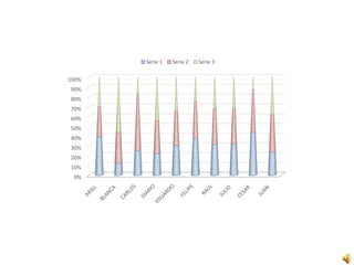
This bar graph compares the performance of 10 individuals across 3 categories. Juan, Cesar and Julio scored highest overall, with Juan at 100% in one category. Blanca, Ariel and Carlos scored lowest, with Ariel at 0% in one category. The remaining individuals, Raul, Felipe and Eduardo, fell in the middle with more varied performance across categories.
Practica 4
El documento describe brevemente que cada palabra corresponde a un cuadro de texto, repitiendo esta oración tres veces.
Practica 4
El documento describe brevemente que cada palabra corresponde a un cuadro de texto, repitiendo esta oración tres veces.
Practica no 3
This bar graph compares the performance of 10 individuals across 3 metrics over time. Serie 1 shows a general downward trend for most individuals. Serie 2 varies more but Juan, Cesar and Julio scored highest. Serie 3 is lowest for most except Eduardo who exceeded 80%.
Agregar texto ( practica no 2)
Este documento no contiene información sustancial para resumir, ya que solo repite la frase "Primer cuadro de texto de la diapositiva" tres veces sin proporcionar ningún otro detalle o contexto.
Titulo no 1
La Unión Europea ha anunciado nuevas sanciones contra Rusia debido a la invasión de Ucrania. Las sanciones incluyen prohibiciones de viaje y congelamiento de activos para más funcionarios rusos, así como restricciones adicionales a las exportaciones de tecnología a Rusia.
Practica 9
Este documento trata sobre el calentamiento global. Explica que las temperaturas fueron cálidas durante la Edad Media, se enfriaron en los siglos XVII-XIX y se volvieron a calentar rápidamente después. También describe que la temperatura promedio mundial aumentó 0.74°C entre 1906-2005, y el aumento fue más rápido después de 1950. Finalmente, menciona que los gases de efecto invernadero absorben y emiten radiación infrarroja, calentando la atmósfera inferior y la superficie de un planeta.
Practica 4
Cada palabra corresponde a un cuadro de texto. El documento repite tres veces la misma oración corta indicando que cada palabra se corresponde con un cuadro de texto.
Prueba 2(practica 1)
Este documento parece estar compuesto por dos títulos sin contenido adicional. No hay suficiente información para generar un resumen significativo en 3 oraciones o menos.
Presentación2
El documento define las Tecnologías de la Información y Comunicación (TICs) como aquellas tecnologías necesarias para gestionar y transformar la información, especialmente el uso de ordenadores y programas para crear, modificar, almacenar, administrar, proteger y recuperar información. Incluye ejemplos como el acceso móvil a Internet, la televisión terrestre, los dispositivos conectados en el hogar y el uso del navegador de Internet en los ordenadores conectados a la red.