General Tips for Creating PowerPoint® Presentations
NAME
SCHOOL
COURSE NAME
DATE
Title Slide (Previous Slide)
Title of Presentation
Student Name and Credentials
Credentials should be listed as follows:
Highest academic degree earned within a discipline
If you have an ASN, BSN, and MSN, only the MSN would be included
Include degrees from other disciplines. Ex. MSN, MBA
Licensure credentials
Specialty Certifications
Others…
School Name
Course Number
Date of Presentation
Pictures on title slide are optional
Font Types and Sizes
Use at least an 18-point font
Use different size fonts for main points and secondary points
Main point font is 28-point (above)
This font is 24-point
Title font is 36-point
Use a standard font like Times New Roman or Arial
3
Words and Sentences –
Good
Use 1 slide per minute of your presentation
Write in point form, not complete sentences
Include 4-6 points (sentences) per slide
Use bullet points or number each point
Avoid wordiness: use key words and phrases only (full sentences are not required)
Tip: Sometimes graphics/pictures can be
used instead of words
“Pictures are worth 1000 words”
4
Outline Slide
Create an outline for your presentation
If you have been given specific guidelines for content and order of slides, follow the instructions provided
Generally, make your 1st or 2nd slide an outline of your presentation
Only place main points on the outline slide
Ex: Use the titles of each slide as main points
5
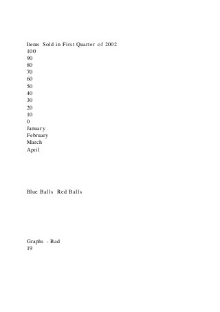
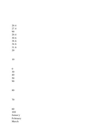
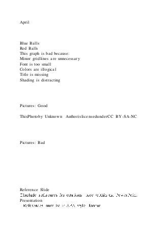
Words and Sentences - Bad
This page contains too many words for a presentation slide. It is not written in point form, making it difficult both for your audience to read and for you to present each point. Although there are exactly the same number of points on this slide as the previous slide, it looks much more complicated. In short, your audience will spend too much time trying to read this paragraph instead of listening to you.
6
Grammar & Spelling
Make sure to proofread for spelling and grammatic errors
Use the spell and grammar check program
Make sure to proofread for missing or repeated words
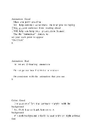
Animation: Good
Show one point at a time:
Will help audience concentrate on what you are saying
Will prevent audience from reading ahead
Will help you keep your presentation focused
Use the “Animation” feature to
set your each point to appear
“On Click”
8
Animation: Bad
Do not use distracting animation
Do not go overboard with the animation
Be consistent with the animation that you use
9
Color: Good
Use a color of font that contrasts sharply with the background
Ex: Dark blue or black font on white
background
If a dark background (black) is used white or light colored font
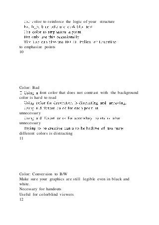
Use color to reinforce the logic of your structure
Ex: light blue title and dark blue text
Use color to emphasize a point
But only use this occasionally
Tip: Use can also use BOLD, Italics ...


![-text citations must also be in APA format
References: (Example)
Bourgeault, I. L., Armstrong, P. Armstrong, & et al. (2001).
Every day experiences of implicit rationing: Comparing the
voices of nurses in California and British Columbia. Sociology
in Health & Illness, 23(5), 633-653.
https://doi.org/10.1111/1467-
9566.00269
Boykin, A., & Schoenhofer, S. O. (2001). Nursing as caring: A
model for transforming practice [Kindle Edition]. Sudbury,
MA: Jones and Bartlett Publishers. Retrieved from
http://www.amazon.com.
Fingfeld-Connett, D. (2008). Meta-synthesis of caring in
nursing.
Journal of Clinical Nursing, 17, 196-204.
https://doi.org/10.1111/j.1365-2702.2006.01824.x
Halvorsen, K., Forde, R., & Nortvedt, P. (2008). Professional
challenges of bedside rationing in intensive care. Nursing
Ethics, 15(6), 715-728.
https://doi.org/10.1177/0969733008095383
Thank You, Question, and Contact Info Slides - Optional
It is customary to thank your audience with a simple thank
you slide.
You may also include thank you to anyone that helped you](https://image.slidesharecdn.com/generaltipsforcreatingpowerpointpresentations-220922031058-ded71f3c/85/General-Tips-for-Creating-PowerPoint-Presentations-28-320.jpg)