1. (1) In what ways does your media product use, develop or challenge forms and conventions of real media
products? - Technical Approach
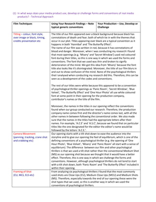
Film Techniques Using Your Research Findings – Note Your Production – Use, Develop or
typical generic conventions Challenge
Titling – colour, font style, The title of our film appeared over a black background because black has
over image or black, timing, connotations of death and fear; both of which tie in with the themes that
credits presentation etc occur in our plot. Titles appearing over black are a typical convention as it
happens in both ‘Hannibal’ and ‘The Butterfly Effect’.
The name of our film was written in red, because it has connotations of
blood and danger. Moreover, when I was conducting my research I found
that most openings (e.g. ‘Misery’ and ‘Secret Window’) used red coloured
font during their titles, so this is one way in which we used the forms and
conventions. The font that we used was thin and broken to signify
deterioration of the mind. We got this idea from ‘Misery’ because the font
title also looks like it’s disintegrated. Moreover, the title of our film blurs in
and out to show confusion of the mind. None of the psychological thrillers
that I analysed when conducting my research did this. Therefore, this can be
seen as a development of the codes and conventions.
The rest of our titles were white because this appeared to be a convention
of psychological thriller openings as ‘Panic Room’, ‘Secret Window’, ‘Blue
Velvet’, ‘The Butterfly Effect’ and ‘One Hour Photo’ all use white coloured
font at some point in their opening for the production company,
contributor’s names or the title of the film.
Moreover, the names in the titles in our opening reflect the conventions
found when our group conducted our research. Therefore, the production
company name comes first and the director’s name comes last, with all the
other names in between following the conventional order. We also made
sure that the names in the titles had the appropriate letters after their
names. For example, ‘A.C.E’ and ‘A.S.C’, because we found that on particular
titles like the one designated for the editor the editor’s name would be
followed by the letters ‘A.C.E.’.
Camera Movement Our opening starts with a tilt shot down to ease the audience into the
(panning, tracking, crane shot storyline and to give our opening the feel of equilibrium, which is one of the
and crabbing etc) defining conventions of a psychological thriller (e.g. the opening of ‘One
Hour Photo’, ‘Blue Velvet’, ‘Misery’ and ‘Panic Room’ all start with a sense of
equilibrium). The difference between our film and other psychological
thrillers is that we used a tilt shot rather than the conventional Medium Shot
(MS) as our opening shot because we thought that it would have a better
effect. Therefore, this is one way in which we challenge the forms and
conventions. However, although psychological thrillers do not tend to start
with a tilt shot down, both ‘Panic Room’ and ‘The Butterfly Effect’ included it
within their opening.
Framing of Shot From analyzing six psychological thrillers I found that the most commonly
(CU, MLS, ELS etc) used shots are Close Ups (CU), Medium Close Ups (MCU) and Medium Shots
(MS). Therefore, especially towards the end of our opening these were the
shot types that we used, so this is another way in which we used the
conventions of psychological thrillers.
2. Camera Angles (high and low In the opening of ‘Misery’,’ The Butterfly Effect’,’ Blue Velvet’,’ Secret
angles etc Window’ and ‘One Hour Photo’ the camera angle is at eye level for the
majority of their openings, as it shows subjects as we would expect to see
them in real life and it is a fairly neutral shot. We choose to use this
convention for the duration of our opening as it creates the feel of
equilibrium, which is what we were hoping to achieve.
Selection of including colour, When I conducted my research on psychological thrillers I found that most
figure, props, lighting, objects, of the main characters wear black, red or white items of clothing, because of
location and setting; this our main character Horatio, wears all three of these colours. This was a
way for us to develop the forms and conventions. His costume was largely
based on the main character from the psychological thriller ‘Falling Down’,
who also wears smart attire. We chose this costume to show that Horatio
doesn’t fit into the society around him, as he is dressed more formally than
his peers e.g. Mia.
Like in ‘One Hour Photo’ we used the convention of photographs to show
the extent of Horatio’s obsession. The extent of his obsession is highlighted
by the fact that Mia wears a different costume in the pictures to show that it
has happened on more than one occasion. Also, Horatio wears quite
prominent glasses, as they are stereotypically associated as being a sign of
intelligence. As Horatio’s glasses are abnormally large they are meant to
show that he has an unusually large IQ and they therefore, accentuate his
differences. The use of the glasses as a prop is a convention of psychological
thrillers as the main characters of ‘Secret Window’ and ‘Falling Down’ both
wear them, so using glasses as a prop was another way in which we used the
forms and conventions of real media products.
Moreover, our media product is set in a city because from the openings of
the six films I analysed as part of my research I found that generally the two
types of settings that are commonly used are remote locations and
suburban towns/cities. So this was another way that we used the
conventions.
In ‘Misery’, ‘Secret Window’ (and sometimes in ‘The Butterfly Effect’ and
‘Blue Velvet’) dark lighting is used when bad things happen on screen to
show that what is happening has negative connotations and to invoke a
dramatic ambience. This is part of Claude Levi-Strauss’s narrative theory
about binary opposites. We also used this in our opening as in the second
half the lighting is dark to signify that what Horatio is doing is wrong.
Editing directions From my research I found that in most of the openings continuity editing is
(Match cuts, jump cut, reverse used, rather than a series of shot-reverse-shots or jumps cuts, in order to
shots – cutting rthymn etc) establish a logical coherence between shots. (However, there were
exceptions to this rule). In order to follow the conventions for the majority
of our opening continuity editing is used.
Sound Techniques (diegetic We mainly used non-diegtic sound within our opening because we found
and non diegetic, silence, that it was a typical convention of psychological thrillers. The sound score
dialogue and music etc that we used was a copyright free piece of music that was called ‘Sad Story’,
which served as a way for use to create an eerie feel to our opening.
However, we also used diegetic sound at the beginning for Horatio’s heavy
breathing. This mix of diegetic and non-diegetic sound within psychological
thrillers has been used before (e.g. in the opening for ‘Secret Window’) so it
can be seen as a convention. The music that we used also acts as a signifier
3. to the genre, as it is quite quiet and has a creepy undertone to it like in
‘Misery’. Whereas, if our film was a horror/slasher it would most likely use a
really strong and intense sound score within the opening two minutes.
Actor’s positioning and Like in ‘Secret Window’ our protagonist is normally at the centre of the shot,
movement especially in the second half of the opening, to show that he is central to the
storyline. This is another way that we used the conventions.
Narrative Theory We also used the forms and conventions by including Todorovs narrative
theory about the stages of narrative within our opening, which are
equilibrium and the disruption of equilibrium. For example, the sunny day
creates a sense of equilibrium and it being a normal day and the pictures of
Mia on the wall acts as the disruption of the equilibrium because it is the
first obvious signifier that something is wrong.