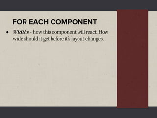
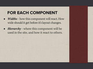
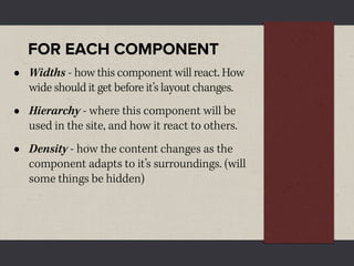
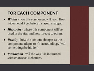
Download as PDF, PPTX


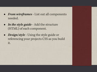
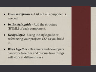


The document discusses the importance of style guides in responsive web design, emphasizing their role in documenting components, enhancing workflows, and facilitating collaboration between designers and developers. It outlines various stages of the design process, including wireframes, initial prototyping, and the creation of style tiles. The author advocates for treating websites as systems rather than static pages, with a focus on adapting components to different screen sizes and contexts.