Download to read offline


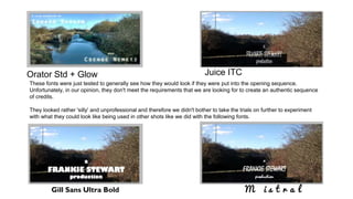
The document discusses the author's favorite font, Century Gothic, and its suitability for creating authentic-looking credits in a high-key lit environment. Various other fonts were tested for the opening sequence but were deemed unprofessional, leading to the decision not to pursue them further. The author expresses a strong preference for the chosen font due to its modern and harsh connotation.


