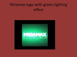
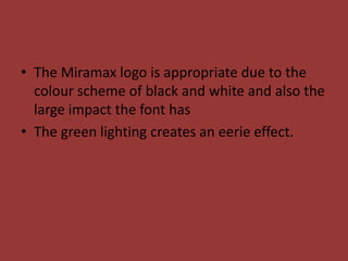
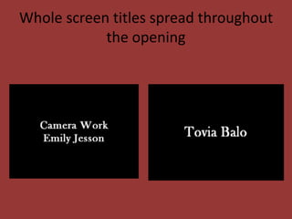
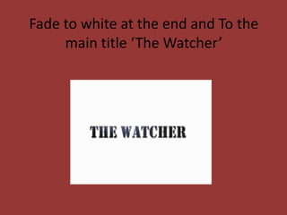
Final Title Ideas
Miramax logo with green lighting
            effect
• The Miramax logo is appropriate due to the
  colour scheme of black and white and also the
  large impact the font has
• The green lighting creates an eerie effect.
Our Production company Logo
• Our production company logo is white on
  black which has connotations of good and evil
  and life and death as does our other opening
  titles
Whole screen titles spread throughout
            the opening
Fade to white at the end and To the
     main title ‘The Watcher’
• We have chosen this font for our title as it had
  a large impact and matches the rest of the
  titles colour scheme of black and white but is
  reversed and is black on white which makes it
  stand out from the rest of the titles.

Final title ideas

  • 1.
  • 2.
    Miramax logo withgreen lighting effect
  • 3.
    • The Miramaxlogo is appropriate due to the colour scheme of black and white and also the large impact the font has • The green lighting creates an eerie effect.
  • 4.
  • 5.
    • Our productioncompany logo is white on black which has connotations of good and evil and life and death as does our other opening titles
  • 6.
    Whole screen titlesspread throughout the opening
  • 7.
    Fade to whiteat the end and To the main title ‘The Watcher’
  • 8.
    • We havechosen this font for our title as it had a large impact and matches the rest of the titles colour scheme of black and white but is reversed and is black on white which makes it stand out from the rest of the titles.