


Final - Font Change
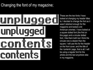
- 1. Changing the fontof my magazine;These are the two fonts I have looked at changing my header titles to; I decided to change the font as it wasn’t abstract enough for the magazine and looked a bit American oriented. I have looked at a square dotted font (the first on this page) and a circular dotted font, I like them both but I think the circular one is clearer than the square. I will use this for the header on the front cover, and the title of the ‘contents’ page, that is all; I will be using a regular font for the article and the text anywhere else in my magazine.