- GDP growth in the UK has slowed slightly in 2015 compared to 2014, with quarterly growth of 0.5% in Q3 2015. Private consumption and investment have remained robust drivers of growth.
- Annual inflation has remained close to zero for most of 2015, driven by falling goods prices, while services inflation has remained around 2.5%.
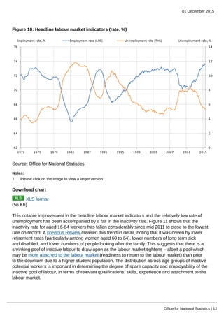
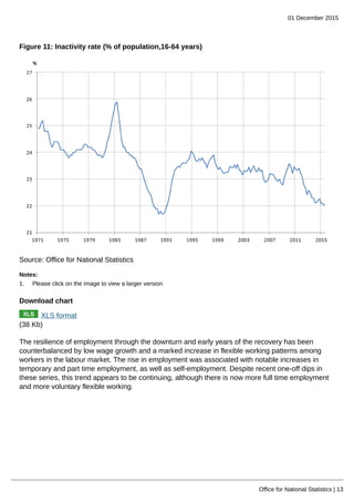
- The UK labor market continues to strengthen, with record high employment, falling unemployment, and a declining inactivity rate, indicating further tightening in the labor market.