Different layouts and styles in which you could present your guide
•Download as DOC, PDF•
0 likes•42 views
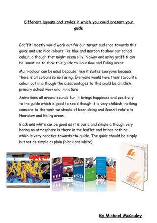
The document discusses different layout styles that could be used for a guide, including graffiti using school colors but noting it may seem immature, using multiple colors to suit everyone but risking appearing childish, and animations bringing positivity but being too childish. It also mentions black and white being simple but too boring and negative. The guide should be simple but not as plain as black and white.
Report
Share
Report
Share
Recommended
Jamankulova bermet small size
1) The document discusses activities at a boarding school to help develop and entertain children, including playing games like "Find Me" to improve memory, drawing to develop imagination and skills, and playing outdoors.
2) Developing speech is also discussed as an important skill, with reciting poetry seen as a way to help pronunciation.
3) The boarding school aims to support children and teach them useful skills while having fun together.
Logo
The document discusses the design of a school magazine logo. Students instructed Noel to use the school logo and make it more dynamic. Noel removed the original white background and replaced it with a distorted brick wall. The red on black color scheme works well and catches the eye. Noel also used a graffiti font for the magazine title as decided by the students. The final logo design reflects both contemporary and traditional elements, matching the magazine's intended ethos.
Design Process & Target Audience
This document discusses how to determine a target audience for design projects. It emphasizes focusing on the target audience and considering their demographics like age, income, ethnicity, family, education, occupation, and gender. Location factors also need attention, such as what region the audience lives in and the local climate. Designers should analyze behaviors of the target group regarding brand loyalty, value placed on quality, and any other relevant habits. Examples are provided to illustrate properly defining the audience.
Target audience 'demons'
This document discusses audience profiling and target audiences. It explains that advertisers profile potential audiences by identifying consumers of similar products to determine a primary target audience. Uses and gratification theory is also discussed, noting that audiences use media to fulfill different needs. The document then profiles the target audience for a music video for the song "Demons" by Imagine Dragons. Based on fans of similar artists, the target audience is identified as females aged 18-24 living in northern England who enjoy music, sports, and spending time with friends and family.
Digital Strategy, Consumer Insights & Target Audience
The document provides an overview of digital strategy, insights, and target audiences. It defines a digital strategy as a plan to accomplish measurable objectives using digital tools. A digital strategist develops and oversees digital strategies by conducting research, synthesizing insights, monitoring brand health, and collaborating with others. Insights that fuel creativity come from examining category conventions, cultural tensions, and consumer motivations. Defining the target audience involves understanding people's social graphs, interest graphs, and digital communities that can spread messages and influence purchasing decisions.
Colour schemes
The document discusses potential color schemes for a documentary about stress and pressures faced by teenagers. It analyzes the connotations and suitability of green, yellow, pink, blue, and red. Green represents calmness and relaxation, while yellow signifies joy and energy. Pink is used in a poll featured in the documentary. Blue conveys intelligence and control in a serious tone without being overpowering. Ultimately, the group chooses blue as the main color scheme as it best captures the serious documentary topic in an engaging way and provides consistency with colors used elsewhere.
Colour schemes
The document discusses potential color schemes - green, yellow, pink, blue, and red - for a documentary about stress and pressures faced by teenagers. It analyzes the meanings and tones associated with each color. Green represents calmness and relaxation. Yellow signifies joy, friendliness and energy. Pink is used in a poll featured in the documentary. Blue conveys intelligence and control, fitting the documentary's serious topic, while still engaging viewers. Red is too strong and may create the wrong tone. Ultimately, the group decides on blue as the main color scheme, as it matches elements in the video footage and will keep viewers interested while conveying the appropriate serious tone.
Possible colour schemes
The document discusses potential color schemes for a documentary about pressures faced by teenagers. It analyzes the colors green, yellow, pink, white, blue, and red. Green represents calmness and relaxation, while yellow signifies joy and energy that appeals to teenagers. Pink matches the color used in a poll for the documentary. White is simple but draws attention without being too dark or upbeat. Blue represents intelligence and control relating to school pressures. Red is attention-grabbing but may be too distracting or associated with danger. Ultimately, the group decides white is the best main color as it keeps a formal yet engaging tone and allows audiences to clearly see elements without being overpowering or contradicting the serious topic.
My final performance evaluation
This performance evaluation summarizes the student's final performance in a school play. [1] The student found the performance nerve-wracking at first but stayed calm during the opening. [2] They successfully navigated various scenes and roles, including delivering lines as a therapist and rapping as a character. [3] Overall, the student felt they met their aims in each scene and was pleased with the high quality of the entire performance.
My final performance evaluation
This performance evaluation summarizes the student's final performance in a school play. [1] The student found the performance nerve-wracking at first but stayed calm during the opening. [2] They successfully navigated various scenes and roles, including delivering lines as a therapist and rapping as a character. [3] Overall, the student felt they met their goals and delivered a good performance, though noted some areas for other actors to improve, and was pleased with the positive feedback they received from teachers and a successful final performance.
Script for assemblies
This script introduces an upcoming school musical production called "Cell Block 33" and encourages students from all year groups to audition. It explains that the auditions will take place on November 23rd from 3:30-5:30pm in the Concert Hall, and that students just need to sign up on the audition sheet in the school shop and fill out an audition form. The production is said to be a fun experience for talented performers of singing, dancing, and acting.
Cell block 33 final script dbh edited
Okay, let's try moving our discussion in a more positive direction. What
are some small ways each of you can show respect to others here?
Carla: I ain't showing respect to no one.
Moorland: Carla, respect is how you'll earn people's trust and a second chance.
Think about it - how can you start respecting others, just a little?
Carla sighs loudly but doesn't respond. The other inmates are also silent.
Moorland: Alright, let's talk about something else then. Whitney, how are you
finding the art therapy classes? Anything you'd like to share about what you're
working on?
Whitney
Cell block powerpoint
This document contains a list of 17 names. It appears to be listing people but provides no other context about them, their roles, or what the purpose of the list might be. The names include individuals from various cultural and ethnic backgrounds.
Process of creating the home page for paper
Michael outlines the steps taken to create the home page for the Paper Week website. First, he created a template and added the title. Second, he created tabs for the main sections. Third, he created a picture slider with four pages to display images and edited the images and text on each slide. Lastly, he added additional elements like contact details, images, a logo, and a tree icon to represent Paper Week. The final home page was completed with the picture slider functioning.
Campaign name ideas
This document provides 20 potential campaign name ideas focused on saving paper and helping the environment. The names emphasize themes like saving trees by reducing paper usage, hugging trees to show environmental support, and calling individuals to action as paper savers, environmental helpers or friends. The names suggest catchy yet informative titles to promote conservation through a paper saving campaign.
Final front home page 1 and 2
The document explains that there are two images below because the box containing an image and information has an animation that changes the content like a picture slider.
Final front home page 3 and 4
The document explains that there are two images below because the box containing an image and information has an animation that changes the content like a picture slider.
Final Home Page
Trees provide us with oxygen and are used to make paper. During Paper Week, people are encouraged to reuse, reduce, and recycle paper to help save trees, resources, and the environment. Children can help by starting a recycling parade with friends to encourage others to recycle and be role models like the brave children confidently recycling paper in the image.
Final Home Page
Paper is made from trees, which provide us with oxygen. During Paper Week, people are encouraged to reuse, reduce, and recycle paper to save trees and help the environment. Children in the document demonstrate recycling paper, and readers, especially children, are encouraged to start their own recycling parades and convince others to recycle through courage and bravery.
Food intial idea
The document discusses a campaign to change the food offered at Cranford Community College. The campaign aims to change the taste, portion sizes, presentation, and prices of the school food. The target audience is primarily the students, as the document argues they are being overcharged and deserve better food options. Success will be measured by changes to the food prices, quality, and variety offered at the school. Posters and videos are proposed as techniques to persuade the school to implement these changes.
Analysed child hope website
The website uses blue as its main color throughout the logo, template, and text to symbolize how every child in the world suffers from child labor. An emotive image shows a poor child suffering from child labor as he looks through rubbish to find plastic bottles, creating tension. While the text uses a formal, representable font, subheadings use a childish font to connect to children, the charity's audience. Orange is also used to highlight key information and calls to action like "Donate Now" to stand out on the website.
Analysed virgin still hot airlines website
The virgin logo uses red and text colors to attract attention and convey sexuality and luxury. Images of women are used to advertise to females and portray an upscale experience, using colors like red and purple that symbolize flirtation and wealth. The formal yet appealing design aims to promote virgin airlines as a high-class escape for women travelers seeking luxury.
More Related Content
More from Michael
My final performance evaluation
This performance evaluation summarizes the student's final performance in a school play. [1] The student found the performance nerve-wracking at first but stayed calm during the opening. [2] They successfully navigated various scenes and roles, including delivering lines as a therapist and rapping as a character. [3] Overall, the student felt they met their aims in each scene and was pleased with the high quality of the entire performance.
My final performance evaluation
This performance evaluation summarizes the student's final performance in a school play. [1] The student found the performance nerve-wracking at first but stayed calm during the opening. [2] They successfully navigated various scenes and roles, including delivering lines as a therapist and rapping as a character. [3] Overall, the student felt they met their goals and delivered a good performance, though noted some areas for other actors to improve, and was pleased with the positive feedback they received from teachers and a successful final performance.
Script for assemblies
This script introduces an upcoming school musical production called "Cell Block 33" and encourages students from all year groups to audition. It explains that the auditions will take place on November 23rd from 3:30-5:30pm in the Concert Hall, and that students just need to sign up on the audition sheet in the school shop and fill out an audition form. The production is said to be a fun experience for talented performers of singing, dancing, and acting.
Cell block 33 final script dbh edited
Okay, let's try moving our discussion in a more positive direction. What
are some small ways each of you can show respect to others here?
Carla: I ain't showing respect to no one.
Moorland: Carla, respect is how you'll earn people's trust and a second chance.
Think about it - how can you start respecting others, just a little?
Carla sighs loudly but doesn't respond. The other inmates are also silent.
Moorland: Alright, let's talk about something else then. Whitney, how are you
finding the art therapy classes? Anything you'd like to share about what you're
working on?
Whitney
Cell block powerpoint
This document contains a list of 17 names. It appears to be listing people but provides no other context about them, their roles, or what the purpose of the list might be. The names include individuals from various cultural and ethnic backgrounds.
Process of creating the home page for paper
Michael outlines the steps taken to create the home page for the Paper Week website. First, he created a template and added the title. Second, he created tabs for the main sections. Third, he created a picture slider with four pages to display images and edited the images and text on each slide. Lastly, he added additional elements like contact details, images, a logo, and a tree icon to represent Paper Week. The final home page was completed with the picture slider functioning.
Campaign name ideas
This document provides 20 potential campaign name ideas focused on saving paper and helping the environment. The names emphasize themes like saving trees by reducing paper usage, hugging trees to show environmental support, and calling individuals to action as paper savers, environmental helpers or friends. The names suggest catchy yet informative titles to promote conservation through a paper saving campaign.
Final front home page 1 and 2
The document explains that there are two images below because the box containing an image and information has an animation that changes the content like a picture slider.
Final front home page 3 and 4
The document explains that there are two images below because the box containing an image and information has an animation that changes the content like a picture slider.
Final Home Page
Trees provide us with oxygen and are used to make paper. During Paper Week, people are encouraged to reuse, reduce, and recycle paper to help save trees, resources, and the environment. Children can help by starting a recycling parade with friends to encourage others to recycle and be role models like the brave children confidently recycling paper in the image.
Final Home Page
Paper is made from trees, which provide us with oxygen. During Paper Week, people are encouraged to reuse, reduce, and recycle paper to save trees and help the environment. Children in the document demonstrate recycling paper, and readers, especially children, are encouraged to start their own recycling parades and convince others to recycle through courage and bravery.
Food intial idea
The document discusses a campaign to change the food offered at Cranford Community College. The campaign aims to change the taste, portion sizes, presentation, and prices of the school food. The target audience is primarily the students, as the document argues they are being overcharged and deserve better food options. Success will be measured by changes to the food prices, quality, and variety offered at the school. Posters and videos are proposed as techniques to persuade the school to implement these changes.
Analysed child hope website
The website uses blue as its main color throughout the logo, template, and text to symbolize how every child in the world suffers from child labor. An emotive image shows a poor child suffering from child labor as he looks through rubbish to find plastic bottles, creating tension. While the text uses a formal, representable font, subheadings use a childish font to connect to children, the charity's audience. Orange is also used to highlight key information and calls to action like "Donate Now" to stand out on the website.
Analysed virgin still hot airlines website
The virgin logo uses red and text colors to attract attention and convey sexuality and luxury. Images of women are used to advertise to females and portray an upscale experience, using colors like red and purple that symbolize flirtation and wealth. The formal yet appealing design aims to promote virgin airlines as a high-class escape for women travelers seeking luxury.
More from Michael (20)
Different layouts and styles in which you could present your guide
- 1. Different layouts and styles in which you could present your guide Graffiti mostly would work out for our target audience towards this guide and use nice colours like blue and maroon to show our school colour, although that might seem silly in away and using graffiti can be immature to show this guide to Hounslow and Ealing areas. Multi-colour can be used because then it suites everyone because there is all colours so no fusing. Everyone would have their favourite colour put in although the disadvantages to this could be childish, primary school work and immature. Animations all around sounds fun, it brings happiness and positivity to the guide which is good to see although it is very childish, nothing compare to the work we should of been doing and doesn’t relate to Hounslow and Ealing areas. Black and white can be good as it is basic and simple although very boring no atmosphere is there in the leaflet and brings nothing which is very negative towards the guide. The guide should be simply but not as simple as plain (black and white). By Michael McCauley