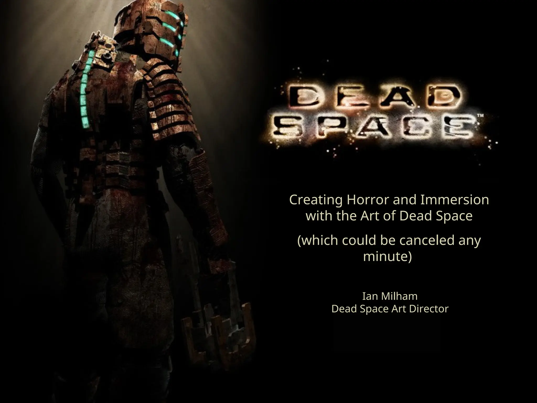
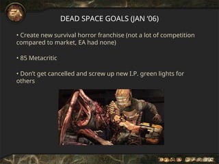
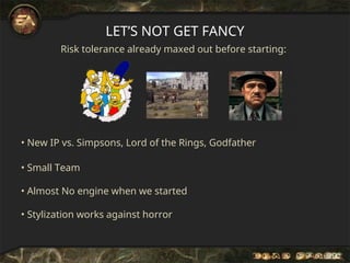
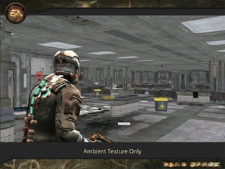
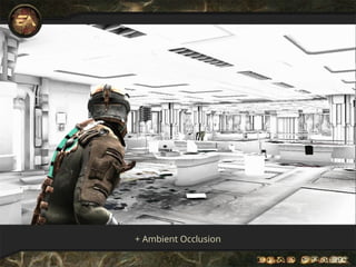
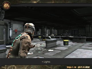
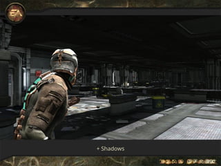
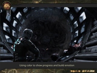
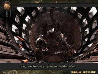
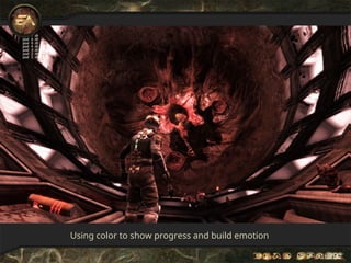
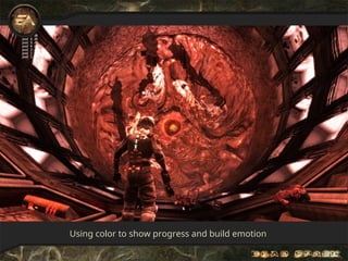
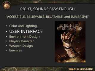
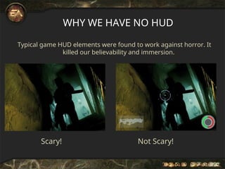
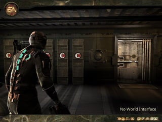
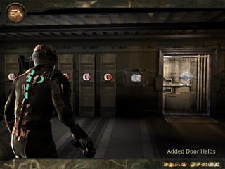
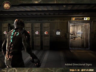
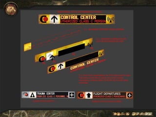
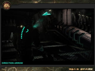
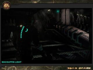
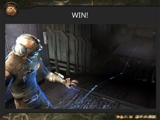
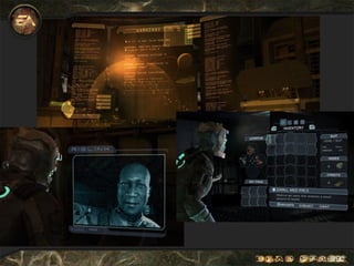
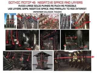
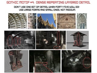
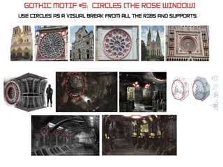
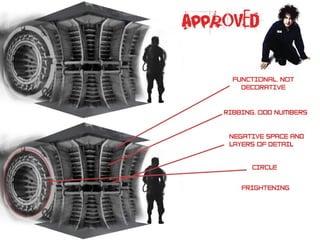
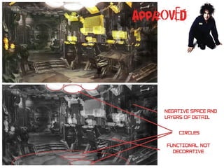
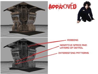
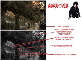
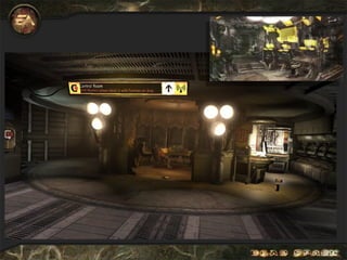
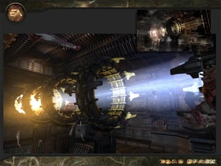
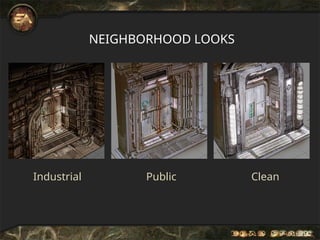
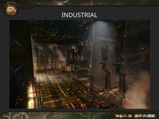
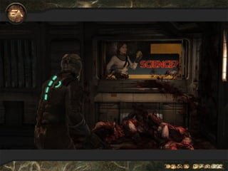
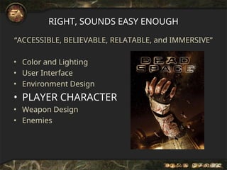
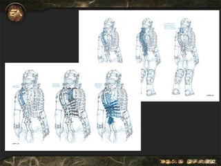
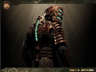
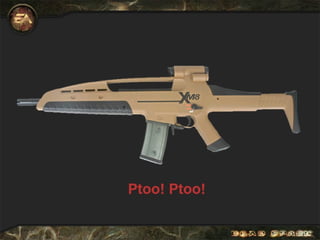
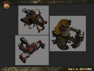
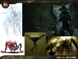
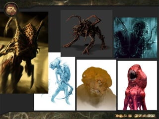
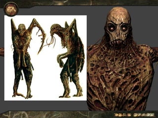
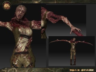
Creating Horror and Immersion
with the Art of Dead Space
(which could be canceled any
minute)
Ian Milham
Dead Space Art Director
Lullabye Trailer
Outline
• Where we started
• Horror vs. Sci-Fi
• What We Did
– Color and Lighting
– User Interface
– Environment Design
– Player Character
– Weapon Design
– Enemies
• What Went Right / What Went Wrong
• Work-in-Progress Examples
• Q&A
DEAD SPACE GOALS (JAN ‘06)
• Create new survival horror franchise (not a lot of competition
compared to market, EA had none)
• 85 Metacritic
• Don’t get cancelled and screw up new I.P. green lights for
others
LET’S NOT GET FANCY
Risk tolerance already maxed out before starting:
• New IP vs. Simpsons, Lord of the Rings, Godfather
• Small Team
• Almost No engine when we started
• Stylization works against horror
HORROR VS. SCI-FI ACTION
HORROR
(Little Competition)
Slow Movement,
Exploration
Less Combat, More Lethal
Environmental Storytelling
More Mystery
Fragile Everyman Player
SCI-FI ACTION
(Tons of Competition)
Fast Movement
Frequent Combat, Less
Lethal
Action Storytelling
More Explicit
Superheroic Ass Kicker
ALWAYS EMPHASIZE HORROR!
keys to horror art direction
Accessible, Believable, and Relatable
• Games already a step behind film “reality”
• Not too many logic leaps required
• Easy to relate to
• Keep magic tech to a minimum (No Lasers or force fields)
Immersive
• Once we’ve got them, don’t let go
• Don’t remind them it’s just a game
Must Move Away from Sci-Fi Action!
RIGHT, SOUNDS EASY ENOUGH
“ACCESSIBLE, BELIEVABLE, RELATABLE, and IMMERSIVE”
• Color and Lighting
• User Interface
• Environment Design
• Player Character
• Weapon Design
• Enemies
RIGHT, SOUNDS EASY ENOUGH
“ACCESSIBLE, BELIEVABLE, RELATABLE, and IMMERSIVE”
• COLOR AND LIGHTING
• User Interface
• Environment Design
• Player Character
• Weapon Design
• Enemies
COLOR AND LIGHTING
DAVID FINCHER
Ambient Texture Only
+ Ambient Occlusion
+ Lights
+ Shadows
+ VFX Light Source Textures
+ VFX / Bloom/ FSAA
+ Color Look-Up
Using color to show progress and build emotion
RIGHT, SOUNDS EASY ENOUGH
“ACCESSIBLE, BELIEVABLE, RELATABLE, and IMMERSIVE”
• Color and Lighting
• USER INTERFACE
• Environment Design
• Player Character
• Weapon Design
• Enemies
WHY WE HAVE NO HUD
Typical game HUD elements were found to work against horror. It
killed our believability and immersion.
WHY WE HAVE NO HUD
Scary! Not Scary!
No World Interface
First Round
Added Door Halos
Added Directional Signs
WIN!
RIGHT, SOUNDS EASY ENOUGH
“ACCESSIBLE, BELIEVABLE, RELATABLE, and IMMERSIVE”
• Color and Lighting
• User Interface
• ENVIRONMENT DESIGN
• Player Character
• Weapon Design
• Enemies
NEIGHBORHOOD LOOKS
Industrial Public Clean
INDUSTRIAL
PUBLIC
CLEAN
RIGHT, SOUNDS EASY ENOUGH
“ACCESSIBLE, BELIEVABLE, RELATABLE, and IMMERSIVE”
• Color and Lighting
• User Interface
• Environment Design
• PLAYER CHARACTER
• Weapon Design
• Enemies
RIGHT, SOUNDS EASY ENOUGH
“ACCESSIBLE, BELIEVABLE, RELATABLE, and IMMERSIVE”
• Color and Lighting
• User Interface
• Environment Design
• Player Character
• WEAPON DESIGN
• Enemies
RIGHT, SOUNDS EASY ENOUGH
“ACCESSIBLE, BELIEVABLE, RELATABLE, and IMMERSIVE”
• Color and Lighting
• User Interface
• Environment Design
• Player Character
• Weapon Design
• ENEMIES
Outline
• Where we started
• Horror vs. Sci-Fi
• What We Did
– Color and Lighting
– User Interface
– Environment Design
– Player Character
– Weapon Design
– Enemies
• WHAT WENT RIGHT/WHAT WENT WRONG
• Work-in-Progress Examples / Q&A
RIGHT: PUSHED INTERNAL PR HARD
RIGHT: 3D CONCEPT ART
RIGHT: DID LESS, POLISHED MORE
• Polish and Presentation highest scoring aspects of DS
• Controlled what problems we tackled
• We cut off rendering features early.
– Relatively modest rendering (no HDR, basic shading)
– Artists had final tools early, learned them well
• We cut off content early
– Engineering Alpha 4/18
– Content Alpha 5/31
– Content Lock 7/31 (No A or B bugs)
– Audio Lock After Everyone else (huge win)
– Ship 10/14
• Tons of Focus Grouping, time to properly respond
WORK IN PROGRESS EXAMPLES / Q&A
• Dismemberment Prototype (Spring 2006)
• Xbox Whitebox Capture (Summer 2006)
• Pregnant Necromorph Pre-Viz (Winter 2007)
• Lurker Necromorph Pre-Viz (Winter 2007)
• Leaper Necromorph Pre-Viz (Winter 2007)
• Infector Necromorph Pre-Viz (Winter 2007)
• Grabber Necromorph Pre-Viz (Winter 2007)
• Greenlight Demo Capture (Spring 2007)
Thanks!

Dead Space : An Analysis form GameArt perspective

  • 1.
    Creating Horror andImmersion with the Art of Dead Space (which could be canceled any minute) Ian Milham Dead Space Art Director
  • 3.
  • 4.
    Outline • Where westarted • Horror vs. Sci-Fi • What We Did – Color and Lighting – User Interface – Environment Design – Player Character – Weapon Design – Enemies • What Went Right / What Went Wrong • Work-in-Progress Examples • Q&A
  • 5.
    DEAD SPACE GOALS(JAN ‘06) • Create new survival horror franchise (not a lot of competition compared to market, EA had none) • 85 Metacritic • Don’t get cancelled and screw up new I.P. green lights for others
  • 6.
    LET’S NOT GETFANCY Risk tolerance already maxed out before starting: • New IP vs. Simpsons, Lord of the Rings, Godfather • Small Team • Almost No engine when we started • Stylization works against horror
  • 7.
    HORROR VS. SCI-FIACTION HORROR (Little Competition) Slow Movement, Exploration Less Combat, More Lethal Environmental Storytelling More Mystery Fragile Everyman Player SCI-FI ACTION (Tons of Competition) Fast Movement Frequent Combat, Less Lethal Action Storytelling More Explicit Superheroic Ass Kicker ALWAYS EMPHASIZE HORROR!
  • 8.
    keys to horrorart direction Accessible, Believable, and Relatable • Games already a step behind film “reality” • Not too many logic leaps required • Easy to relate to • Keep magic tech to a minimum (No Lasers or force fields) Immersive • Once we’ve got them, don’t let go • Don’t remind them it’s just a game Must Move Away from Sci-Fi Action!
  • 9.
    RIGHT, SOUNDS EASYENOUGH “ACCESSIBLE, BELIEVABLE, RELATABLE, and IMMERSIVE” • Color and Lighting • User Interface • Environment Design • Player Character • Weapon Design • Enemies
  • 10.
    RIGHT, SOUNDS EASYENOUGH “ACCESSIBLE, BELIEVABLE, RELATABLE, and IMMERSIVE” • COLOR AND LIGHTING • User Interface • Environment Design • Player Character • Weapon Design • Enemies
  • 11.
  • 12.
  • 13.
  • 14.
  • 15.
  • 16.
  • 17.
    + VFX LightSource Textures
  • 18.
    + VFX /Bloom/ FSAA
  • 19.
  • 23.
    Using color toshow progress and build emotion
  • 24.
    Using color toshow progress and build emotion
  • 25.
    Using color toshow progress and build emotion
  • 26.
    Using color toshow progress and build emotion
  • 27.
    RIGHT, SOUNDS EASYENOUGH “ACCESSIBLE, BELIEVABLE, RELATABLE, and IMMERSIVE” • Color and Lighting • USER INTERFACE • Environment Design • Player Character • Weapon Design • Enemies
  • 28.
  • 29.
    Typical game HUDelements were found to work against horror. It killed our believability and immersion. WHY WE HAVE NO HUD Scary! Not Scary!
  • 30.
  • 31.
  • 32.
  • 33.
  • 38.
  • 40.
    RIGHT, SOUNDS EASYENOUGH “ACCESSIBLE, BELIEVABLE, RELATABLE, and IMMERSIVE” • Color and Lighting • User Interface • ENVIRONMENT DESIGN • Player Character • Weapon Design • Enemies
  • 54.
  • 55.
  • 56.
  • 57.
  • 61.
    RIGHT, SOUNDS EASYENOUGH “ACCESSIBLE, BELIEVABLE, RELATABLE, and IMMERSIVE” • Color and Lighting • User Interface • Environment Design • PLAYER CHARACTER • Weapon Design • Enemies
  • 66.
    RIGHT, SOUNDS EASYENOUGH “ACCESSIBLE, BELIEVABLE, RELATABLE, and IMMERSIVE” • Color and Lighting • User Interface • Environment Design • Player Character • WEAPON DESIGN • Enemies
  • 70.
    RIGHT, SOUNDS EASYENOUGH “ACCESSIBLE, BELIEVABLE, RELATABLE, and IMMERSIVE” • Color and Lighting • User Interface • Environment Design • Player Character • Weapon Design • ENEMIES
  • 76.
    Outline • Where westarted • Horror vs. Sci-Fi • What We Did – Color and Lighting – User Interface – Environment Design – Player Character – Weapon Design – Enemies • WHAT WENT RIGHT/WHAT WENT WRONG • Work-in-Progress Examples / Q&A
  • 77.
  • 78.
  • 79.
  • 80.
    RIGHT: DID LESS,POLISHED MORE • Polish and Presentation highest scoring aspects of DS • Controlled what problems we tackled • We cut off rendering features early. – Relatively modest rendering (no HDR, basic shading) – Artists had final tools early, learned them well • We cut off content early – Engineering Alpha 4/18 – Content Alpha 5/31 – Content Lock 7/31 (No A or B bugs) – Audio Lock After Everyone else (huge win) – Ship 10/14 • Tons of Focus Grouping, time to properly respond
  • 81.
    WORK IN PROGRESSEXAMPLES / Q&A • Dismemberment Prototype (Spring 2006) • Xbox Whitebox Capture (Summer 2006) • Pregnant Necromorph Pre-Viz (Winter 2007) • Lurker Necromorph Pre-Viz (Winter 2007) • Leaper Necromorph Pre-Viz (Winter 2007) • Infector Necromorph Pre-Viz (Winter 2007) • Grabber Necromorph Pre-Viz (Winter 2007) • Greenlight Demo Capture (Spring 2007) Thanks!