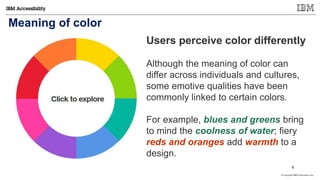
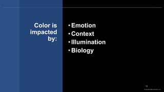
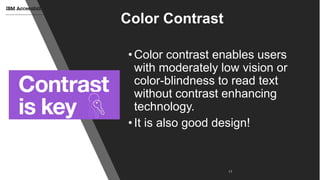
The document discusses the importance of color in design, highlighting its emotional and cultural significance, as well as how it affects accessibility. It emphasizes the need for good color contrast to enhance readability, especially for users with visual impairments. Additionally, it provides guidelines and resources for selecting appropriate color schemes to improve accessibility in design.


![© Copyright IBM Corporation 2017
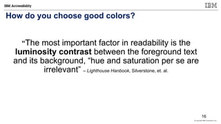
What is the Minimum Contrast requirement?
1.4.3 Contrast (Minimum): The visual presentation
of text and images of text has a contrast ratio of at least 4.5:1,
except for the following: (Level AA).
[ISO-9241-3] requires a minimum contrast of 3:1. The 4.5:1 ratio
accounts for the loss in contrast that results from moderately low
visual acuity, congenital or acquired color deficiencies, or the loss
of contrast sensitivity that typically accompanies aging.
18](https://image.slidesharecdn.com/csun2017-design-with-color-031417a-170314194600/85/Csun2017-design-with-color-031417a-18-320.jpg)