Report
Share
Download to read offline
Recommended
Bloger
Este documento describe las características básicas de los blogs. Los bloggers son personas que publican contenido como textos, imágenes, audios y videos en un sitio web de actualización periódica conocido como blog o bitácora digital. Un blog puede contener diferentes tipos de medios publicados de manera cronológica y es fácil de crear en plataformas como Blogger de Google al completar un formulario con la dirección de correo electrónico. Una vez creado, se puede insertar nuevos contenidos como videos, imágenes y presentaciones sub
Mesa de Comunicaciones Congreso Internacional Universidad católica del Perú-2012
Mesa de Comunicaciones Congreso Internacional Universidad católica del Perú-2012UNIVERSIDAD PRIVADA CÉSAR VALLEJO
Este documento describe los nuevos escenarios de aprendizaje que ofrece la realidad aumentada. Explica que la realidad aumentada permite añadir información virtual a objetos físicos existentes para darles contexto. También menciona algunas aplicaciones educativas como usar códigos QR para proporcionar información adicional y cómo esto puede desarrollar habilidades de pensamiento superior en los estudiantes.Gbi
Este documento explica cómo crear un grupo de discusión en la plataforma GBI. Primero, los estudiantes deben ingresar a pregrado.uniminuto.edu y luego a Aulas Virtuales. Luego, ingresan con su usuario y acceden a GBI. Finalmente, van a la zona de evaluación, ingresan al Foro de Presentación y allí pueden crear un nuevo foro ingresando el tema y enviándolo para habilitarlo.
Gbi slideshare 2
El documento proporciona instrucciones para navegar el correo electrónico estudiantil y el área segura de una institución educativa. Explica cómo acceder al correo, configurar la cuenta, actualizar datos personales, ver el horario de clases, calificaciones y obtener ayuda financiera.
Evaluation - Question 1
This document summarizes how the media product, a pop music magazine, uses conventions of real pop magazines. Key conventions included are a bright pink masthead to catch attention, three coverlines and a central image on the front cover. The mode of address is informal and chatty to relate to teenage girls aged 14-16. Images are clean cut and professional looking to portray a happy, fun magazine. Puffs and free posters are included to entice readers. Formats like barcodes and pricing are used to look like real magazines without challenging genres conventions. The goal is to create an instantly recognizable pop magazine.
Evaluation question 333333333333333
The document discusses research conducted to identify the target audience for a J. Cole music video and related marketing materials. Through social media research, the target audience was identified as teenagers aged 14-19. Focus groups with this demographic provided feedback that guided improvements to the music video and creation of a magazine advertisement and CD digipak cover. Their feedback helped ensure the materials clearly conveyed the intended message and effectively engaged the target teenage audience.
A2
The toys shop, luxury shop, and slippers shop were summarized in 3 sentences:
The toys shop had a variety of interesting toys arranged by function with friendly sales assistance, while the luxury shop featured expensive products in a sparse and quiet environment with minimal assistance, and the slippers shop had many slipper options crowded on the walls and floors without much customer interaction.
Evaluation 4
The document discusses the use of various media technologies throughout the design, planning, and evaluation stages of a project. A laptop and computer were used for planning, designing, and editing tasks using software like Adobe Premier Pro, Photoshop, Paint, and Word. Hardware like a video camera, tripod, and digital camera were used to film and take photos. Websites provided fonts, images, soundtracks and a platform to share the teaser trailer. Various technologies were essential to the creation and presentation of the final products and ancillary materials.
Evaluation 3
The document discusses feedback received from an audience on several products: a magazine, poster, and teaser trailer. The hardest part was meeting the audience's high standards for the main product. The audience suggested changing the magazine layout and price, and making the poster genre clearer and scarier. Most people liked the products but appreciated all constructive criticism. The interviewee has learned that audience feedback is extremely important, as it can make or break products, and the audience's opinions, comments and criticisms are needed to fulfill their standards and needs.
Evaluation 2
The document discusses the effectiveness of combining a main product and ancillary texts for a target audience. It analyzes feedback showing the magazine was the most positively received product. The teaser trailer was aimed to stand out the most to the audience. Audiences are more likely to watch online trailers than read magazines or see posters. The magazine was deemed the most popular product according to feedback. It is highly important for both the main product and ancillary texts to be enjoyed by the target audience in order to make them a success. The ancillary tasks are extremely important as they advertise the main product to the audience through various marketing channels.
Evaluation 1
This document discusses a media product project and how it both followed and challenged conventions of typical media products. It provides examples of how the magazine challenged conventions through its masthead structure and outdoor photography. The teaser trailer also challenged conventions through its changing soundtracks that created a confusing atmosphere for viewers. While most conventions were followed, like the typical black and white poster format, the image depicted a more dark and mysterious theme fitting the film. The document analyzes how the project followed relevance to professional media through both conforming to and innovating conventions.
Evaluation question 2
The magazine was the most effective product according to audience feedback. The teaser trailer was intended to stand out the most to the target audience since it was the main product developed. Audiences are most likely to view movie trailers online or in theaters rather than read magazines or look at posters. The movie magazine received the most positive feedback and would likely be the most popular product on the market. It is crucial for audiences to enjoy both the main product and supplemental materials for the marketing campaign to be successful.
Evaluation question 1
The document contains responses to questions about a film project. It discusses:
1) Choosing the thriller genre after conducting audience surveys on popular genres.
2) Picking actors based on their experience, personality, and suitability for the roles.
3) Aiming the film at a target audience of 15-25 year olds who would engage with the complex emotional storyline and ambitious characters.
4) Using a mix of tense and upbeat music to challenge conventions by confusing audiences about what will happen next.
5) An ambition to make the teaser trailer scarier and mess with audiences' minds more but realizing this could not be done to the desired standard.
Evaluation question 3
The document summarizes feedback from an audience on various marketing products. It discusses that developing creative ideas was easiest while meeting the audience's high standards for the main product was hardest. The audience wanted to make the film genre clearer in the trailer. Most approved of the products but constructive criticism was appreciated. All feedback was accepted to learn that audience feedback is extremely important to meeting their needs and standards.
Double page spread mock ups
This document contains mock-ups for a double page spread featuring interviews and album coverage. The mock-ups include headings, quotes, photos, and a question and answer section to highlight an interview and provide information on an album.
Double page spread
Ed Hill is an up and coming artist who had early support from friends and family that helped kick off his music career. His first single was called "Attak O Da ThoonderBugs!" due to his interest in sci-fi. He has been working in the music industry for 2-3 years and found success in drum and bass, which fit with his bass and voice skills. His goal is to become a major icon in the drum and bass genre like Pendulum or The Prodigy.
Contents page analysis (main task)
The document analyzes the contents pages of various magazines, examining their layout, house style, use of images and text, and conventions. Key points discussed include the use of color palettes and fonts to create consistent branding, placement of images and quotes to lure readers to specific articles, and standard elements like mastheads, tables of contents and subscription notices. Overall conventions are generally followed but with non-traditional elements added to appeal to younger audiences.
Personal learning and reflection
The document summarizes the analysis done on magazine front covers, contents pages, double page spreads, and audience research to help design a magazine. Some key findings include that magazine covers typically have the masthead at the top and use consistent color schemes and graphics. Contents pages usually feature large photos and "lures" like quotes to entice readers. Double page spreads commonly have one page of text and one of photos. Audience research showed the target youth audience prefers genres like rap and R&B, and would be interested in ads for new technology and music.
Front cover analysis (main task)
The document analyzes 10 different magazine covers and discusses their design elements. It notes that magazine covers typically feature eye-catching mastheads at the top to draw readers in. Covers also use bright colors, graphics, and images of popular artists to attract attention and interest buyers browsing the shelves. Skylines showing additional artists are also used to keep readers engaged even if they are not fans of the main featured artist. Barcodes with pricing are included to make the magazines look professionally produced.
Front cover analysis (main task)
The document analyzes the front covers of 10 different magazines. It discusses the masthead, barcode, main image, graphics, and skyline of each cover and how they follow magazine conventions or relate to the genre of music featured. Key elements like the masthead, barcode, and graphics are used across magazines to identify them as professionally made media and draw viewers in.
Double page spread analysis (main task)
The document analyzes the layout, design elements, and stylistic choices used across multiple double page spreads in a magazine. Most spreads follow a conventional layout with a large photo on one page and text on the other to create familiarity for readers. Colors, fonts, and focal elements are designed to attract the target teenage/young adult audience and build reader engagement through quotes, headlines and images placed in prominent positions within the spreads.
Evaluation
The document analyzes 10 magazine front covers and discusses conventions they follow that could be applied to a magazine cover being designed. Most covers had the masthead at the top and spanned the page width. All had a large central image matching the color scheme and graphics. This inspired wanting to establish a consistent color scheme and style. Most used attention-grabbing words like "PLUS!" or "Exclusive" to draw readers in, suggesting using similar lures. Nearly all had barcodes adding to a professional look.
Organisation of photo shoot
The document outlines the organization of a photo shoot for the front cover of a magazine. An email was sent to bass player Ed Hill, a friend of the photographer, to confirm his participation in the shoot. Further details on the timing and location of the photo shoot were then sent to Ed Hill in a follow up sheet.
Flat plan
This document appears to be a table of contents for a magazine, listing various articles, advertisements, and sections including album coverage and a reader poll on favorite new albums. It also includes page numbers ranging from 1 to 58 in a non-sequential order, suggesting a non-standard layout.
Location recce
The document summarizes the steps taken to scout a location for a photo shoot. It identifies checking if the location is suitable, the necessary equipment, potential health and safety issues, lighting conditions, interesting camera angles, electricity supply, coordinating schedules, and communicating expectations to all involved. The optimal location was determined to be a study with a wooden background, adjustable indoor lighting, and angles that make the subject look powerful.
Calender for the project
The document contains calendars for January through December 2011 that list lesson dates and deadlines for a student multimedia project. In January and February, lessons cover producing calendars, planning photography, and designing magazine covers in InDesign. March lessons involve adding images and finalizing covers, contents pages, and double page spreads. April contains portfolio deadlines. May lessons involve evaluation and presentation of the final magazine.
Front cover slideshow
This document provides details on the design of a magazine cover and contents. It discusses using orange and complementary colors on the cover. The magazine name "ZERO DEGREES" will be in a specific font. Grey rectangles will be used on the cover without detracting from the main image. The target audience is 16-25 year olds, so an informal tone will be used to relate to them through articles on music and technology. The main cover image and a double page spread are shown, along with ads for Xbox, iPad, and PS3.
More Related Content
More from EDPRICE93
Evaluation 3
The document discusses feedback received from an audience on several products: a magazine, poster, and teaser trailer. The hardest part was meeting the audience's high standards for the main product. The audience suggested changing the magazine layout and price, and making the poster genre clearer and scarier. Most people liked the products but appreciated all constructive criticism. The interviewee has learned that audience feedback is extremely important, as it can make or break products, and the audience's opinions, comments and criticisms are needed to fulfill their standards and needs.
Evaluation 2
The document discusses the effectiveness of combining a main product and ancillary texts for a target audience. It analyzes feedback showing the magazine was the most positively received product. The teaser trailer was aimed to stand out the most to the audience. Audiences are more likely to watch online trailers than read magazines or see posters. The magazine was deemed the most popular product according to feedback. It is highly important for both the main product and ancillary texts to be enjoyed by the target audience in order to make them a success. The ancillary tasks are extremely important as they advertise the main product to the audience through various marketing channels.
Evaluation 1
This document discusses a media product project and how it both followed and challenged conventions of typical media products. It provides examples of how the magazine challenged conventions through its masthead structure and outdoor photography. The teaser trailer also challenged conventions through its changing soundtracks that created a confusing atmosphere for viewers. While most conventions were followed, like the typical black and white poster format, the image depicted a more dark and mysterious theme fitting the film. The document analyzes how the project followed relevance to professional media through both conforming to and innovating conventions.
Evaluation question 2
The magazine was the most effective product according to audience feedback. The teaser trailer was intended to stand out the most to the target audience since it was the main product developed. Audiences are most likely to view movie trailers online or in theaters rather than read magazines or look at posters. The movie magazine received the most positive feedback and would likely be the most popular product on the market. It is crucial for audiences to enjoy both the main product and supplemental materials for the marketing campaign to be successful.
Evaluation question 1
The document contains responses to questions about a film project. It discusses:
1) Choosing the thriller genre after conducting audience surveys on popular genres.
2) Picking actors based on their experience, personality, and suitability for the roles.
3) Aiming the film at a target audience of 15-25 year olds who would engage with the complex emotional storyline and ambitious characters.
4) Using a mix of tense and upbeat music to challenge conventions by confusing audiences about what will happen next.
5) An ambition to make the teaser trailer scarier and mess with audiences' minds more but realizing this could not be done to the desired standard.
Evaluation question 3
The document summarizes feedback from an audience on various marketing products. It discusses that developing creative ideas was easiest while meeting the audience's high standards for the main product was hardest. The audience wanted to make the film genre clearer in the trailer. Most approved of the products but constructive criticism was appreciated. All feedback was accepted to learn that audience feedback is extremely important to meeting their needs and standards.
Double page spread mock ups
This document contains mock-ups for a double page spread featuring interviews and album coverage. The mock-ups include headings, quotes, photos, and a question and answer section to highlight an interview and provide information on an album.
Double page spread
Ed Hill is an up and coming artist who had early support from friends and family that helped kick off his music career. His first single was called "Attak O Da ThoonderBugs!" due to his interest in sci-fi. He has been working in the music industry for 2-3 years and found success in drum and bass, which fit with his bass and voice skills. His goal is to become a major icon in the drum and bass genre like Pendulum or The Prodigy.
Contents page analysis (main task)
The document analyzes the contents pages of various magazines, examining their layout, house style, use of images and text, and conventions. Key points discussed include the use of color palettes and fonts to create consistent branding, placement of images and quotes to lure readers to specific articles, and standard elements like mastheads, tables of contents and subscription notices. Overall conventions are generally followed but with non-traditional elements added to appeal to younger audiences.
Personal learning and reflection
The document summarizes the analysis done on magazine front covers, contents pages, double page spreads, and audience research to help design a magazine. Some key findings include that magazine covers typically have the masthead at the top and use consistent color schemes and graphics. Contents pages usually feature large photos and "lures" like quotes to entice readers. Double page spreads commonly have one page of text and one of photos. Audience research showed the target youth audience prefers genres like rap and R&B, and would be interested in ads for new technology and music.
Front cover analysis (main task)
The document analyzes 10 different magazine covers and discusses their design elements. It notes that magazine covers typically feature eye-catching mastheads at the top to draw readers in. Covers also use bright colors, graphics, and images of popular artists to attract attention and interest buyers browsing the shelves. Skylines showing additional artists are also used to keep readers engaged even if they are not fans of the main featured artist. Barcodes with pricing are included to make the magazines look professionally produced.
Front cover analysis (main task)
The document analyzes the front covers of 10 different magazines. It discusses the masthead, barcode, main image, graphics, and skyline of each cover and how they follow magazine conventions or relate to the genre of music featured. Key elements like the masthead, barcode, and graphics are used across magazines to identify them as professionally made media and draw viewers in.
Double page spread analysis (main task)
The document analyzes the layout, design elements, and stylistic choices used across multiple double page spreads in a magazine. Most spreads follow a conventional layout with a large photo on one page and text on the other to create familiarity for readers. Colors, fonts, and focal elements are designed to attract the target teenage/young adult audience and build reader engagement through quotes, headlines and images placed in prominent positions within the spreads.
Evaluation
The document analyzes 10 magazine front covers and discusses conventions they follow that could be applied to a magazine cover being designed. Most covers had the masthead at the top and spanned the page width. All had a large central image matching the color scheme and graphics. This inspired wanting to establish a consistent color scheme and style. Most used attention-grabbing words like "PLUS!" or "Exclusive" to draw readers in, suggesting using similar lures. Nearly all had barcodes adding to a professional look.
Organisation of photo shoot
The document outlines the organization of a photo shoot for the front cover of a magazine. An email was sent to bass player Ed Hill, a friend of the photographer, to confirm his participation in the shoot. Further details on the timing and location of the photo shoot were then sent to Ed Hill in a follow up sheet.
Flat plan
This document appears to be a table of contents for a magazine, listing various articles, advertisements, and sections including album coverage and a reader poll on favorite new albums. It also includes page numbers ranging from 1 to 58 in a non-sequential order, suggesting a non-standard layout.
Location recce
The document summarizes the steps taken to scout a location for a photo shoot. It identifies checking if the location is suitable, the necessary equipment, potential health and safety issues, lighting conditions, interesting camera angles, electricity supply, coordinating schedules, and communicating expectations to all involved. The optimal location was determined to be a study with a wooden background, adjustable indoor lighting, and angles that make the subject look powerful.
Calender for the project
The document contains calendars for January through December 2011 that list lesson dates and deadlines for a student multimedia project. In January and February, lessons cover producing calendars, planning photography, and designing magazine covers in InDesign. March lessons involve adding images and finalizing covers, contents pages, and double page spreads. April contains portfolio deadlines. May lessons involve evaluation and presentation of the final magazine.
Front cover slideshow
This document provides details on the design of a magazine cover and contents. It discusses using orange and complementary colors on the cover. The magazine name "ZERO DEGREES" will be in a specific font. Grey rectangles will be used on the cover without detracting from the main image. The target audience is 16-25 year olds, so an informal tone will be used to relate to them through articles on music and technology. The main cover image and a double page spread are shown, along with ads for Xbox, iPad, and PS3.
More from EDPRICE93 (20)
Contents page
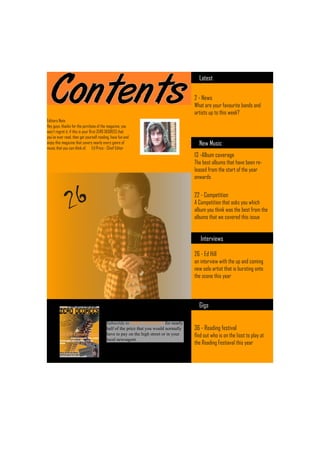
- 1. Latest 2 - News What are your favourite bands and artists up to this week? Editiors Note Hey guys, thanks for the purchase of the magazine, you won’t regret it. if this is your first ZERO DEGREES that you’ve ever read, then get yourself reading, have fun and enjoy this magazine that covers nearly every genre of New Music music that you can think of. Ed Price - Chief Editor 13 -Album coverage The best albums that have been re- leased from the start of the year onwards 26 22 - Competition A Competition that asks you which album you think was the best from the albums that we covered this issue Interviews 26 - Ed Hill an interview with the up and coming new solo artist that is bursting onto the scene this year Gigs Subscride to ZERO DEGREES for nearly half of the price that you would normally 36 - Reading festival have to pay on the high street or in your find out who is on the liost to play at local newsagent. the Reading Festiaval this year