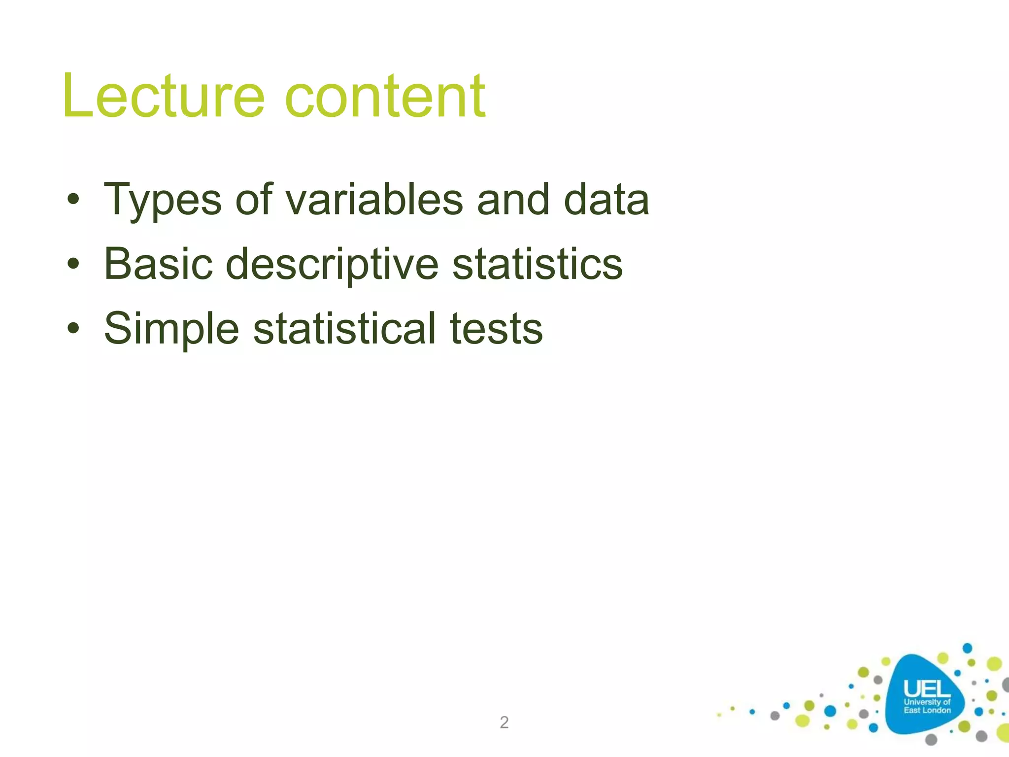
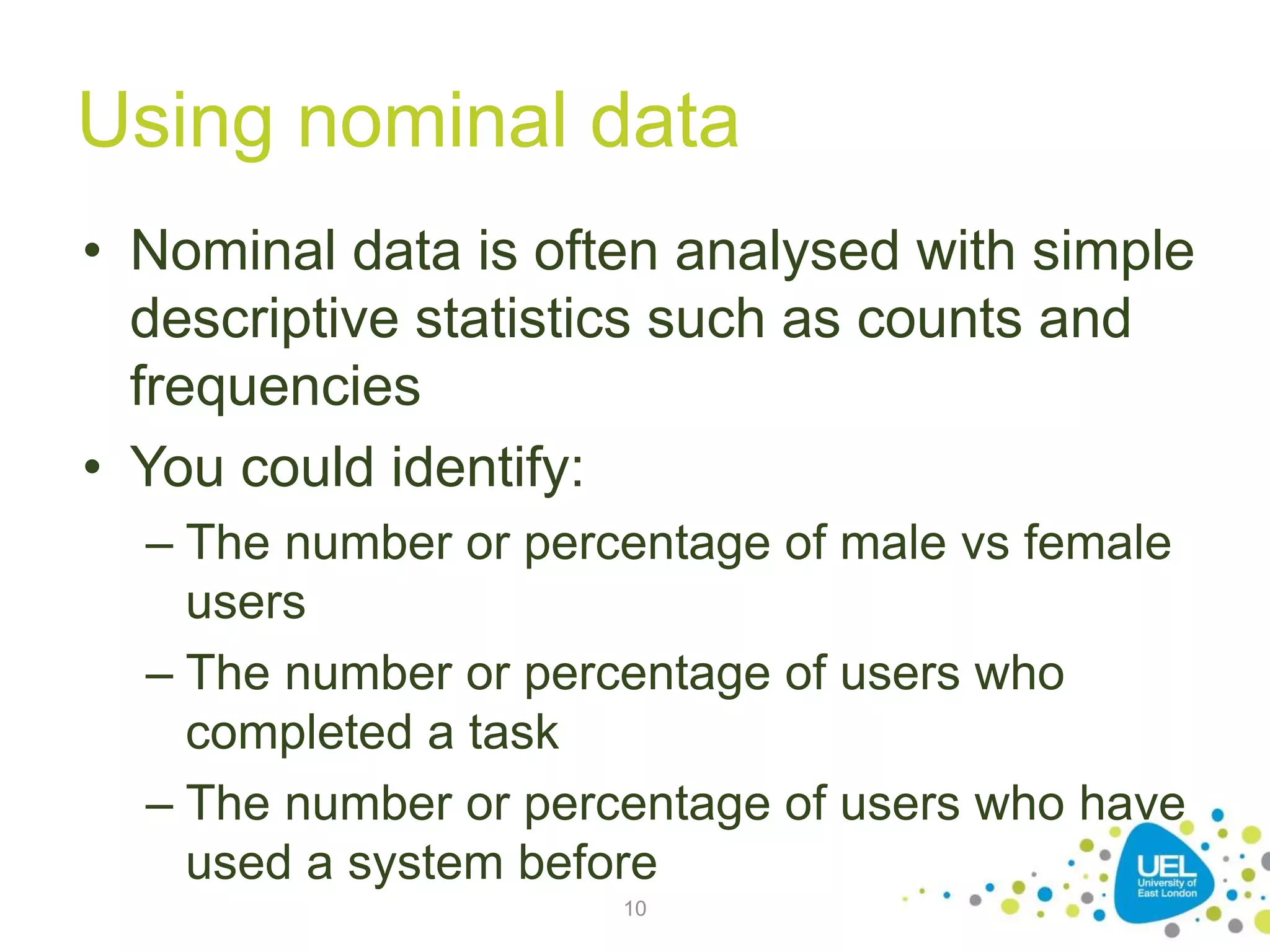
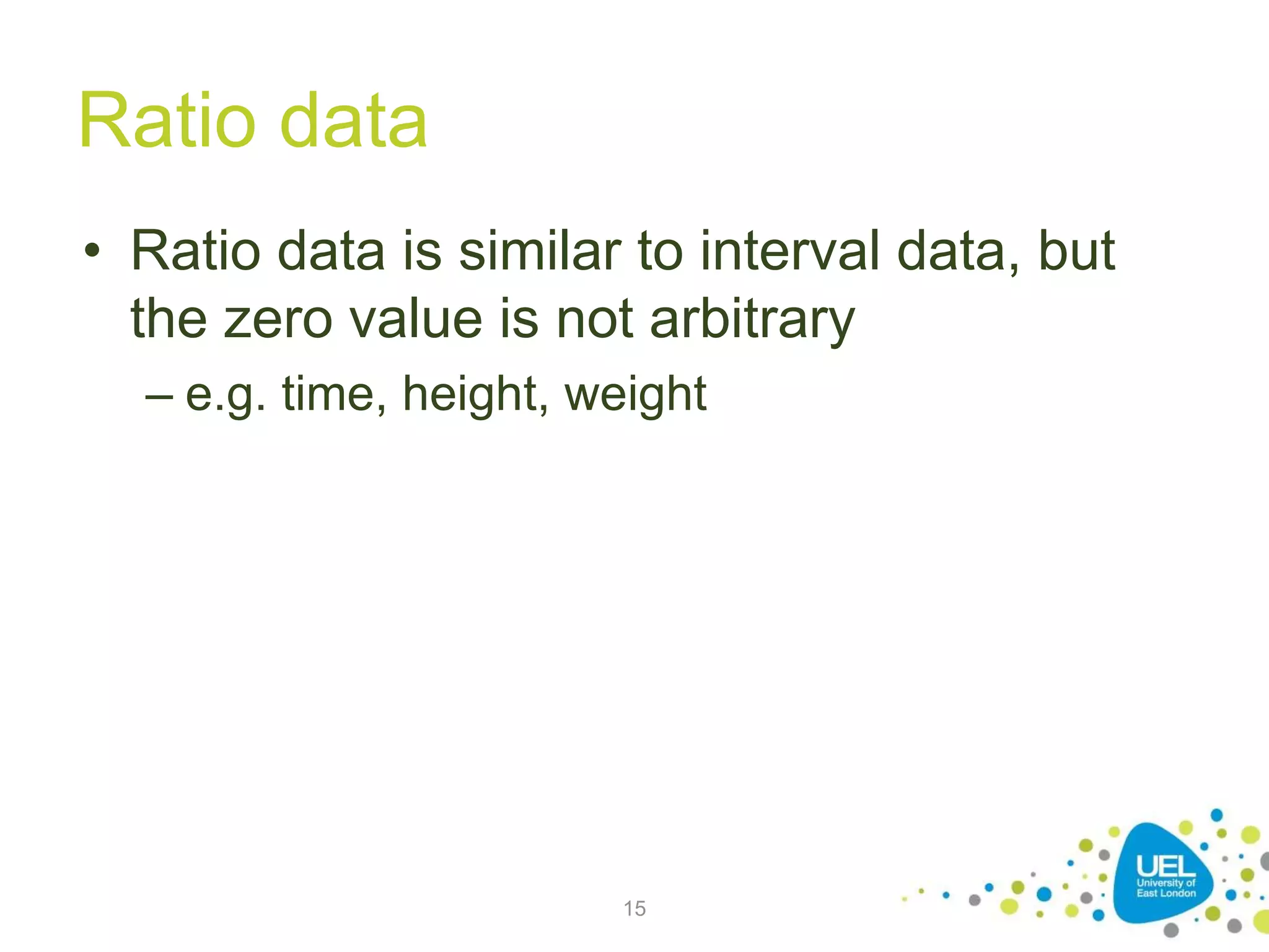
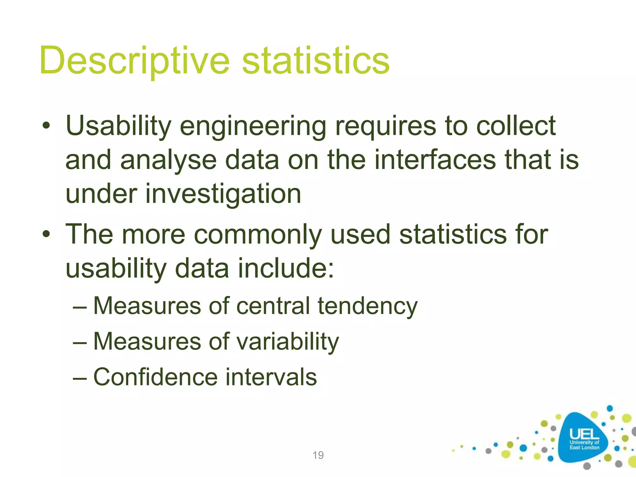
CN5111 – Week 2:
Background
Dr. Andres Baravalle
Lecture content
• Types of variables and data
• Basic descriptive statistics
• Simple statistical tests
2
Measuring the User Experience
• The next slides are based on the core text
book for this module, "Measuring the User
Experience"
3
Types of variables and data
4
Data and statistics
• This week we will cover background
information about data and statistics that
you will have to use in the next weeks
• We are now going to look at:
– What qualitative and quantitative data we
should collect in usability studies
– How we collect it
– How we analyse it
5
Independent and dependent
variables
• You have two types of variables:
independent and dependent
– Dependent variables: things you measure, as
success rate, number of errors, user
satisfaction, completion time
– Independent variables: things you can
manipulate, as the testing conditions (e.g.
interfaces, browser, monitor)
6
Types of variables (2)
• Dependent variables represent an output
or effect (what you plan to measure)
• Independent variables represent inputs or
causes, or are tested to see if they
represent the causes of a phenomenon
(what you plan to manipulate)
7
Types of data
• Both independent and dependent
variables can be measured using 4 types
of data:
– Nominal
– Ordinal
– Interval
– Ratio
8
Nominal data
• Nominal data are unordered groups or
categories
– e.g. male/female
– These are typically independent variables that
allow you to segment your data in different
groups.
9
Using nominal data
• Nominal data is often analysed with simple
descriptive statistics such as counts and
frequencies
• You could identify:
– The number or percentage of male vs female
users
– The number or percentage of users who
completed a task
– The number or percentage of users who have
used a system before
10
Ordinal data
• Ordinal data includes ordered groups or
categories
• The intervals between measurements are
not meaningful
– e.g. excellent, good, satisfactory, adequate
and poor ("Likert scale")
– on a Likert scale, the difference between 1
and 2 is not necessarily the same as the
difference between 3 and 4
11
Using ordinal data
• Ordinal data is commonly analysed by
looking at frequencies
• You could identify:
– The percentage of visitors of a web site who
had a good or excellent experience
12
Interval data
• Interval data is similar to ordinal, but
intervals are equally split and there is no
natural zero point
– e.g. temperature, or the system usability scale
(http://en.wikipedia.org/wiki/System_usability_
scale)
13
Using interval data
• Interval data allows to calculate a wide
range of descriptive statistics (including
averages and standard deviation)
• You can typically distinguish ordinal from
interval data by evaluating whether a point
halfway between any two of the defined
data points makes sense
– If it does the data is interval data
14
Ratio data
• Ratio data is similar to interval data, but
the zero value is not arbitrary
– e.g. time, height, weight
15
Using ratio data
• Interval data can be analysed with the
same techniques used for ratio data
16
Types of data
• What are the types that you are more
likely to be using in your studies?
– More here:
http://www.usablestats.com/lessons/noir
17
Basic descriptive statistics
18
Descriptive statistics
• Usability engineering requires to collect
and analyse data on the interfaces that is
under investigation
• The more commonly used statistics for
usability data include:
– Measures of central tendency
– Measures of variability
– Confidence intervals
19
Measures of central tendency
• Measures of central tendency are a way to
chose a single number to represent a set
• The most common measures of central
tendency are:
– The mean
– The median
– The mode
20
Mean, median and mode
Participant Task time
(seconds)
P1 10
P2 10
P3 30
P4 40
• The mean is the sum of
all values divided by the
number of values
• The median is the value
in the middle (or the
mean of the 2 values in
the middle if the number
of values is even)
• The mode is the most
common value
21
Measures of variability
• Measures of variability reflect how the data
are spread across of range of values
• The most common measures of variability
are range and standard deviation
22
Range
• The range is the distance between the
minimum and maximum value
– The range can allow to identify "outliers" (data
points that are extreme and may indicate
errors in data collection)
23
Standard deviation
• The standard deviation for a set of
observations is a commonly used
indication of deviation from the mean
– You can calculate the standard deviation as
"the square root of the average of the squared
differences of the values from their average
value"
24
Standard deviation example
25
Calculating the standard
deviation
• As part of this module, you can use the built-in
Excel functions (STDEV.P)
• Other Excel functions you'll need to know:
• MIN()
• MAX()
• AVERAGE()
• MEDIAN()
• MODE()
• IF()
• AVERAGEIF()
26
Use of standard deviation
• Almost all observations in any data set lie
within 3 standard deviations from the
mean
27
Confidence interval
• A confidence interval is an estimate of a
range of values that includes the true
population value for a statistic, such as a
mean
– A confidence level of 95%, or an alpha level of
5%, means that you want to be 95% certain of
something
28
Correlation
• The correlation coefficient is the measure
of the strength of the relationship between
the two variables
– The correlation has a range from −1 to +1
– The stronger the relationship, the closer the
value is to −1 or +1.
29
Percentiles
• When analysing data sets, it's often useful
to describe data using percentiles
– The 1st percentile of a data set is the number
that divides the bottom 1% of the data from
the top 99%
– It can be useful – for example:
• To distinguish between better and worst users
when analysing a task
• To distinguish between more usable or less usable
tasks
30
Significant percentiles
• Certain percentiles are particularly
important:
– The deciles divide a data set into tenths
– The quartiles into quarters
• Quartiles are the most commonly used
percentiles
31
Presenting your data
• After you have collected enough numerical
data, the next step is presenting the data
• Your spreadsheet software will allow to
draw a number of charts; the most
common ones are:
– Column charts
– Line charts
– Pie charts
– Scatter charts
32

Background on Usability Engineering

  • 1.
    CN5111 – Week2: Background Dr. Andres Baravalle
  • 2.
    Lecture content • Typesof variables and data • Basic descriptive statistics • Simple statistical tests 2
  • 3.
    Measuring the UserExperience • The next slides are based on the core text book for this module, "Measuring the User Experience" 3
  • 4.
  • 5.
    Data and statistics •This week we will cover background information about data and statistics that you will have to use in the next weeks • We are now going to look at: – What qualitative and quantitative data we should collect in usability studies – How we collect it – How we analyse it 5
  • 6.
    Independent and dependent variables •You have two types of variables: independent and dependent – Dependent variables: things you measure, as success rate, number of errors, user satisfaction, completion time – Independent variables: things you can manipulate, as the testing conditions (e.g. interfaces, browser, monitor) 6
  • 7.
    Types of variables(2) • Dependent variables represent an output or effect (what you plan to measure) • Independent variables represent inputs or causes, or are tested to see if they represent the causes of a phenomenon (what you plan to manipulate) 7
  • 8.
    Types of data •Both independent and dependent variables can be measured using 4 types of data: – Nominal – Ordinal – Interval – Ratio 8
  • 9.
    Nominal data • Nominaldata are unordered groups or categories – e.g. male/female – These are typically independent variables that allow you to segment your data in different groups. 9
  • 10.
    Using nominal data •Nominal data is often analysed with simple descriptive statistics such as counts and frequencies • You could identify: – The number or percentage of male vs female users – The number or percentage of users who completed a task – The number or percentage of users who have used a system before 10
  • 11.
    Ordinal data • Ordinaldata includes ordered groups or categories • The intervals between measurements are not meaningful – e.g. excellent, good, satisfactory, adequate and poor ("Likert scale") – on a Likert scale, the difference between 1 and 2 is not necessarily the same as the difference between 3 and 4 11
  • 12.
    Using ordinal data •Ordinal data is commonly analysed by looking at frequencies • You could identify: – The percentage of visitors of a web site who had a good or excellent experience 12
  • 13.
    Interval data • Intervaldata is similar to ordinal, but intervals are equally split and there is no natural zero point – e.g. temperature, or the system usability scale (http://en.wikipedia.org/wiki/System_usability_ scale) 13
  • 14.
    Using interval data •Interval data allows to calculate a wide range of descriptive statistics (including averages and standard deviation) • You can typically distinguish ordinal from interval data by evaluating whether a point halfway between any two of the defined data points makes sense – If it does the data is interval data 14
  • 15.
    Ratio data • Ratiodata is similar to interval data, but the zero value is not arbitrary – e.g. time, height, weight 15
  • 16.
    Using ratio data •Interval data can be analysed with the same techniques used for ratio data 16
  • 17.
    Types of data •What are the types that you are more likely to be using in your studies? – More here: http://www.usablestats.com/lessons/noir 17
  • 18.
  • 19.
    Descriptive statistics • Usabilityengineering requires to collect and analyse data on the interfaces that is under investigation • The more commonly used statistics for usability data include: – Measures of central tendency – Measures of variability – Confidence intervals 19
  • 20.
    Measures of centraltendency • Measures of central tendency are a way to chose a single number to represent a set • The most common measures of central tendency are: – The mean – The median – The mode 20
  • 21.
    Mean, median andmode Participant Task time (seconds) P1 10 P2 10 P3 30 P4 40 • The mean is the sum of all values divided by the number of values • The median is the value in the middle (or the mean of the 2 values in the middle if the number of values is even) • The mode is the most common value 21
  • 22.
    Measures of variability •Measures of variability reflect how the data are spread across of range of values • The most common measures of variability are range and standard deviation 22
  • 23.
    Range • The rangeis the distance between the minimum and maximum value – The range can allow to identify "outliers" (data points that are extreme and may indicate errors in data collection) 23
  • 24.
    Standard deviation • Thestandard deviation for a set of observations is a commonly used indication of deviation from the mean – You can calculate the standard deviation as "the square root of the average of the squared differences of the values from their average value" 24
  • 25.
  • 26.
    Calculating the standard deviation •As part of this module, you can use the built-in Excel functions (STDEV.P) • Other Excel functions you'll need to know: • MIN() • MAX() • AVERAGE() • MEDIAN() • MODE() • IF() • AVERAGEIF() 26
  • 27.
    Use of standarddeviation • Almost all observations in any data set lie within 3 standard deviations from the mean 27
  • 28.
    Confidence interval • Aconfidence interval is an estimate of a range of values that includes the true population value for a statistic, such as a mean – A confidence level of 95%, or an alpha level of 5%, means that you want to be 95% certain of something 28
  • 29.
    Correlation • The correlationcoefficient is the measure of the strength of the relationship between the two variables – The correlation has a range from −1 to +1 – The stronger the relationship, the closer the value is to −1 or +1. 29
  • 30.
    Percentiles • When analysingdata sets, it's often useful to describe data using percentiles – The 1st percentile of a data set is the number that divides the bottom 1% of the data from the top 99% – It can be useful – for example: • To distinguish between better and worst users when analysing a task • To distinguish between more usable or less usable tasks 30
  • 31.
    Significant percentiles • Certainpercentiles are particularly important: – The deciles divide a data set into tenths – The quartiles into quarters • Quartiles are the most commonly used percentiles 31
  • 32.
    Presenting your data •After you have collected enough numerical data, the next step is presenting the data • Your spreadsheet software will allow to draw a number of charts; the most common ones are: – Column charts – Line charts – Pie charts – Scatter charts 32