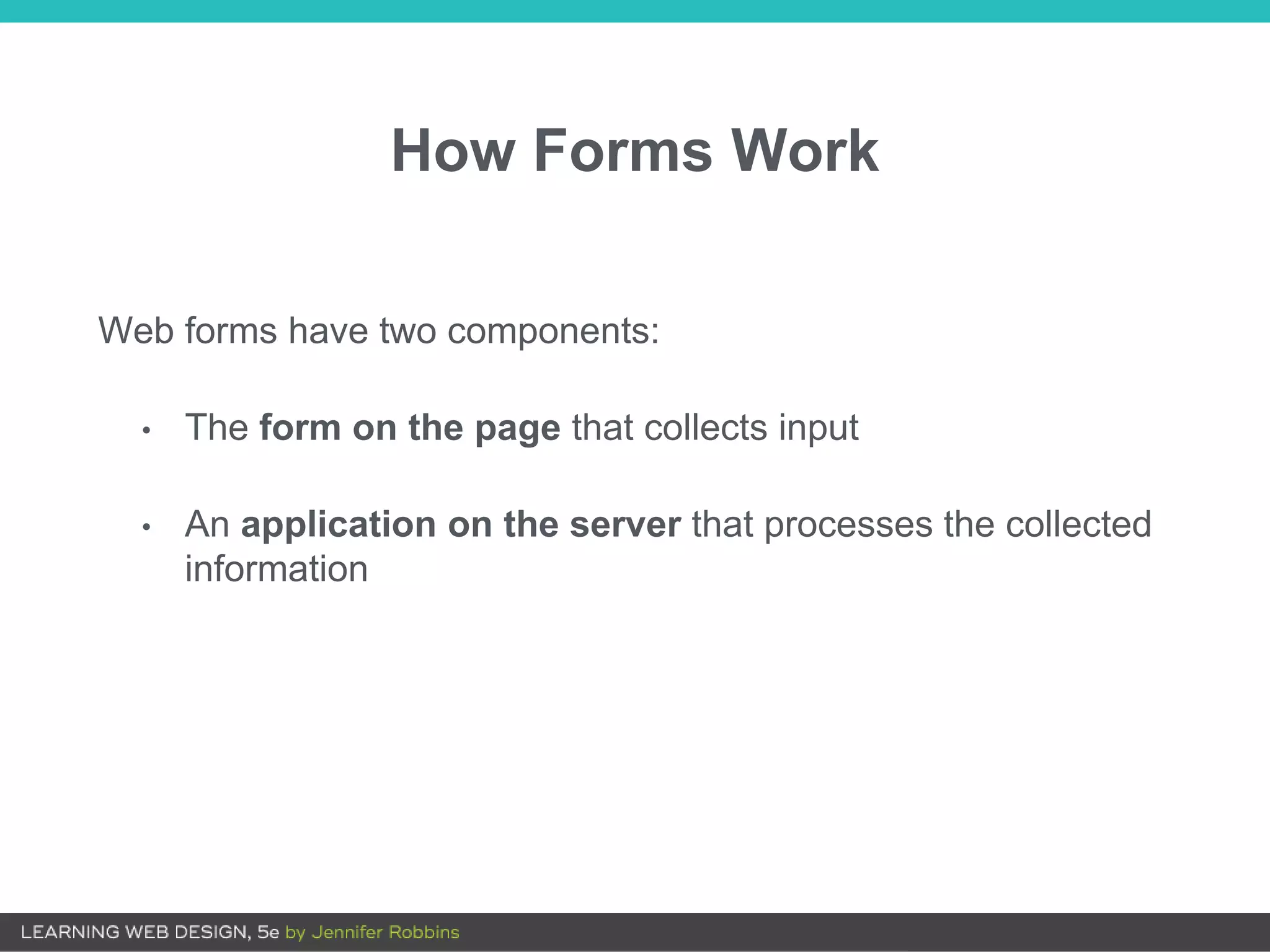
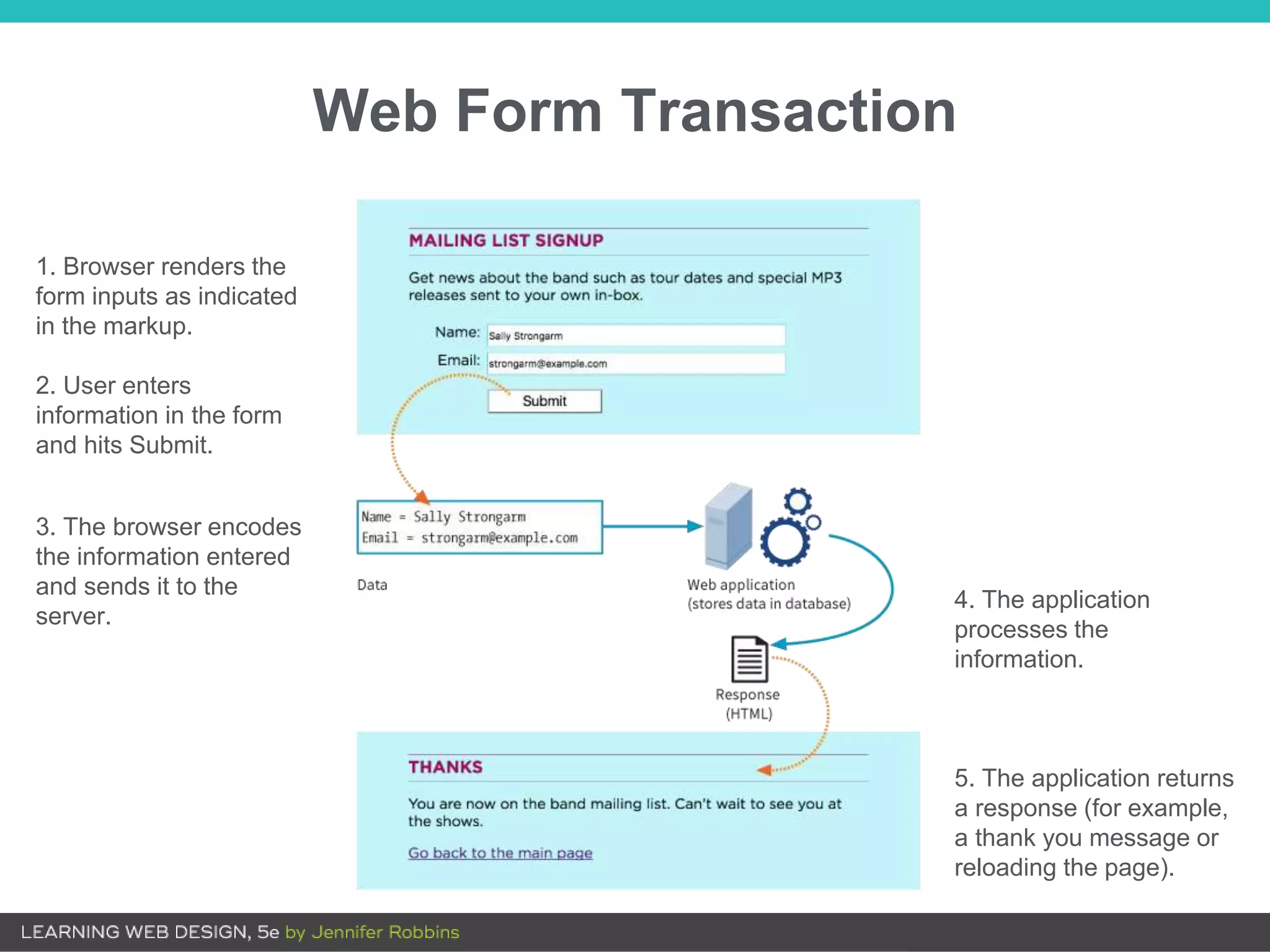
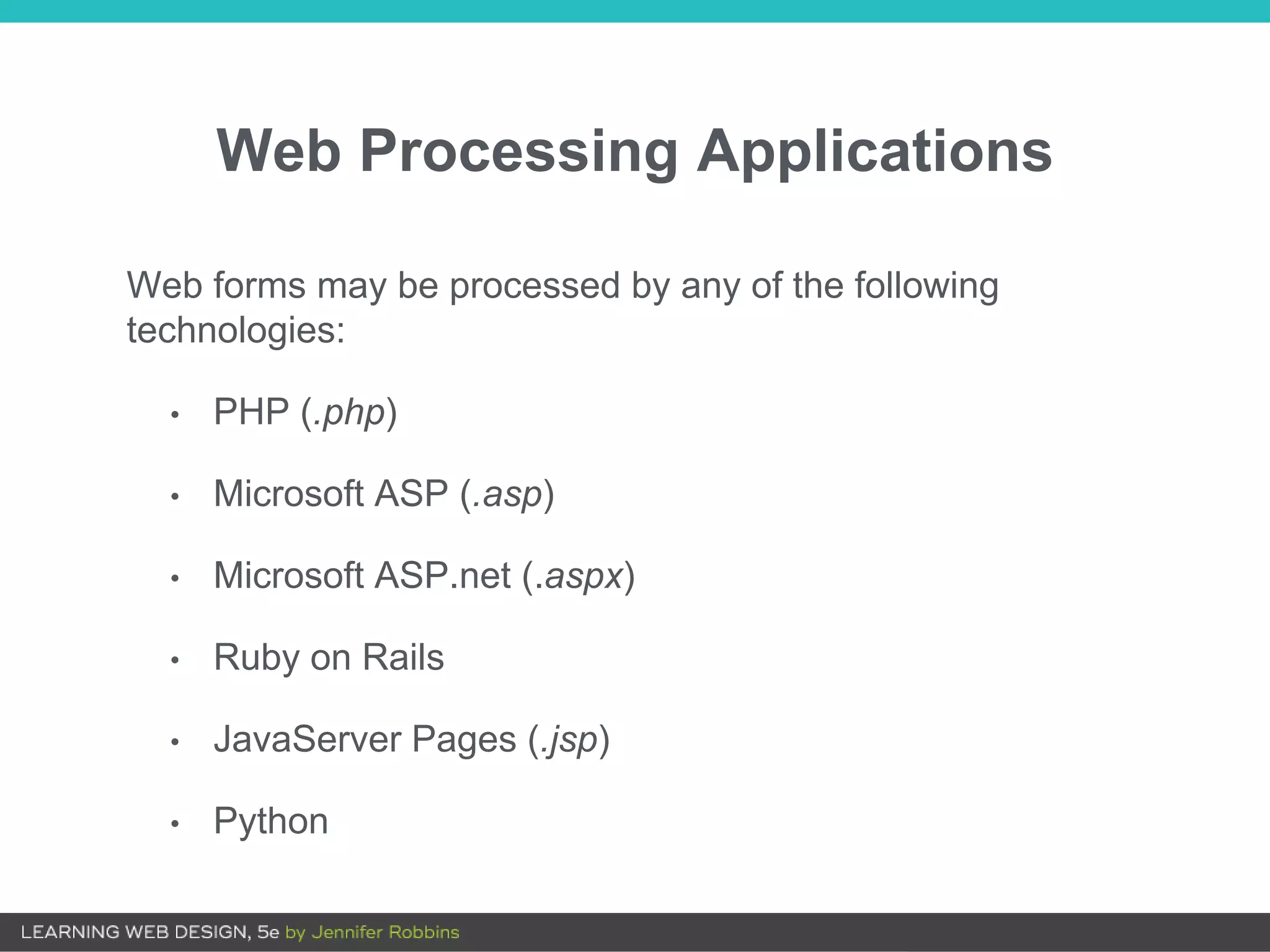
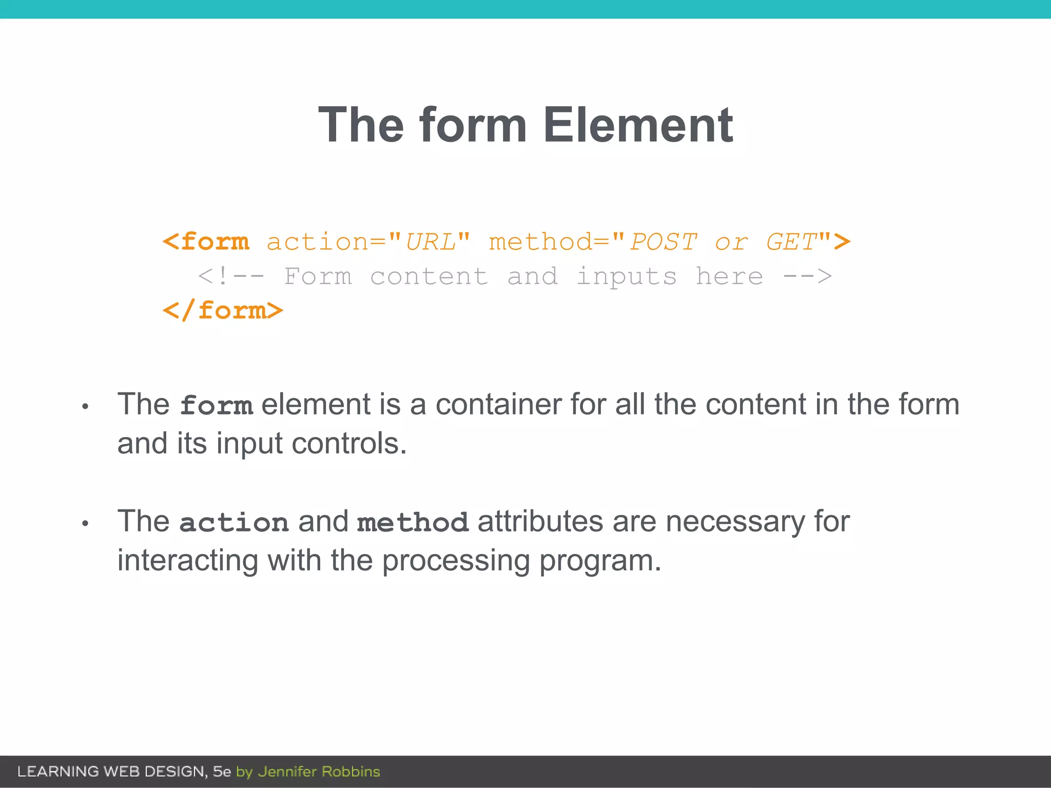
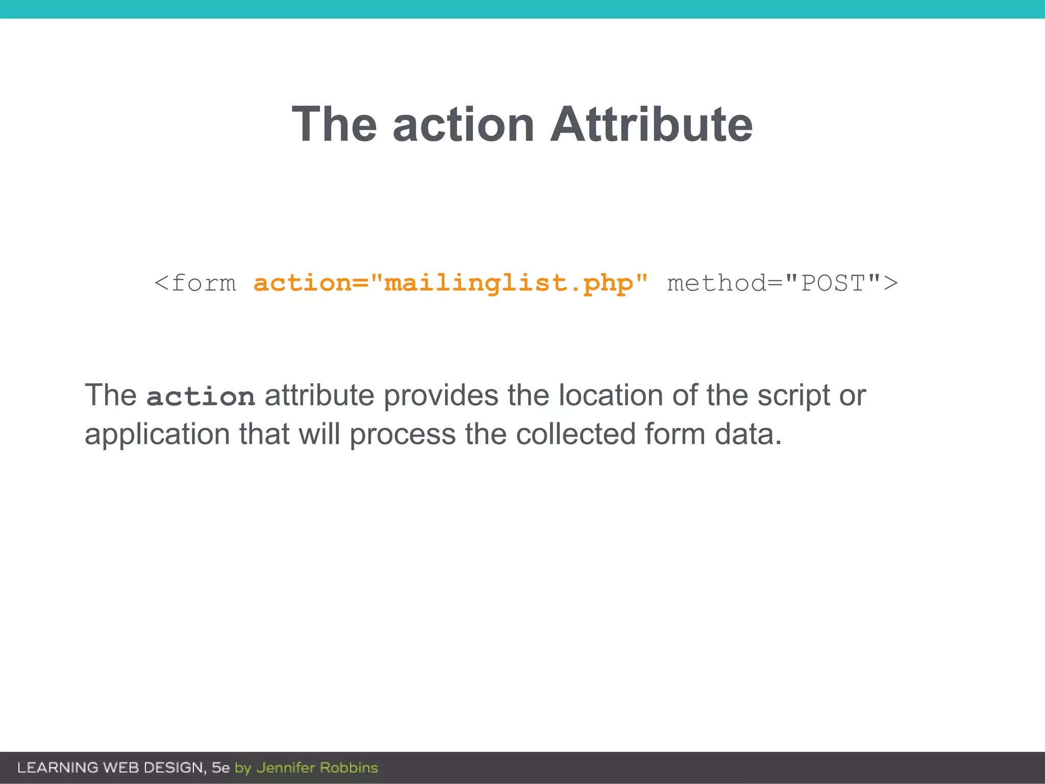
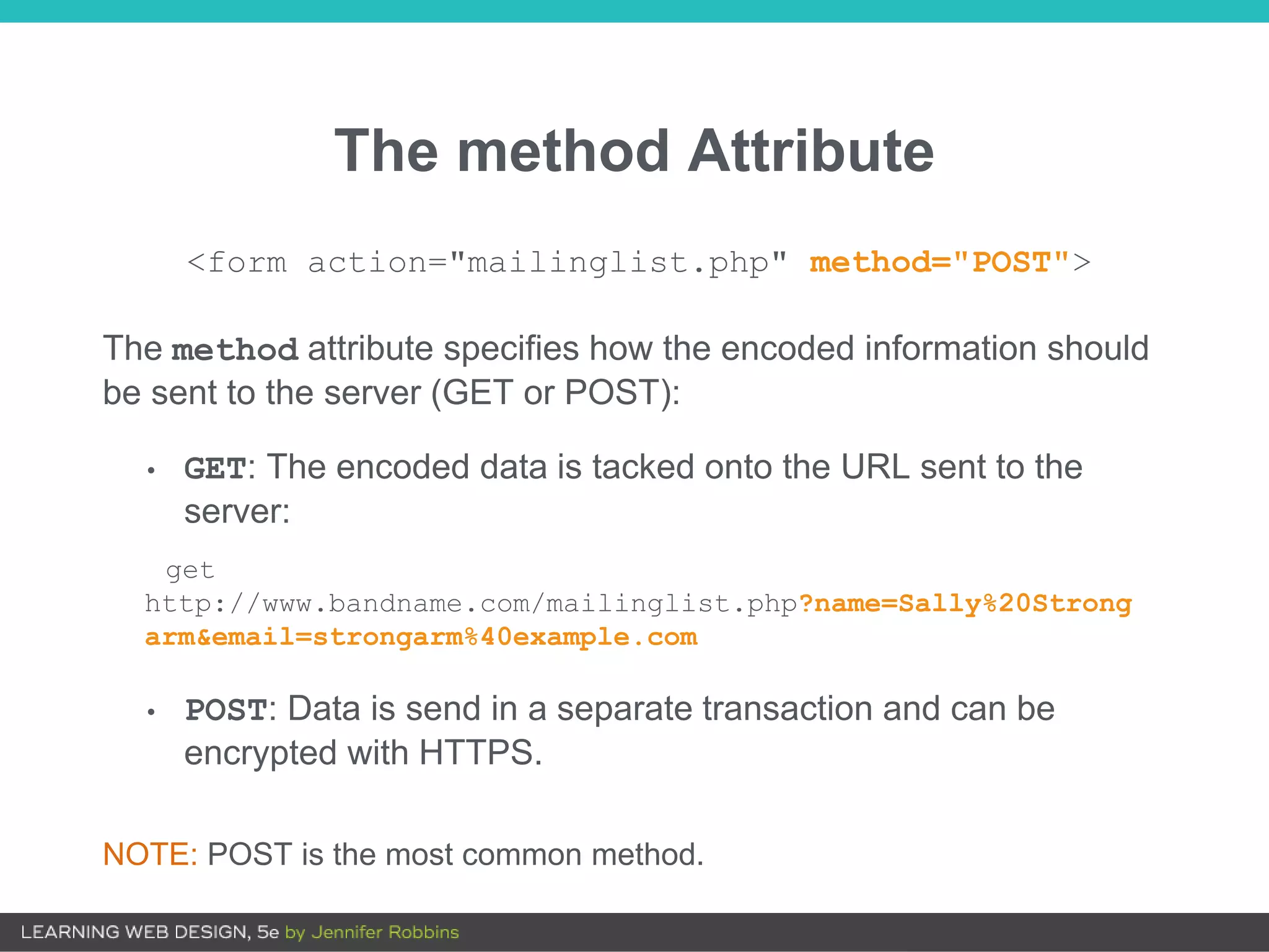
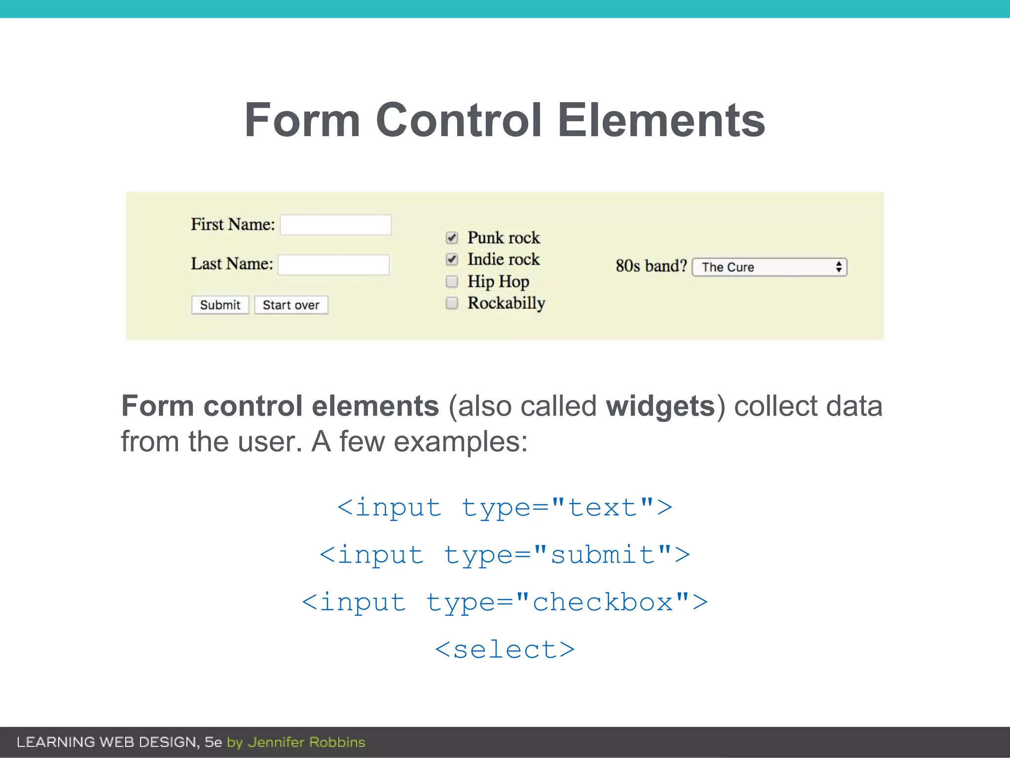
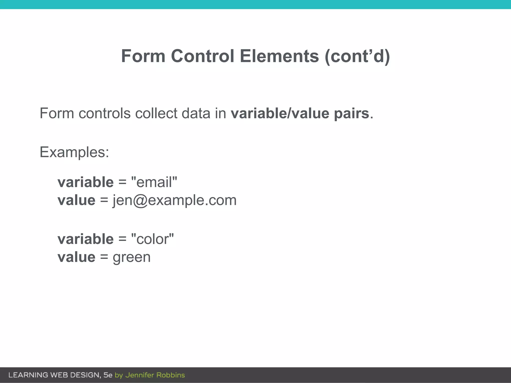
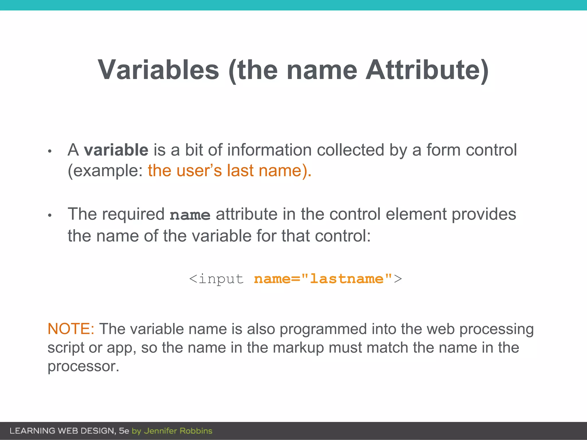
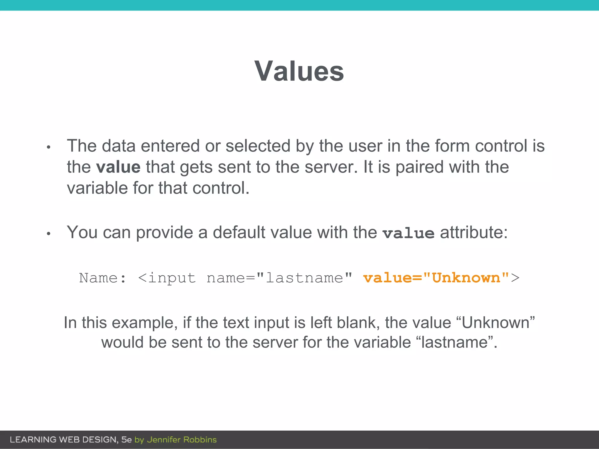
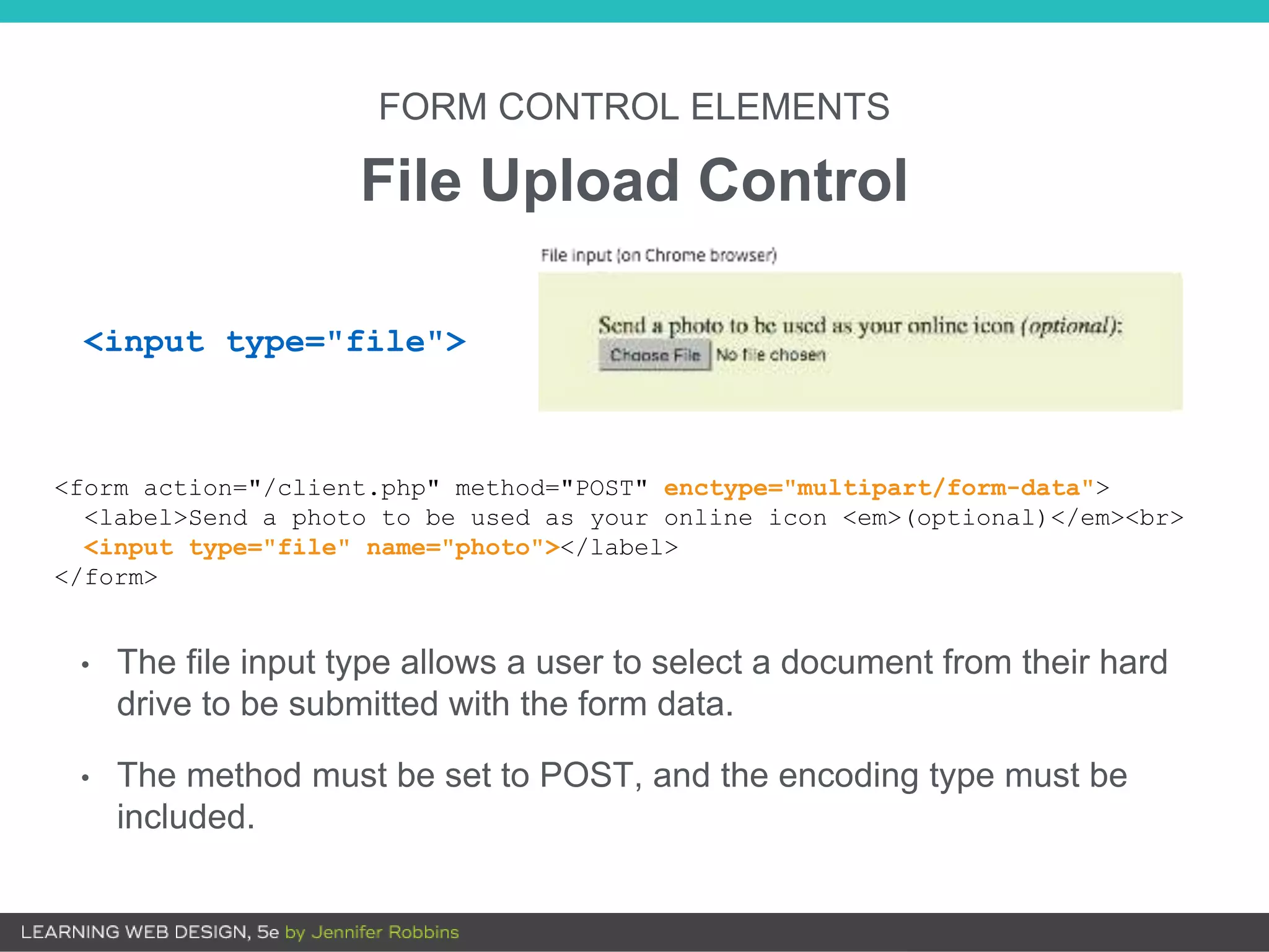
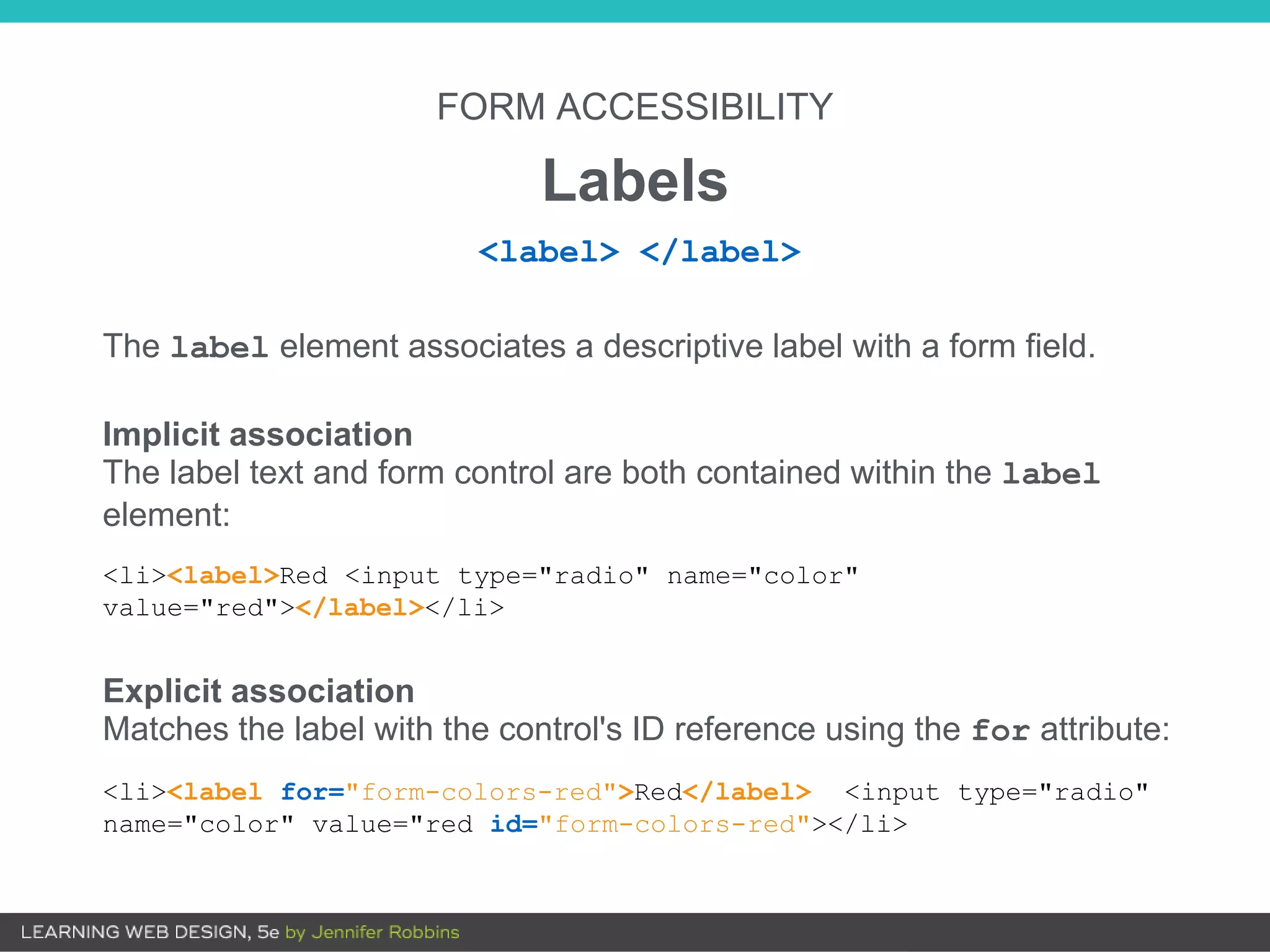
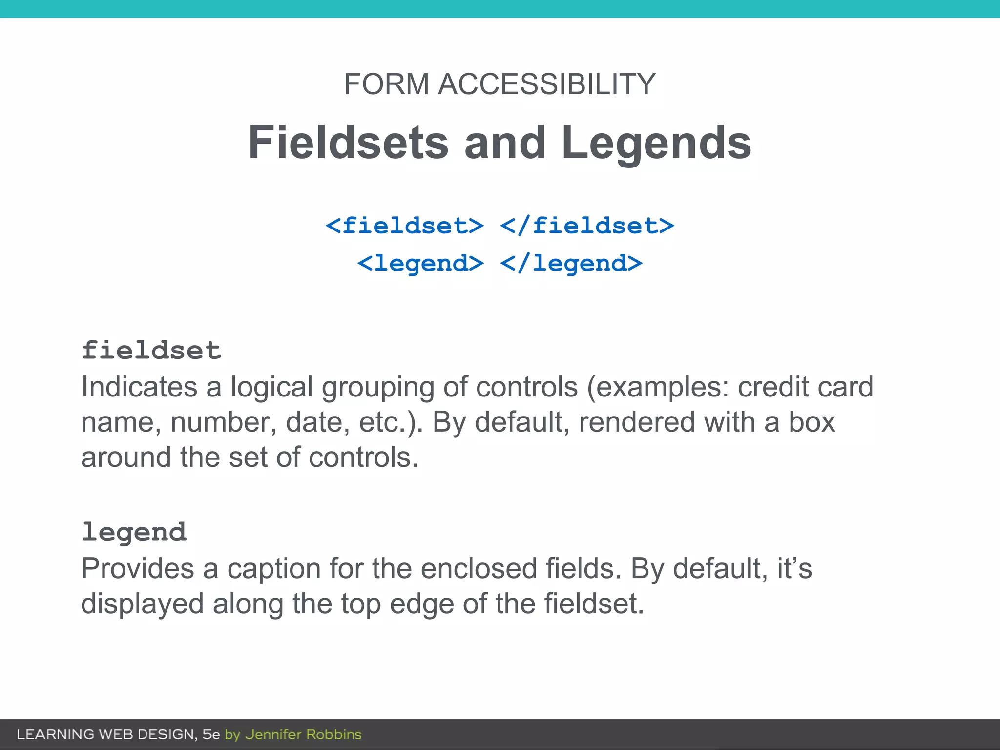
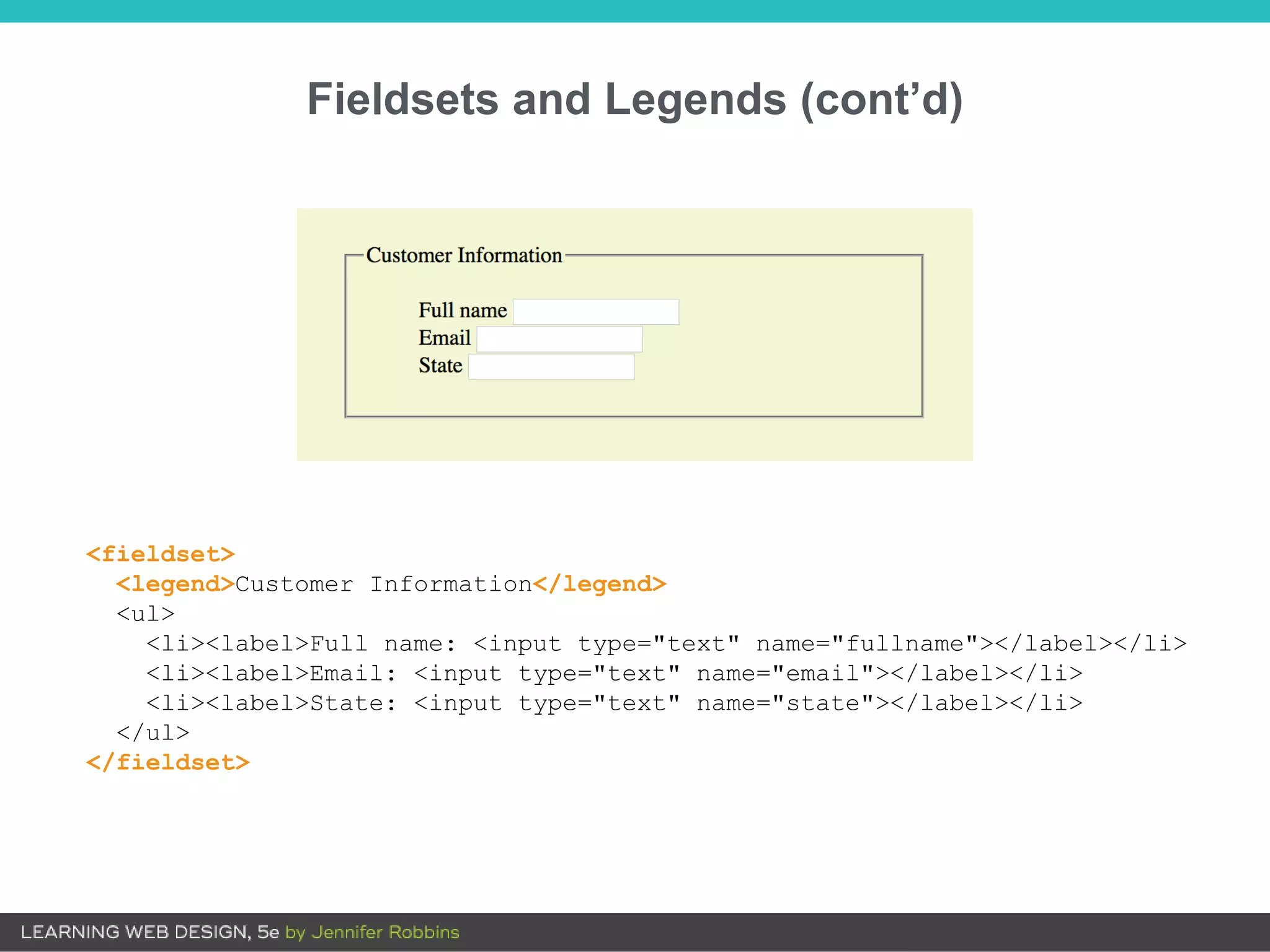
9
FORMS
OVERVIEW
• How forms work
• The form element
• Text entry controls
• Buttons
• Menus
• Specialized inputs
• Form accessibility
• Form design tips
How Forms Work
Web forms have two components:
• The form on the page that collects input
• An application on the server that processes the collected
information
4. The application
processes the
information.
5. The application returns
a response (for example,
a thank you message or
reloading the page).
1. Browser renders the
form inputs as indicated
in the markup.
2. User enters
information in the form
and hits Submit.
3. The browser encodes
the information entered
and sends it to the
server.
Web Form Transaction
Web Processing Applications
Web forms may be processed by any of the following
technologies:
• PHP (.php)
• Microsoft ASP (.asp)
• Microsoft ASP.net (.aspx)
• Ruby on Rails
• JavaServer Pages (.jsp)
• Python
The form Element
<form action="URL" method="POST or GET">
<!-- Form content and inputs here -->
</form>
• The form element is a container for all the content in the form
and its input controls.
• The action and method attributes are necessary for
interacting with the processing program.
The action Attribute
The action attribute provides the location of the script or
application that will process the collected form data.
<form action="mailinglist.php" method="POST">
The method Attribute
The method attribute specifies how the encoded information should
be sent to the server (GET or POST):
• GET: The encoded data is tacked onto the URL sent to the
server:
get
http://www.bandname.com/mailinglist.php?name=Sally%20Strong
arm&email=strongarm%40example.com
• POST: Data is send in a separate transaction and can be
encrypted with HTTPS.
NOTE: POST is the most common method.
<form action="mailinglist.php" method="POST">
Form Control Elements
<input type="text">
<input type="submit">
<input type="checkbox">
<select>
Form control elements (also called widgets) collect data
from the user. A few examples:
Form controls collect data in variable/value pairs.
Examples:
variable = "email"
value = jen@example.com
variable = "color"
value = green
Form Control Elements (cont’d)
Variables (the name Attribute)
• A variable is a bit of information collected by a form control
(example: the user’s last name).
• The required name attribute in the control element provides
the name of the variable for that control:
<input name="lastname">
NOTE: The variable name is also programmed into the web processing
script or app, so the name in the markup must match the name in the
processor.
Values
• The data entered or selected by the user in the form control is
the value that gets sent to the server. It is paired with the
variable for that control.
• You can provide a default value with the value attribute:
Name: <input name="lastname" value="Unknown">
In this example, if the text input is left blank, the value “Unknown”
would be sent to the server for the variable “lastname”.
FORM CONTROL ELEMENTS
Text Entry Input
<input type="text" name="color" value="Red" maxlength="24">
type: Type of input control, in this case a single-line text field
name: Required variable name
value: Default text that appears in the field and is sent to server if the field
is left blank
maxlength, minlength: Sets a character limit for the field
size: The length of the field in number of characters (CSS is more
common for sizing)
<input type="text">
FORM CONTROL ELEMENTS
Password Field
<input type="password" name="pswd" maxlength="10">
• Like a text entry field, except the characters are obscured from
view
• The data entered is not encrypted on the way to the server
(unless it uses HTTPS, a secure web protocol).
<input type="password">
FORM CONTROL ELEMENTS
Multi-line Text Entry
<textarea name="entry" rows="6" cols="64">This band is totally
awesome!</textarea>
The content of the textarea element is the default value.
rows: The number of rows tall the field is initially drawn (users can write
more)
cols: Width of initial text field, in number of characters
maxlength, minlength: Limits the number of characters that can be
entered
<textarea> </textarea>
• These input types are more semantically rich than a default
text field.
• Browsers may provide keyboards tailored to the input type.
• Browsers may validate entries on the fly without using the
server application.
FORM CONTROL ELEMENTS
Specialized Text Entry Fields
<input type="search">
<input type="email">
<input type="tel">
<input type="url">
Specialized Text Entries (cont’d)
<input type="tel" name=""> <input type="email" name="">
Numerical keyboard provided on iOS Opera looks for email address structure
FORM CONTROL ELEMENTS
Submit and Reset Buttons
<input type="submit">
• Submits the collected form data to the server. Does not require
a variable name (name attribute):
<input type="reset" value="Start over">
• Resets the form to its defaults
• Less common with the rise of JavaScript for form handling
• Change the button text with the value attribute.
FORM CONTROL ELEMENTS
Custom Buttons
<button> </button>
The button element is used for creating custom buttons with
JavaScript.
<input type="button">
Creates a custom button that has no predefined function and can
be customized with JavaScript
<input type="image" alt="">
Allows an image to be used as a button to replace the Submit
button. It requires a descriptive alt attribute value.
FORM CONTROL ELEMENTS
Radio Buttons
<p>How old are you?</p>
<ol>
<li><input type="radio" name="age" value="under24" checked> under 24</li>
<li><input type="radio" name="age" value="25-34"> 25 to 34</li>
<li><input type="radio" name="age" value="35-44"> 35 to 44</li>
<li><input type="radio" name="age" value="over45"> 45+</li>
</ol>
NOTE: You can’t belong to more than one age group, so radio buttons
are the right choice for this list.
Only one radio button may
be selected at a time.
<input type="radio">
Radio Buttons (cont’d.)
• Applying the same variable name to input elements binds
them together as a mutually exclusive set of options.
• The value for each button must be provided with the value
attribute.
• The checked attribute causes an option to be selected when
the page loads. Only one input may be checked.
<input type="radio" value="">
FORM CONTROL ELEMENTS
Checkbox Buttons
NOTE: You can like more than one type of music, so checkbox buttons
are the right choice for this list.
<p>What type of music do you listen to?</p>
<ul>
<li><input type="checkbox" name="genre" value="punk" checked> Punk rock</li>
<li><input type="checkbox" name="genre" value="indie" checked> Indie rock</li>
<li><input type="checkbox" name="genre" value="hiphop"> Hip Hop</li>
<li><input type="checkbox" name="genre" value="rockabilly"> Rockabilly</li>
</ul>
Multiple checkbox buttons
may be selected.
<input type="checkbox">
Checkbox Buttons (cont’d)
• Applying the same variable name to input elements binds
them together as a group.
• The value for each button must be provided with the value
attribute.
• The checked attribute causes an option to be selected when
the page loads. Multiple buttons in a group may be checked.
<input type="checkbox" value="">
FORM CONTROL ELEMENTS
Drop-down Menus
• The select element creates a drop-down menu when there
is no size attribute (or if size="1").
• The select element contains some number of option
elements.
• The content of the option element is the value sent to the
server (or one can be provided with the value attribute).
<select> </select>
<option> </option>
<optgroup> </optgroup>
Drop-down Menus (cont’d.)
<p>What is your favorite 80s band?
<select name="EightiesFave">
<option>The Cure</option>
<option>Cocteau Twins</option>
<option>Tears for Fears</option>
<option>Thompson Twins</option>
<option value="EBTG">Everything But the Girl</option>
<option>Depeche Mode</option>
<option>The Smiths</option>
<option>New Order</option>
</select>
</p>
The select menu drops down to reveal options when the user
clicks on it.
FORM CONTROL ELEMENTS
Scrolling Menus
• The same markup as drop-down menus, but the size attribute
specifies how many lines to display.
• The multiple attribute allows more than one option to be selected.
<p>What is your favorite 80s band?
<select name="EightiesFave" size="6" multiple>
<option>The Cure</option>
...
</select>
</p>
Scrolling Menus (cont’d)
Use the optgroup element to create a conceptual group of options.
The label attribute provides the the heading for the group:
<select name="icecream" size="7" multiple>
<optgroup label="traditional">
<option>vanilla</option>
<option>chocolate</option>
</optgroup>
<optgroup label="fancy">
<option>Super praline</option>
<option>Nut surprise</option>
<option>Candy corn</option>
</optgroup>
</select>
FORM CONTROL ELEMENTS
File Upload Control
• The file input type allows a user to select a document from their hard
drive to be submitted with the form data.
• The method must be set to POST, and the encoding type must be
included.
<form action="/client.php" method="POST" enctype="multipart/form-data">
<label>Send a photo to be used as your online icon <em>(optional)</em><br>
<input type="file" name="photo"></label>
</form>
<input type="file">
FORM CONTROL ELEMENTS
Hidden Control
• Sometimes it is necessary to feed values to the processing
script/app that don’t come from the user.
• Hidden controls don’t display in the browser.
<input type="hidden">
<input type="hidden" name="success-link"
value="http://www.example.com/thankyou.html">
FORM CONTROL ELEMENTS
Date and Time Controls
A starting value may be provided in standard date-time format.
<input type="date">
<input type="time">
<input type="datetime-local">
<input type="month">
<input type="week">
<input type="date" name="birthday" value="2017-01-14">
Date and Time Controls (cont’d)
Browsers may display date
and time selection widgets (not
universally supported).
On non-supporting browsers,
date and time inputs display as
usable text-entry fields.
FORM CONTROL ELEMENTS
Numerical Controls
<input type="number">
<input type="range">
Number and range controls
collect numerical data.
Browsers may render counter
or slider widgets.
Both types accept min and
max attributes for setting limits
on the allowed values.
FORM CONTROL ELEMENTS
Color Selector
<input type="color">
The color input type is
intended to provide a pop-up
color picker.
It is not well supported. Non-
supporting browsers display a
text-entry field.
Form Accessibility
• Users may not be able to see the form. They may be listening
to it with a screen reader.
• Whereas sighted users can see at a glance how elements are
organized, form accessibility features create semantic
connections between form components.
FORM ACCESSIBILITY
Labels
The label element associates a descriptive label with a form field.
Implicit association
The label text and form control are both contained within the label
element:
<li><label>Red <input type="radio" name="color"
value="red"></label></li>
Explicit association
Matches the label with the control's ID reference using the for attribute:
<li><label for="form-colors-red">Red</label> <input type="radio"
name="color" value="red id="form-colors-red"></li>
<label> </label>
FORM ACCESSIBILITY
Fieldsets and Legends
fieldset
Indicates a logical grouping of controls (examples: credit card
name, number, date, etc.). By default, rendered with a box
around the set of controls.
legend
Provides a caption for the enclosed fields. By default, it’s
displayed along the top edge of the fieldset.
<fieldset> </fieldset>
<legend> </legend>
Fieldsets and Legends (cont’d)
<fieldset>
<legend>Customer Information</legend>
<ul>
<li><label>Full name: <input type="text" name="fullname"></label></li>
<li><label>Email: <input type="text" name="email"></label></li>
<li><label>State: <input type="text" name="state"></label></li>
</ul>
</fieldset>
Form Design Tips
• Avoid unnecessary questions.
• Consider the impact of label placement. Labels above fields
tend to lead to faster completion.
• Choose input types carefully.
• Group related inputs.
• Primary actions (e.g., “Buy”) should be visually dominant to
secondary actions (e.g., “Back”).

Chapter 9: Forms

  • 1.
  • 2.
    OVERVIEW • How formswork • The form element • Text entry controls • Buttons • Menus • Specialized inputs • Form accessibility • Form design tips
  • 3.
    How Forms Work Webforms have two components: • The form on the page that collects input • An application on the server that processes the collected information
  • 4.
    4. The application processesthe information. 5. The application returns a response (for example, a thank you message or reloading the page). 1. Browser renders the form inputs as indicated in the markup. 2. User enters information in the form and hits Submit. 3. The browser encodes the information entered and sends it to the server. Web Form Transaction
  • 5.
    Web Processing Applications Webforms may be processed by any of the following technologies: • PHP (.php) • Microsoft ASP (.asp) • Microsoft ASP.net (.aspx) • Ruby on Rails • JavaServer Pages (.jsp) • Python
  • 6.
    The form Element <formaction="URL" method="POST or GET"> <!-- Form content and inputs here --> </form> • The form element is a container for all the content in the form and its input controls. • The action and method attributes are necessary for interacting with the processing program.
  • 7.
    The action Attribute Theaction attribute provides the location of the script or application that will process the collected form data. <form action="mailinglist.php" method="POST">
  • 8.
    The method Attribute Themethod attribute specifies how the encoded information should be sent to the server (GET or POST): • GET: The encoded data is tacked onto the URL sent to the server: get http://www.bandname.com/mailinglist.php?name=Sally%20Strong arm&email=strongarm%40example.com • POST: Data is send in a separate transaction and can be encrypted with HTTPS. NOTE: POST is the most common method. <form action="mailinglist.php" method="POST">
  • 9.
    Form Control Elements <inputtype="text"> <input type="submit"> <input type="checkbox"> <select> Form control elements (also called widgets) collect data from the user. A few examples:
  • 10.
    Form controls collectdata in variable/value pairs. Examples: variable = "email" value = jen@example.com variable = "color" value = green Form Control Elements (cont’d)
  • 11.
    Variables (the nameAttribute) • A variable is a bit of information collected by a form control (example: the user’s last name). • The required name attribute in the control element provides the name of the variable for that control: <input name="lastname"> NOTE: The variable name is also programmed into the web processing script or app, so the name in the markup must match the name in the processor.
  • 12.
    Values • The dataentered or selected by the user in the form control is the value that gets sent to the server. It is paired with the variable for that control. • You can provide a default value with the value attribute: Name: <input name="lastname" value="Unknown"> In this example, if the text input is left blank, the value “Unknown” would be sent to the server for the variable “lastname”.
  • 13.
    FORM CONTROL ELEMENTS TextEntry Input <input type="text" name="color" value="Red" maxlength="24"> type: Type of input control, in this case a single-line text field name: Required variable name value: Default text that appears in the field and is sent to server if the field is left blank maxlength, minlength: Sets a character limit for the field size: The length of the field in number of characters (CSS is more common for sizing) <input type="text">
  • 14.
    FORM CONTROL ELEMENTS PasswordField <input type="password" name="pswd" maxlength="10"> • Like a text entry field, except the characters are obscured from view • The data entered is not encrypted on the way to the server (unless it uses HTTPS, a secure web protocol). <input type="password">
  • 15.
    FORM CONTROL ELEMENTS Multi-lineText Entry <textarea name="entry" rows="6" cols="64">This band is totally awesome!</textarea> The content of the textarea element is the default value. rows: The number of rows tall the field is initially drawn (users can write more) cols: Width of initial text field, in number of characters maxlength, minlength: Limits the number of characters that can be entered <textarea> </textarea>
  • 16.
    • These inputtypes are more semantically rich than a default text field. • Browsers may provide keyboards tailored to the input type. • Browsers may validate entries on the fly without using the server application. FORM CONTROL ELEMENTS Specialized Text Entry Fields <input type="search"> <input type="email"> <input type="tel"> <input type="url">
  • 17.
    Specialized Text Entries(cont’d) <input type="tel" name=""> <input type="email" name=""> Numerical keyboard provided on iOS Opera looks for email address structure
  • 18.
    FORM CONTROL ELEMENTS Submitand Reset Buttons <input type="submit"> • Submits the collected form data to the server. Does not require a variable name (name attribute): <input type="reset" value="Start over"> • Resets the form to its defaults • Less common with the rise of JavaScript for form handling • Change the button text with the value attribute.
  • 19.
    FORM CONTROL ELEMENTS CustomButtons <button> </button> The button element is used for creating custom buttons with JavaScript. <input type="button"> Creates a custom button that has no predefined function and can be customized with JavaScript <input type="image" alt=""> Allows an image to be used as a button to replace the Submit button. It requires a descriptive alt attribute value.
  • 20.
    FORM CONTROL ELEMENTS RadioButtons <p>How old are you?</p> <ol> <li><input type="radio" name="age" value="under24" checked> under 24</li> <li><input type="radio" name="age" value="25-34"> 25 to 34</li> <li><input type="radio" name="age" value="35-44"> 35 to 44</li> <li><input type="radio" name="age" value="over45"> 45+</li> </ol> NOTE: You can’t belong to more than one age group, so radio buttons are the right choice for this list. Only one radio button may be selected at a time. <input type="radio">
  • 21.
    Radio Buttons (cont’d.) •Applying the same variable name to input elements binds them together as a mutually exclusive set of options. • The value for each button must be provided with the value attribute. • The checked attribute causes an option to be selected when the page loads. Only one input may be checked. <input type="radio" value="">
  • 22.
    FORM CONTROL ELEMENTS CheckboxButtons NOTE: You can like more than one type of music, so checkbox buttons are the right choice for this list. <p>What type of music do you listen to?</p> <ul> <li><input type="checkbox" name="genre" value="punk" checked> Punk rock</li> <li><input type="checkbox" name="genre" value="indie" checked> Indie rock</li> <li><input type="checkbox" name="genre" value="hiphop"> Hip Hop</li> <li><input type="checkbox" name="genre" value="rockabilly"> Rockabilly</li> </ul> Multiple checkbox buttons may be selected. <input type="checkbox">
  • 23.
    Checkbox Buttons (cont’d) •Applying the same variable name to input elements binds them together as a group. • The value for each button must be provided with the value attribute. • The checked attribute causes an option to be selected when the page loads. Multiple buttons in a group may be checked. <input type="checkbox" value="">
  • 24.
    FORM CONTROL ELEMENTS Drop-downMenus • The select element creates a drop-down menu when there is no size attribute (or if size="1"). • The select element contains some number of option elements. • The content of the option element is the value sent to the server (or one can be provided with the value attribute). <select> </select> <option> </option> <optgroup> </optgroup>
  • 25.
    Drop-down Menus (cont’d.) <p>Whatis your favorite 80s band? <select name="EightiesFave"> <option>The Cure</option> <option>Cocteau Twins</option> <option>Tears for Fears</option> <option>Thompson Twins</option> <option value="EBTG">Everything But the Girl</option> <option>Depeche Mode</option> <option>The Smiths</option> <option>New Order</option> </select> </p> The select menu drops down to reveal options when the user clicks on it.
  • 26.
    FORM CONTROL ELEMENTS ScrollingMenus • The same markup as drop-down menus, but the size attribute specifies how many lines to display. • The multiple attribute allows more than one option to be selected. <p>What is your favorite 80s band? <select name="EightiesFave" size="6" multiple> <option>The Cure</option> ... </select> </p>
  • 27.
    Scrolling Menus (cont’d) Usethe optgroup element to create a conceptual group of options. The label attribute provides the the heading for the group: <select name="icecream" size="7" multiple> <optgroup label="traditional"> <option>vanilla</option> <option>chocolate</option> </optgroup> <optgroup label="fancy"> <option>Super praline</option> <option>Nut surprise</option> <option>Candy corn</option> </optgroup> </select>
  • 28.
    FORM CONTROL ELEMENTS FileUpload Control • The file input type allows a user to select a document from their hard drive to be submitted with the form data. • The method must be set to POST, and the encoding type must be included. <form action="/client.php" method="POST" enctype="multipart/form-data"> <label>Send a photo to be used as your online icon <em>(optional)</em><br> <input type="file" name="photo"></label> </form> <input type="file">
  • 29.
    FORM CONTROL ELEMENTS HiddenControl • Sometimes it is necessary to feed values to the processing script/app that don’t come from the user. • Hidden controls don’t display in the browser. <input type="hidden"> <input type="hidden" name="success-link" value="http://www.example.com/thankyou.html">
  • 30.
    FORM CONTROL ELEMENTS Dateand Time Controls A starting value may be provided in standard date-time format. <input type="date"> <input type="time"> <input type="datetime-local"> <input type="month"> <input type="week"> <input type="date" name="birthday" value="2017-01-14">
  • 31.
    Date and TimeControls (cont’d) Browsers may display date and time selection widgets (not universally supported). On non-supporting browsers, date and time inputs display as usable text-entry fields.
  • 32.
    FORM CONTROL ELEMENTS NumericalControls <input type="number"> <input type="range"> Number and range controls collect numerical data. Browsers may render counter or slider widgets. Both types accept min and max attributes for setting limits on the allowed values.
  • 33.
    FORM CONTROL ELEMENTS ColorSelector <input type="color"> The color input type is intended to provide a pop-up color picker. It is not well supported. Non- supporting browsers display a text-entry field.
  • 34.
    Form Accessibility • Usersmay not be able to see the form. They may be listening to it with a screen reader. • Whereas sighted users can see at a glance how elements are organized, form accessibility features create semantic connections between form components.
  • 35.
    FORM ACCESSIBILITY Labels The labelelement associates a descriptive label with a form field. Implicit association The label text and form control are both contained within the label element: <li><label>Red <input type="radio" name="color" value="red"></label></li> Explicit association Matches the label with the control's ID reference using the for attribute: <li><label for="form-colors-red">Red</label> <input type="radio" name="color" value="red id="form-colors-red"></li> <label> </label>
  • 36.
    FORM ACCESSIBILITY Fieldsets andLegends fieldset Indicates a logical grouping of controls (examples: credit card name, number, date, etc.). By default, rendered with a box around the set of controls. legend Provides a caption for the enclosed fields. By default, it’s displayed along the top edge of the fieldset. <fieldset> </fieldset> <legend> </legend>
  • 37.
    Fieldsets and Legends(cont’d) <fieldset> <legend>Customer Information</legend> <ul> <li><label>Full name: <input type="text" name="fullname"></label></li> <li><label>Email: <input type="text" name="email"></label></li> <li><label>State: <input type="text" name="state"></label></li> </ul> </fieldset>
  • 38.
    Form Design Tips •Avoid unnecessary questions. • Consider the impact of label placement. Labels above fields tend to lead to faster completion. • Choose input types carefully. • Group related inputs. • Primary actions (e.g., “Buy”) should be visually dominant to secondary actions (e.g., “Back”).