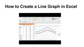
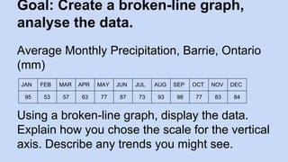
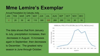
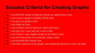
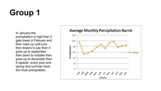
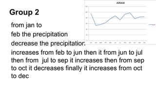
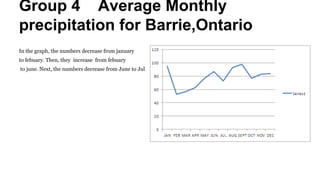
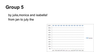
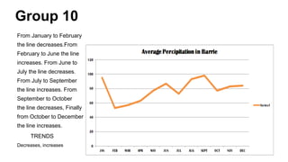
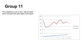
This document provides instructions for students to create a broken-line graph in Excel to display monthly precipitation data and analyze trends. It includes sample precipitation data for Barrie, Ontario and Calcutta, India. Students are divided into groups and each group describes trends they see in the data and receives feedback. Criteria for successful graph creation are outlined. The lesson concludes by asking students to provide feedback on the online math lesson format through the "Math Wall."