
Recommended
More Related Content
More from yahalex
Billy tallent
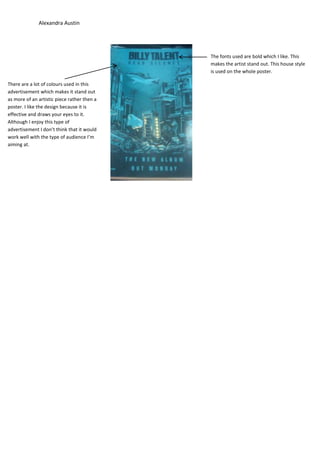
- 1. Alexandra Austin The fonts used are bold which I like. This makes the artist stand out. This house style is used on the whole poster. There are a lot of colours used in this advertisement which makes it stand out as more of an artistic piece rather then a poster. I like the design because it is effective and draws your eyes to it. Although I enjoy this type of advertisement I don’t think that it would work well with the type of audience I’m aiming at.