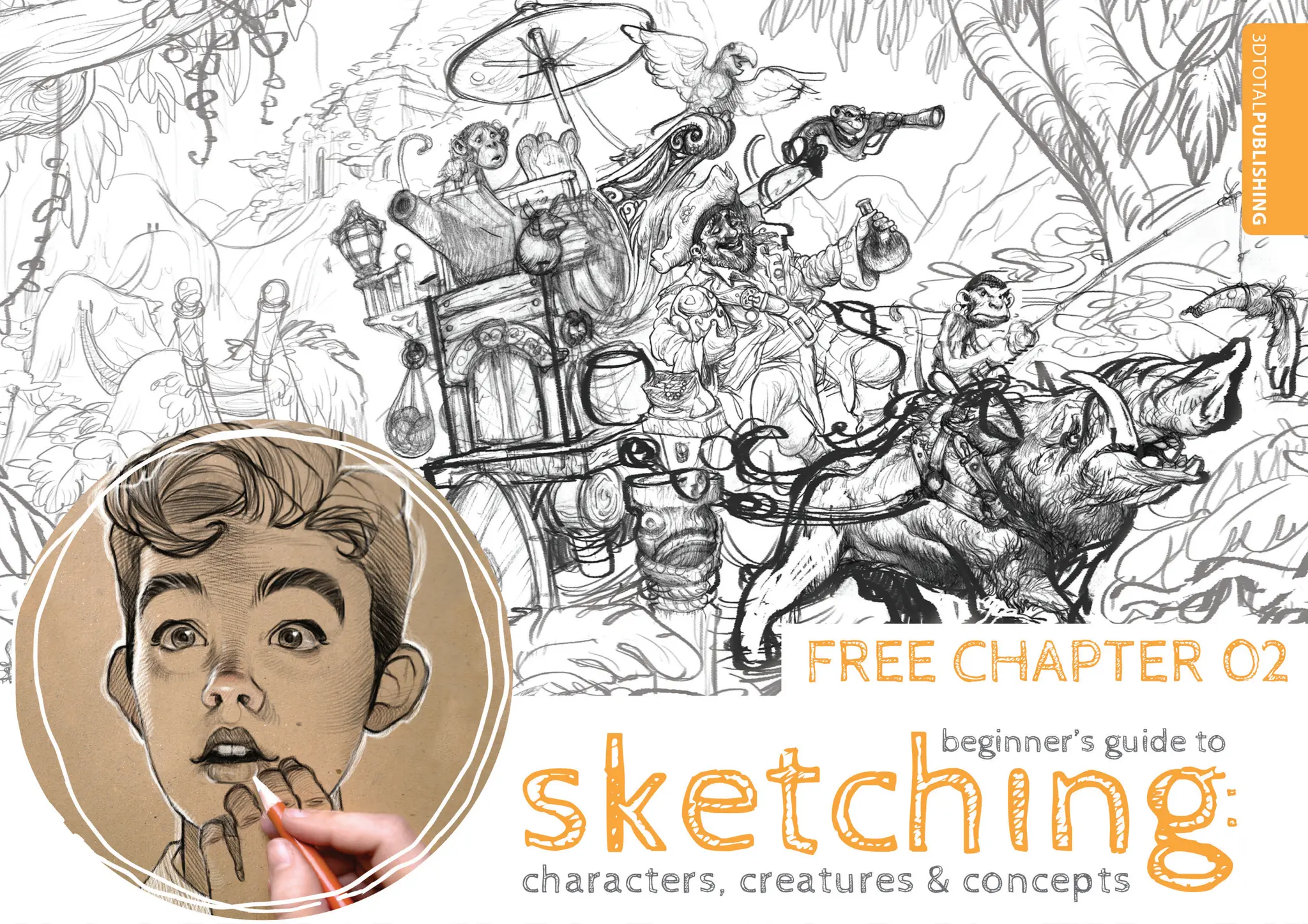
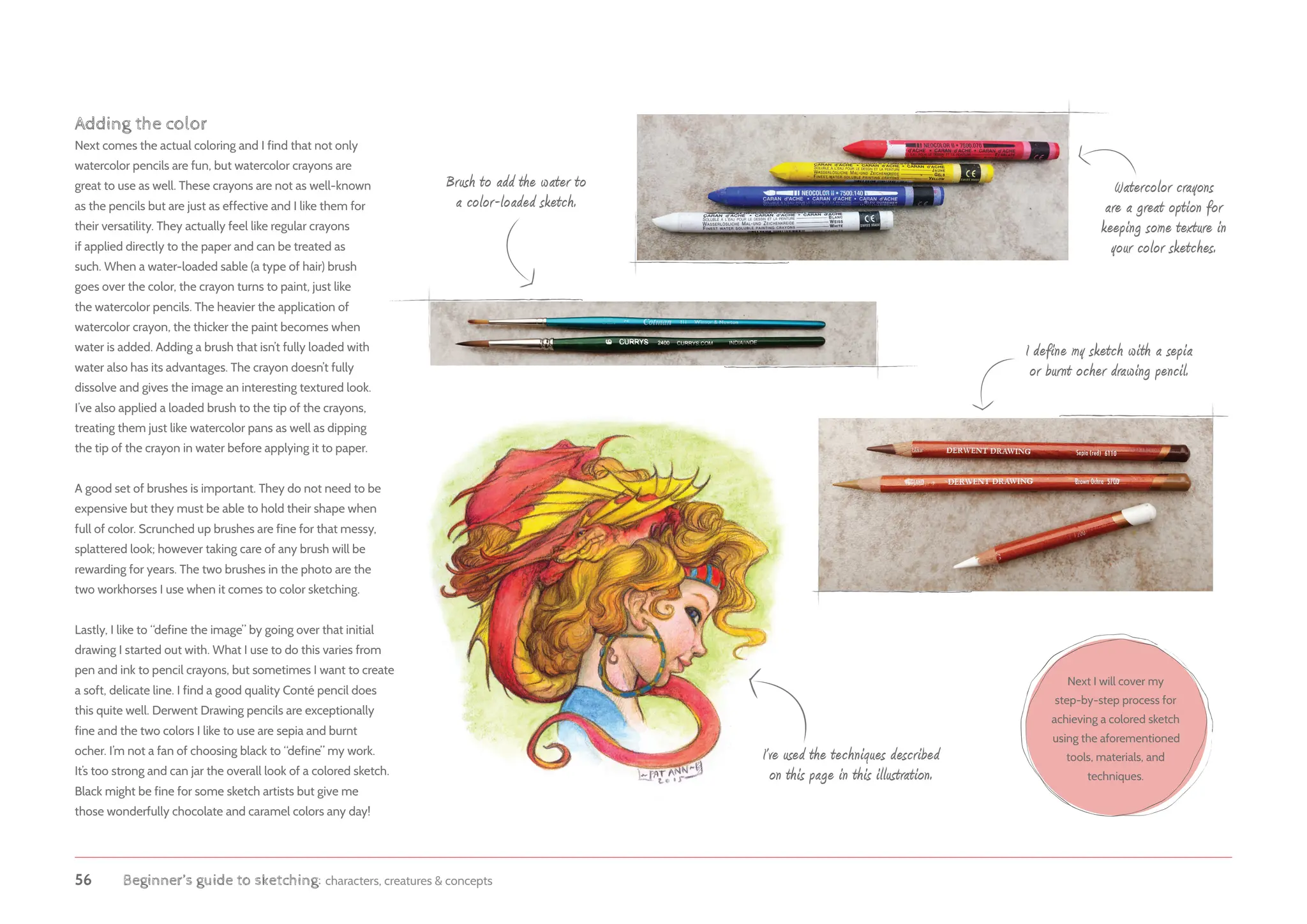
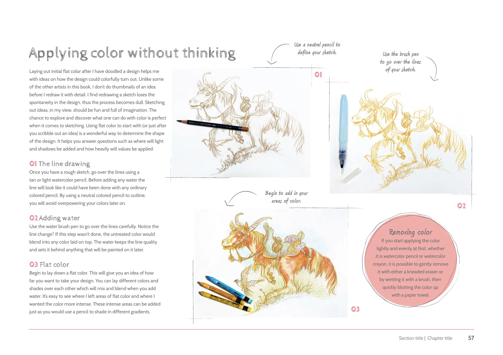
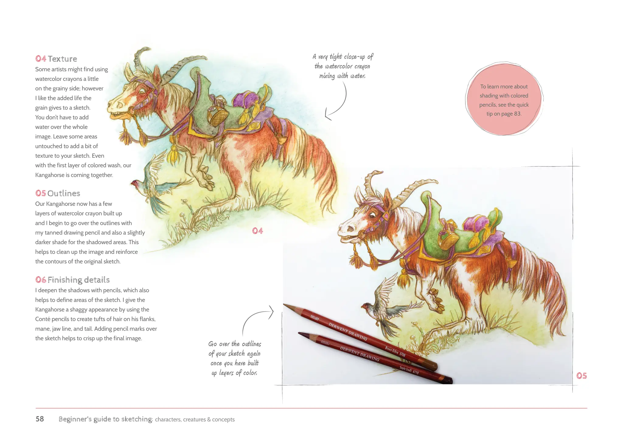
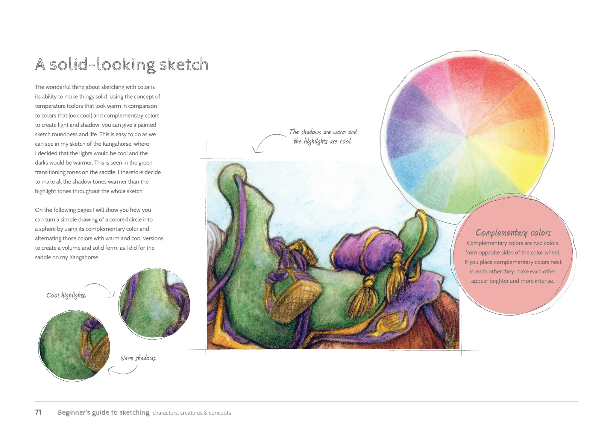
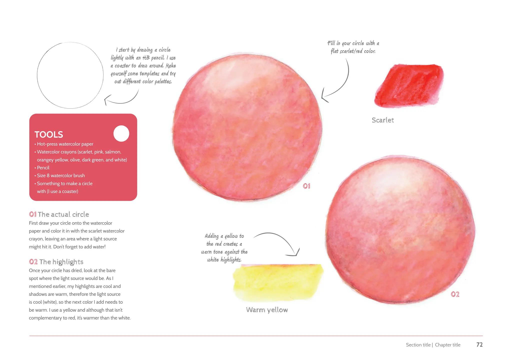
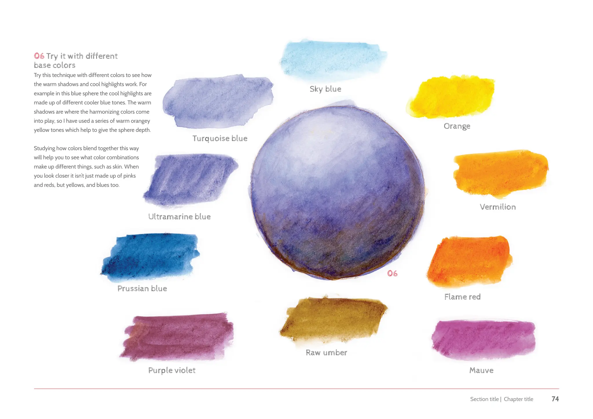
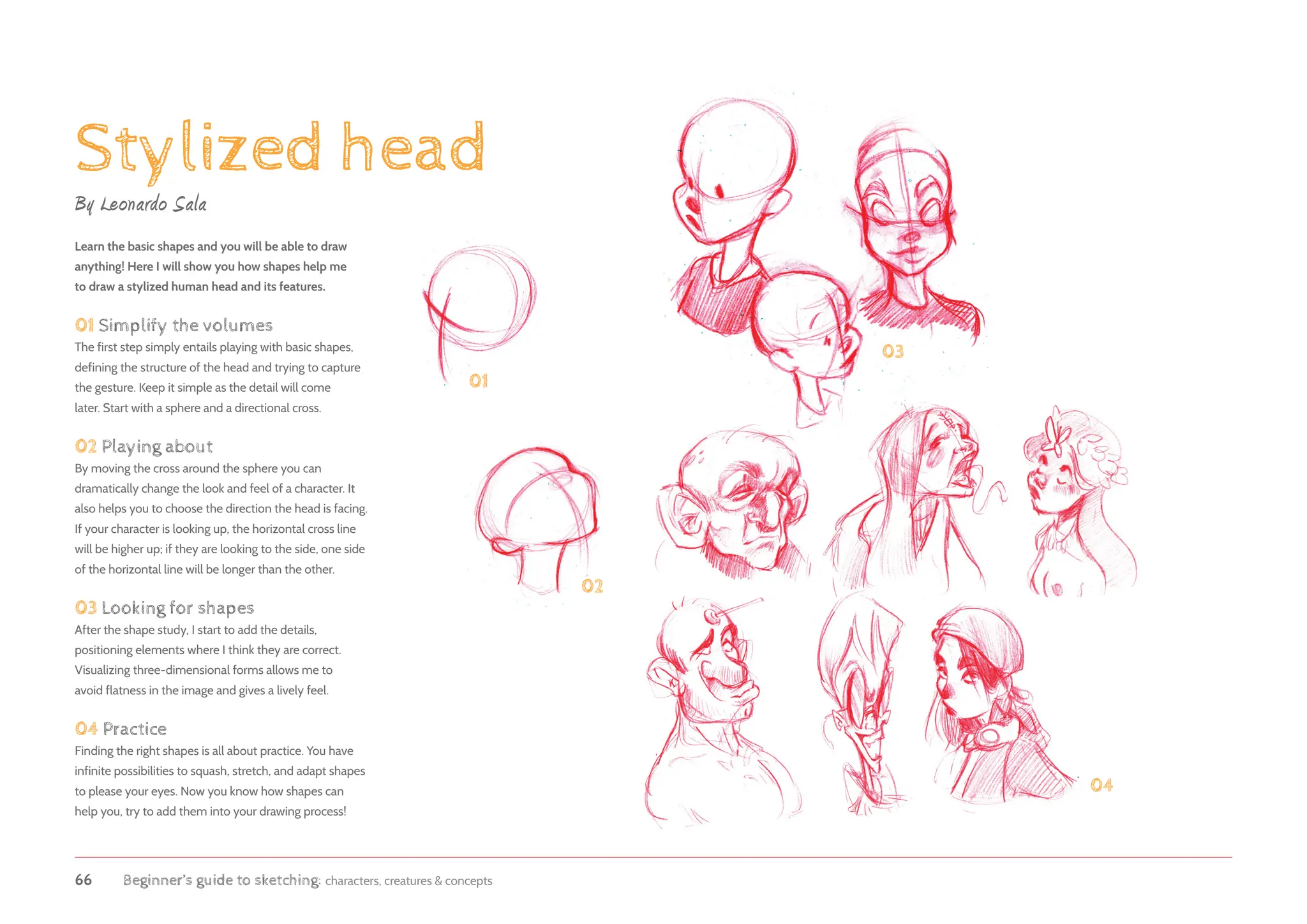
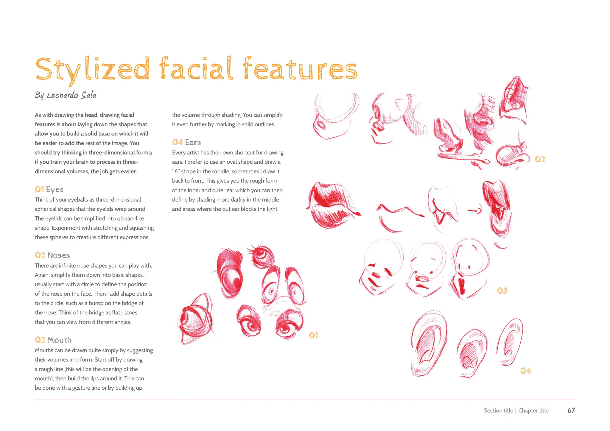
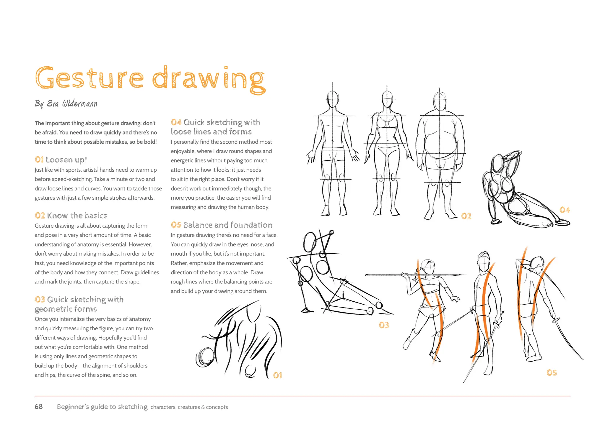
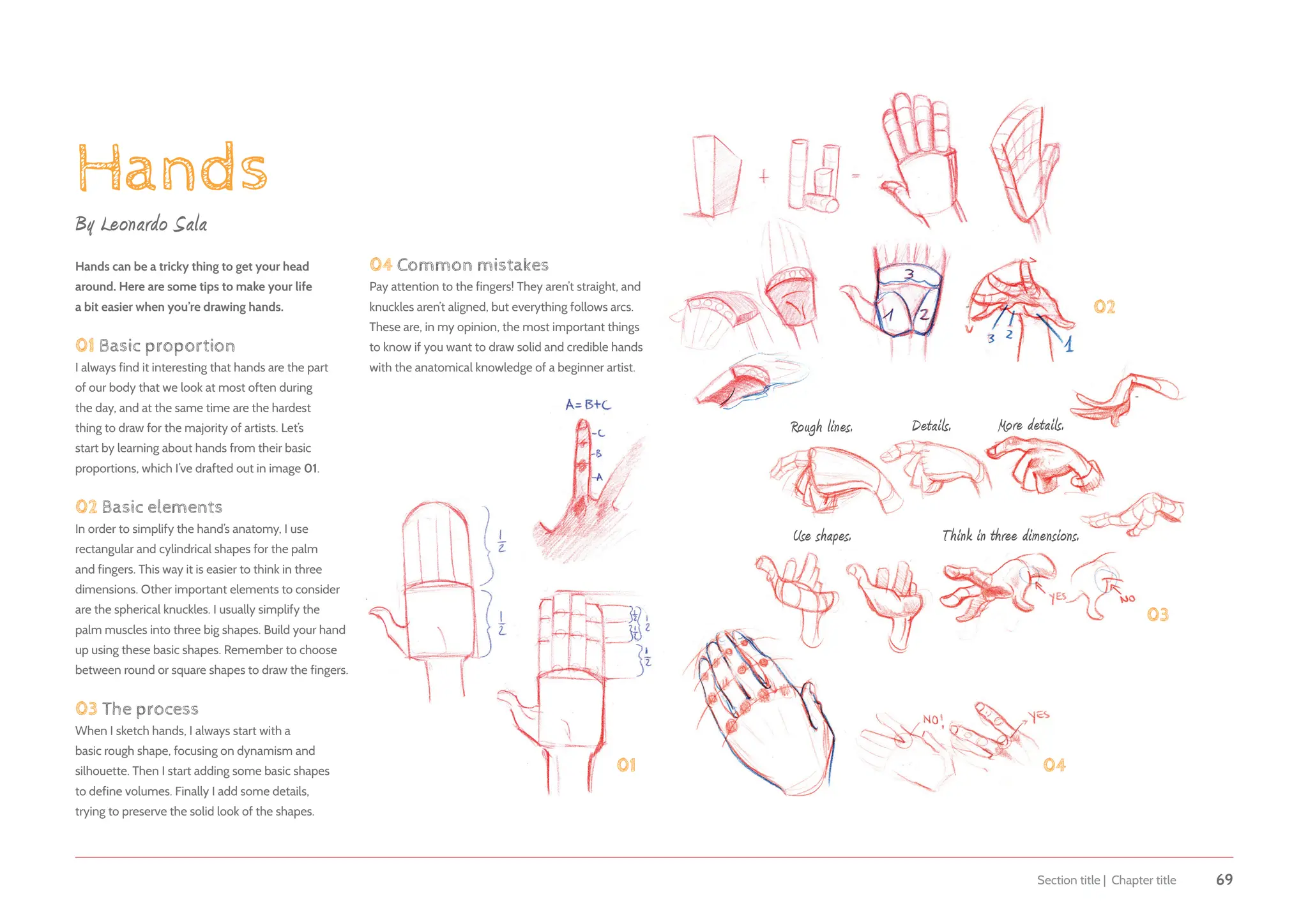
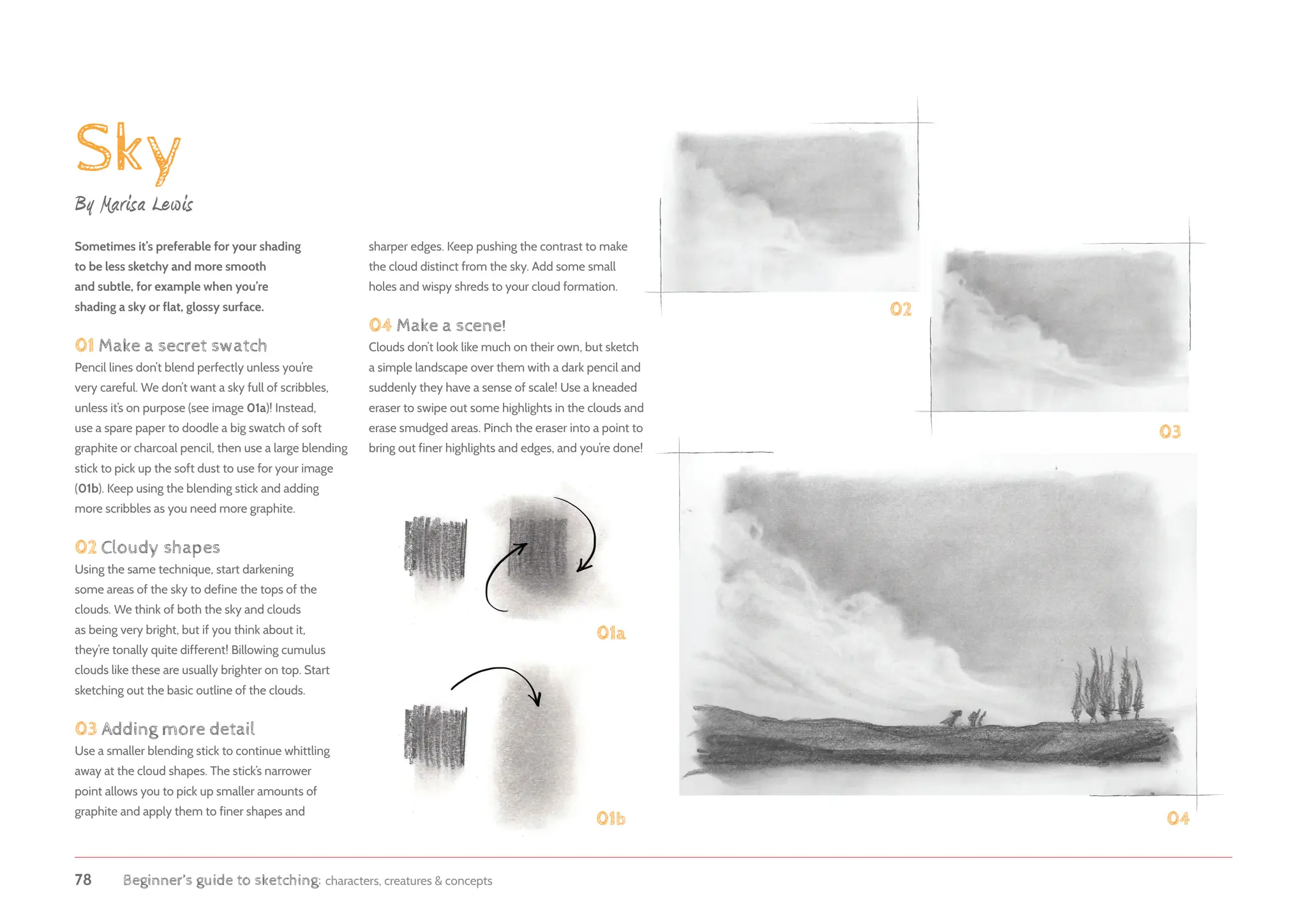
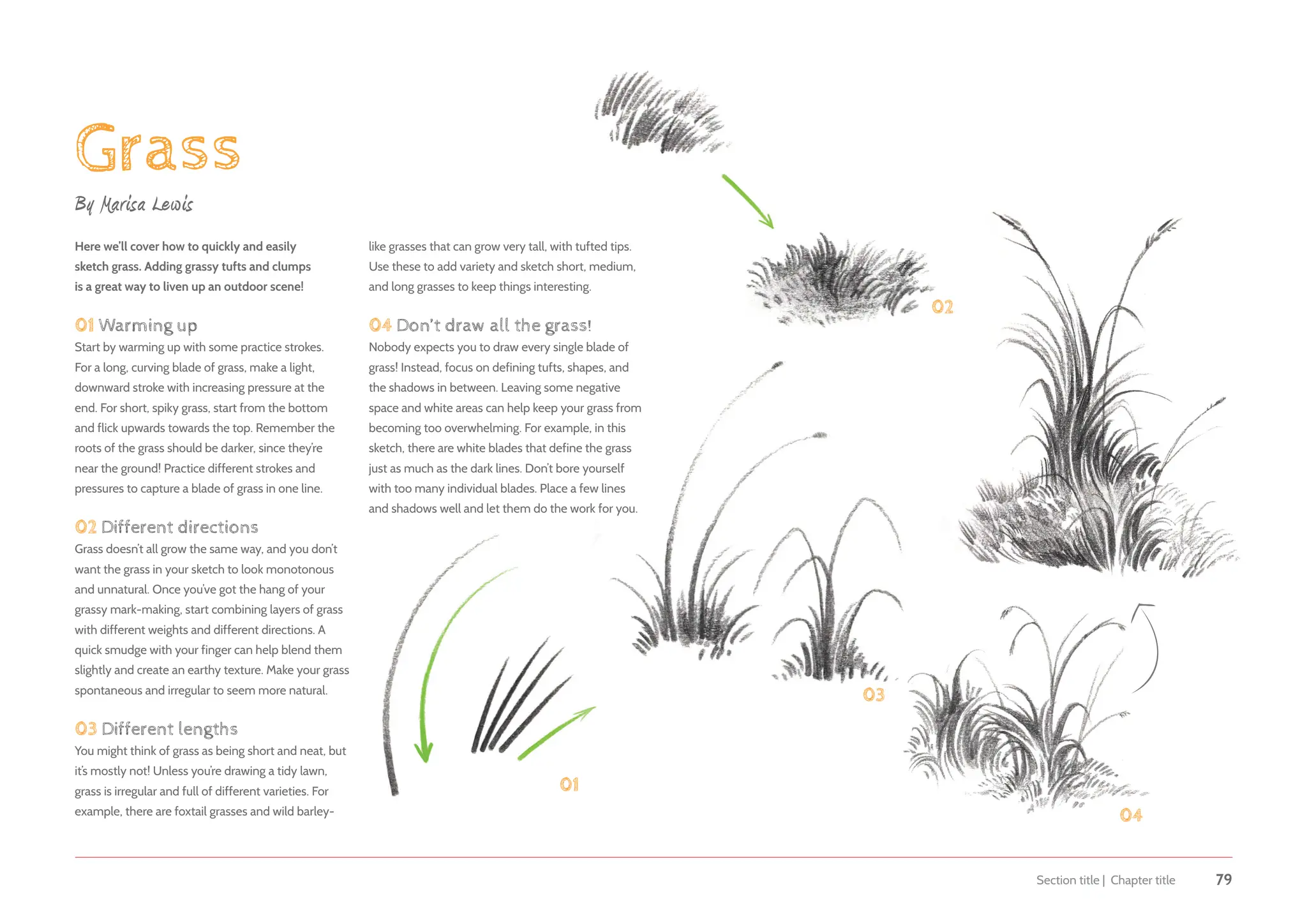
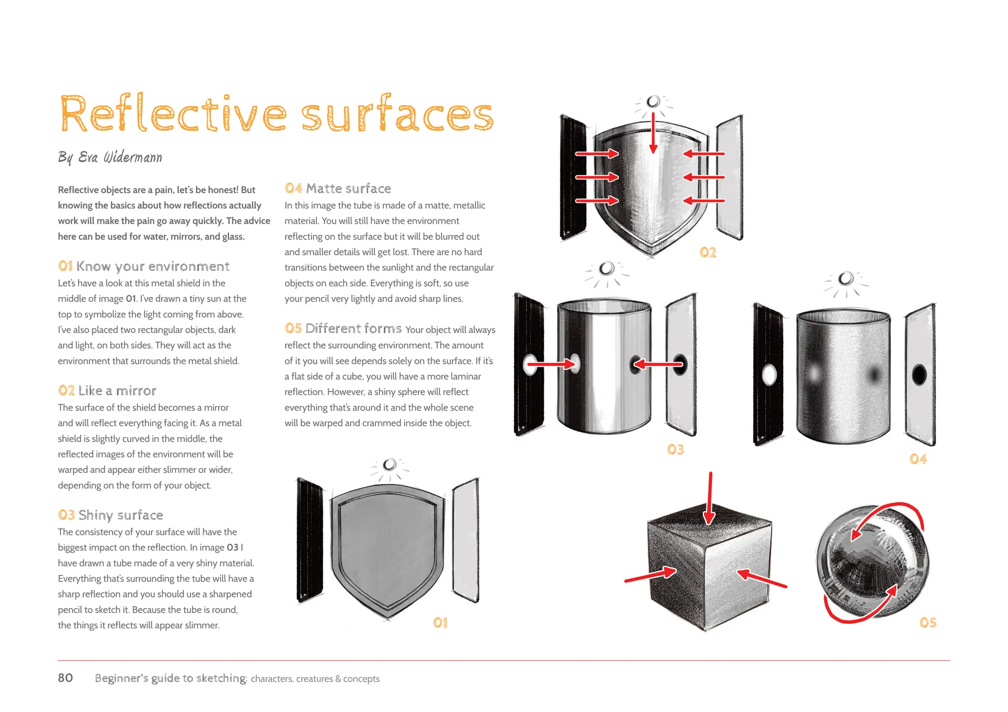
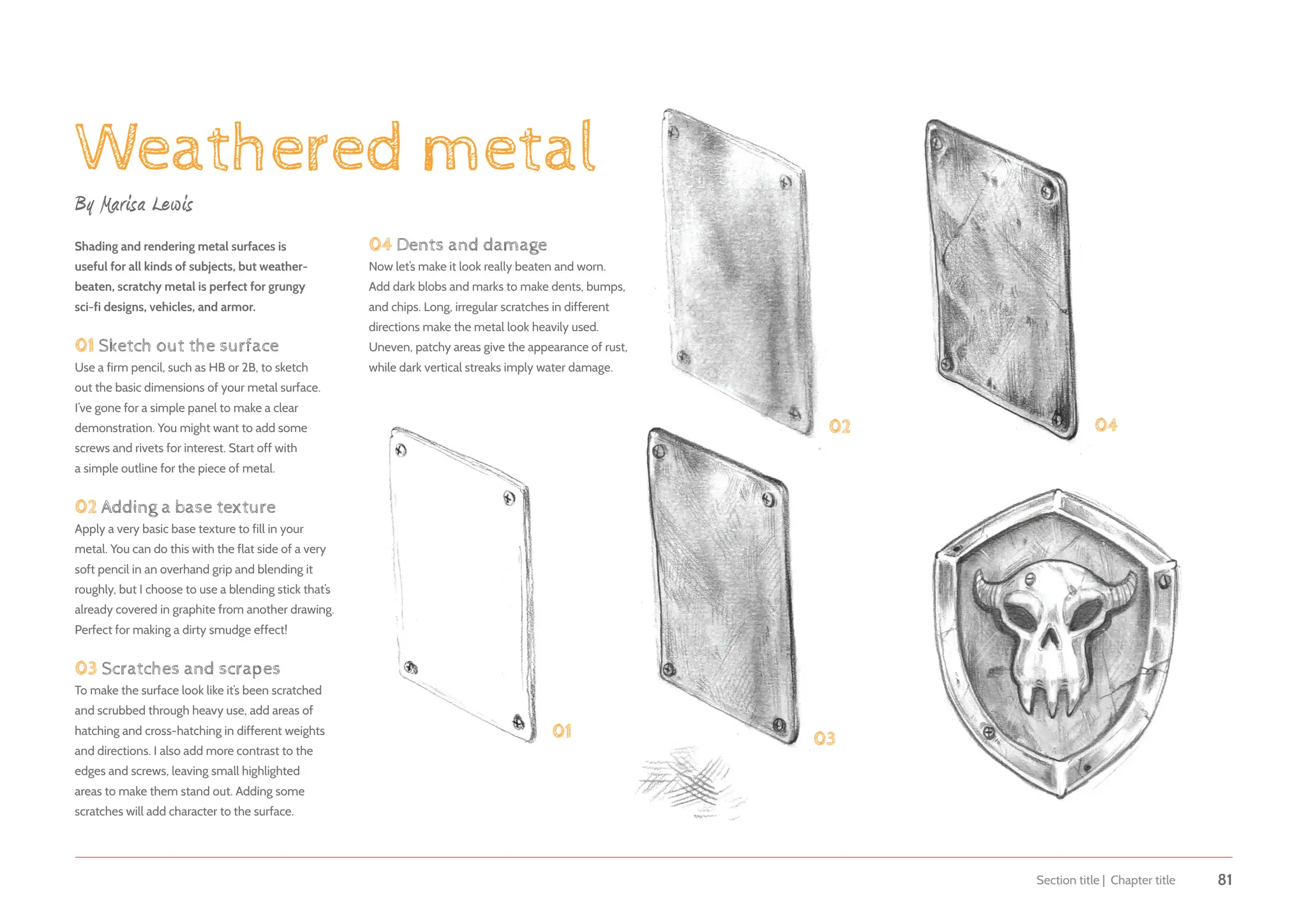
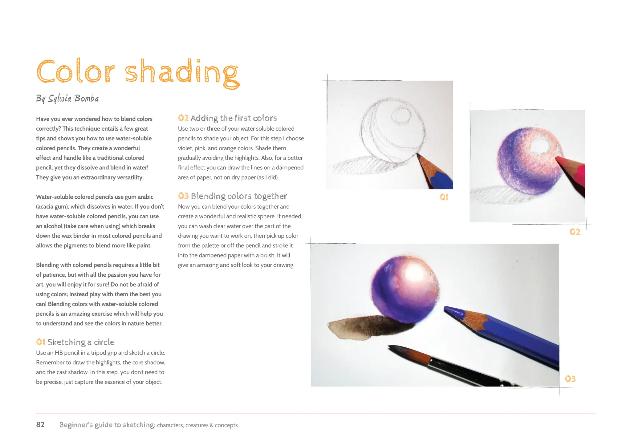
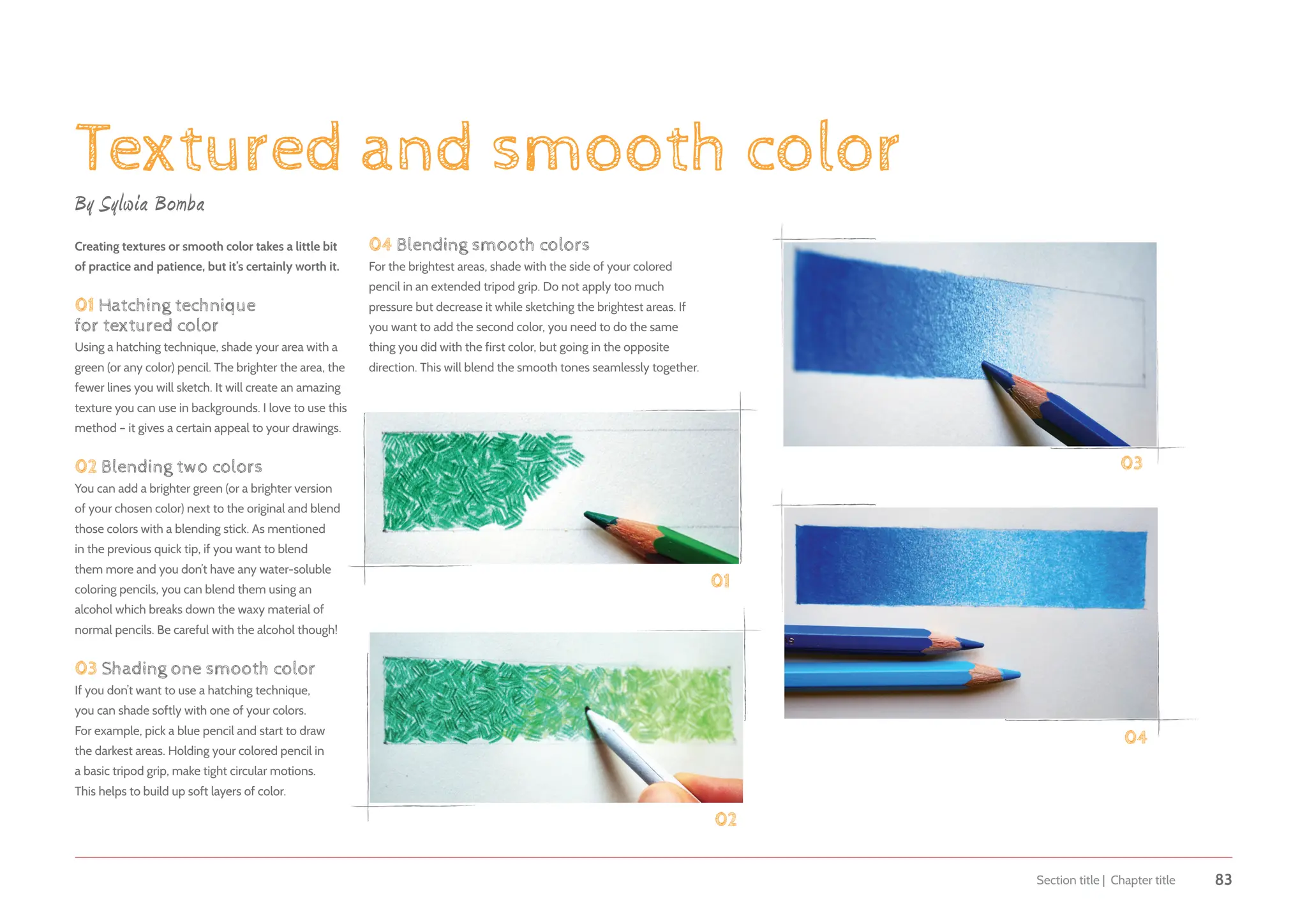
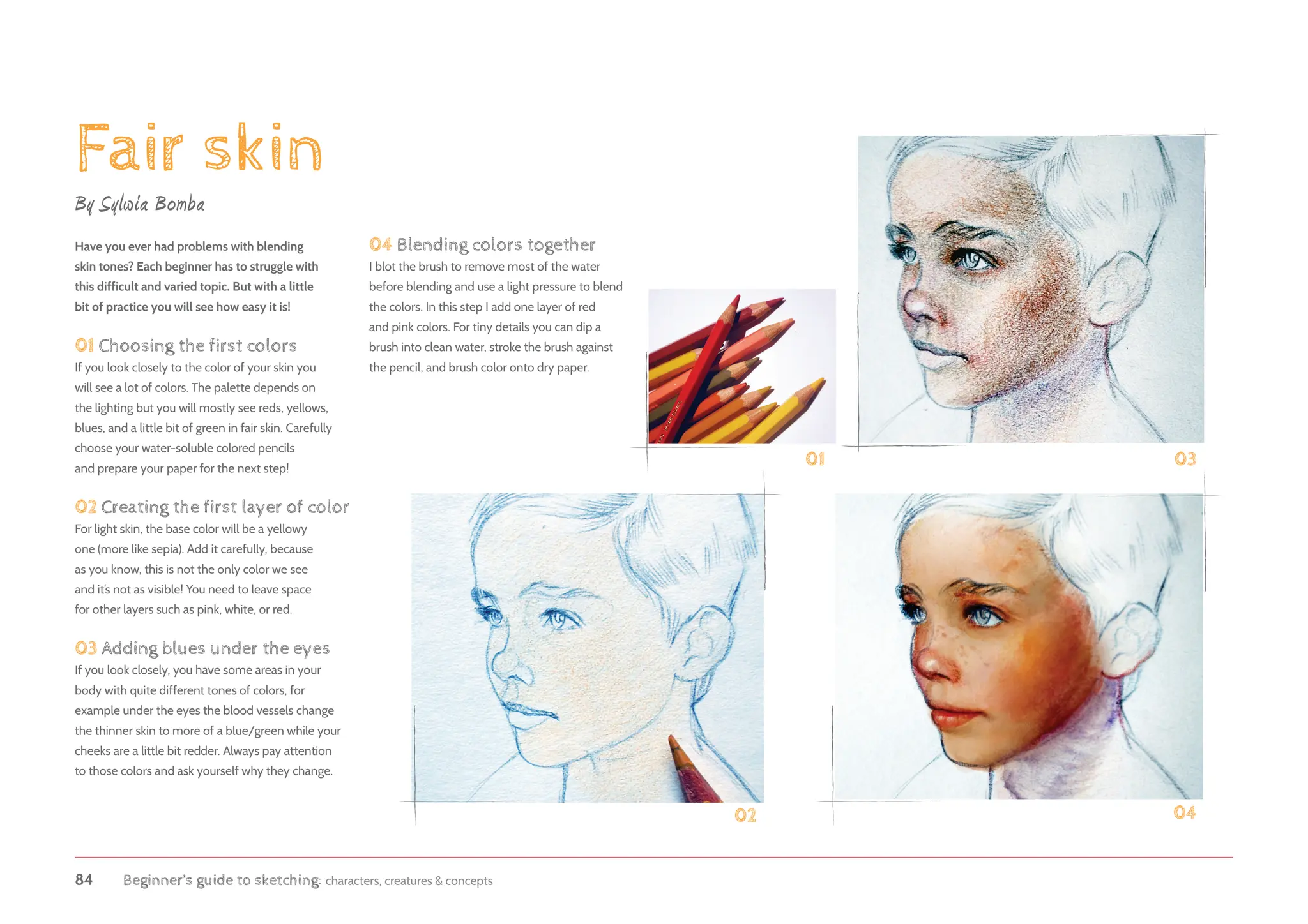
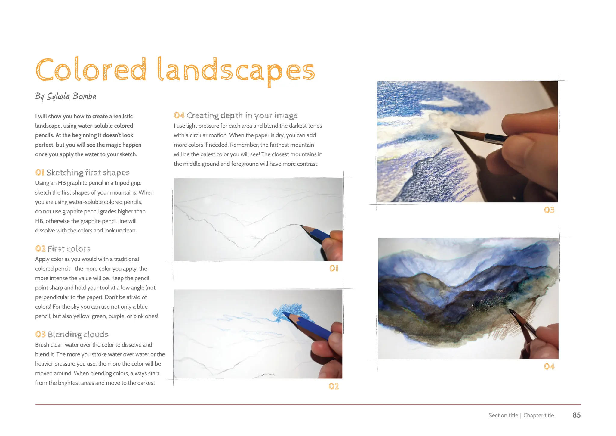
54 Beginner’s guide to sketching: characters, creatures & concepts
Sketching in color
Discover how to add color to a concept without
becoming overwhelmed by the technical details.
When I’m asked to create a character, coloring
isn’t the first thing that comes to my mind. I’m
a line artist! Pencils, pens, things that make
scribbly marks, I love those. However, I wanted
to branch out with my art and the best way to
do that is by adding color. The thing was I didn’t
want to lose the linear style that I love, which
took many years to perfect. Over the years I
have therefore played around with different
techniques that give a drawing fullness but don’t
take over it. The best technique I came up with
is actually the simplest. In this chapter I’ll show
you how I start an idea with just line art and
flat color, then step by step build up the image
with contrasting values to bring life to it.
Building up color in a sketch
can help to create volume.
Layering color helps to
define your sketch.
By Patricia Ann Lewis-MacDougall
TOOLS
• 
Watercolor pencils
• 
Watercolor crayons
• 
Colored pencils
• 
Brush pen and brushes
Although this is a more finished watercolor
image, the layers of color used to give
volume to the characters can be easily
seen in the weeds below the characters.
I initially used sienna brown
watercolor pencil to draw the
whole image, then gradually
built layer upon layer of color.
Anything less than 140 lbs hot-press paper will collapse under
all that water. This close-up detail of the Kinglet can really
show how much abuse a 140 lbs watercolor paper can take.
I packed on the Chinese white to create fluffed up
chest feathers. This thick layering technique also
gave the bird distinction from its environment.
Section title | Chapter title 55
The watercolor block that
I use is 100% cotton, 140
lbs, white hot-press paper
so it has the strength
needed for building
up layers of color.
Sketch out your lines with neutral-
colored pencils and add water
with a water brush pen.
Coloring tools for a line artist
Sketching should be spontaneous. Therefore the tools
you decide to use should cater to that. Since I like to
play around with pencils, I found myself attracted to
watercolor pencils and hot-press paper. They are the
closest things I am used to and are, in my opinion,
the easiest to carry around and to clean up after.
My drawing and painting materials
The tools that I have come to enjoy are Derwent
Inktense watercolor pencils. Not only are they a great
pencil to draw and sketch with but when water is
added, the intensity of hue is unbelievable. I use the
“tan” color for my drawings and then, with a loaded
water brush pen, I go over the line so that whatever
color I add to it, the line itself disappears into a
gorgeous flow of watercolor. A water brush pen acts
like a brush marker and therefore its never-ending
water source keeps me focused on my drawing rather
than having to stop the line to re-soak my brush.
There is one drawback I find to using a water brush pen
and that is also that it is a never-ending water source!
The pen may be great for line work but I find that it can
become a pain in actual painting. It will give water all the
time, so if you want to add a little water to the color you
beautifully laid down with panache, it will just flood the
spot. For this reason I keep this tool just for line work.
Materials and techniques
56 Beginner’s guide to sketching: characters, creatures  concepts
Adding the color
Next comes the actual coloring and I find that not only
watercolor pencils are fun, but watercolor crayons are
great to use as well. These crayons are not as well-known
as the pencils but are just as effective and I like them for
their versatility. They actually feel like regular crayons
if applied directly to the paper and can be treated as
such. When a water-loaded sable (a type of hair) brush
goes over the color, the crayon turns to paint, just like
the watercolor pencils. The heavier the application of
watercolor crayon, the thicker the paint becomes when
water is added. Adding a brush that isn’t fully loaded with
water also has its advantages. The crayon doesn’t fully
dissolve and gives the image an interesting textured look.
I’ve also applied a loaded brush to the tip of the crayons,
treating them just like watercolor pans as well as dipping
the tip of the crayon in water before applying it to paper.
A good set of brushes is important. They do not need to be
expensive but they must be able to hold their shape when
full of color. Scrunched up brushes are fine for that messy,
splattered look; however taking care of any brush will be
rewarding for years. The two brushes in the photo are the
two workhorses I use when it comes to color sketching.
Lastly, I like to “define the image” by going over that initial
drawing I started out with. What I use to do this varies from
pen and ink to pencil crayons, but sometimes I want to create
a soft, delicate line. I find a good quality Conté pencil does
this quite well. Derwent Drawing pencils are exceptionally
fine and the two colors I like to use are sepia and burnt
ocher. I’m not a fan of choosing black to “define” my work.
It’s too strong and can jar the overall look of a colored sketch.
Black might be fine for some sketch artists but give me
those wonderfully chocolate and caramel colors any day!
Next I will cover my
step-by-step process for
achieving a colored sketch
using the aforementioned
tools, materials, and
techniques.
I’ve used the techniques described
on this page in this illustration.
I define my sketch with a sepia
or burnt ocher drawing pencil.
Brush to add the water to
a color-loaded sketch.
Watercolor crayons
are a great option for
keeping some texture in
your color sketches.
Section title | Chapter title 57
Laying out initial flat color after I have doodled a design helps me
with ideas on how the design could colorfully turn out. Unlike some
of the other artists in this book, I don’t do thumbnails of an idea
before I redraw it with detail. I find redrawing a sketch loses the
spontaneity in the design, thus the process becomes dull. Sketching
out ideas, in my view, should be fun and full of imagination. The
chance to explore and discover what one can do with color is perfect
when it comes to sketching. Using flat color to start with (or just after
you scribble out an idea) is a wonderful way to determine the shape
of the design. It helps you answer questions such as where will light
and shadows be added and how heavily will values be applied.
01 The line drawing
Once you have a rough sketch, go over the lines using a
tan or light watercolor pencil. Before adding any water the
line will look like it could have been done with any ordinary
colored pencil. By using a neutral colored pencil to outline,
you will avoid overpowering your colors later on.
02Adding water
Use the water brush pen to go over the lines carefully. Notice the
line change? If this step wasn’t done, the untreated color would
blend into any color laid on top. The water keeps the line quality
and sets it behind anything that will be painted on it later.
03 Flat color
Begin to lay down a flat color. This will give you an idea of how
far you want to take your design. You can lay different colors and
shades over each other which will mix and blend when you add
water. It’s easy to see where I left areas of flat color and where I
wanted the color more intense. These intense areas can be added
just as you would use a pencil to shade in different gradients.
Applying color without thinking
Use a neutral pencil to
define your sketch.
Begin to add in your
areas of color.
Use the brush pen
to go over the lines
of your sketch.
Removing color
If you start applying the color
lightly and evenly at first, whether
it is watercolor pencil or watercolor
crayon, it is possible to gently remove
it with either a kneaded eraser or
by wetting it with a brush, then
quickly blotting the color up
with a paper towel.
03
01
02
58 Beginner’s guide to sketching: characters, creatures  concepts
04Texture
Some artists might find using
watercolor crayons a little
on the grainy side; however
I like the added life the
grain gives to a sketch.
You don’t have to add
water over the whole
image. Leave some areas
untouched to add a bit of
texture to your sketch. Even
with the first layer of colored wash, our
Kangahorse is coming together.
05Outlines
Our Kangahorse now has a few
layers of watercolor crayon built up
and I begin to go over the outlines with
my tanned drawing pencil and also a slightly
darker shade for the shadowed areas. This
helps to clean up the image and reinforce
the contours of the original sketch.
06Finishing details
I deepen the shadows with pencils, which also
helps to define areas of the sketch. I give the
Kangahorse a shaggy appearance by using the
Conté pencils to create tufts of hair on his flanks,
mane, jaw line, and tail. Adding pencil marks over
the sketch helps to crisp up the final image.
Go over the outlines
of your sketch again
once you have built
up layers of color.
A very tight close-up of
the watercolor crayon
mixing with water.
04
05
To learn more about
shading with colored
pencils, see the quick
tip on page 83.
Section title | Chapter title 59
To add more texture
and details, add more
lines with pencils.
06
60 Beginner’s guide to sketching: characters, creatures  concepts
A solid-looking sketch
The wonderful thing about sketching with color is
its ability to make things solid. Using the concept of
temperature (colors that look warm in comparison
to colors that look cool) and complementary colors
to create light and shadow, you can give a painted
sketch roundness and life. This is easy to do as we
can see in my sketch of the Kangahorse, where
I decided that the lights would be cool and the
darks would be warmer. This is seen in the green
transitioning tones on the saddle. I therefore decide
to make all the shadow tones warmer than the
highlight tones throughout the whole sketch.
On the following pages I will show you how you
can turn a simple drawing of a colored circle into
a sphere by using its complementary color and
alternating those colors with warm and cool versions
to create a volume and solid form, as I did for the
saddle on my Kangahorse.
The shadows are warm and
the highlights are cool.
Cool highlights.
Warm shadows.
Complementary colors
Complementary colors are two colors
from opposite sides of the color wheel.
If you place complementary colors next
to each other they make each other
appear brighter and more intense.
Section title | Chapter title 61
Fill in your circle with a
flat scarlet/red color.
01The actual circle
First draw your circle onto the watercolor
paper and color it in with the scarlet watercolor
crayon, leaving an area where a light source
might hit it. Don’t forget to add water!
02 The highlights
Once your circle has dried, look at the bare
spot where the light source would be. As I
mentioned earlier, my highlights are cool and
shadows are warm, therefore the light source
is cool (white), so the next color I add needs to
be warm. I use a yellow and although that isn’t
complementary to red, it’s warmer than the white.
01
02
Adding a yellow to
the red creates a
warm tone against the
white highlights.
I start by drawing a circle
lightly with an HB pencil. I use
a coaster to draw around. Make
yourself some templates and try
out different color palettes.
Warm yellow
Scarlet
TOOLS
• 
Hot-press watercolor paper
• 
Watercolor crayons (scarlet, pink, salmon,
orangey yellow, olive, dark green, and white)
• Pencil
• 
Size 8 watercolor brush
• 
Something to make a circle
with (I use a coaster)
62 Beginner’s guide to sketching: characters, creatures  concepts
03Colors near the highlights
Still working near the highlights, the next step needs
to use the opposite of that warm color used in the
previous step. This time I use two different colors; cool
pink and salmon. Once again these may not necessarily
be complementary to the yellow, but because we
are still in a highlighted area, the temperature will
be more important than the contrasting color.
04 The shadows
As we continue down the sphere, complementary
colors gain their importance. The sphere will get darker
in color, therefore warm greens will be added against
the cool scarlet of the sphere itself. If you think of the
shadows and the highlights as opposites, you can use
color theory to boost that contrast resulting in more
dynamic and more natural-looking shadows.
05 Visually red
My last step, once the sphere has dried, is to lightly
go over the sphere in its original color. If done
lightly, the contrasting colors should smooth out
and keep the sphere visually looking red.
Pink
Dark green
Olive
03
04
05
Build up several
cool colors in the
lighter areas.
Use harmonizing colors
to create depth.
Use a complementary color
in the shadow areas.
Salmon
Scarlet
Section title | Chapter title 63
Prussian blue
Raw umber
Flame red
Vermilion
Orange
Sky blue
Turquoise blue
Ultramarine blue
Purple violet Mauve
06
06 Try it with different
base colors
Try this technique with different colors to see how
the warm shadows and cool highlights work. For
example in this blue sphere the cool highlights are
made up of different cooler blue tones. The warm
shadows are where the harmonizing colors come
into play, so I have used a series of warm orangey
yellow tones which help to give the sphere depth.
Studying how colors blend together this way
will help you to see what color combinations
make up different things, such as skin. When
you look closer it isn’t just made up of pinks
and reds, but yellows, and blues too.
65 Beginner’s guide to sketching: characters, creatures  concepts
Sketching in color
Discover how to add color to a concept without
becoming overwhelmed by the technical details.
When I’m asked to create a character, coloring
isn’t the first thing that comes to my mind. I’m
a line artist! Pencils, pens, things that make
scribbly marks, I love those. However, I wanted
to branch out with my art and the best way to
do that is by adding color. The thing was I didn’t
want to lose the linear style that I love, which
took many years to perfect. Over the years I
have therefore played around with different
techniques that give a drawing fullness but don’t
take over it. The best technique I came up with
is actually the simplest. In this chapter I’ll show
you how I start an idea with just line art and
flat color, then step by step build up the image
with contrasting values to bring life to it.
Building up color in a sketch
can help to create volume.
Layering color helps to
define your sketch.
By Patricia Ann Lewis-MacDougall
TOOLS
• 
Watercolor pencils
• 
Watercolor crayons
• 
Colored pencils
• 
Brush pen and brushes
Although this is a more finished watercolor
image, the layers of color used to give
volume to the characters can be easily
seen in the weeds below the characters.
I initially used sienna brown
watercolor pencil to draw the
whole image, then gradually
built layer upon layer of color.
Anything less than 140 lbs hot-press paper will collapse under
all that water. This close-up detail of the Kinglet can really
show how much abuse a 140 lbs watercolor paper can take.
I packed on the Chinese white to create fluffed up
chest feathers. This thick layering technique also
gave the bird distinction from its environment.
Section title | Chapter title 66
The watercolor block that
I use is 100% cotton, 140
lbs, white hot-press paper
so it has the strength
needed for building
up layers of color.
Sketch out your lines with neutral-
colored pencils and add water
with a water brush pen.
Coloring tools for a line artist
Sketching should be spontaneous. Therefore the tools
you decide to use should cater to that. Since I like to
play around with pencils, I found myself attracted to
watercolor pencils and hot-press paper. They are the
closest things I am used to and are, in my opinion,
the easiest to carry around and to clean up after.
My drawing and painting materials
The tools that I have come to enjoy are Derwent
Inktense watercolor pencils. Not only are they a great
pencil to draw and sketch with but when water is
added, the intensity of hue is unbelievable. I use the
“tan” color for my drawings and then, with a loaded
water brush pen, I go over the line so that whatever
color I add to it, the line itself disappears into a
gorgeous flow of watercolor. A water brush pen acts
like a brush marker and therefore its never-ending
water source keeps me focused on my drawing rather
than having to stop the line to re-soak my brush.
There is one drawback I find to using a water brush pen
and that is also that it is a never-ending water source!
The pen may be great for line work but I find that it can
become a pain in actual painting. It will give water all the
time, so if you want to add a little water to the color you
beautifully laid down with panache, it will just flood the
spot. For this reason I keep this tool just for line work.
Materials and techniques
67 Beginner’s guide to sketching: characters, creatures  concepts
Adding the color
Next comes the actual coloring and I find that not only
watercolor pencils are fun, but watercolor crayons are
great to use as well. These crayons are not as well-known
as the pencils but are just as effective and I like them for
their versatility. They actually feel like regular crayons
if applied directly to the paper and can be treated as
such. When a water-loaded sable (a type of hair) brush
goes over the color, the crayon turns to paint, just like
the watercolor pencils. The heavier the application of
watercolor crayon, the thicker the paint becomes when
water is added. Adding a brush that isn’t fully loaded with
water also has its advantages. The crayon doesn’t fully
dissolve and gives the image an interesting textured look.
I’ve also applied a loaded brush to the tip of the crayons,
treating them just like watercolor pans as well as dipping
the tip of the crayon in water before applying it to paper.
A good set of brushes is important. They do not need to be
expensive but they must be able to hold their shape when
full of color. Scrunched up brushes are fine for that messy,
splattered look; however taking care of any brush will be
rewarding for years. The two brushes in the photo are the
two workhorses I use when it comes to color sketching.
Lastly, I like to “define the image” by going over that initial
drawing I started out with. What I use to do this varies from
pen and ink to pencil crayons, but sometimes I want to create
a soft, delicate line. I find a good quality Conté pencil does
this quite well. Derwent Drawing pencils are exceptionally
fine and the two colors I like to use are sepia and burnt
ocher. I’m not a fan of choosing black to “define” my work.
It’s too strong and can jar the overall look of a colored sketch.
Black might be fine for some sketch artists but give me
those wonderfully chocolate and caramel colors any day!
Next I will cover my
step-by-step process for
achieving a colored sketch
using the aforementioned
tools, materials, and
techniques.
I’ve used the techniques described
on this page in this illustration.
I define my sketch with a sepia
or burnt ocher drawing pencil.
Brush to add the water to
a color-loaded sketch.
Watercolor crayons
are a great option for
keeping some texture in
your color sketches.
Section title | Chapter title 68
Laying out initial flat color after I have doodled a design helps me
with ideas on how the design could colorfully turn out. Unlike some
of the other artists in this book, I don’t do thumbnails of an idea
before I redraw it with detail. I find redrawing a sketch loses the
spontaneity in the design, thus the process becomes dull. Sketching
out ideas, in my view, should be fun and full of imagination. The
chance to explore and discover what one can do with color is perfect
when it comes to sketching. Using flat color to start with (or just after
you scribble out an idea) is a wonderful way to determine the shape
of the design. It helps you answer questions such as where will light
and shadows be added and how heavily will values be applied.
01 The line drawing
Once you have a rough sketch, go over the lines using a
tan or light watercolor pencil. Before adding any water the
line will look like it could have been done with any ordinary
colored pencil. By using a neutral colored pencil to outline,
you will avoid overpowering your colors later on.
02Adding water
Use the water brush pen to go over the lines carefully. Notice the
line change? If this step wasn’t done, the untreated color would
blend into any color laid on top. The water keeps the line quality
and sets it behind anything that will be painted on it later.
03 Flat color
Begin to lay down a flat color. This will give you an idea of how
far you want to take your design. You can lay different colors and
shades over each other which will mix and blend when you add
water. It’s easy to see where I left areas of flat color and where I
wanted the color more intense. These intense areas can be added
just as you would use a pencil to shade in different gradients.
Applying color without thinking
Use a neutral pencil to
define your sketch.
Begin to add in your
areas of color.
Use the brush pen
to go over the lines
of your sketch.
Removing color
If you start applying the color
lightly and evenly at first, whether
it is watercolor pencil or watercolor
crayon, it is possible to gently remove
it with either a kneaded eraser or
by wetting it with a brush, then
quickly blotting the color up
with a paper towel.
03
01
02
69 Beginner’s guide to sketching: characters, creatures  concepts
04Texture
Some artists might find using
watercolor crayons a little
on the grainy side; however
I like the added life the
grain gives to a sketch.
You don’t have to add
water over the whole
image. Leave some areas
untouched to add a bit of
texture to your sketch. Even
with the first layer of colored wash, our
Kangahorse is coming together.
05Outlines
Our Kangahorse now has a few
layers of watercolor crayon built up
and I begin to go over the outlines with
my tanned drawing pencil and also a slightly
darker shade for the shadowed areas. This
helps to clean up the image and reinforce
the contours of the original sketch.
06Finishing details
I deepen the shadows with pencils, which also
helps to define areas of the sketch. I give the
Kangahorse a shaggy appearance by using the
Conté pencils to create tufts of hair on his flanks,
mane, jaw line, and tail. Adding pencil marks over
the sketch helps to crisp up the final image.
Go over the outlines
of your sketch again
once you have built
up layers of color.
A very tight close-up of
the watercolor crayon
mixing with water.
04
05
To learn more about
shading with colored
pencils, see the quick
tip on page 83.
Section title | Chapter title 70
To add more texture
and details, add more
lines with pencils.
06
71 Beginner’s guide to sketching: characters, creatures  concepts
A solid-looking sketch
The wonderful thing about sketching with color is
its ability to make things solid. Using the concept of
temperature (colors that look warm in comparison
to colors that look cool) and complementary colors
to create light and shadow, you can give a painted
sketch roundness and life. This is easy to do as we
can see in my sketch of the Kangahorse, where
I decided that the lights would be cool and the
darks would be warmer. This is seen in the green
transitioning tones on the saddle. I therefore decide
to make all the shadow tones warmer than the
highlight tones throughout the whole sketch.
On the following pages I will show you how you
can turn a simple drawing of a colored circle into
a sphere by using its complementary color and
alternating those colors with warm and cool versions
to create a volume and solid form, as I did for the
saddle on my Kangahorse.
The shadows are warm and
the highlights are cool.
Cool highlights.
Warm shadows.
Complementary colors
Complementary colors are two colors
from opposite sides of the color wheel.
If you place complementary colors next
to each other they make each other
appear brighter and more intense.
Section title | Chapter title 72
Fill in your circle with a
flat scarlet/red color.
01The actual circle
First draw your circle onto the watercolor
paper and color it in with the scarlet watercolor
crayon, leaving an area where a light source
might hit it. Don’t forget to add water!
02 The highlights
Once your circle has dried, look at the bare
spot where the light source would be. As I
mentioned earlier, my highlights are cool and
shadows are warm, therefore the light source
is cool (white), so the next color I add needs to
be warm. I use a yellow and although that isn’t
complementary to red, it’s warmer than the white.
01
02
Adding a yellow to
the red creates a
warm tone against the
white highlights.
I start by drawing a circle
lightly with an HB pencil. I use
a coaster to draw around. Make
yourself some templates and try
out different color palettes.
Warm yellow
Scarlet
TOOLS
• 
Hot-press watercolor paper
• 
Watercolor crayons (scarlet, pink, salmon,
orangey yellow, olive, dark green, and white)
• Pencil
• 
Size 8 watercolor brush
• 
Something to make a circle
with (I use a coaster)
73 Beginner’s guide to sketching: characters, creatures  concepts
03Colors near the highlights
Still working near the highlights, the next step needs
to use the opposite of that warm color used in the
previous step. This time I use two different colors; cool
pink and salmon. Once again these may not necessarily
be complementary to the yellow, but because we
are still in a highlighted area, the temperature will
be more important than the contrasting color.
04 The shadows
As we continue down the sphere, complementary
colors gain their importance. The sphere will get darker
in color, therefore warm greens will be added against
the cool scarlet of the sphere itself. If you think of the
shadows and the highlights as opposites, you can use
color theory to boost that contrast resulting in more
dynamic and more natural-looking shadows.
05 Visually red
My last step, once the sphere has dried, is to lightly
go over the sphere in its original color. If done
lightly, the contrasting colors should smooth out
and keep the sphere visually looking red.
Pink
Dark green
Olive
03
04
05
Build up several
cool colors in the
lighter areas.
Use harmonizing colors
to create depth.
Use a complementary color
in the shadow areas.
Salmon
Scarlet
Section title | Chapter title 74
Prussian blue
Raw umber
Flame red
Vermilion
Orange
Sky blue
Turquoise blue
Ultramarine blue
Purple violet Mauve
06
06 Try it with different
base colors
Try this technique with different colors to see how
the warm shadows and cool highlights work. For
example in this blue sphere the cool highlights are
made up of different cooler blue tones. The warm
shadows are where the harmonizing colors come
into play, so I have used a series of warm orangey
yellow tones which help to give the sphere depth.
Studying how colors blend together this way
will help you to see what color combinations
make up different things, such as skin. When
you look closer it isn’t just made up of pinks
and reds, but yellows, and blues too.
75 Beginner’s guide to sketching: characters, creatures  concepts
Section title | Chapter title 76
Quick tips
Now that you’re starting to find your way, we’ve compiled a range of useful tips and advice from the experts
to boost your sketching knowledge. From fur to feathers, to shading different surfaces, this section will help
you tackle tricky subjects and give you the skills you need to take your own sketches to the next level.
66 Beginner’s guide to sketching: characters, creatures  concepts
Stylized head
01
02
04
03
Learn the basic shapes and you will be able to draw
anything! Here I will show you how shapes help me
to draw a stylized human head and its features.
01 Simplify the volumes
The first step simply entails playing with basic shapes,
defining the structure of the head and trying to capture
the gesture. Keep it simple as the detail will come
later. Start with a sphere and a directional cross.
02 Playing about
By moving the cross around the sphere you can
dramatically change the look and feel of a character. It
also helps you to choose the direction the head is facing.
If your character is looking up, the horizontal cross line
will be higher up; if they are looking to the side, one side
of the horizontal line will be longer than the other.
03 Looking for shapes
After the shape study, I start to add the details,
positioning elements where I think they are correct.
Visualizing three-dimensional forms allows me to
avoid flatness in the image and gives a lively feel.
04 Practice
Finding the right shapes is all about practice. You have
infinite possibilities to squash, stretch, and adapt shapes
to please your eyes. Now you know how shapes can
help you, try to add them into your drawing process!
By Leonardo Sala
Section title | Chapter title 67
Stylized facial features
By Leonardo Sala
As with drawing the head, drawing facial
features is about laying down the shapes that
allow you to build a solid base on which it will
be easier to add the rest of the image. You
should try thinking in three-dimensional forms;
if you train your brain to process in three-
dimensional volumes, the job gets easier.
01 Eyes
Think of your eyeballs as three-dimensional
spherical shapes that the eyelids wrap around.
The eyelids can be simplified into a bean-like
shape. Experiment with stretching and squashing
these spheres to creature different expressions.
02 Noses
There are infinite nose shapes you can play with.
Again, simplify them down into basic shapes. I
usually start with a circle to define the position
of the nose on the face. Then I add shape details
to the circle, such as a bump on the bridge of
the nose. Think of the bridge as flat planes
that you can view from different angles.
03 Mouth
Mouths can be drawn quite simply by suggesting
their volumes and form. Start off by drawing
a rough line (this will be the opening of the
mouth), then build the lips around it. This can
be done with a gesture line or by building up
01
02
03
04
the volume through shading. You can simplify
it even further by marking in solid outlines.
04 Ears
Every artist has their own shortcut for drawing
ears. I prefer to use an oval shape and draw a
“6” shape in the middle; sometimes I draw it
back to front. This gives you the rough form
of the inner and outer ear which you can then
define by shading more darkly in the middle
and areas where the out ear blocks the light.
68 Beginner’s guide to sketching: characters, creatures  concepts
Gesture drawing
01
02
03
04
05
The important thing about gesture drawing: don’t
be afraid. You need to draw quickly and there’s no
time to think about possible mistakes, so be bold!
01 Loosen up!
Just like with sports, artists’ hands need to warm up
before speed-sketching. Take a minute or two and
draw loose lines and curves. You want to tackle those
gestures with just a few simple strokes afterwards.
02 Know the basics
Gesture drawing is all about capturing the form
and pose in a very short amount of time. A basic
understanding of anatomy is essential. However,
don’t worry about making mistakes. In order to be
fast, you need knowledge of the important points
of the body and how they connect. Draw guidelines
and mark the joints, then capture the shape.
03 Quick sketching with
geometric forms
Once you internalize the very basics of anatomy
and quickly measuring the figure, you can try two
different ways of drawing. Hopefully you’ll find
out what you’re comfortable with. One method
is using only lines and geometric shapes to
build up the body – the alignment of shoulders
and hips, the curve of the spine, and so on.
By Eva Widermann
04 Quick sketching with
loose lines and forms
I personally find the second method most
enjoyable, where I draw round shapes and
energetic lines without paying too much
attention to how it looks; it just needs
to sit in the right place. Don’t worry if it
doesn’t work out immediately though, the
more you practice, the easier you will find
measuring and drawing the human body.
05 Balance and foundation
In gesture drawing there’s no need for a face.
You can quickly draw in the eyes, nose, and
mouth if you like, but it’s not important.
Rather, emphasize the movement and
direction of the body as a whole. Draw
rough lines where the balancing points are
and build up your drawing around them.
Section title | Chapter title 69
Hands
By Leonardo Sala
Hands can be a tricky thing to get your head
around. Here are some tips to make your life
a bit easier when you’re drawing hands.
01 Basic proportion
I always find it interesting that hands are the part
of our body that we look at most often during
the day, and at the same time are the hardest
thing to draw for the majority of artists. Let’s
start by learning about hands from their basic
proportions, which I’ve drafted out in image 01.
02 Basic elements
In order to simplify the hand’s anatomy, I use
rectangular and cylindrical shapes for the palm
and fingers. This way it is easier to think in three
dimensions. Other important elements to consider
are the spherical knuckles. I usually simplify the
palm muscles into three big shapes. Build your hand
up using these basic shapes. Remember to choose
between round or square shapes to draw the fingers.
03 The process
When I sketch hands, I always start with a
basic rough shape, focusing on dynamism and
silhouette. Then I start adding some basic shapes
to define volumes. Finally I add some details,
trying to preserve the solid look of the shapes.
01
03
04
04 Common mistakes
Pay attention to the fingers! They aren’t straight, and
knuckles aren’t aligned, but everything follows arcs.
These are, in my opinion, the most important things
to know if you want to draw solid and credible hands
with the anatomical knowledge of a beginner artist.
02
Rough lines. Details. More details.
Use shapes. Think in three dimensions.
70 Beginner’s guide to sketching: characters, creatures  concepts
Silhouettes and thumbnails
By Leonardo Sala
Have you ever noticed that every important
character in an animation movie is recognizable
from their shadow alone? This magic has a name:
the silhouette. The silhouette is “the business
card” of your character and it’s strictly related
to the shapes it is composed of. The purpose of
finding a strong and interesting silhouette is to
create an easily recognizable character that will
remain clear in the visual memory of the viewer.
Since my artistic background is strongly influenced
by animation, I try to research silhouettes not only
for the creation of static characters but in every
dynamic pose I draw. In motion pictures, in fact,
viewers should be able to immediately understand
what the character is doing at any given time.
01 A readable silhouette
To test out whether your characters are readable
as silhouettes, grab a piece of tracing paper (or add
another layer in your digital painting software) and
trace around your character, filling it in with a solid
color. If you look at the examples here, it’s clear that
the first girl (01a) is holding a mug, but what about
the second one (01b)? It’s not as clear. A great way
to test your silhouettes is to show them to your
friends or colleagues and ask them what they see.
If the answer is correct, the silhouette works!
01a
02
02 Searching for shapes
Another great exercise to practice finding
silhouettes and also for fighting artist’s block
is to scribble on a sheet of paper with a pencil
without looking down. Then take another color
and find a silhouette or shape that inspires you,
and turn it into a character or creature sketch!
01b
Section title | Chapter title 71
Curly hair
By Eva Widermann
When it comes to drawing curls, most people dread
these quirky strands. However, if you understand
how they work, it’s actually easier than you think.
01 Simple lines
Draw two straight vertical lines; these will be your
guidelines for the width and length of the curl. Now
loosely draw a wavy line down between the two
lines. Double this wavy line a little below the first.
You can already see a curly ribbon forming before
you. Now connect the open parts on the sides,
remove the guidelines and add some details.
02 Variety is key
Now that you’ve learned the basic form of a curl, try
to add some variety to the shape and make your
curls lively and bouncy. Change the width of the
ribbon, make it slimmer or thicker, split it and pull the
curl together, or loosen it up. Most importantly, look
at hair and how it behaves, simplify, and then draw.
03 Curly hairstyle
To make the curls look natural and lively, add a
bit of curve to your guidelines to give the hair
some direction and flow. Now draw in the ribbon
as described earlier and clean up the lines. With
this technique you can add one curly strand after
another directly onto the head. Try changing
the flow or width to add some variety too.
01
02
03
04
04 Curls in perspective
The same technique is also very useful when
it comes to drawing curls in perspective,
which can sometimes be difficult. Use the
guidelines to keep the shape of your curl.
72 Beginner’s guide to sketching: characters, creatures  concepts
Straight hair
By Leonardo Sala
Here we will look at using dynamic
lines to sketch a straight hairstyle.
01 Draw with your shoulder,
not with your wrist!
This is my secret technique for creating curved,
sensual lines. When I draw straight, dynamic
hair I usually start with the masses, creating a
general shape. Drawing from my shoulder, I
try to figure out the volume and the masses
of the hair until they look good to me.
02 Filling out the volume
In the second phase I start adding the elbow to
the movement in order to precisely define the
flow in the masses and volume. Remember to
think in three dimensions! When guiding your
lines, constantly think about the direction the hair
is going and let the lines follow that movement.
03 Finer details
Towards the end you can use your wrist
for the last touches to the hair, such as the
thin lines or corrections. Personally, I like
to add some short sketchy lines in order to
emphasize volumes and dynamism. But still,
it’s all about practice. My advice for learning
where to put what? Use photo references!
01
02 03 04
04 Fluid lines
Letting the shoulder guide your pencil gives you
access to sketchy and fluid lines. It may be difficult
at first, but with practice you will be able to give
your sketches the emotion you’re aiming for.
Section title | Chapter title 73
Drawing creatures
By Tiffany Turrill
Artists are often encouraged to take on
figure drawing sessions to master the human
anatomy, but what happens if you’re trying to
draw creatures that aren’t necessarily real?
01 Look at real animals
and draw them!
I’m designing a demon-type creature so I’ve
pulled references of cane toads and vampire
bats. I start by loosely familiarizing with these
real animals’ anatomy and shapes. Both
animals are small and roughly circular, so they
basically work as oblong ribcages with legs.
Work by drawing muscle groups quickly.
02 Build your creature
General shapes are established, so it’s time to make
this little frog-bat into a real monster. Tracing paper
is great for layering over and over to refine a design
and find pleasing shapes. Remember to keep your
wrist gently firm! Keep your movements fluid and
try to hold off from getting too detailed just yet.
03 Refine the design
Now that we have a basic idea of what the
rough shape and structure of the creature is,
we can go forward with refining the sketch.
Add spines, scales, fur, and get crazy with the
feet and face! The basic structure is already
01
02
03 04
established. I added some embellishments to
the facial structure, tusks, and a gnarly tongue!
04 Explore poses and
try new angles
While still keeping your hand movements
loose, try a few small thumbnails to give your
creature a sense of movement and weight. This
visual short-hand will help you find poses for
later, more refined artwork. If you’re designing
a creature, it won’t likely be stationary! What
kind of walking gait does he have? Is it curious?
Aggressive? Give him a personality and have fun!
74 Beginner’s guide to sketching: characters, creatures  concepts
Creature shape
By Tiffany Turrill
Familiarizing yourself with animal anatomy can get
very technical very quickly, so here are some tips
on how to approach animal construction without
necessarily drawing every bone and muscle.
01 Start with a profile view
This is the easiest way to get a sense of the animal’s
full length and shape. Block in the major shapes:
ribs, hips, and shoulders. Try to be mindful of
the musculature and its function when roughly
sketching. Big predators such as these cats have
huge neck and shoulder muscles for hauling prey.
02 Try a 3/4 position breakdown
Lightly establish a midline and build volumetric
shapes to keep your perspective in check. This helps
if a creature has a complex integument such as fur or
feathers covering its underlying anatomy. I find feline
faces challenging, so it’s helpful to remember that
their skulls are boxes with a gently sloping snout.
03 Work along the spine
If you’re drawing vertebrates, the spine and ribs are
your anchor point for any drawing. This becomes
particularly important when creating less static poses
or working from more challenging angles. Tigers
are quite robust, yet they have long and flexible
bodies despite their heft. Here I worked by building
round muscle shapes off of the bunched-up spine.
01
02
03
04
04 Volume, volume, volume
Most animals have some sort of pattern
or texture. Quickly lay in suggested
fur, feathers, scales, and so on, while
conforming to the muscle and skin volume.
The ribs and pelvis are highlighted here.
It helps me keep the perspective on
track as I begin to lay in the striped fur.
Section title | Chapter title 75
Creature eyes
By Tiffany Turrill
When it comes to creature design, the eyes
make the face. Here are some tips on how
to draw engaging animal peepers!
01 Start with the skull
Often a lot of skull space is devoted to eyes
and their structures. Use a loose gesture
grip on the pencil to sketch in the skull. This
velociraptor skull has pretty large structures
dedicated to sight as it was a visual hunter.
02 Musculature and
other eye structures
Remember that although eyeballs are spheres, you’re
really only seeing a portion of it. You can quickly
sketch these in to help you suggest volume and keep
eyelids in perspective. Some vertebrates, including
dinosaurs, have a sclerotic ring under the white of
the eye to support oblong or marine eye structures.
03 Observe and experiment
Optical structures have a tremendous variety of
shapes and function, even among vertebrates.
Keep your creature’s lifestyle in mind and use this to
inform its eye shape and texture. Marine eyeballs
tend to be a flat matte, while terrestrial animals have
a shiny liquid cornea to help the lens focus in the air.
04 Reflections and shadows
Build the chosen eye type out and refine it.
Eyelids cast a shadow and light often reflects
along the visible eyeball in a semicircle. Being
of a shiny, moist consistency, eyes reflect light,
are often cast in shadow, and are brighter in
the center on account of their volume.
01
02
03
04
76 Beginner’s guide to sketching: characters, creatures  concepts
Scaly creatures
By Tiffany Turrill
Whether you’re tackling dragons or crocodiles,
here’s an easy, shorthand way to draw scales that
saves time, looks nice, and won’t cripple your hand!
01 Understand the shape
of your creature
Develop the creature beforehand with volume in
mind, but scale-free. If you jump into the scales
too early on, you may accidentally distort the
perspective or body proportions. This design is
based around the bodies of sea lions, otters, and
turtles (and of course, octopuses), so scales will
make these disparate parts a bit more cohesive.
02 Block in the largest
scale patches
Portions of animal’s bodies tend to be more
heavily armored on their backs and outer sides
of the limbs, so these are the locations where
the largest clusters of scales would be. I block
these in along with the tentacle suckers. This
also works for feathers and tufts of fur.
03 Suggesting volume
through value
Work smoothly and quickly to build up more
scales in areas where you’d like to suggest more
volume. Pay attention to joints and areas of large
muscle groups such as shoulders and thighs.
Scales are rarely ever seen at a direct angle. They
almost never appear as full a circle, so often
simple lightly curved hatches give a scaly effect.
04 Distance via level of detail
To avoid from overcrowding your creature, leave
blank patches, especially on surfaces that are further
away from the viewer. This allows a bit more visual
breathing room. In the completed drawing I make
sure I keep the furthermost flippers relatively scale-
free, but there’s still enough scaliness to go around!
01
02
03
04
Section title | Chapter title 77
Fur and feathers
By Eva Widermann
Just like human hair, drawing fur and feathers is all
about learning the details and the structure – then
simplifying it to create the right look for your image.
01 The structure of
fur and feathers
A strand of fur is thicker at the root and thins out
towards the end, which makes it very flexible and
helps it bend easily. A feather is constructed to
be quite sturdy, especially the flight feathers from
the wings and tail. One hair is basically one pencil
stroke but a single feather is more like a full shape.
02 Too much is too much
One mistake I often see is when people draw
hair-by-hair to fill a space. Logic would tell us
that this is correct, after all it is a lot of hair if you
look closely. However, if you step back, all you
can see is a fluffy surface, so you have to make
out the characteristics and draw it as a whole.
03 The difference between
fur and feathers
Because fur can be long and fine, it behaves
differently than stiff feathers. Always draw fur
using light and flowing lines which come directly
from your wrist. Let the fur flow in some different
directions, always keeping in mind that the ends get
thinner. Feathers will point in the same direction
and form several layers, overlapping like a fan.
04 Different shapes
for a different look
Do your research and you’ll find out how
many different shapes of feathers actually
exist. They are beautiful by themselves
but once you put them together they can
create a whole new look for the plumage.
05 Variety of fur
The same applies to fur; there are many
different forms of fur and each has a unique
set of characteristics. It’s important to keep
the hair flowing in a direction depending
on what kind of fur you like to draw. While
long and straight fur will always grow in
the same direction, a short and fluffy coat
will be chaotic. Play around with it!
01
02
03
04
05
78 Beginner’s guide to sketching: characters, creatures  concepts
Sky
By Marisa Lewis
Sometimes it’s preferable for your shading
to be less sketchy and more smooth
and subtle, for example when you’re
shading a sky or flat, glossy surface.
01 Make a secret swatch
Pencil lines don’t blend perfectly unless you’re
very careful. We don’t want a sky full of scribbles,
unless it’s on purpose (see image 01a)! Instead,
use a spare paper to doodle a big swatch of soft
graphite or charcoal pencil, then use a large blending
stick to pick up the soft dust to use for your image
(01b). Keep using the blending stick and adding
more scribbles as you need more graphite.
02 Cloudy shapes
Using the same technique, start darkening
some areas of the sky to define the tops of the
clouds. We think of both the sky and clouds
as being very bright, but if you think about it,
they’re tonally quite different! Billowing cumulus
clouds like these are usually brighter on top. Start
sketching out the basic outline of the clouds.
03 Adding more detail
Use a smaller blending stick to continue whittling
away at the cloud shapes. The stick’s narrower
point allows you to pick up smaller amounts of
graphite and apply them to finer shapes and
01b
02
03
04
sharper edges. Keep pushing the contrast to make
the cloud distinct from the sky. Add some small
holes and wispy shreds to your cloud formation.
04 Make a scene!
Clouds don’t look like much on their own, but sketch
a simple landscape over them with a dark pencil and
suddenly they have a sense of scale! Use a kneaded
eraser to swipe out some highlights in the clouds and
erase smudged areas. Pinch the eraser into a point to
bring out finer highlights and edges, and you’re done!
01a
Section title | Chapter title 79
Grass
By Marisa Lewis
Here we’ll cover how to quickly and easily
sketch grass. Adding grassy tufts and clumps
is a great way to liven up an outdoor scene!
01 Warming up
Start by warming up with some practice strokes.
For a long, curving blade of grass, make a light,
downward stroke with increasing pressure at the
end. For short, spiky grass, start from the bottom
and flick upwards towards the top. Remember the
roots of the grass should be darker, since they’re
near the ground! Practice different strokes and
pressures to capture a blade of grass in one line.
02 Different directions
Grass doesn’t all grow the same way, and you don’t
want the grass in your sketch to look monotonous
and unnatural. Once you’ve got the hang of your
grassy mark-making, start combining layers of grass
with different weights and different directions. A
quick smudge with your finger can help blend them
slightly and create an earthy texture. Make your grass
spontaneous and irregular to seem more natural.
03 Different lengths
You might think of grass as being short and neat, but
it’s mostly not! Unless you’re drawing a tidy lawn,
grass is irregular and full of different varieties. For
example, there are foxtail grasses and wild barley-
01
02
03
04
like grasses that can grow very tall, with tufted tips.
Use these to add variety and sketch short, medium,
and long grasses to keep things interesting.
04 Don’t draw all the grass!
Nobody expects you to draw every single blade of
grass! Instead, focus on defining tufts, shapes, and
the shadows in between. Leaving some negative
space and white areas can help keep your grass from
becoming too overwhelming. For example, in this
sketch, there are white blades that define the grass
just as much as the dark lines. Don’t bore yourself
with too many individual blades. Place a few lines
and shadows well and let them do the work for you.
80 Beginner’s guide to sketching: characters, creatures  concepts
Reflective surfaces
By Eva Widermann
Reflective objects are a pain, let’s be honest! But
knowing the basics about how reflections actually
work will make the pain go away quickly. The advice
here can be used for water, mirrors, and glass.
01 Know your environment
Let’s have a look at this metal shield in the
middle of image 01. I’ve drawn a tiny sun at the
top to symbolize the light coming from above.
I’ve also placed two rectangular objects, dark
and light, on both sides. They will act as the
environment that surrounds the metal shield.
02 Like a mirror
The surface of the shield becomes a mirror
and will reflect everything facing it. As a metal
shield is slightly curved in the middle, the
reflected images of the environment will be
warped and appear either slimmer or wider,
depending on the form of your object.
03 Shiny surface
The consistency of your surface will have the
biggest impact on the reflection. In image 03 I
have drawn a tube made of a very shiny material.
Everything that’s surrounding the tube will have a
sharp reflection and you should use a sharpened
pencil to sketch it. Because the tube is round,
the things it reflects will appear slimmer. 01
02
03
04
05
04 Matte surface
In this image the tube is made of a matte, metallic
material. You will still have the environment
reflecting on the surface but it will be blurred out
and smaller details will get lost. There are no hard
transitions between the sunlight and the rectangular
objects on each side. Everything is soft, so use
your pencil very lightly and avoid sharp lines.
05 Different forms Your object will always
reflect the surrounding environment. The amount
of it you will see depends solely on the surface. If it’s
a flat side of a cube, you will have a more laminar
reflection. However, a shiny sphere will reflect
everything that’s around it and the whole scene
will be warped and crammed inside the object.
Section title | Chapter title 81
Weathered metal
By Marisa Lewis
Shading and rendering metal surfaces is
useful for all kinds of subjects, but weather-
beaten, scratchy metal is perfect for grungy
sci-fi designs, vehicles, and armor.
01 Sketch out the surface
Use a firm pencil, such as HB or 2B, to sketch
out the basic dimensions of your metal surface.
I’ve gone for a simple panel to make a clear
demonstration. You might want to add some
screws and rivets for interest. Start off with
a simple outline for the piece of metal.
02 Adding a base texture
Apply a very basic base texture to fill in your
metal. You can do this with the flat side of a very
soft pencil in an overhand grip and blending it
roughly, but I choose to use a blending stick that’s
already covered in graphite from another drawing.
Perfect for making a dirty smudge effect!
03 Scratches and scrapes
To make the surface look like it’s been scratched
and scrubbed through heavy use, add areas of
hatching and cross-hatching in different weights
and directions. I also add more contrast to the
edges and screws, leaving small highlighted
areas to make them stand out. Adding some
scratches will add character to the surface.
01
02
03
04
04 Dents and damage
Now let’s make it look really beaten and worn.
Add dark blobs and marks to make dents, bumps,
and chips. Long, irregular scratches in different
directions make the metal look heavily used.
Uneven, patchy areas give the appearance of rust,
while dark vertical streaks imply water damage.
82 Beginner’s guide to sketching: characters, creatures  concepts
Color shading
By Sylwia Bomba
Have you ever wondered how to blend colors
correctly? This technique entails a few great
tips and shows you how to use water-soluble
colored pencils. They create a wonderful
effect and handle like a traditional colored
pencil, yet they dissolve and blend in water!
They give you an extraordinary versatility.
Water-soluble colored pencils use gum arabic
(acacia gum), which dissolves in water. If you don’t
have water-soluble colored pencils, you can use
an alcohol (take care when using) which breaks
down the wax binder in most colored pencils and
allows the pigments to blend more like paint.
Blending with colored pencils requires a little bit
of patience, but with all the passion you have for
art, you will enjoy it for sure! Do not be afraid of
using colors; instead play with them the best you
can! Blending colors with water-soluble colored
pencils is an amazing exercise which will help you
to understand and see the colors in nature better.
01 Sketching a circle
Use an HB pencil in a tripod grip and sketch a circle.
Remember to draw the highlights, the core shadow,
and the cast shadow. In this step, you don’t need to
be precise, just capture the essence of your object.
01
02
03
02 Adding the first colors
Use two or three of your water soluble colored
pencils to shade your object. For this step I choose
violet, pink, and orange colors. Shade them
gradually avoiding the highlights. Also, for a better
final effect you can draw the lines on a dampened
area of paper, not on dry paper (as I did).
03 Blending colors together
Now you can blend your colors together and
create a wonderful and realistic sphere. If needed,
you can wash clear water over the part of the
drawing you want to work on, then pick up color
from the palette or off the pencil and stroke it
into the dampened paper with a brush. It will
give an amazing and soft look to your drawing.
Section title | Chapter title 83
Textured and smooth color
By Sylwia Bomba
Creating textures or smooth color takes a little bit
of practice and patience, but it’s certainly worth it.
01 Hatching technique
for textured color
Using a hatching technique, shade your area with a
green (or any color) pencil. The brighter the area, the
fewer lines you will sketch. It will create an amazing
texture you can use in backgrounds. I love to use this
method – it gives a certain appeal to your drawings.
02 Blending two colors
You can add a brighter green (or a brighter version
of your chosen color) next to the original and blend
those colors with a blending stick. As mentioned
in the previous quick tip, if you want to blend
them more and you don’t have any water-soluble
coloring pencils, you can blend them using an
alcohol which breaks down the waxy material of
normal pencils. Be careful with the alcohol though!
03 Shading one smooth color
If you don’t want to use a hatching technique,
you can shade softly with one of your colors.
For example, pick a blue pencil and start to draw
the darkest areas. Holding your colored pencil in
a basic tripod grip, make tight circular motions.
This helps to build up soft layers of color.
04 Blending smooth colors
For the brightest areas, shade with the side of your colored
pencil in an extended tripod grip. Do not apply too much
pressure but decrease it while sketching the brightest areas. If
you want to add the second color, you need to do the same
thing you did with the first color, but going in the opposite
direction. This will blend the smooth tones seamlessly together.
01
04
03
02
84 Beginner’s guide to sketching: characters, creatures  concepts
Fair skin
By Sylwia Bomba
Have you ever had problems with blending
skin tones? Each beginner has to struggle with
this difficult and varied topic. But with a little
bit of practice you will see how easy it is!
01 Choosing the first colors
If you look closely to the color of your skin you
will see a lot of colors. The palette depends on
the lighting but you will mostly see reds, yellows,
blues, and a little bit of green in fair skin. Carefully
choose your water-soluble colored pencils
and prepare your paper for the next step!
02 Creating the first layer of color
For light skin, the base color will be a yellowy
one (more like sepia). Add it carefully, because
as you know, this is not the only color we see
and it’s not as visible! You need to leave space
for other layers such as pink, white, or red.
03 Adding blues under the eyes
If you look closely, you have some areas in your
body with quite different tones of colors, for
example under the eyes the blood vessels change
the thinner skin to more of a blue/green while your
cheeks are a little bit redder. Always pay attention
to those colors and ask yourself why they change.
04 Blending colors together
I blot the brush to remove most of the water
before blending and use a light pressure to blend
the colors. In this step I add one layer of red
and pink colors. For tiny details you can dip a
brush into clean water, stroke the brush against
the pencil, and brush color onto dry paper.
01
02 04
03
Section title | Chapter title 85
Colored landscapes
By Sylwia Bomba
I will show you how to create a realistic
landscape, using water-soluble colored
pencils. At the beginning it doesn’t look
perfect, but you will see the magic happen
once you apply the water to your sketch.
01 Sketching first shapes
Using an HB graphite pencil in a tripod grip,
sketch the first shapes of your mountains. When
you are using water-soluble colored pencils,
do not use graphite pencil grades higher than
HB, otherwise the graphite pencil line will
dissolve with the colors and look unclean.
02 First colors
Apply color as you would with a traditional
colored pencil - the more color you apply, the
more intense the value will be. Keep the pencil
point sharp and hold your tool at a low angle (not
perpendicular to the paper). Don’t be afraid of
colors! For the sky you can use not only a blue
pencil, but also yellow, green, purple, or pink ones!
03 Blending clouds
Brush clean water over the color to dissolve and
blend it. The more you stroke water over water or the
heavier pressure you use, the more the color will be
moved around. When blending colors, always start
from the brightest areas and move to the darkest.
01
02
02
03
04
04 Creating depth in your image
I use light pressure for each area and blend the darkest tones
with a circular motion. When the paper is dry, you can add
more colors if needed. Remember, the farthest mountain
will be the palest color you will see! The closest mountains in
the middle ground and foreground will have more contrast.
beginners_guide_to_sketching_free_chapter_02.pdf

beginners_guide_to_sketching_free_chapter_02.pdf

  • 3.
    54 Beginner’s guideto sketching: characters, creatures & concepts Sketching in color Discover how to add color to a concept without becoming overwhelmed by the technical details. When I’m asked to create a character, coloring isn’t the first thing that comes to my mind. I’m a line artist! Pencils, pens, things that make scribbly marks, I love those. However, I wanted to branch out with my art and the best way to do that is by adding color. The thing was I didn’t want to lose the linear style that I love, which took many years to perfect. Over the years I have therefore played around with different techniques that give a drawing fullness but don’t take over it. The best technique I came up with is actually the simplest. In this chapter I’ll show you how I start an idea with just line art and flat color, then step by step build up the image with contrasting values to bring life to it. Building up color in a sketch can help to create volume. Layering color helps to define your sketch. By Patricia Ann Lewis-MacDougall TOOLS • Watercolor pencils • Watercolor crayons • Colored pencils • Brush pen and brushes Although this is a more finished watercolor image, the layers of color used to give volume to the characters can be easily seen in the weeds below the characters. I initially used sienna brown watercolor pencil to draw the whole image, then gradually built layer upon layer of color. Anything less than 140 lbs hot-press paper will collapse under all that water. This close-up detail of the Kinglet can really show how much abuse a 140 lbs watercolor paper can take. I packed on the Chinese white to create fluffed up chest feathers. This thick layering technique also gave the bird distinction from its environment.
  • 4.
    Section title |Chapter title 55 The watercolor block that I use is 100% cotton, 140 lbs, white hot-press paper so it has the strength needed for building up layers of color. Sketch out your lines with neutral- colored pencils and add water with a water brush pen. Coloring tools for a line artist Sketching should be spontaneous. Therefore the tools you decide to use should cater to that. Since I like to play around with pencils, I found myself attracted to watercolor pencils and hot-press paper. They are the closest things I am used to and are, in my opinion, the easiest to carry around and to clean up after. My drawing and painting materials The tools that I have come to enjoy are Derwent Inktense watercolor pencils. Not only are they a great pencil to draw and sketch with but when water is added, the intensity of hue is unbelievable. I use the “tan” color for my drawings and then, with a loaded water brush pen, I go over the line so that whatever color I add to it, the line itself disappears into a gorgeous flow of watercolor. A water brush pen acts like a brush marker and therefore its never-ending water source keeps me focused on my drawing rather than having to stop the line to re-soak my brush. There is one drawback I find to using a water brush pen and that is also that it is a never-ending water source! The pen may be great for line work but I find that it can become a pain in actual painting. It will give water all the time, so if you want to add a little water to the color you beautifully laid down with panache, it will just flood the spot. For this reason I keep this tool just for line work. Materials and techniques
  • 5.
    56 Beginner’s guideto sketching: characters, creatures concepts Adding the color Next comes the actual coloring and I find that not only watercolor pencils are fun, but watercolor crayons are great to use as well. These crayons are not as well-known as the pencils but are just as effective and I like them for their versatility. They actually feel like regular crayons if applied directly to the paper and can be treated as such. When a water-loaded sable (a type of hair) brush goes over the color, the crayon turns to paint, just like the watercolor pencils. The heavier the application of watercolor crayon, the thicker the paint becomes when water is added. Adding a brush that isn’t fully loaded with water also has its advantages. The crayon doesn’t fully dissolve and gives the image an interesting textured look. I’ve also applied a loaded brush to the tip of the crayons, treating them just like watercolor pans as well as dipping the tip of the crayon in water before applying it to paper. A good set of brushes is important. They do not need to be expensive but they must be able to hold their shape when full of color. Scrunched up brushes are fine for that messy, splattered look; however taking care of any brush will be rewarding for years. The two brushes in the photo are the two workhorses I use when it comes to color sketching. Lastly, I like to “define the image” by going over that initial drawing I started out with. What I use to do this varies from pen and ink to pencil crayons, but sometimes I want to create a soft, delicate line. I find a good quality Conté pencil does this quite well. Derwent Drawing pencils are exceptionally fine and the two colors I like to use are sepia and burnt ocher. I’m not a fan of choosing black to “define” my work. It’s too strong and can jar the overall look of a colored sketch. Black might be fine for some sketch artists but give me those wonderfully chocolate and caramel colors any day! Next I will cover my step-by-step process for achieving a colored sketch using the aforementioned tools, materials, and techniques. I’ve used the techniques described on this page in this illustration. I define my sketch with a sepia or burnt ocher drawing pencil. Brush to add the water to a color-loaded sketch. Watercolor crayons are a great option for keeping some texture in your color sketches.
  • 6.
    Section title |Chapter title 57 Laying out initial flat color after I have doodled a design helps me with ideas on how the design could colorfully turn out. Unlike some of the other artists in this book, I don’t do thumbnails of an idea before I redraw it with detail. I find redrawing a sketch loses the spontaneity in the design, thus the process becomes dull. Sketching out ideas, in my view, should be fun and full of imagination. The chance to explore and discover what one can do with color is perfect when it comes to sketching. Using flat color to start with (or just after you scribble out an idea) is a wonderful way to determine the shape of the design. It helps you answer questions such as where will light and shadows be added and how heavily will values be applied. 01 The line drawing Once you have a rough sketch, go over the lines using a tan or light watercolor pencil. Before adding any water the line will look like it could have been done with any ordinary colored pencil. By using a neutral colored pencil to outline, you will avoid overpowering your colors later on. 02Adding water Use the water brush pen to go over the lines carefully. Notice the line change? If this step wasn’t done, the untreated color would blend into any color laid on top. The water keeps the line quality and sets it behind anything that will be painted on it later. 03 Flat color Begin to lay down a flat color. This will give you an idea of how far you want to take your design. You can lay different colors and shades over each other which will mix and blend when you add water. It’s easy to see where I left areas of flat color and where I wanted the color more intense. These intense areas can be added just as you would use a pencil to shade in different gradients. Applying color without thinking Use a neutral pencil to define your sketch. Begin to add in your areas of color. Use the brush pen to go over the lines of your sketch. Removing color If you start applying the color lightly and evenly at first, whether it is watercolor pencil or watercolor crayon, it is possible to gently remove it with either a kneaded eraser or by wetting it with a brush, then quickly blotting the color up with a paper towel. 03 01 02
  • 7.
    58 Beginner’s guideto sketching: characters, creatures concepts 04Texture Some artists might find using watercolor crayons a little on the grainy side; however I like the added life the grain gives to a sketch. You don’t have to add water over the whole image. Leave some areas untouched to add a bit of texture to your sketch. Even with the first layer of colored wash, our Kangahorse is coming together. 05Outlines Our Kangahorse now has a few layers of watercolor crayon built up and I begin to go over the outlines with my tanned drawing pencil and also a slightly darker shade for the shadowed areas. This helps to clean up the image and reinforce the contours of the original sketch. 06Finishing details I deepen the shadows with pencils, which also helps to define areas of the sketch. I give the Kangahorse a shaggy appearance by using the Conté pencils to create tufts of hair on his flanks, mane, jaw line, and tail. Adding pencil marks over the sketch helps to crisp up the final image. Go over the outlines of your sketch again once you have built up layers of color. A very tight close-up of the watercolor crayon mixing with water. 04 05 To learn more about shading with colored pencils, see the quick tip on page 83.
  • 8.
    Section title |Chapter title 59 To add more texture and details, add more lines with pencils. 06
  • 9.
    60 Beginner’s guideto sketching: characters, creatures concepts A solid-looking sketch The wonderful thing about sketching with color is its ability to make things solid. Using the concept of temperature (colors that look warm in comparison to colors that look cool) and complementary colors to create light and shadow, you can give a painted sketch roundness and life. This is easy to do as we can see in my sketch of the Kangahorse, where I decided that the lights would be cool and the darks would be warmer. This is seen in the green transitioning tones on the saddle. I therefore decide to make all the shadow tones warmer than the highlight tones throughout the whole sketch. On the following pages I will show you how you can turn a simple drawing of a colored circle into a sphere by using its complementary color and alternating those colors with warm and cool versions to create a volume and solid form, as I did for the saddle on my Kangahorse. The shadows are warm and the highlights are cool. Cool highlights. Warm shadows. Complementary colors Complementary colors are two colors from opposite sides of the color wheel. If you place complementary colors next to each other they make each other appear brighter and more intense.
  • 10.
    Section title |Chapter title 61 Fill in your circle with a flat scarlet/red color. 01The actual circle First draw your circle onto the watercolor paper and color it in with the scarlet watercolor crayon, leaving an area where a light source might hit it. Don’t forget to add water! 02 The highlights Once your circle has dried, look at the bare spot where the light source would be. As I mentioned earlier, my highlights are cool and shadows are warm, therefore the light source is cool (white), so the next color I add needs to be warm. I use a yellow and although that isn’t complementary to red, it’s warmer than the white. 01 02 Adding a yellow to the red creates a warm tone against the white highlights. I start by drawing a circle lightly with an HB pencil. I use a coaster to draw around. Make yourself some templates and try out different color palettes. Warm yellow Scarlet TOOLS • Hot-press watercolor paper • Watercolor crayons (scarlet, pink, salmon, orangey yellow, olive, dark green, and white) • Pencil • Size 8 watercolor brush • Something to make a circle with (I use a coaster)
  • 11.
    62 Beginner’s guideto sketching: characters, creatures concepts 03Colors near the highlights Still working near the highlights, the next step needs to use the opposite of that warm color used in the previous step. This time I use two different colors; cool pink and salmon. Once again these may not necessarily be complementary to the yellow, but because we are still in a highlighted area, the temperature will be more important than the contrasting color. 04 The shadows As we continue down the sphere, complementary colors gain their importance. The sphere will get darker in color, therefore warm greens will be added against the cool scarlet of the sphere itself. If you think of the shadows and the highlights as opposites, you can use color theory to boost that contrast resulting in more dynamic and more natural-looking shadows. 05 Visually red My last step, once the sphere has dried, is to lightly go over the sphere in its original color. If done lightly, the contrasting colors should smooth out and keep the sphere visually looking red. Pink Dark green Olive 03 04 05 Build up several cool colors in the lighter areas. Use harmonizing colors to create depth. Use a complementary color in the shadow areas. Salmon Scarlet
  • 12.
    Section title |Chapter title 63 Prussian blue Raw umber Flame red Vermilion Orange Sky blue Turquoise blue Ultramarine blue Purple violet Mauve 06 06 Try it with different base colors Try this technique with different colors to see how the warm shadows and cool highlights work. For example in this blue sphere the cool highlights are made up of different cooler blue tones. The warm shadows are where the harmonizing colors come into play, so I have used a series of warm orangey yellow tones which help to give the sphere depth. Studying how colors blend together this way will help you to see what color combinations make up different things, such as skin. When you look closer it isn’t just made up of pinks and reds, but yellows, and blues too.
  • 14.
    65 Beginner’s guideto sketching: characters, creatures concepts Sketching in color Discover how to add color to a concept without becoming overwhelmed by the technical details. When I’m asked to create a character, coloring isn’t the first thing that comes to my mind. I’m a line artist! Pencils, pens, things that make scribbly marks, I love those. However, I wanted to branch out with my art and the best way to do that is by adding color. The thing was I didn’t want to lose the linear style that I love, which took many years to perfect. Over the years I have therefore played around with different techniques that give a drawing fullness but don’t take over it. The best technique I came up with is actually the simplest. In this chapter I’ll show you how I start an idea with just line art and flat color, then step by step build up the image with contrasting values to bring life to it. Building up color in a sketch can help to create volume. Layering color helps to define your sketch. By Patricia Ann Lewis-MacDougall TOOLS • Watercolor pencils • Watercolor crayons • Colored pencils • Brush pen and brushes Although this is a more finished watercolor image, the layers of color used to give volume to the characters can be easily seen in the weeds below the characters. I initially used sienna brown watercolor pencil to draw the whole image, then gradually built layer upon layer of color. Anything less than 140 lbs hot-press paper will collapse under all that water. This close-up detail of the Kinglet can really show how much abuse a 140 lbs watercolor paper can take. I packed on the Chinese white to create fluffed up chest feathers. This thick layering technique also gave the bird distinction from its environment.
  • 15.
    Section title |Chapter title 66 The watercolor block that I use is 100% cotton, 140 lbs, white hot-press paper so it has the strength needed for building up layers of color. Sketch out your lines with neutral- colored pencils and add water with a water brush pen. Coloring tools for a line artist Sketching should be spontaneous. Therefore the tools you decide to use should cater to that. Since I like to play around with pencils, I found myself attracted to watercolor pencils and hot-press paper. They are the closest things I am used to and are, in my opinion, the easiest to carry around and to clean up after. My drawing and painting materials The tools that I have come to enjoy are Derwent Inktense watercolor pencils. Not only are they a great pencil to draw and sketch with but when water is added, the intensity of hue is unbelievable. I use the “tan” color for my drawings and then, with a loaded water brush pen, I go over the line so that whatever color I add to it, the line itself disappears into a gorgeous flow of watercolor. A water brush pen acts like a brush marker and therefore its never-ending water source keeps me focused on my drawing rather than having to stop the line to re-soak my brush. There is one drawback I find to using a water brush pen and that is also that it is a never-ending water source! The pen may be great for line work but I find that it can become a pain in actual painting. It will give water all the time, so if you want to add a little water to the color you beautifully laid down with panache, it will just flood the spot. For this reason I keep this tool just for line work. Materials and techniques
  • 16.
    67 Beginner’s guideto sketching: characters, creatures concepts Adding the color Next comes the actual coloring and I find that not only watercolor pencils are fun, but watercolor crayons are great to use as well. These crayons are not as well-known as the pencils but are just as effective and I like them for their versatility. They actually feel like regular crayons if applied directly to the paper and can be treated as such. When a water-loaded sable (a type of hair) brush goes over the color, the crayon turns to paint, just like the watercolor pencils. The heavier the application of watercolor crayon, the thicker the paint becomes when water is added. Adding a brush that isn’t fully loaded with water also has its advantages. The crayon doesn’t fully dissolve and gives the image an interesting textured look. I’ve also applied a loaded brush to the tip of the crayons, treating them just like watercolor pans as well as dipping the tip of the crayon in water before applying it to paper. A good set of brushes is important. They do not need to be expensive but they must be able to hold their shape when full of color. Scrunched up brushes are fine for that messy, splattered look; however taking care of any brush will be rewarding for years. The two brushes in the photo are the two workhorses I use when it comes to color sketching. Lastly, I like to “define the image” by going over that initial drawing I started out with. What I use to do this varies from pen and ink to pencil crayons, but sometimes I want to create a soft, delicate line. I find a good quality Conté pencil does this quite well. Derwent Drawing pencils are exceptionally fine and the two colors I like to use are sepia and burnt ocher. I’m not a fan of choosing black to “define” my work. It’s too strong and can jar the overall look of a colored sketch. Black might be fine for some sketch artists but give me those wonderfully chocolate and caramel colors any day! Next I will cover my step-by-step process for achieving a colored sketch using the aforementioned tools, materials, and techniques. I’ve used the techniques described on this page in this illustration. I define my sketch with a sepia or burnt ocher drawing pencil. Brush to add the water to a color-loaded sketch. Watercolor crayons are a great option for keeping some texture in your color sketches.
  • 17.
    Section title |Chapter title 68 Laying out initial flat color after I have doodled a design helps me with ideas on how the design could colorfully turn out. Unlike some of the other artists in this book, I don’t do thumbnails of an idea before I redraw it with detail. I find redrawing a sketch loses the spontaneity in the design, thus the process becomes dull. Sketching out ideas, in my view, should be fun and full of imagination. The chance to explore and discover what one can do with color is perfect when it comes to sketching. Using flat color to start with (or just after you scribble out an idea) is a wonderful way to determine the shape of the design. It helps you answer questions such as where will light and shadows be added and how heavily will values be applied. 01 The line drawing Once you have a rough sketch, go over the lines using a tan or light watercolor pencil. Before adding any water the line will look like it could have been done with any ordinary colored pencil. By using a neutral colored pencil to outline, you will avoid overpowering your colors later on. 02Adding water Use the water brush pen to go over the lines carefully. Notice the line change? If this step wasn’t done, the untreated color would blend into any color laid on top. The water keeps the line quality and sets it behind anything that will be painted on it later. 03 Flat color Begin to lay down a flat color. This will give you an idea of how far you want to take your design. You can lay different colors and shades over each other which will mix and blend when you add water. It’s easy to see where I left areas of flat color and where I wanted the color more intense. These intense areas can be added just as you would use a pencil to shade in different gradients. Applying color without thinking Use a neutral pencil to define your sketch. Begin to add in your areas of color. Use the brush pen to go over the lines of your sketch. Removing color If you start applying the color lightly and evenly at first, whether it is watercolor pencil or watercolor crayon, it is possible to gently remove it with either a kneaded eraser or by wetting it with a brush, then quickly blotting the color up with a paper towel. 03 01 02
  • 18.
    69 Beginner’s guideto sketching: characters, creatures concepts 04Texture Some artists might find using watercolor crayons a little on the grainy side; however I like the added life the grain gives to a sketch. You don’t have to add water over the whole image. Leave some areas untouched to add a bit of texture to your sketch. Even with the first layer of colored wash, our Kangahorse is coming together. 05Outlines Our Kangahorse now has a few layers of watercolor crayon built up and I begin to go over the outlines with my tanned drawing pencil and also a slightly darker shade for the shadowed areas. This helps to clean up the image and reinforce the contours of the original sketch. 06Finishing details I deepen the shadows with pencils, which also helps to define areas of the sketch. I give the Kangahorse a shaggy appearance by using the Conté pencils to create tufts of hair on his flanks, mane, jaw line, and tail. Adding pencil marks over the sketch helps to crisp up the final image. Go over the outlines of your sketch again once you have built up layers of color. A very tight close-up of the watercolor crayon mixing with water. 04 05 To learn more about shading with colored pencils, see the quick tip on page 83.
  • 19.
    Section title |Chapter title 70 To add more texture and details, add more lines with pencils. 06
  • 20.
    71 Beginner’s guideto sketching: characters, creatures concepts A solid-looking sketch The wonderful thing about sketching with color is its ability to make things solid. Using the concept of temperature (colors that look warm in comparison to colors that look cool) and complementary colors to create light and shadow, you can give a painted sketch roundness and life. This is easy to do as we can see in my sketch of the Kangahorse, where I decided that the lights would be cool and the darks would be warmer. This is seen in the green transitioning tones on the saddle. I therefore decide to make all the shadow tones warmer than the highlight tones throughout the whole sketch. On the following pages I will show you how you can turn a simple drawing of a colored circle into a sphere by using its complementary color and alternating those colors with warm and cool versions to create a volume and solid form, as I did for the saddle on my Kangahorse. The shadows are warm and the highlights are cool. Cool highlights. Warm shadows. Complementary colors Complementary colors are two colors from opposite sides of the color wheel. If you place complementary colors next to each other they make each other appear brighter and more intense.
  • 21.
    Section title |Chapter title 72 Fill in your circle with a flat scarlet/red color. 01The actual circle First draw your circle onto the watercolor paper and color it in with the scarlet watercolor crayon, leaving an area where a light source might hit it. Don’t forget to add water! 02 The highlights Once your circle has dried, look at the bare spot where the light source would be. As I mentioned earlier, my highlights are cool and shadows are warm, therefore the light source is cool (white), so the next color I add needs to be warm. I use a yellow and although that isn’t complementary to red, it’s warmer than the white. 01 02 Adding a yellow to the red creates a warm tone against the white highlights. I start by drawing a circle lightly with an HB pencil. I use a coaster to draw around. Make yourself some templates and try out different color palettes. Warm yellow Scarlet TOOLS • Hot-press watercolor paper • Watercolor crayons (scarlet, pink, salmon, orangey yellow, olive, dark green, and white) • Pencil • Size 8 watercolor brush • Something to make a circle with (I use a coaster)
  • 22.
    73 Beginner’s guideto sketching: characters, creatures concepts 03Colors near the highlights Still working near the highlights, the next step needs to use the opposite of that warm color used in the previous step. This time I use two different colors; cool pink and salmon. Once again these may not necessarily be complementary to the yellow, but because we are still in a highlighted area, the temperature will be more important than the contrasting color. 04 The shadows As we continue down the sphere, complementary colors gain their importance. The sphere will get darker in color, therefore warm greens will be added against the cool scarlet of the sphere itself. If you think of the shadows and the highlights as opposites, you can use color theory to boost that contrast resulting in more dynamic and more natural-looking shadows. 05 Visually red My last step, once the sphere has dried, is to lightly go over the sphere in its original color. If done lightly, the contrasting colors should smooth out and keep the sphere visually looking red. Pink Dark green Olive 03 04 05 Build up several cool colors in the lighter areas. Use harmonizing colors to create depth. Use a complementary color in the shadow areas. Salmon Scarlet
  • 23.
    Section title |Chapter title 74 Prussian blue Raw umber Flame red Vermilion Orange Sky blue Turquoise blue Ultramarine blue Purple violet Mauve 06 06 Try it with different base colors Try this technique with different colors to see how the warm shadows and cool highlights work. For example in this blue sphere the cool highlights are made up of different cooler blue tones. The warm shadows are where the harmonizing colors come into play, so I have used a series of warm orangey yellow tones which help to give the sphere depth. Studying how colors blend together this way will help you to see what color combinations make up different things, such as skin. When you look closer it isn’t just made up of pinks and reds, but yellows, and blues too.
  • 24.
    75 Beginner’s guideto sketching: characters, creatures concepts
  • 25.
    Section title |Chapter title 76 Quick tips Now that you’re starting to find your way, we’ve compiled a range of useful tips and advice from the experts to boost your sketching knowledge. From fur to feathers, to shading different surfaces, this section will help you tackle tricky subjects and give you the skills you need to take your own sketches to the next level.
  • 26.
    66 Beginner’s guideto sketching: characters, creatures concepts Stylized head 01 02 04 03 Learn the basic shapes and you will be able to draw anything! Here I will show you how shapes help me to draw a stylized human head and its features. 01 Simplify the volumes The first step simply entails playing with basic shapes, defining the structure of the head and trying to capture the gesture. Keep it simple as the detail will come later. Start with a sphere and a directional cross. 02 Playing about By moving the cross around the sphere you can dramatically change the look and feel of a character. It also helps you to choose the direction the head is facing. If your character is looking up, the horizontal cross line will be higher up; if they are looking to the side, one side of the horizontal line will be longer than the other. 03 Looking for shapes After the shape study, I start to add the details, positioning elements where I think they are correct. Visualizing three-dimensional forms allows me to avoid flatness in the image and gives a lively feel. 04 Practice Finding the right shapes is all about practice. You have infinite possibilities to squash, stretch, and adapt shapes to please your eyes. Now you know how shapes can help you, try to add them into your drawing process! By Leonardo Sala
  • 27.
    Section title |Chapter title 67 Stylized facial features By Leonardo Sala As with drawing the head, drawing facial features is about laying down the shapes that allow you to build a solid base on which it will be easier to add the rest of the image. You should try thinking in three-dimensional forms; if you train your brain to process in three- dimensional volumes, the job gets easier. 01 Eyes Think of your eyeballs as three-dimensional spherical shapes that the eyelids wrap around. The eyelids can be simplified into a bean-like shape. Experiment with stretching and squashing these spheres to creature different expressions. 02 Noses There are infinite nose shapes you can play with. Again, simplify them down into basic shapes. I usually start with a circle to define the position of the nose on the face. Then I add shape details to the circle, such as a bump on the bridge of the nose. Think of the bridge as flat planes that you can view from different angles. 03 Mouth Mouths can be drawn quite simply by suggesting their volumes and form. Start off by drawing a rough line (this will be the opening of the mouth), then build the lips around it. This can be done with a gesture line or by building up 01 02 03 04 the volume through shading. You can simplify it even further by marking in solid outlines. 04 Ears Every artist has their own shortcut for drawing ears. I prefer to use an oval shape and draw a “6” shape in the middle; sometimes I draw it back to front. This gives you the rough form of the inner and outer ear which you can then define by shading more darkly in the middle and areas where the out ear blocks the light.
  • 28.
    68 Beginner’s guideto sketching: characters, creatures concepts Gesture drawing 01 02 03 04 05 The important thing about gesture drawing: don’t be afraid. You need to draw quickly and there’s no time to think about possible mistakes, so be bold! 01 Loosen up! Just like with sports, artists’ hands need to warm up before speed-sketching. Take a minute or two and draw loose lines and curves. You want to tackle those gestures with just a few simple strokes afterwards. 02 Know the basics Gesture drawing is all about capturing the form and pose in a very short amount of time. A basic understanding of anatomy is essential. However, don’t worry about making mistakes. In order to be fast, you need knowledge of the important points of the body and how they connect. Draw guidelines and mark the joints, then capture the shape. 03 Quick sketching with geometric forms Once you internalize the very basics of anatomy and quickly measuring the figure, you can try two different ways of drawing. Hopefully you’ll find out what you’re comfortable with. One method is using only lines and geometric shapes to build up the body – the alignment of shoulders and hips, the curve of the spine, and so on. By Eva Widermann 04 Quick sketching with loose lines and forms I personally find the second method most enjoyable, where I draw round shapes and energetic lines without paying too much attention to how it looks; it just needs to sit in the right place. Don’t worry if it doesn’t work out immediately though, the more you practice, the easier you will find measuring and drawing the human body. 05 Balance and foundation In gesture drawing there’s no need for a face. You can quickly draw in the eyes, nose, and mouth if you like, but it’s not important. Rather, emphasize the movement and direction of the body as a whole. Draw rough lines where the balancing points are and build up your drawing around them.
  • 29.
    Section title |Chapter title 69 Hands By Leonardo Sala Hands can be a tricky thing to get your head around. Here are some tips to make your life a bit easier when you’re drawing hands. 01 Basic proportion I always find it interesting that hands are the part of our body that we look at most often during the day, and at the same time are the hardest thing to draw for the majority of artists. Let’s start by learning about hands from their basic proportions, which I’ve drafted out in image 01. 02 Basic elements In order to simplify the hand’s anatomy, I use rectangular and cylindrical shapes for the palm and fingers. This way it is easier to think in three dimensions. Other important elements to consider are the spherical knuckles. I usually simplify the palm muscles into three big shapes. Build your hand up using these basic shapes. Remember to choose between round or square shapes to draw the fingers. 03 The process When I sketch hands, I always start with a basic rough shape, focusing on dynamism and silhouette. Then I start adding some basic shapes to define volumes. Finally I add some details, trying to preserve the solid look of the shapes. 01 03 04 04 Common mistakes Pay attention to the fingers! They aren’t straight, and knuckles aren’t aligned, but everything follows arcs. These are, in my opinion, the most important things to know if you want to draw solid and credible hands with the anatomical knowledge of a beginner artist. 02 Rough lines. Details. More details. Use shapes. Think in three dimensions.
  • 30.
    70 Beginner’s guideto sketching: characters, creatures concepts Silhouettes and thumbnails By Leonardo Sala Have you ever noticed that every important character in an animation movie is recognizable from their shadow alone? This magic has a name: the silhouette. The silhouette is “the business card” of your character and it’s strictly related to the shapes it is composed of. The purpose of finding a strong and interesting silhouette is to create an easily recognizable character that will remain clear in the visual memory of the viewer. Since my artistic background is strongly influenced by animation, I try to research silhouettes not only for the creation of static characters but in every dynamic pose I draw. In motion pictures, in fact, viewers should be able to immediately understand what the character is doing at any given time. 01 A readable silhouette To test out whether your characters are readable as silhouettes, grab a piece of tracing paper (or add another layer in your digital painting software) and trace around your character, filling it in with a solid color. If you look at the examples here, it’s clear that the first girl (01a) is holding a mug, but what about the second one (01b)? It’s not as clear. A great way to test your silhouettes is to show them to your friends or colleagues and ask them what they see. If the answer is correct, the silhouette works! 01a 02 02 Searching for shapes Another great exercise to practice finding silhouettes and also for fighting artist’s block is to scribble on a sheet of paper with a pencil without looking down. Then take another color and find a silhouette or shape that inspires you, and turn it into a character or creature sketch! 01b
  • 31.
    Section title |Chapter title 71 Curly hair By Eva Widermann When it comes to drawing curls, most people dread these quirky strands. However, if you understand how they work, it’s actually easier than you think. 01 Simple lines Draw two straight vertical lines; these will be your guidelines for the width and length of the curl. Now loosely draw a wavy line down between the two lines. Double this wavy line a little below the first. You can already see a curly ribbon forming before you. Now connect the open parts on the sides, remove the guidelines and add some details. 02 Variety is key Now that you’ve learned the basic form of a curl, try to add some variety to the shape and make your curls lively and bouncy. Change the width of the ribbon, make it slimmer or thicker, split it and pull the curl together, or loosen it up. Most importantly, look at hair and how it behaves, simplify, and then draw. 03 Curly hairstyle To make the curls look natural and lively, add a bit of curve to your guidelines to give the hair some direction and flow. Now draw in the ribbon as described earlier and clean up the lines. With this technique you can add one curly strand after another directly onto the head. Try changing the flow or width to add some variety too. 01 02 03 04 04 Curls in perspective The same technique is also very useful when it comes to drawing curls in perspective, which can sometimes be difficult. Use the guidelines to keep the shape of your curl.
  • 32.
    72 Beginner’s guideto sketching: characters, creatures concepts Straight hair By Leonardo Sala Here we will look at using dynamic lines to sketch a straight hairstyle. 01 Draw with your shoulder, not with your wrist! This is my secret technique for creating curved, sensual lines. When I draw straight, dynamic hair I usually start with the masses, creating a general shape. Drawing from my shoulder, I try to figure out the volume and the masses of the hair until they look good to me. 02 Filling out the volume In the second phase I start adding the elbow to the movement in order to precisely define the flow in the masses and volume. Remember to think in three dimensions! When guiding your lines, constantly think about the direction the hair is going and let the lines follow that movement. 03 Finer details Towards the end you can use your wrist for the last touches to the hair, such as the thin lines or corrections. Personally, I like to add some short sketchy lines in order to emphasize volumes and dynamism. But still, it’s all about practice. My advice for learning where to put what? Use photo references! 01 02 03 04 04 Fluid lines Letting the shoulder guide your pencil gives you access to sketchy and fluid lines. It may be difficult at first, but with practice you will be able to give your sketches the emotion you’re aiming for.
  • 33.
    Section title |Chapter title 73 Drawing creatures By Tiffany Turrill Artists are often encouraged to take on figure drawing sessions to master the human anatomy, but what happens if you’re trying to draw creatures that aren’t necessarily real? 01 Look at real animals and draw them! I’m designing a demon-type creature so I’ve pulled references of cane toads and vampire bats. I start by loosely familiarizing with these real animals’ anatomy and shapes. Both animals are small and roughly circular, so they basically work as oblong ribcages with legs. Work by drawing muscle groups quickly. 02 Build your creature General shapes are established, so it’s time to make this little frog-bat into a real monster. Tracing paper is great for layering over and over to refine a design and find pleasing shapes. Remember to keep your wrist gently firm! Keep your movements fluid and try to hold off from getting too detailed just yet. 03 Refine the design Now that we have a basic idea of what the rough shape and structure of the creature is, we can go forward with refining the sketch. Add spines, scales, fur, and get crazy with the feet and face! The basic structure is already 01 02 03 04 established. I added some embellishments to the facial structure, tusks, and a gnarly tongue! 04 Explore poses and try new angles While still keeping your hand movements loose, try a few small thumbnails to give your creature a sense of movement and weight. This visual short-hand will help you find poses for later, more refined artwork. If you’re designing a creature, it won’t likely be stationary! What kind of walking gait does he have? Is it curious? Aggressive? Give him a personality and have fun!
  • 34.
    74 Beginner’s guideto sketching: characters, creatures concepts Creature shape By Tiffany Turrill Familiarizing yourself with animal anatomy can get very technical very quickly, so here are some tips on how to approach animal construction without necessarily drawing every bone and muscle. 01 Start with a profile view This is the easiest way to get a sense of the animal’s full length and shape. Block in the major shapes: ribs, hips, and shoulders. Try to be mindful of the musculature and its function when roughly sketching. Big predators such as these cats have huge neck and shoulder muscles for hauling prey. 02 Try a 3/4 position breakdown Lightly establish a midline and build volumetric shapes to keep your perspective in check. This helps if a creature has a complex integument such as fur or feathers covering its underlying anatomy. I find feline faces challenging, so it’s helpful to remember that their skulls are boxes with a gently sloping snout. 03 Work along the spine If you’re drawing vertebrates, the spine and ribs are your anchor point for any drawing. This becomes particularly important when creating less static poses or working from more challenging angles. Tigers are quite robust, yet they have long and flexible bodies despite their heft. Here I worked by building round muscle shapes off of the bunched-up spine. 01 02 03 04 04 Volume, volume, volume Most animals have some sort of pattern or texture. Quickly lay in suggested fur, feathers, scales, and so on, while conforming to the muscle and skin volume. The ribs and pelvis are highlighted here. It helps me keep the perspective on track as I begin to lay in the striped fur.
  • 35.
    Section title |Chapter title 75 Creature eyes By Tiffany Turrill When it comes to creature design, the eyes make the face. Here are some tips on how to draw engaging animal peepers! 01 Start with the skull Often a lot of skull space is devoted to eyes and their structures. Use a loose gesture grip on the pencil to sketch in the skull. This velociraptor skull has pretty large structures dedicated to sight as it was a visual hunter. 02 Musculature and other eye structures Remember that although eyeballs are spheres, you’re really only seeing a portion of it. You can quickly sketch these in to help you suggest volume and keep eyelids in perspective. Some vertebrates, including dinosaurs, have a sclerotic ring under the white of the eye to support oblong or marine eye structures. 03 Observe and experiment Optical structures have a tremendous variety of shapes and function, even among vertebrates. Keep your creature’s lifestyle in mind and use this to inform its eye shape and texture. Marine eyeballs tend to be a flat matte, while terrestrial animals have a shiny liquid cornea to help the lens focus in the air. 04 Reflections and shadows Build the chosen eye type out and refine it. Eyelids cast a shadow and light often reflects along the visible eyeball in a semicircle. Being of a shiny, moist consistency, eyes reflect light, are often cast in shadow, and are brighter in the center on account of their volume. 01 02 03 04
  • 36.
    76 Beginner’s guideto sketching: characters, creatures concepts Scaly creatures By Tiffany Turrill Whether you’re tackling dragons or crocodiles, here’s an easy, shorthand way to draw scales that saves time, looks nice, and won’t cripple your hand! 01 Understand the shape of your creature Develop the creature beforehand with volume in mind, but scale-free. If you jump into the scales too early on, you may accidentally distort the perspective or body proportions. This design is based around the bodies of sea lions, otters, and turtles (and of course, octopuses), so scales will make these disparate parts a bit more cohesive. 02 Block in the largest scale patches Portions of animal’s bodies tend to be more heavily armored on their backs and outer sides of the limbs, so these are the locations where the largest clusters of scales would be. I block these in along with the tentacle suckers. This also works for feathers and tufts of fur. 03 Suggesting volume through value Work smoothly and quickly to build up more scales in areas where you’d like to suggest more volume. Pay attention to joints and areas of large muscle groups such as shoulders and thighs. Scales are rarely ever seen at a direct angle. They almost never appear as full a circle, so often simple lightly curved hatches give a scaly effect. 04 Distance via level of detail To avoid from overcrowding your creature, leave blank patches, especially on surfaces that are further away from the viewer. This allows a bit more visual breathing room. In the completed drawing I make sure I keep the furthermost flippers relatively scale- free, but there’s still enough scaliness to go around! 01 02 03 04
  • 37.
    Section title |Chapter title 77 Fur and feathers By Eva Widermann Just like human hair, drawing fur and feathers is all about learning the details and the structure – then simplifying it to create the right look for your image. 01 The structure of fur and feathers A strand of fur is thicker at the root and thins out towards the end, which makes it very flexible and helps it bend easily. A feather is constructed to be quite sturdy, especially the flight feathers from the wings and tail. One hair is basically one pencil stroke but a single feather is more like a full shape. 02 Too much is too much One mistake I often see is when people draw hair-by-hair to fill a space. Logic would tell us that this is correct, after all it is a lot of hair if you look closely. However, if you step back, all you can see is a fluffy surface, so you have to make out the characteristics and draw it as a whole. 03 The difference between fur and feathers Because fur can be long and fine, it behaves differently than stiff feathers. Always draw fur using light and flowing lines which come directly from your wrist. Let the fur flow in some different directions, always keeping in mind that the ends get thinner. Feathers will point in the same direction and form several layers, overlapping like a fan. 04 Different shapes for a different look Do your research and you’ll find out how many different shapes of feathers actually exist. They are beautiful by themselves but once you put them together they can create a whole new look for the plumage. 05 Variety of fur The same applies to fur; there are many different forms of fur and each has a unique set of characteristics. It’s important to keep the hair flowing in a direction depending on what kind of fur you like to draw. While long and straight fur will always grow in the same direction, a short and fluffy coat will be chaotic. Play around with it! 01 02 03 04 05
  • 38.
    78 Beginner’s guideto sketching: characters, creatures concepts Sky By Marisa Lewis Sometimes it’s preferable for your shading to be less sketchy and more smooth and subtle, for example when you’re shading a sky or flat, glossy surface. 01 Make a secret swatch Pencil lines don’t blend perfectly unless you’re very careful. We don’t want a sky full of scribbles, unless it’s on purpose (see image 01a)! Instead, use a spare paper to doodle a big swatch of soft graphite or charcoal pencil, then use a large blending stick to pick up the soft dust to use for your image (01b). Keep using the blending stick and adding more scribbles as you need more graphite. 02 Cloudy shapes Using the same technique, start darkening some areas of the sky to define the tops of the clouds. We think of both the sky and clouds as being very bright, but if you think about it, they’re tonally quite different! Billowing cumulus clouds like these are usually brighter on top. Start sketching out the basic outline of the clouds. 03 Adding more detail Use a smaller blending stick to continue whittling away at the cloud shapes. The stick’s narrower point allows you to pick up smaller amounts of graphite and apply them to finer shapes and 01b 02 03 04 sharper edges. Keep pushing the contrast to make the cloud distinct from the sky. Add some small holes and wispy shreds to your cloud formation. 04 Make a scene! Clouds don’t look like much on their own, but sketch a simple landscape over them with a dark pencil and suddenly they have a sense of scale! Use a kneaded eraser to swipe out some highlights in the clouds and erase smudged areas. Pinch the eraser into a point to bring out finer highlights and edges, and you’re done! 01a
  • 39.
    Section title |Chapter title 79 Grass By Marisa Lewis Here we’ll cover how to quickly and easily sketch grass. Adding grassy tufts and clumps is a great way to liven up an outdoor scene! 01 Warming up Start by warming up with some practice strokes. For a long, curving blade of grass, make a light, downward stroke with increasing pressure at the end. For short, spiky grass, start from the bottom and flick upwards towards the top. Remember the roots of the grass should be darker, since they’re near the ground! Practice different strokes and pressures to capture a blade of grass in one line. 02 Different directions Grass doesn’t all grow the same way, and you don’t want the grass in your sketch to look monotonous and unnatural. Once you’ve got the hang of your grassy mark-making, start combining layers of grass with different weights and different directions. A quick smudge with your finger can help blend them slightly and create an earthy texture. Make your grass spontaneous and irregular to seem more natural. 03 Different lengths You might think of grass as being short and neat, but it’s mostly not! Unless you’re drawing a tidy lawn, grass is irregular and full of different varieties. For example, there are foxtail grasses and wild barley- 01 02 03 04 like grasses that can grow very tall, with tufted tips. Use these to add variety and sketch short, medium, and long grasses to keep things interesting. 04 Don’t draw all the grass! Nobody expects you to draw every single blade of grass! Instead, focus on defining tufts, shapes, and the shadows in between. Leaving some negative space and white areas can help keep your grass from becoming too overwhelming. For example, in this sketch, there are white blades that define the grass just as much as the dark lines. Don’t bore yourself with too many individual blades. Place a few lines and shadows well and let them do the work for you.
  • 40.
    80 Beginner’s guideto sketching: characters, creatures concepts Reflective surfaces By Eva Widermann Reflective objects are a pain, let’s be honest! But knowing the basics about how reflections actually work will make the pain go away quickly. The advice here can be used for water, mirrors, and glass. 01 Know your environment Let’s have a look at this metal shield in the middle of image 01. I’ve drawn a tiny sun at the top to symbolize the light coming from above. I’ve also placed two rectangular objects, dark and light, on both sides. They will act as the environment that surrounds the metal shield. 02 Like a mirror The surface of the shield becomes a mirror and will reflect everything facing it. As a metal shield is slightly curved in the middle, the reflected images of the environment will be warped and appear either slimmer or wider, depending on the form of your object. 03 Shiny surface The consistency of your surface will have the biggest impact on the reflection. In image 03 I have drawn a tube made of a very shiny material. Everything that’s surrounding the tube will have a sharp reflection and you should use a sharpened pencil to sketch it. Because the tube is round, the things it reflects will appear slimmer. 01 02 03 04 05 04 Matte surface In this image the tube is made of a matte, metallic material. You will still have the environment reflecting on the surface but it will be blurred out and smaller details will get lost. There are no hard transitions between the sunlight and the rectangular objects on each side. Everything is soft, so use your pencil very lightly and avoid sharp lines. 05 Different forms Your object will always reflect the surrounding environment. The amount of it you will see depends solely on the surface. If it’s a flat side of a cube, you will have a more laminar reflection. However, a shiny sphere will reflect everything that’s around it and the whole scene will be warped and crammed inside the object.
  • 41.
    Section title |Chapter title 81 Weathered metal By Marisa Lewis Shading and rendering metal surfaces is useful for all kinds of subjects, but weather- beaten, scratchy metal is perfect for grungy sci-fi designs, vehicles, and armor. 01 Sketch out the surface Use a firm pencil, such as HB or 2B, to sketch out the basic dimensions of your metal surface. I’ve gone for a simple panel to make a clear demonstration. You might want to add some screws and rivets for interest. Start off with a simple outline for the piece of metal. 02 Adding a base texture Apply a very basic base texture to fill in your metal. You can do this with the flat side of a very soft pencil in an overhand grip and blending it roughly, but I choose to use a blending stick that’s already covered in graphite from another drawing. Perfect for making a dirty smudge effect! 03 Scratches and scrapes To make the surface look like it’s been scratched and scrubbed through heavy use, add areas of hatching and cross-hatching in different weights and directions. I also add more contrast to the edges and screws, leaving small highlighted areas to make them stand out. Adding some scratches will add character to the surface. 01 02 03 04 04 Dents and damage Now let’s make it look really beaten and worn. Add dark blobs and marks to make dents, bumps, and chips. Long, irregular scratches in different directions make the metal look heavily used. Uneven, patchy areas give the appearance of rust, while dark vertical streaks imply water damage.
  • 42.
    82 Beginner’s guideto sketching: characters, creatures concepts Color shading By Sylwia Bomba Have you ever wondered how to blend colors correctly? This technique entails a few great tips and shows you how to use water-soluble colored pencils. They create a wonderful effect and handle like a traditional colored pencil, yet they dissolve and blend in water! They give you an extraordinary versatility. Water-soluble colored pencils use gum arabic (acacia gum), which dissolves in water. If you don’t have water-soluble colored pencils, you can use an alcohol (take care when using) which breaks down the wax binder in most colored pencils and allows the pigments to blend more like paint. Blending with colored pencils requires a little bit of patience, but with all the passion you have for art, you will enjoy it for sure! Do not be afraid of using colors; instead play with them the best you can! Blending colors with water-soluble colored pencils is an amazing exercise which will help you to understand and see the colors in nature better. 01 Sketching a circle Use an HB pencil in a tripod grip and sketch a circle. Remember to draw the highlights, the core shadow, and the cast shadow. In this step, you don’t need to be precise, just capture the essence of your object. 01 02 03 02 Adding the first colors Use two or three of your water soluble colored pencils to shade your object. For this step I choose violet, pink, and orange colors. Shade them gradually avoiding the highlights. Also, for a better final effect you can draw the lines on a dampened area of paper, not on dry paper (as I did). 03 Blending colors together Now you can blend your colors together and create a wonderful and realistic sphere. If needed, you can wash clear water over the part of the drawing you want to work on, then pick up color from the palette or off the pencil and stroke it into the dampened paper with a brush. It will give an amazing and soft look to your drawing.
  • 43.
    Section title |Chapter title 83 Textured and smooth color By Sylwia Bomba Creating textures or smooth color takes a little bit of practice and patience, but it’s certainly worth it. 01 Hatching technique for textured color Using a hatching technique, shade your area with a green (or any color) pencil. The brighter the area, the fewer lines you will sketch. It will create an amazing texture you can use in backgrounds. I love to use this method – it gives a certain appeal to your drawings. 02 Blending two colors You can add a brighter green (or a brighter version of your chosen color) next to the original and blend those colors with a blending stick. As mentioned in the previous quick tip, if you want to blend them more and you don’t have any water-soluble coloring pencils, you can blend them using an alcohol which breaks down the waxy material of normal pencils. Be careful with the alcohol though! 03 Shading one smooth color If you don’t want to use a hatching technique, you can shade softly with one of your colors. For example, pick a blue pencil and start to draw the darkest areas. Holding your colored pencil in a basic tripod grip, make tight circular motions. This helps to build up soft layers of color. 04 Blending smooth colors For the brightest areas, shade with the side of your colored pencil in an extended tripod grip. Do not apply too much pressure but decrease it while sketching the brightest areas. If you want to add the second color, you need to do the same thing you did with the first color, but going in the opposite direction. This will blend the smooth tones seamlessly together. 01 04 03 02
  • 44.
    84 Beginner’s guideto sketching: characters, creatures concepts Fair skin By Sylwia Bomba Have you ever had problems with blending skin tones? Each beginner has to struggle with this difficult and varied topic. But with a little bit of practice you will see how easy it is! 01 Choosing the first colors If you look closely to the color of your skin you will see a lot of colors. The palette depends on the lighting but you will mostly see reds, yellows, blues, and a little bit of green in fair skin. Carefully choose your water-soluble colored pencils and prepare your paper for the next step! 02 Creating the first layer of color For light skin, the base color will be a yellowy one (more like sepia). Add it carefully, because as you know, this is not the only color we see and it’s not as visible! You need to leave space for other layers such as pink, white, or red. 03 Adding blues under the eyes If you look closely, you have some areas in your body with quite different tones of colors, for example under the eyes the blood vessels change the thinner skin to more of a blue/green while your cheeks are a little bit redder. Always pay attention to those colors and ask yourself why they change. 04 Blending colors together I blot the brush to remove most of the water before blending and use a light pressure to blend the colors. In this step I add one layer of red and pink colors. For tiny details you can dip a brush into clean water, stroke the brush against the pencil, and brush color onto dry paper. 01 02 04 03
  • 45.
    Section title |Chapter title 85 Colored landscapes By Sylwia Bomba I will show you how to create a realistic landscape, using water-soluble colored pencils. At the beginning it doesn’t look perfect, but you will see the magic happen once you apply the water to your sketch. 01 Sketching first shapes Using an HB graphite pencil in a tripod grip, sketch the first shapes of your mountains. When you are using water-soluble colored pencils, do not use graphite pencil grades higher than HB, otherwise the graphite pencil line will dissolve with the colors and look unclean. 02 First colors Apply color as you would with a traditional colored pencil - the more color you apply, the more intense the value will be. Keep the pencil point sharp and hold your tool at a low angle (not perpendicular to the paper). Don’t be afraid of colors! For the sky you can use not only a blue pencil, but also yellow, green, purple, or pink ones! 03 Blending clouds Brush clean water over the color to dissolve and blend it. The more you stroke water over water or the heavier pressure you use, the more the color will be moved around. When blending colors, always start from the brightest areas and move to the darkest. 01 02 02 03 04 04 Creating depth in your image I use light pressure for each area and blend the darkest tones with a circular motion. When the paper is dry, you can add more colors if needed. Remember, the farthest mountain will be the palest color you will see! The closest mountains in the middle ground and foreground will have more contrast.