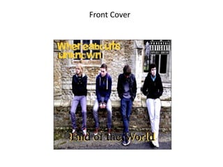
Ancillary cd final
•Download as PPTX, PDF•
0 likes•174 views

This short document describes a book with a front cover, double page inside spread, and back cover. The front and back covers enclose internal pages, with a double page spread shown in the middle to represent example interior content.
Report
Share
Report
Share

Recommended
All three page progressions
This document outlines the progression of a book from front cover to contents page to double page spreads. It shows the development of the book from its opening sections through to the main body of double page articles or chapters. The progression moves from cover to contents to the main substance of paired pages within the book.
Dead Beat Pictures
This short document contains 3 sections: a front cover, contents page, and double paged spread. The front cover introduces the title. The contents page lists what is included. The double paged spread provides two facing pages of content.
Evaluation question 1
The document discusses the production of a music magazine as part of an evaluation. It describes researching existing successful music magazines to inform decisions around layout, color scheme, images, and fonts. Photoshop, Fireworks, and Publisher were used to edit images and design the magazine pages. Research also helped with camera angles and photo editing to appeal to the target audience of young adults. The layout follows conventions of music magazines with an attention-grabbing cover and cluttered contents page.
Evaluation question 1
The document discusses the production of a music magazine. It describes researching existing magazines like Kerrang to inform decisions around layout, images, and color scheme. Surveys were also used to select cover images and get feedback. Photoshop and Publisher were used to edit images and design pages professionally. The layout follows conventions of music magazines with a large cover image, contents listing new information, and double page article spreads. Dark colors like red, black, and white were chosen to suit the rock genre. Fonts were also selected to attract the target audience.
Evaluation question 5
My target audience for the music magazine is rock and metal fans ages 14 to 25, as research showed they are the biggest buyers of music magazines. The front cover uses a unique font for the masthead to look loud and in your face, appealing fonts for cover lines to attract different ages, and dark clothes as the central image since that is what rock/metal fans typically wear. The contents page relates the three images to the main article and uses the same font as the masthead to look loud, with an editor's paragraph to appeal to the target audience. The double page spread features a large central image, changes the color scheme to avoid looking boring, and includes guitars/drums in images to indicate a rock/metal genre
Shotlist
The document provides a shot list for a music video with 41 shots. It describes the camera movements, angles, actions, and transitions between each shot. Key shots include close-ups of band members singing alone intercut with shots of them later performing together, and split screens showing upside down chin faces singing. Shots depict unconventional instruments and locations being used for the performance.
Band name survey results jack penska
The band name survey results showed different opinions from respondents, making it difficult to pick a single name. As a group, they opted for the name "Conference of Idiots" as it is immature yet civilized, fitting with their theme of making energetic and random videos.
Analysis of 2nd similar product
The document analyzes the cinematography techniques used in a scene to create tension and a creepy atmosphere. It describes an establishing shot of an old, ominous-looking mansion on an overcast day. A high angle shot and unsettling dialogue further the tension. Jump cuts and a long shot of an empty mansion exaggerate its strangeness. A two shot and shot/reverse shot match two identical people looking at each other mysteriously. While the costumes are typically dark, high-key lighting contrasts the expected low-key lighting for the distorted scene.
Visual homework media
Alternative rock emerged from the independent music scene in 1984, with bands like R.E.M. and The Smiths inspiring new artists in the 1980s. The release of Nirvana's hit single "Smells Like Teen Spirit" in 1991 caused the genre to achieve widespread popularity. In the late 1990s, the popularity of alternative rock declined due to events like Kurt Cobain's death and a lawsuit filed by Pearl Jam, though some bands like Coldplay remained mainstream. In the 21st century, alternative rock has further receded from the mainstream as new genres like R&B and indie rock have risen in popularity.
Jack penska analysis of media product
The video uses various camera shots and editing techniques to emphasize anger and create mystery. Throughout the video, close-up shots of the singers showcase their expressions of anger. Additionally, jump cuts, fast pacing, and ambient sounds of sirens establish a tense atmosphere. Mise-en-scene elements like hooded robes, supernatural makeup, low lighting, and fire surrounding the band further a mysterious and angry tone.
Evaluation question 7
The document discusses improvements made to a school magazine project from a preliminary task. More research was conducted, including analyzing other magazines, surveys, and focus groups to inform layout, colors, images, typography, and audience engagement. The front cover was improved with a larger central image, varied fonts, and barcode to look more realistic. The contents page also saw vast improvements with more images, content, and color scheme tailored to the target audience and genre. Additionally, an editor's insight was included to look more professional. An extra double page spread was also developed to demonstrate more research into creating an appealing, professional magazine.
Evaluation question 5
My target audience is rock and metal fans ages 14 to 25. For the front cover, I used a unique font for the masthead to make the magazine stand out as loud and in your face. I included various colors and images of dark clothes to appeal to rock fans. The contents page relates the images to the main article and uses the masthead font to convey a loud impression. For the double page spread, I used a large central image taking up most of the page along with guitars and drums to showcase a rock/metal band and appeal to the target audience.
Evaluation question 2
The document summarizes how a media product represents social groups. It represents rock and metal social groups through images that consider lighting, props, clothing and location to convey the genre. It mainly features males in their late teens to appeal to the target audience. The images aim to appeal to fans by showing casual dark clothes and instruments traditionally used in rock and metal bands. The color scheme uses black and red to appeal to fans who wear dark clothes and listen to songs about anger and crime. The large, unique masthead font aims to look "in your face" and appeal to metal fans who enjoy shouting music.
Evaluation question 7
This document discusses improvements made to a school magazine project from a preliminary task. More research was conducted, including analyzing other magazines, surveys, and focus groups to improve layout, color scheme, images, typography, and audience engagement. The central image on the cover takes up more space than before. Multiple fonts are used to appeal to different audiences and a variety of colors make the cover more eye-catching. The contents page also sees significant improvements with more images, content, and a better color scheme tailored to the target audience and genre. Additionally, an editor's insight is included to look more professional.
Evaluation question 3
The document discusses which media institution would be best suited to distribute the author's new rock music magazine. It argues that Bauer Media Group, which distributes the successful rock magazine Kerrang!, or Time Inc, which owns the rock magazine NME through IPC Media, would be good choices as they both have experience distributing similar genre magazines and have wide distribution networks.
Evaluation question 2
The magazine represents rock and metal social groups through images of mainly male musicians in their late teens wearing dark casual clothes, taken in practice music settings. The lighting, props, clothing and locations in the images aim to portray the genre of music. The magazine also uses colors like black and red, and a large, unique font for the masthead, to appeal to its target audience of rock and metal fans.
Contents page draft 1
This draft magazine contents page layout includes the main sections of contents, advertisements, page numbers, featured articles with images, and summaries of the main articles. The designer intends to further develop this draft by adding real images and applying draft colors and fonts to make it look more polished and professional.
Double page spread draft 1
This document is a draft layout for a double page spread. The left page will feature a large image that continues onto the right page as a background image. The right page will have the headline and intro text at the top, and the feature article, sub-images and pull quotes at the bottom. The creator aims to improve the draft by adding a kicker, byline, and sample colors, fonts and text.
Front cover draft 1
This document is a draft layout for a front cover. It includes elements like the masthead, strapline, cover lines, central image, banner, sub-images, and barcode. The designer notes the layout follows the natural flow of the eye and isn't too cluttered, allowing flexibility. The central image will span the full page and potentially provide color, making it eye-catching. The designer plans to further develop the draft by experimenting with colors, fonts, and potentially using this as a final design.
More Related Content
More from Jack Penska
Band name survey results jack penska
The band name survey results showed different opinions from respondents, making it difficult to pick a single name. As a group, they opted for the name "Conference of Idiots" as it is immature yet civilized, fitting with their theme of making energetic and random videos.
Analysis of 2nd similar product
The document analyzes the cinematography techniques used in a scene to create tension and a creepy atmosphere. It describes an establishing shot of an old, ominous-looking mansion on an overcast day. A high angle shot and unsettling dialogue further the tension. Jump cuts and a long shot of an empty mansion exaggerate its strangeness. A two shot and shot/reverse shot match two identical people looking at each other mysteriously. While the costumes are typically dark, high-key lighting contrasts the expected low-key lighting for the distorted scene.
Visual homework media
Alternative rock emerged from the independent music scene in 1984, with bands like R.E.M. and The Smiths inspiring new artists in the 1980s. The release of Nirvana's hit single "Smells Like Teen Spirit" in 1991 caused the genre to achieve widespread popularity. In the late 1990s, the popularity of alternative rock declined due to events like Kurt Cobain's death and a lawsuit filed by Pearl Jam, though some bands like Coldplay remained mainstream. In the 21st century, alternative rock has further receded from the mainstream as new genres like R&B and indie rock have risen in popularity.
Jack penska analysis of media product
The video uses various camera shots and editing techniques to emphasize anger and create mystery. Throughout the video, close-up shots of the singers showcase their expressions of anger. Additionally, jump cuts, fast pacing, and ambient sounds of sirens establish a tense atmosphere. Mise-en-scene elements like hooded robes, supernatural makeup, low lighting, and fire surrounding the band further a mysterious and angry tone.
Evaluation question 7
The document discusses improvements made to a school magazine project from a preliminary task. More research was conducted, including analyzing other magazines, surveys, and focus groups to inform layout, colors, images, typography, and audience engagement. The front cover was improved with a larger central image, varied fonts, and barcode to look more realistic. The contents page also saw vast improvements with more images, content, and color scheme tailored to the target audience and genre. Additionally, an editor's insight was included to look more professional. An extra double page spread was also developed to demonstrate more research into creating an appealing, professional magazine.
Evaluation question 5
My target audience is rock and metal fans ages 14 to 25. For the front cover, I used a unique font for the masthead to make the magazine stand out as loud and in your face. I included various colors and images of dark clothes to appeal to rock fans. The contents page relates the images to the main article and uses the masthead font to convey a loud impression. For the double page spread, I used a large central image taking up most of the page along with guitars and drums to showcase a rock/metal band and appeal to the target audience.
Evaluation question 2
The document summarizes how a media product represents social groups. It represents rock and metal social groups through images that consider lighting, props, clothing and location to convey the genre. It mainly features males in their late teens to appeal to the target audience. The images aim to appeal to fans by showing casual dark clothes and instruments traditionally used in rock and metal bands. The color scheme uses black and red to appeal to fans who wear dark clothes and listen to songs about anger and crime. The large, unique masthead font aims to look "in your face" and appeal to metal fans who enjoy shouting music.
Evaluation question 7
This document discusses improvements made to a school magazine project from a preliminary task. More research was conducted, including analyzing other magazines, surveys, and focus groups to improve layout, color scheme, images, typography, and audience engagement. The central image on the cover takes up more space than before. Multiple fonts are used to appeal to different audiences and a variety of colors make the cover more eye-catching. The contents page also sees significant improvements with more images, content, and a better color scheme tailored to the target audience and genre. Additionally, an editor's insight is included to look more professional.
Evaluation question 3
The document discusses which media institution would be best suited to distribute the author's new rock music magazine. It argues that Bauer Media Group, which distributes the successful rock magazine Kerrang!, or Time Inc, which owns the rock magazine NME through IPC Media, would be good choices as they both have experience distributing similar genre magazines and have wide distribution networks.
Evaluation question 2
The magazine represents rock and metal social groups through images of mainly male musicians in their late teens wearing dark casual clothes, taken in practice music settings. The lighting, props, clothing and locations in the images aim to portray the genre of music. The magazine also uses colors like black and red, and a large, unique font for the masthead, to appeal to its target audience of rock and metal fans.
Contents page draft 1
This draft magazine contents page layout includes the main sections of contents, advertisements, page numbers, featured articles with images, and summaries of the main articles. The designer intends to further develop this draft by adding real images and applying draft colors and fonts to make it look more polished and professional.
Double page spread draft 1
This document is a draft layout for a double page spread. The left page will feature a large image that continues onto the right page as a background image. The right page will have the headline and intro text at the top, and the feature article, sub-images and pull quotes at the bottom. The creator aims to improve the draft by adding a kicker, byline, and sample colors, fonts and text.
Front cover draft 1
This document is a draft layout for a front cover. It includes elements like the masthead, strapline, cover lines, central image, banner, sub-images, and barcode. The designer notes the layout follows the natural flow of the eye and isn't too cluttered, allowing flexibility. The central image will span the full page and potentially provide color, making it eye-catching. The designer plans to further develop the draft by experimenting with colors, fonts, and potentially using this as a final design.
More from Jack Penska (16)
Ancillary cd final
- 1. Front Cover
- 3. Back Cover