Download to read offline
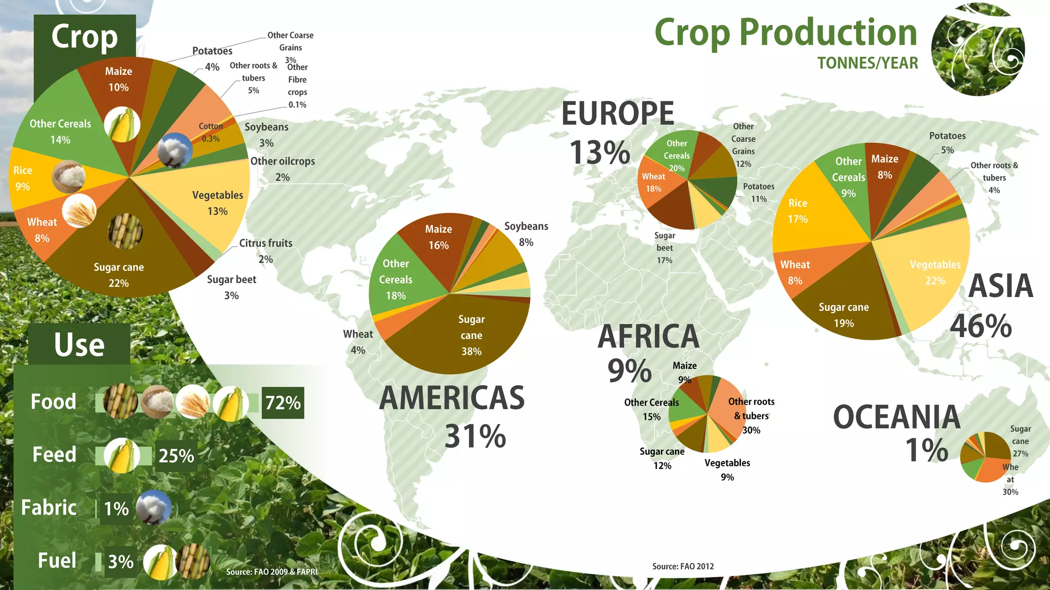
This document shows graphs of the yield per hectare from 1961 to 2009 for several key crops like maize, potatoes, rice, soybeans and wheat. The yields for all crops have increased significantly over this period. A second graph shows the global supply of calories per person per day from major food sources like maize, potatoes, rice, soybeans and wheat, which has also risen considerably since 1961 according to the food supply quantity data.


