Download to read offline
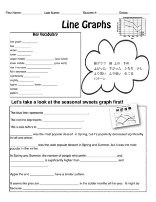
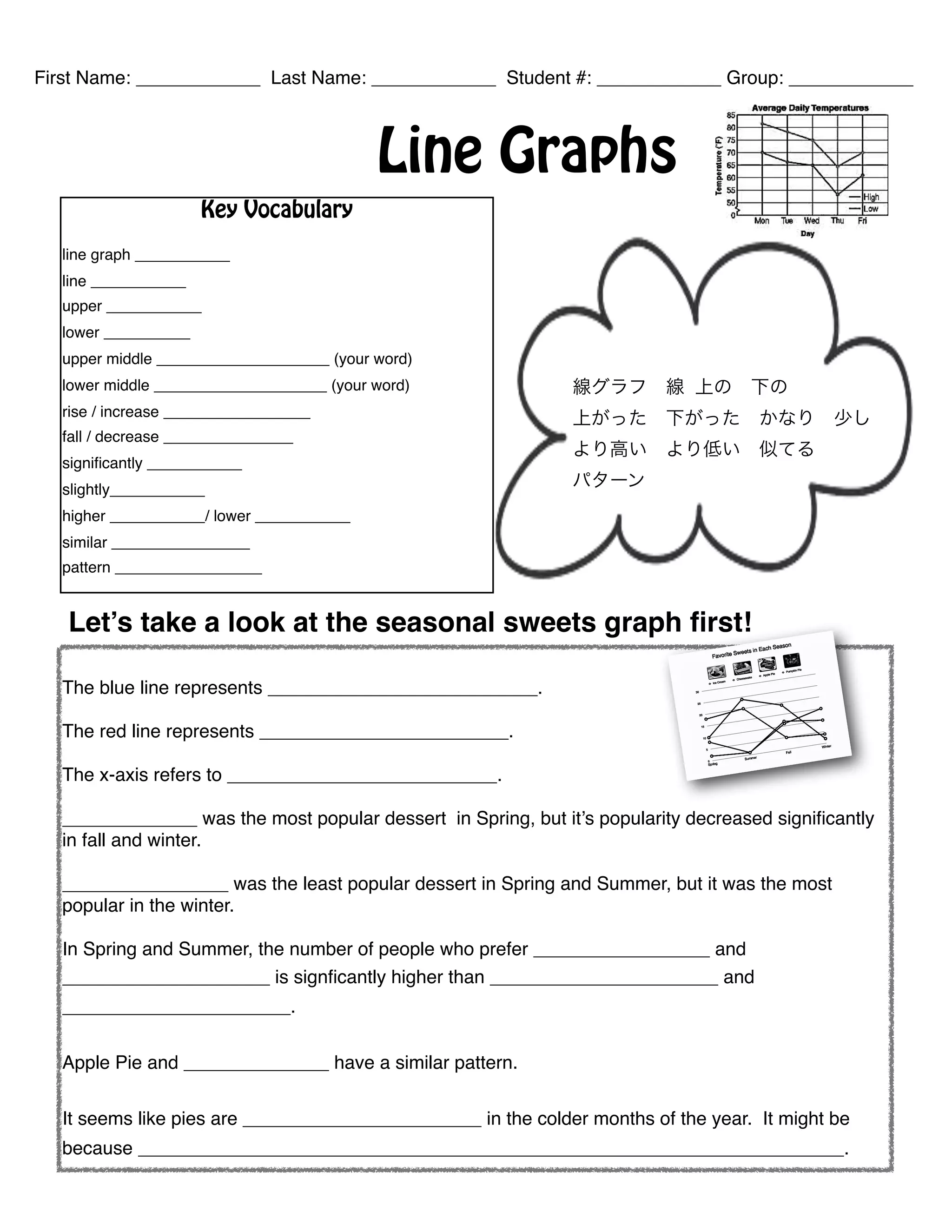


- The graph shows seasonal trends for different desserts' popularity. - Apple pie and pumpkin pie had similar patterns of being more popular in colder months. - Ice cream was the most popular dessert in spring but its popularity decreased significantly in fall and winter, while cheesecake was the least popular in spring and summer but the most popular in winter.


![Getting Started with Apache Spark: Big Data Made Simple [Free Meetup]](https://cdn.slidesharecdn.com/ss_thumbnails/apachesparkgettingstarted-260203175547-8361bcc3-thumbnail.jpg?width=640&height=640&fit=bounds)
