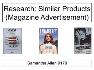
3. JAY-Z – The Blueprint 3
• The main image of this magazine advertisement is a
collection of white instruments piled upon each other
carelessly in what appears to be an all white room, the
use of instruments denotes that this advertisement is
musically related. The main image also covers the full
background of the advertisement.
• The masthead is placed in the top third of the
advertisement which is a generic convention. The
masthead states the artists name all in bold and capital
letters, therefore this will gain attention from the
audience/reader as the artist is very well known. The
masthead also includes the title of the album ‘THE
BLUEPRINT 3’ which has a sign that is also included
across the main image, this shows consistency.
• The house-style is white and black with a hint of red, this
allows the advertisement to remain simple with a subtle
amount of boldness.
• Also in the lower third section is the songs included on the
track, this allows the reader an inside understanding of
the content in the album. A release date is stated,
therefore the reader knows when the album will become
available for them. The artists website is stated for
promotional purposes and further information for the
reader. Also the record label company the artist is
signed to which connotes professionalism.
4.
5. • The main image of this magazine advertisement is an image of
the artist, using this as the background image gains the
readers attention, this instantly is an identification of whom
this magazine advertisement is about. Also using a mid-
shot makes the readers feel more involved personally.
The angle of the camera is on a slight tilt facing upwards,
this therefore connotes the importance of the artist.
• The masthead of this advertisement is placed in the top third of
the advertisement which is a generic convention. The
masthead states the artists name all in bold and capital
letters, therefore this will gain attention from the
audience/reader as the artist is very well known.
• The house-style of the advertisement is blue and white which
contrasts well with the main image, for example the main
image has a slightly cloudy blue sky behind the artist the
white coloured masthead is placed on top of the blue sky.
This is a subtle use of house-style.
• In the lower third section is the name of the album, which is in a
blue font to maintain the house-style, the songs included
on the album which are usually the most popular songs will
be listed, this allows the reader an inside of the content in
the album, also the use of the most popular songs
represents the advertisement to be more appealing to the
reader as they will feel more personally involved from
knowing the song. The release date is included, the reader
can know when the album will become available for them.
Also including a store the album can be purchased from for
more information and their website.
Lana Del Rey – Born To Die
6.
7. • The main image is an image of the artist, the use of this image
attracts the readers attention as there is an instant
identification of who the artist is. Also in the background of the
image is the artists signature ‘R’ for identification and also this
represents a motif of the artist. The name of the album has
been wrote across the main image, ‘RATED R’. The name of
the album alongside the main image works together, as
‘RATED R’ connotes that the content is bad and explicit,
therefore the artist has been captured in a very dark light, the
pose of the artist also helps with this representation by
covering an eye, also the costume, which also allows the
genre identification, the artist is wearing a black leather top,
heavy make-up with thick black eyeliner and black lipstick, and
also lots of jewelry. This main image includes a lot of
conventions and representation.
• The masthead of this advertisement has not been placed in the
generic positioning, instead has been placed in the bottom
third of the advertisement, this represents the ‘badness’ of the
album as it is breaking the rules of the typical conventions.
The masthead states the artists name in capital letters, and has
been placed slanted, again another convention that
represents the ‘badness’ of the album, also this is another
aspect of identification of the artist for the reader. Also in the
third bottom section two songs are included, these the most
well known songs listed, the reader has insight of the content in
the album, also listing the most popular songs represents the
advertisement to be more appealing to the reader as they will
feel more personally involved from knowing the song.
• The house-style of this advertisement is mainly black, with hints of
grey and red.
Rihanna – RATED R
8. Conclusion
After undertaking this task and analysing these three music magazine
advertisement posters this has allowed me to understand the typical conventions
used in this form of promotion.
When creating the advanced production ancillary task I will apply these
conventions, such as the masthead will involve the artists name in a large font
using capital letters and ‘bold’ as this will gain the readers attention and also will be
an identification of the artist, the main image I will use will be a photograph of the
artist as the reader can engage with the advertisement and they will be able to
identify who the artist is instantly. Also in the lower third part of the section I will
include two well known songs that will be in the album in order to interest the reader
and make them feel involved with the advertisement as the song will be familiar, a
release date of the albums purchase, the name of the artists website, and where the
album can be purchased from to give the reader as much information as possible.
After completing this task I feel it has given me more confidence when creating my
ancillary task as I know the correct stereo-typical conventions to apply to my
magazine advertisement in order for it to be similar to a real life product.