1. Enderʼs Game Alternate Cover Analysis
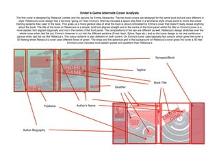
The first cover is designed by Rebecca Lemker and the second, by Emma Alexandra. The two book covers are designed for the same book but are very different in
style. Rebeccaʼs cover design has a lot more “going on” than Emmaʼs. She has included a space ship fleet in a wireframe-style virtual world to mimic the virtual
training systems they used in the book. This gives us a more general idea of what the book is about contrasted by Emmaʼs cover that doesnʼt really reveal anything
about the book. The title of the book on Rebeccaʼs is a simple, bold font aligned straight and in the centre of the front panel whilst the title on Emmaʼs cover is a
more stylistic font aligned diagonally and not in the centre of the front panel. The compositions of the two are different as well. Rebeccaʼs design stretches over the
whole cover when laid flat out, Emmaʼs however is cut into the different sections (Front, back, Spine, flaps etc.) and so the cover design is not one continuous
canvas when laid flat out like Rebeccaʼs. The colour scheme is also different on both covers. On Emmaʼs cover uses basically two colours which gives the cover a
2D feeling whilst Rebeccaʼs cover uses different tones of green. The ships and the spherical grid in the background on Rebeccaʼs cover gives the cover a 3D feel.
Emmaʼs cover includes more splash quotes and qualifiers than Rebeccaʼs.
Book Title
Author Biography
Synopsis/Blurb
Authorʼs Name
Qualifier
Tagline
Publisher