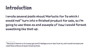
1. Introduction
I wrote several posts about Warlocks for 5e which I
would notf1 turn into a finished product for sale, so I'm
going to use them as and example of how I would format
something like that up.
f1 Because 1) there's no 5e license yet and 2) Vestiges are an idea from 4e, and I would not steal and
resell them without at least renaming them.
4. Markdown
The original text of all 3 entries was in markdown, A
method of formatting raw text which makes it easy to
convert into a finished product. It also made it easy for
me to combine the three documents into one big one.
5. Editing and Rewriting
I spend a little bit of time editing and rewriting the
posts so they form one coherent doc. Boring, but
necessary.
6. Exporting
Once I was ready, it was time to move it to something I
could pretty it up with. Normally, I would just use
pandoc to generate a styled word doc from a markdown
file, but for purposes of illustration, I'll just copy and
paste the text into Microsoft Word.
7. A Word on Word
This is not the best tool for the job. Not even close. But
it's fairly ubiquitous and the tricks that work for it
work for open office (and to a lesser extent, pages). If
you want to go full-bore desktop publishing, that's a
whole other thing.
8.
9. # Raw Markdown
This is kind of a mess, and what follows is a manual
process of converting the formatting by hand. This is
kind of exactly why it's better to convert the file, but if
you can't, it's a matter of turning # into h1, ## into
heading 2 and so on. In the end, it will look more like this.
10.
11. This definitely looks a lot more orderly, and because
everything is styled, It is not going to be too hard to re-tune
the doc. Right now it just uses Word's default
styles, but with just a little bit of tweaking, it looks
more like:
12. Basic Layout
This isn't going to win any layout
awards, but it's functional and
hasn't required a lot of fiddling on
my part. At this point, I just need
to jazz it up a little.
I could totally go nuts with the
fonts here - do something super
fancy for the header, but I find
that kind of tacky.
13. Art
There are a ton of ways to get
cheap or free art, but I lack both
talent and patience, so I dropped
5 bucks at drivethrustuff for 3
images that I think I can get good
use out of.
16. Bottom Line
So, with about an hour's effort, a working knowledge of
Microsoft Word and $5 of stock art, I have something I
could probably get away with charging a buck for on
drivethru.
I wouldn't do this, of course. This is actually way over
the top for my personal taste. But it's a fun illustration.