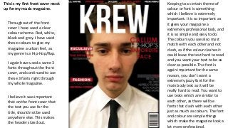
This is myfirst front cover mock
up for my music magazine.
Throughout of the front
cover I have used a clear
colour scheme. Red, white,
black and grey. I have used
these colours to give my
magazine a urban feel, as
my genre is a Hip-Hop/Rap.
I again have used a same 3
fonts throughout the front
cover, and continued to use
these 3 fonts right through
my whole magazine.
I believe it was important
that on the front cover that
the text you use for the
title, should not be used
anywhere else. This makes
the header stand out.
Keeping to a certain theme of
colour or font is something
which I believe is extremely
important. It is so important as
it gives your magazine a
extremely professional look, and
it is so simple and easy to do.
The colours you use also must
match with each other and not
clash, as if the colour clashes it
could leave the text hard to read
and you want your text to be as
clear as possible. The font is
again important for the same
reason, you don’t want a
extremely jazzy font for the
main body text as it will be
really hard to read. You want to
use texts which are similar to
each other, as there will be
fonts that clash with each other
just as much as colours. The font
and colour are simple things
which make the magazine look a
lot more professional.
2.
The decision tocall my magazine was hard, as I had other possible
names I wanted to call it, ‘H.Y.F.R’ or ‘Stronger’. All 3 of my names,
where taken from song lyrics from popular Hip Hip/Rap stars, as I
wanted it to be clear what genre my music magazine was on. I was
actually going to call the magazine ‘CREW’ but I think ‘KREW’ gives
the magazine a more ‘Hip-Hop’ effect.
The top of my front cover I have listed artists in which are featured
inside the magazine, this is an idea I took from the magazine Vibe,
which is a popular Hip Hop/Magazine. The top picture is mine and
the bottom is vibes.
This part of the magazine, is again something which I seen in an
edition of vibe. I liked the idea as the ‘exclusive’ and the ‘fashion’
stand out, this is something I wanted as that is something that will
grab the target audiences attention. When you use words like
‘exclusive’, especially in capital letters you are guaranteed to grab the
buyers attention if they are scanning through a magazine rack in a
shop. Also the word definitive gives the impression that the
interview is exclusive and it makes you feel as if you have to read it.
These are words I wanted to use on my front cover to grab attention.
3.
The front coverpictures are something which I believe should be carefully
thought of as it is the main feature of your magazine. So as the biggest/main
selling point I wanted to research magazines which Kanye West has been in
and recreate one of his photo-shoots as he is one the main artists in the
industry. I found in nearly all of his photo-shoots he was wearing a suit and tie,
so this is something I really wanted to use. I found this cover with GQ
specifically and decided it was something I wanted to copy. I wanted to go for
the full head shot as it really draws attention to the artist and lets everyone
know that he is the main artist in the magazine.
This plus section is something I seen on a edition of Q
magazine. I think that is an extremely effective way to show
the reader what else is in the magazine, rather than saving all
this information for the contents page. Also I didn’t want my
contents page to look extremely busy so the list idea was
really affective for me. The list lay out doesn't overpower the
front cover as well, which is something I didn’t want when
creating a Hip Hop magazine, as my research shows they are
known for having less on the front. I added the and more
bullet point to the end as that is something which will make
the reader pick up the magazine and look through it.
On the front cover it is
extremely important to
have lines which are
going to help sell your
magazine and by using
the word favourite I think
it really sells Callum. Also
my mentioning the genre
it makes it clear to any
new readers what the
music magazine is about.