User interface design for touch screen displays
•Download as DOCX, PDF•
0 likes•55 views

With projected capacitive touch technology (PCAP) it has become increasingly common to include a capacitive touchscreen in almost every new product that contains a display. Today many, if not most, users expect a device to be touch enabled and want the user experience to be good. When designing software for touch screen displays, any designer should be aware of some best practices.

Recommended
More Related Content
Viewers also liked
Viewers also liked (10)
Similar to User interface design for touch screen displays
Similar to User interface design for touch screen displays (20)
Recently uploaded
Recently uploaded (20)
User interface design for touch screen displays
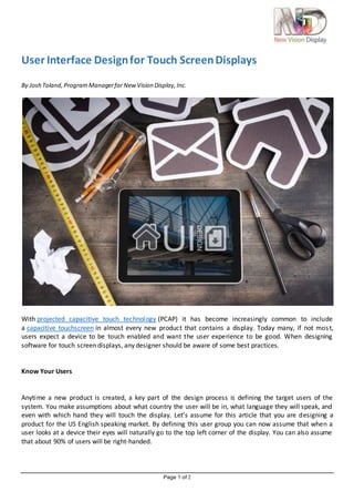
- 1. Page 1 of 2 User Interface Designfor Touch ScreenDisplays By Josh Toland,ProgramManagerfor NewVision Display,Inc. With projected capacitive touch technology (PCAP) it has become increasingly common to include a capacitive touchscreen in almost every new product that contains a display. Today many, if not most, users expect a device to be touch enabled and want the user experience to be good. When designing software for touch screen displays, any designer should be aware of some best practices. Know Your Users Anytime a new product is created, a key part of the design process is defining the target users of the system. You make assumptions about what country the user will be in, what language they will speak, and even with which hand they will touch the display. Let’s assume for this article that you are designing a product for the US English speaking market. By defining this user group you can now assume that when a user looks at a device their eyes will naturally go to the top left corner of the display. You can also assume that about 90% of users will be right-handed.
- 2. Page 2 of 2 Navigation Users do not want to read a manual or have to “figure out” how to use an application. Navigation elements should be kept as simple and consistent as possible. Luckily there has been a lot of research into designing software for mobile devices that has trained the users what to look for. 1. Use Common Elements 1. Items like navigation bars on top of the screen or a home button requires no explanation for a user to understand. 2. Don’t Hide Navigation 1. Nothing is more frustrating than trying to find a way off a page or to go back. Keep navigation elements always available and easy to access. 3. Minimize Touches/Clicks 1. A goal for any application should be to minimize the number of times a user must touch a button or link in order to accomplish their task. 4. Visual Hierarchy 1. If possible a visual guide can help a user quickly and easily navigate an application. Button Size and Placement There are technical limitations and physical limitations that need to be taken into account when design a good user interface. The technology is always improving and allowing for more precise input, but the real problem is that the human finger is not. MIT did a study and discovered that the average human fingertip measures roughly 8-10mm. This will naturally limit the precision a finger can have when using a capacitive touchscreen. 1. How will your device be held? 1. The way a device is held will determine how a user will interact with it. Will they hold it like a tablet and user their thumbs to click or more like a phone and have a free hand and use fingertips to touch. 2. Gesture Support 1. Depending on the size of your display you may consider gesture support. The larger the display the more a user expects simple gestures like scroll, zoom, and swipe to be supported. If you choose to support these then the UI must have a “no fly zone” to allow the user enough space to perform the gesture without clicking on another navigation element. 3. Button Size/Spacing 1. Apple recommends that 44pt x 44pt is the minimum size a button should be. Nokia says 7mm and Microsoft says 9mm. This data in combination that the human finger is roughly 8- 10mm is a guideline for minimum sizes, but there isn’t one for maximum sizes. 2. Some research suggests that if a button is too big a user can overlook the button and not see that it is clickable. 4. Don’t Block Information 1. Users don’t have x-ray vision. Be mindful when designing the UI that a user will be blocking portions of the screen with their hands and fingers while trying to click. If they are changing values on the screen make sure they can still see the data while editing. Thanks to companies like Apple and schools like MIT there is a wealth of knowledge online about design user interfaces. Every application is different and every product is different. However there are a number of common design elements that can be used to keep the user experience fast and easy.
- 3. Page 3 of 3 References: 1. User Interface Design Guidelines for Great Experience Design https://software.intel.com/en-us/articles/user-experience-design 2. Mobile Web Application Best Practices https://www.w3.org/TR/mwabp/ 3. An MIT study, “Human Fingertips to Investigate the Mechanics of Tactile Sense,” discovered that an average size fingertip measures 8-10 mm http://touchlab.mit.edu/publications/2003_009.pdf 4. Apple iOS Human Interface Guidelines https://developer.apple.com/ios/human-interface-guidelines/visual-design/layout/ 5. Microsoft Windows Phone UI Guidelines https://msdn.microsoft.com/en-us/library/windows/apps/hh202889(v=vs.105).aspx