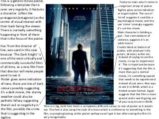
This is ageneric movie poster,
following a template that is
seen very regularly. It features
a character (often the
protagonist/antagonist) as the
centre of visual interest with
their back facing the viewer.
There is normally something
happening in front of them
that is the focus of the poster.
Features main actor’s name in
large text at top of poster.
Tagline gives some indication
as to genre/plot. The use of
'mind’ suggests it could be a
psychological movie, and the
use ‘crime’ strongly suggests
it’s a crime movie.
Main character is holding a
gun – has connotations of
violence, suggests it’s an
adult movie.
Credits block at bottom of
poster, with producer info,
actors, director, writer etc.
Has ‘from the director of’
line, was used in this case
because ‘The Dark Knight’ is
one of the most critically and
commercially successful films
of all time, so a new film from
that director will make people
want to see it.
Poster gives some indication
of tone, there are lots of dark
colours possibly suggesting
it’s a dark movie, the stormy
weather could also be
pathetic fallacy suggesting
there’s evil or negativity in
the film, possibly the crime
that is suggesting in the
tagline.
Instead of saying to see the
movie, it says to ‘experience
it’. This is important because
it’s suggesting that the film is
more than just a normal
movie, it’s something special
that needs to be experienced
instead of just seen. Also says
to see it in IMAX, which is a
limited screen format. Again
suggests that this film is more
special and is worth going out
of your way to see in IMAX.
Title is in big, bold font that’s a completely different colour to rest of poster so it stands
out. The font is also using the style of a maze which is a reference to something in the
film, so people glancing at the poster perhaps won’t get it but after seeing the film it’s
very recognisable.
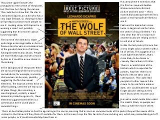
2.
Jonathan Edge
This posteragain features the
protagonist in the centre of the poster,
but this time he’s facing the camera.
This could be to show that the star is
Leonardo DiCaprio, an actor who has a
very large fanbase, so showing his face
will perhaps convince more people to
see it. Looking closer at DiCaprio he is
wearing a smart suit, possibly
suggesting that this movie is about
businesspeople.
Unlike the last poster, this one has
a very bright colour scheme with a
lot of yellow. This suggests it’s a
more light-hearted film, that’s
more likely to be drama or
comedy than action or thriller.
Has area where it mentions that
the film has received Golden
Globe nominations for best
picture and best actor – this is
essentially boasting that the film is
good so more people are likely to
see it.
Features the lead actors name
twice in large text and he’s also
the centre of visual interest – it’s
very clear that he’s a major star
and the studio are relying on him
to sell a lot of tickets.The name of the director is made
quite large and recognisable as he is a
famous director who is considered one
of the greatest directors of all time,
having directed many classics. People
are more likely to go and see a movie
by him as it could be a new classic in
the making.
In the background of the poster there
are various things which have various
connotations; for example, a scantily
clad woman can be seen, possibly
suggesting the film has sexual
elements. The location seems to be an
office building, yet there are many out
of place things, like a monkey, a
marching band, confetti, a dwarf
dressed in protective gear etc., these
elements suggest that the film is a
comedy due to the out of place
comedic things.
There is a credits block at the
bottom which is expected for
posters, however there is no
specific release date, only a
coming soon. This could lead
people to further research the
movie to try and find a release
date, or it could lead them to just
forget about it seeing as they
don’t know when it comes out.
Has some social media links under
the credits block, so people can
keep up with the movie online.
This is an Australian poster so has the age rating in the corner, meaning that as soon as someone looks at the poster they will be aware of the
content in the film and if they think it’s suitable for them. In this case it says the film has lots of sex and drug use, which may immediately put off
some people, or it could immediately draw them in.
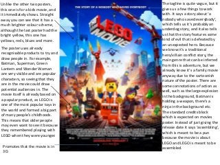
3.
Unlike the othertwo posters,
this one is for a kids movie, and
it immediately shows. Straight
away you can see that it has a
much brighter colour scheme,
although the last poster had the
bright yellow, this one has
yellows, reds, blues and more.
The poster uses already
recognisable products to try and
draw people in. For example,
Batman, Superman, Green
Lantern and Wonder Woman
are very visible and are popular
characters, so seeing that they
are in the movie could draw
potential audiences in. The
movie itself is already based on
a popular product, as LEGO is
one of the most popular toys in
the world and formed a big part
of many people’s childhoods.
This means that older people
may even want to see it because
they remembered playing with
LEGO when they were younger.
The tagline is quite vague, but it
gives us a few things to work
with. It says a story about ‘a
nobody who saved everybody’,
which tells us it’s probably an
underdog story, and it also tells
us that the story features some
kind of evil that is defeated by
an unexpected hero. Because
we know it’s a traditional
hero/villain conflict story, the
main genre that can be inferred
from this is adventure, but we
already know it’s a family movie
anyway due to the cartoonish
nature of the poster. There are
some connotations of action as
well, such as the large explosion
in the background, Batman is
holding a weapon, there’s a
ninja in the background etc.
The standard credits block
which is expected on movies
poster. Instead of just giving the
release date it says ‘assembling’,
which is meant to be a pun
because the movie is about
LEGO and LEGO is meant to be
assembled.Promotes that the movie is in
3D.
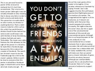
4.
This is ourpersonal favourite
poster of the ones we’ve
analysed, but it’s much less
conventional. This is more of a
teaser poster (although it was not
actually released as one) meaning
that it shows very little in order to
built curiosity and excitement.
This poster has no credits block,
no actor names, no director or
anything like that. That’s a bold
move to make for a film such as
this, which has world-famous
director David Fincher behind the
camera and a well known cats
with the likes of Jesse Eiseneberg,
Andrew Garfield and Justin
Timberlake. The movie very subtly
features the title sideways on the
right of the poster. It is meant to
be styled like a Facebook page
because this film is about the
creation of Facebook. The search
bar of what’s meant to be the
Facebook page has a link to the
movie’s website. While it won’t
be clear to everyone that this
poster is styled like a Facebook
page, it should stick out to those
who look closely enough.
One of the main points of the
poster is the tagline. It has
another reference to Facebook by
saying ‘friends’, but it also
suggests that the film will feature
good and evil fighting because of
the mention of enemies. The
image behind the tagline is of the
lead actor, so if viewers are
familiar with that actor they
should recognise him quickly.
Unusually, the tagline obscures
the actor’s face, but this is again
one of the unconventional
elements of this overall very
unconventional poster. Although
this is our favourite poster of the
ones analysed, it’s too
unconventional for us to take
elements from it when creating
our poster. We will make sure that
our poster has a release date and
an easily readable title, and we
will make sure that our poster
gives a clearer indication of genre
than this one does, because
although you could probably
assume this is a drama film from
the poster there isn’t a huge
amount of evidence to support
that.