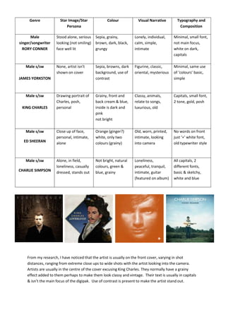
1. Genre Star Image/Star Colour Visual Narrative Typography and
Persona Composition
Male Stood alone, serious Sepia, grainy, Lonely, individual, Minimal, small font,
singer/songwriter looking (not smiling) brown, dark, black, calm, simple, not main focus,
RORY CONNER face well lit grungy intimate white on dark,
capitals
Male s/sw None, artist isn’t Sepia, browns, dark Figurine, classic, Minimal, same use
shown on cover background, use of oriental, mysterious of ‘colours’ basic,
JAMES YORKSTON contrast simple
Male s/sw Drawing portrait of Grainy, front and Classy, animals, Capitals, small font,
Charles, posh, back cream & blue, relate to songs, 2 tone, gold, posh
KING CHARLES personal inside is dark and luxurious, old
pink
not bright
Male s/sw Close up of face, Orange (ginger?) Old, worn, printed, No words on front
personal, intimate, white, only two intimate, looking just ‘+’ white font,
ED SHEERAN alone colours (grainy) into camera old typewriter style
Male s/sw Alone, in field, Not bright, natural Loneliness, All capitals, 2
loneliness, casually colours, green & peaceful, tranquil, different fonts,
CHARLIE SIMPSON dressed, stands out blue, grainy intimate, guitar basic & sketchy,
(featured on album) white and blue
From my research, I have noticed that the artist is usually on the front cover, varying in shot
distances, ranging from extreme close ups to wide shots with the artist looking into the camera.
Artists are usually in the centre of the cover excusing King Charles. They normally have a grainy
effect added to them perhaps to make them look classy and vintage. Their text is usually in capitals
& isn’t the main focus of the digipak. Use of contrast is present to make the artist stand out.