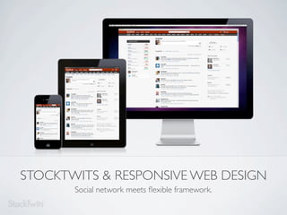
Stocktwits & Responsive Web Design, social network meets flexible framework
•
4 likes•6,540 views

The slides from our presentation on responsive web design using the StockTwits site as a case study. No audio, but feel free to contact us for more information regarding this deck.

Recommended
Recommended
More Related Content
Similar to Stocktwits & Responsive Web Design, social network meets flexible framework
Similar to Stocktwits & Responsive Web Design, social network meets flexible framework (20)
Recently uploaded
Recently uploaded (20)
Stocktwits & Responsive Web Design, social network meets flexible framework
- 1. STOCKTWITS & RESPONSIVE WEB DESIGN Social network meets flexible framework.
- 2. The real-time financial communications platform for the investing and trading community. Chris Corriveau Sean Gilbert John Strott CTO CD UX HELLO from a small part of the StockTwits team.
- 3. Mobile Tablet Web sites Apps, Sites Apps Smart Phones, E-Readers, Tablets, Netbooks, Notebooks, Desktops, Monitors, TVs, Etc. RWD RESPONSIVE WEB DESIGN The use of with fluid grids, flexible images, and media queries to provide optimal viewing experiences on multiple devices.
- 4. <link rel="stylesheet" media="screen and (max-width:500px)" href="example.css" /> Rule Type Feature @media screen and (max-width: 500px) { body { font-size: 1.5em; } } MEDIA QUERY GEN NEXT CSS3 Media Queries, the hip cousin of the CSS2 Media Type.
- 5. Research Engineering Iterate Wireframe Visual Design GETTING THERE Steps toward the first release of our responsive web design.
- 6. REQUIRED RESEARCH Find out what devices are being used to access your site and how to best deliver your content to them.
- 7. A A A B B C C D B C D WIRE-FRAMED-UP Create wireframes that feature your most important content at each breakpoint.
- 8. VISUALIZE THE DESIGN Quickly find out what changes are needed at each breakpoint.
- 9. CODE, CODE AND MORE CODE. Define your breakpoints using media queries.
- 10. 1. .btn { 2. background-color: #69CA24; 3. background-image: linear-gradient(top,#93DA70, 4. border-color: rgba(0, 0, 0, 0.1) rgba(0, 0, 0, 5. border-radius: 3px; 1. @font-face { 2. font-family: 'FontAwesome'; 3. src: url('../font/fontawesome-webfont.eot'); 4. } 1. <img alt=”SVG Example” src="image.svg" /> FUTURE FORWARD Create UI elements with pure CSS, Font Icons and SVG.
- 11. SCRATCH THAT, MAKE IT BETTER Gather feedback, define problems, devise solutions, deploy, & iterate again.
- 12. Convert font sizing to EMs Up Next: JQuery Touch for mobile Explore creating logo as a TrueType font CSS3 Spec Candidates: h1 { div { a{ font-size: 10vw; margin: 0 20px; font-size: 1rem; } width: calc(50%-40px); } } Viewport-percentage lengths: The calc() function: The rem unit: Relative to the size of the Allows mathematical expressions Equal to the computed value of initial containing block. to be used as component values. ‘font-size’ on the root element. THE NEXT BIG THINGS The definitive answer to: “Are we there yet?” is: “Not quite.”
- 13. Top Down Design WHAT ABOUT MOBILE::FIRST-CHILD? Build the theme for mobile devices first, then progressively enhance the UX on other devices, such as desktops.
- 14. ONE SIZE FITS ALL Browser Limitations, Image Sizing/Load Times, Lack of Feature Support, Testing Fitment & more. DOES THIS HAT LOOK FUNNY ON ME? RWD is a great solution for many organizations. However, it's not always a one size fits all.
- 15. GOOD UX BETTER UX BEST UX Improved Mobile UX Improved UX Across Media Best UX Faster Browsing CSS Based Device-specific Integration Manage Context Easy Maintenance Offline Access Cost-Effective Cost-Effective Flexible Data/Network Usage WHO DOES RESPONSIVE WORK FOR? A few business cases by approach for mobile design.
- 16. Metrics Strategy Resources THE CASE FOR RESPONSIVENESS With traffic diversifying, limited resources, and having shipped native apps, creating a RWD made sense for us.
- 17. Love the redesign! If i had enough money, i would try to buy you guys out! Vastly improved user luv the Mega Pop-out experience on iPad capability with the this morning, I love it. auto screen re-sizing. HATE the new layout. Its always change for the sack of change OH NO YOU DIDN’T! Some feedback from our users.
- 18. Reading & Following: Examples: Ethan Marcotte (@beep), RESPONSIVE WEB DESIGN Boston Globe: http://www.abookapart.com/products/responsive-web-design/ http://bostonglobe.com/ Luke W (@lukew), MOBILE FIRST World Wildlife Fund http://www.abookapart.com/products/mobile-first/ http://worldwildlife.org/ Brad Frost (@brad_frost) http://bradfrostweb.com/responsive-web-design-newsletter/ Manchester-Boston photo credit: WWF, Regional Airport: worldwildlife.org Responsive Web Design (@rwd) http://flymanchester.com/ Frameworks: Quick Reference: Twitter bootstrap: http://twitter.github.com/bootstrap/ Can I Use: http://caniuse.com/ The Semantic Grid System: http://semantic.gs/ Media Query Snippets: http://nmsdvid.com/snippets/ Foundation 3: http://foundation.zurb.com/ Google Analytics: http://www.google.com/analytics/ RWD REFERENCE MATERIAL Look it up.
- 19. Chris Corriveau Sean Gilbert John Strott Chief Technical Officer Creative Director Senior Designer, UX chris@stocktwits.com sean@stocktwits.com jstrott@stocktwits.com @genevate @seangilbie @MrJohnnyLane FIN. MERCI. Let us know if you have any questions.
Editor's Notes
- \n
- \n
- \n
- \n
- \n
- \n
- \n
- \n
- \n
- \n
- \n
- \n
- \n
- \n
- \n
- \n
- \n
- \n
- \n