

Recommended
More Related Content
Viewers also liked
Viewers also liked (20)
More from Hainam Travel
More from Hainam Travel (7)
Recently uploaded
Recently uploaded (20)
Rv la marguerite brand identity
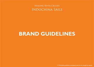
- 1. Mekong River Cruises Indochina Sails BRAND GUIDELINES (*) This brand guidelines is temporary and can be changed by request
- 2. Contents 1 THE MEKONG RIVER CRUISES - INDOCHINA SAILS BRAND Introduction Mekong River Cruises - Indochina Sails Values 2 BRAND ELEMENTS Logotype Reproducing the logotype in color Reproducing the logotype in black and white Logotype artwork Single color logo Logotype exclusion zone Logotype minimum size Backgroud/Properties Incorrect Usage - What not to do with the logotype Primary color palette Typeface Business Systems
- 3. 1 The Mekong River Cruises - Indochina Sails brand Introduction Mekong River Cruises - Indochina Sails brand values
- 4. 1 The Brand Introduction These guidelines describe the basic rules of designing with/reproducing the Mekong River Cruises - Indochina Sails brand identity. In order to gain maximum benefit from these guidelines they must be used consistently, as even small variations will undermine the impact of the Mekong River Cruises - Indochina Sails brand identity.
- 5. 1 The Brand Mekong River Cruises - Indochine Sails brand values Indochina Sails signature identity is derived from Chinese five elements. The elements have a productive cycle. Water - Fire -Metal - Wood - Earth. Water feeds wood for it to grow. Wood feeds fire, which produces Earth. Earth creates metal and Metal holds Water. The cycle continues. Water - Blue, Wave, North Fire Element - Red, Flame, South Metal - Grey, Bucket, West Wood - Green, Tree, East Earth - Orange, Oval, Southwest The creative of Indochina Sails uses at least one of the above elements to represent the productive cycle. The logo is a graphic representation of the haul of the boat sailing in a flowing river. The water is that of alluvial rich Mekong represented by the waves of the logo. The boat dominant interior is wood and water feeds fire to grow. The three waves when viewed together is symbolic of a flying flame which produces earth represented by orange wave. Earth creates metal and metal holds water.
- 6. 2 Brand Elements Logotype Reproducing the logotype in color Reproducing the logotype in black and white Logotype artwork Single color logo Logotype exclusion zone Logotype minimum size Backgroud/Properties Incorrect Usage - What not to do with the logotype Primary color palette Typeface Business Systems
- 7. 2 Brand Elements The Logotype Use of the logotype The precise position and proportion of all the logotype elements is fixed and must always be reproduced in the set relationship shown here.The elements must never be re-drawn or modified in any way. Master Artwork Always use master artwork when producing the Mekong River Cruises - Indochina Sails logotype. It should never be recreated under any circumstances. Always ensure you are using the correct artwork for your information. Printing the logotype The use of the Mekong River Cruises - Indochina Sails logotype in any printed material must be approved by Indochina Sails.
- 8. 2 Brand Elements Reproducing the logotype in color Where possilbe, the Mekong River Cruises - Indo- china Sails should be displayed on a flat white back- ground (example 1). 1 When producing the logotype for printing, care must be taken to ensure that the area surrounding the logotype is tonally even and either sufficiently light or sufficiently dark to ensure the logotype is legible (example 2). 2 When using a colored or textured background, the legibility of the logotype is of paramount importance (example 3). 3
- 9. 2 Brand Elements Reproducing the logotype in black and white For printed material, the logotype should only be reproduced in black and white when appearing on black and white print backgrounds. Wherever possible, the logotype should be reproduced in colors. When printing in black and white, the logotype can be reproduced as black reversed out of white 4 5 on a light background (example 4), or white reversed out of black on a dark background (example 5). Care should be taken to ensure that the area surrounding the logotype is tonally even and either sufficiently light or sufficiently dark so that the logotype is clearly legible (example 6). The logotype can be reproduced in grayscale on a light blackground (example 7) 6 7
- 10. 2 Brand Elements Logotype Artwork The logotype artwork is available for using in the following formats known as supergraphics. Always ensure that you are using the correct artwork for the intended application and in correct accordance with these guidelines.
- 11. 2 Brand Elements Logotype exclusion zone The Mekong River Cruises - Indochina Sails logotypes must be surrounded by an area, which is entirely clear of photography and any other graphic devices. The minumum excludion area, shown below, is made up of the width and height of one of the Mekong River Cruises - Indochina Sails logotypes at the chosen size. X/2 X X/2 X/2 Y/2 z/2 Y z z/2 Y/2
- 12. 2 Brand Elements Logotype Minimum Size Two usage sets (regular and small usage) have been created for maximum flexibility. The small usage version incorporates type and line weights that have been slightly modified to aid in readability as a signature or endorsement in small areas. The small version may only be used where regular usage is not at all possible due to lack of space. X/2 X=3cm X/2 X/2 Y/2 Y=6mm Y/2
- 13. ` 2 Brand Elements Incorrect usage - What not to do with the logotype Examples below show inconsistent use of the Mekong River Cruises - Indochina Sails logotype. Altering the logotype will undermine the impact of the indentity and therefore the Mekong River Cruises - Indochina Sails brand. DO NOT reproduce the logotype in DO NOT place the logotype inside a colors other than those specified. patch of color or lozenge shape DO NOT deform any elements of DO NOT alter the relative size of the logotype the elements of the logotype
- 14. 2 Brand Elements Primary color palette R: 8 | G: 145 | B: 73 R: 57 | G: 38 | B: 109 R: 255 | G: 255 | B: 255 C: 86 | M: 18 | Y: 97 | K: 5 C: 93 | M: 100 | Y: 20| K: 17 C: 0 | M: 0 | Y: 0 | K: 0 #0A9149 #38266D #FFFFFF R: 241 | G: 127 | B: 33 R: 148 | G: 89 | B: 66 C: 86 | M: 18 | Y: 97 | K: 5 C: 32 | M: 67 | Y: 75 | K: 21 #F28121 #955A43
- 15. 2 Brand Elements Typographic Style Trajan Pro ABCDEFGHIJKLMNOPQRSTUV WXYZ1234567890!@#$^&* abcdefghijklmnopqrstuv wxyz When using Trajan Pro, clear, simple presentation is key, e.g. no blur effects or drop shadows. For printed material, headings, sub-headings and body copy can be set in Trajan Pro Regular, or Bold depending on the layout required. The colors of the logotype and text should be used.
- 16. 2 Brand Elements Business Card 16mm 2mm 16mm
- 17. 2 Brand Elements Font type: Maiandra GD Font size: 9 pt