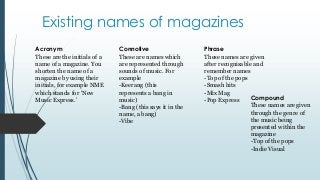
1. Existing names of magazines
Acronym
These are the initials of a
name of a magazine. You
shorten the name of a
magazine by using their
initials, for example NME
which stands for ‘New
Music Express.’
Connotive
These are names which
are represented through
sounds of music. For
example
-Keerang (this
represents a bang in
music)
-Bang (this says it in the
name, a bang)
-Vibe
Phrase
These names are given
after recognisable and
remember names
-Top of the pops
-Smash hits
-Mix Mag
Compound
-Pop Express
These names are given
through the genre of
the music being
presented within the
magazine
-Top of the pops
-Indie Visual
2. Existing magazine mastheads
This is the masthead used for the magazine
KEERANG! The magazine Keerang stereotypically
represents people who are more gothic and enjoy
heavy rock music but opens up people to
understanding the definition of the word
‘Keerang’ as it comes across to the reader as quite
harsh which is ironic as the word is made up.
This links in to the cracked font with the jet black
background conveying an emotion of anger and
thunder. The use of the explanation mark at the
end emphasises the way in which the reader
announces the name of the magazine. The white
font behind the black background draws attention
to the masthead, also creating suspense as to
white signifying calm and happiness.
This is the masthead used throughout the NME
magazine. The acronym is very effective as the
reader may not know what NME stands for
however still sticks in their mind as being a
powering magazine. Using a acronym for a
magazine ensures it to be catchy and trendy name.
The bold font with the colour red suggests
meaning and battle suggesting to the reader love
and heavy music the magazine holds and also the
magazines power. The black outlining on NME
suggests the magazine drawing attention to the
reader and ensuring it catches our eye. The use of
colours used displays the genre of the magazine is
open to all sex groups and isn’t targeted at just one
genre of girls/boys.
3. The masthead for the magazine Q is represented through
a simple hot red background followed by a sophisticated
white writing. The font of the Q suggests elegance and
how professional the magazine is shown to be, the
importance of the magazine coming across in this manor
is very important as it can suggest to the reader that
they're a trustworthy music magazine. The contrast of
the difference in colours draws attention to the reader,
whilst the colour red connotates power and love and
white connotates elegance. Following up on this the
single use of the letter Q rather than ‘que’ discusses how
overpowering and simple yet effective the magazine
name is – it is easily identifiable for the audience and
easy to remember for future references.
The noun ‘stone’ used also represented as a hard object
found on the floor used which can be heavy and hurt
people suggests the language of the magazine. The
graphology of the masthead ‘rolling stones’ displaying a
heavy red with a black shadow background, this
signifies the importance of the colour red as it takes
power over the black drop. The colour red connotates
love and power which draws back to the band group
named ‘rolling stones’ – this is able to catch the
attention of the viewer through the power the masthead
suggests.
4. The naming of the magazine is used as a
phrase to suggest the genre of the music in the
magazine. The noun ‘top’ suggests the
magazine importance other over magazines
and how they want to represent the magazine
to being better than others. The childish
layout of the magazine suggests the target
audience who would typically read the
magazine. The colouring of the background
and font colour changes depending on the
magazine issue, however in this issue the baby
blue on the white font suggests the feminist of
the magazine. The repeated amount of stars
suggests the unprofessional mannerism of the
magazine as its based at young teenage girls.