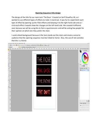
1. Opening Sequence title design
The design of the title for our main task ‘The Dose’. Created on Serif DrawPlus X6, as I
wanted to use different types of effects to make it stand out. It was fun to experiment each
type of effect by opening up the filter effects and keeping it to the right hand side and as I
click each effect it would show the changes on the left hand side. We created 4 different
ones because we will be using this to form a questionnaire and will be asking few people for
their opinion on which one they prefer the most.
I used a black background because it the text stands out the most and create a sense to
audience that the opening sequence must be linked to horror. Also, the use of red connotes
that this is a horror.