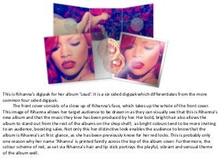
1. This is Rihanna’s digipak for her album ‘Loud’. It is a six sided digipak which differentiates from the more
common four sided digipak.
The front cover consists of a close up of Rihanna’s face, which takes up the whole of the front cover.
This image of Rihanna allows her target audience to be drawn in as they can visually see that this is Rihanna’s
new album and that the music they love has been produced by her. Her bold, bright hair also allows the
album to stand out from the rest of the albums on the shop shelf; as bright colours tend to be more inviting
to an audience, boosting sales. Not only this her distinctive look enables the audience to know that the
album is Rihanna's at first glance, as she has been previously know for her red locks. This is probably only
one reason why her name ‘Rihanna’ is printed faintly across the top of the album cover. Furthermore, the
colour scheme of red, as set via Rihanna's hair and lip stick portrays the playful, vibrant and sensual theme
of the album well.
2. As we open the digipak, there is another image of Rihanna, which covers the three inside pages. The
image if of Rihanna lying on a bed of roses, which is consistent of the colour scheme and also the
theme of roses; which can be found on the front cover of the digipak, on the actual CD’s and also in
Rihanna’s song ‘Only girl in the world’ which features on the album. This iconic scenes in the music
video will allow the audience to make the connection to the album/digipak. Using red roses also
further portrays the theme of love, which coincides with the meaning of her songs.
Throughout the digipak there is a lack of text, conforming to a minimalistic and simplistic
approach. This is so that most of the attention from the target audience is on Rihanna (the main
star). This is quite unusual for a digipak, however it works as Rihanna is a top selling, global artist and
most people will recognise her face without needing to refer to her name.
The digipak contains striking images that really grab the audiences attention. I love the bright
colour of red which has been used , as it catches the eye and conveys a vibrant, bubbly theme.
3. This is the digipak to the soul/RnB duo Lighthouse Family, for their album ‘Ocean Drive’, which is also a
song on the album. The digipak for this album follows the norm of being a four sided digipak.
The front cover contains a picture of the two men that make up the duo, looking very serious, with
their eyes glaring directly into the camera. This is done, to first give a face to the name of the artists and
also to entice the audience and make them feel connected with the duo, via their stares. The old looking
table they are both sitting on, conveys the simplistic approach they are trying to convey. This doesn’t not
draw any attention away from the duo, making them the main focus of the album.
4. When opening the digipak, one photo can be seen. This is of the duo standing with their backs to the
camera, with their heads down looking at the floor. The picture captrues a view of mountains in the distance
and also the rock floor. This again is very minimalistic, making sure that the duo are receiving the most
attention. The men are both dressed a smart, black suit showing that they are in fact a team, who work
together, just like how a football team would wear the same clothing. However, one man is holding a
guitar, which differentiates the two; informing the audience that he is the musician in the duo and the other
may be the vocalist. The second picture and also the image at the back of the digipak, both contain a
lighthouse, which will remind the audience of the name of the duo ‘Lighthouse family’ without having to
read their name, giving them their own stamp on the album. We can also one of the men dancing and
looking like he is putting all emotion into his moves, further implying he is the vocalists. This represents the
genre of the duo, which is soul, as this genre of music has connotations of emotion and heart felt lyrics.
This digipak also contains minimal text. This is so that the main attention can be placed on the pictures.
However, on the back of he digipak, the track list can be found. This follows the black and white colour
scheme, with the writing being in black. It is also place to the side, out of the way of the picture, illustrating
the importance of the picture to the album.