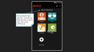
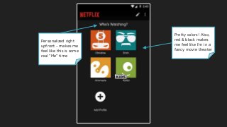
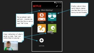
Personalized right
upfront -makes me
feel like this is some
real “Me” time
Pretty colors! Also,
red & black makes
me feel like I’m in a
fancy movie theater
5.
Personalized right
upfront -makes me
feel like this is some
real “Me” time
Pretty colors! Also,
red & black makes
me feel like I’m in a
fancy movie theater
Clear indication of who’s
adult vs kids. “Get ‘em
while they’re young”...
Although minimalist,
personalization takesthe
lead - My List, then Top
Picks for You
Interesting: why do the
labels change from 1st to
3rd person, then use passive
voice?
Saves valuable screenspace
from being taken up with
“Next”/”Prev” buttons
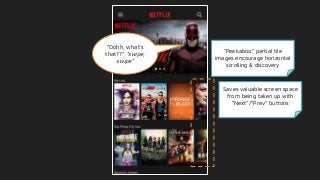
“Oohh, what’s
that??” *swipe,
swipe*
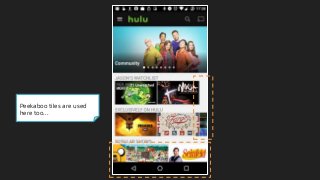
“Peekaboo” partial tile
images encourage horizontal
scrolling & discovery
11.
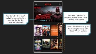
“Peekaboo” partial tile
imagesencourage horizontal
scrolling & discovery
Saves valuable screen space
from being taken up with
“Next”/”Prev” buttons
Wonder why they didn’t
apply the same trick here,
and used slider dot
navigation instead?
12.
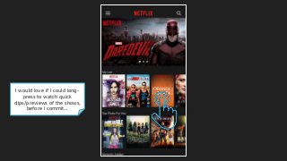
I would loveif I could long-
press to watch quick
clips/previews of the shows,
before I commit...
13.
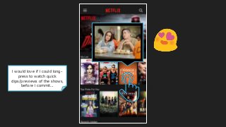
I would loveif I could long-
press to watch quick
clips/previews of the shows,
before I commit...
14.
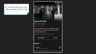
Ok, so let’scatch up on HoC,
before Season 5 hits in May
;)
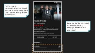
Same partial tiletrick used
for episode listings,
although header is the
only visual
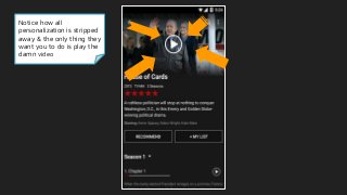
Notice how all
personalization is stripped
away & the only thing they
want you to do is play the
damn video
17.
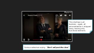
The player interfaceis all
business - again, all
personalization is stripped
away, leaving only
functional elements
18.
This interface isall
business - again, all
personalization is stripped
away, leaving only
functional elements
Famous salesman saying: “Don’t sell past the close”
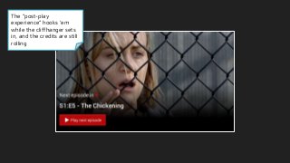
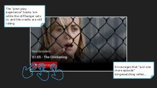
The “post-play
experience” hooks‘em
while the cliffhanger sets
in, and the credits are still
rolling
Encourages that “just one
more episode”
bingewatching reflex...
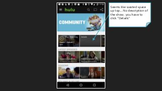
Seems like wastedspace
up top... No description of
the show, you have to
click “Details”
35.
Seems like wastedspace
up top... No description of
the show, you have to
click “Details”
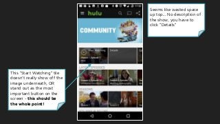
This “Start Watching” tile
doesn’t really show off the
image underneath, OR
stand out as the most
important button on the
screen - this should be
the whole point!
36.
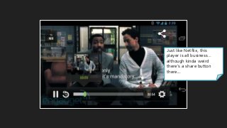
Just like Netflix,this
player is all business…
although kinda weird
there’s a share button
there...
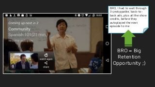
37.
BRO, I hadto wait through
3 unskippable, back-to-
back ads, plus all the show
credits, before they
autoplayed the next
episode for me
38.
BRO, I hadto wait through
3 unskippable, back-to-
back ads, plus all the show
credits, before they
autoplayed the next
episode to me
BRO = Big
Retention
Opportunity ;)
39.
Interesting - whyis the
content I just watched
more prominent than the
content I want to watch
next? Another BRO!
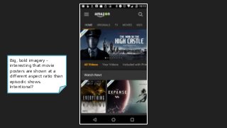
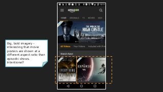
41.
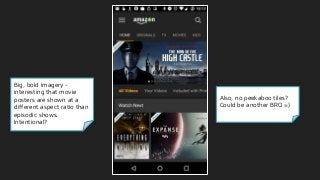
Big, bold imagery-
interesting that movie
posters are shown at a
different aspect ratio than
episodic shows.
Intentional?
42.
Big, bold imagery-
interesting that movie
posters are shown at a
different aspect ratio than
episodic shows.
Intentional?
43.
Big, bold imagery-
interesting that movie
posters are shown at a
different aspect ratio than
episodic shows.
Intentional?
Also, no peekaboo tiles?
Could be another BRO =)
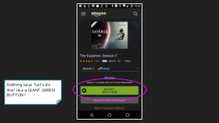
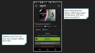
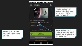
Nothing says “Let’sdo
this” like a GIANT GREEN
BUTTON!
Also interesting that
there’s ZERO description
of the show. WTF am I
about to watch??
51.
Nothing says “Let’sdo
this” like a GIANT GREEN
BUTTON!
Also interesting that
there’s ZERO description
of the show. WTF am I
about to watch??
Social proof is pretty
crammed in there, too -
IMDB is there representin’
for credibility...
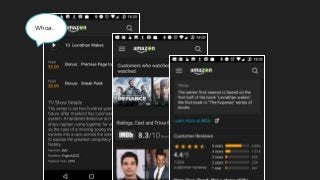
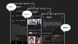
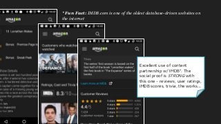
I take itall back, there’s a TON
of content here. But I would’ve
completely missed it, if I hadn’t
kept scrolling past all the
episodes. Huge BRO, bro! (OK,
I’ll stop)
57.
Excellent use ofcontent
partnership w/ IMDB*. The
social proof is STRONG with
this one - reviews, user ratings,
IMDB scores, trivia, the works...
* Fun Fact: IMDB.com is one of the oldest database-driven websites on
the internet
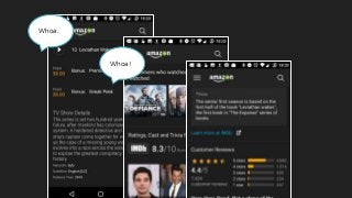
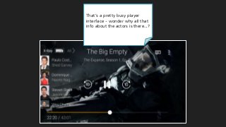
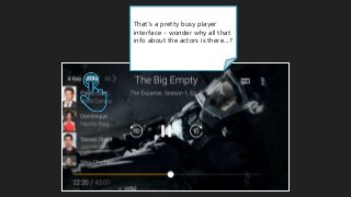
58.
That’s a prettybusy player
interface - wonder why all that
info about the actors is there...?
59.
That’s a prettybusy player
interface - wonder why all that
info about the actors is there...?
60.
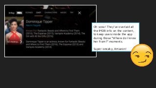
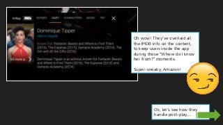
Oh wow! They’veoverlaid all
the IMDB info on the content,
to keep users inside the app
during those “Where do I know
her from?” moments.
Super-sneaky, Amazon!
61.
Oh wow! They’veoverlaid all
the IMDB info on the content,
to keep users inside the app
during those “Where do I know
her from?” moments.
Super-sneaky, Amazon!
Ok, let’s see how they
handle post-play...
63.
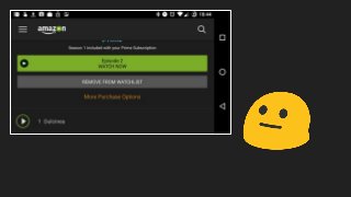
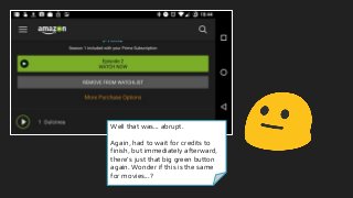
Well that was...abrupt.
Again, had to wait for credits to
finish, but immediately afterward,
there’s just that big green button
again. Wonder if this is the same
for movies...?
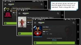
64.
They all simplydump me back on
the info page of the movie I just
watched. That’s a huge BR- uh...
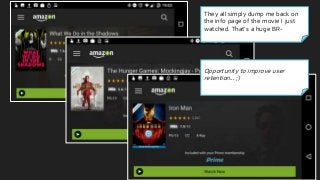
65.
They all simplydump me back on
the info page of the movie I just
watched. That’s a huge BR-
Opportunity to improve user
retention... ;)
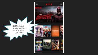
#4 First question after logging in, who’s watching? Personalized right upfront, good going - makes me feel like this is really some “me” time
Pretty colors! Red & black makes me feel like I’m in a fancy movie theater, even though it’s all happening on a tiny screen
Customized icons are pretty cool
Clear indication of who are the kids vs adults
Nice clear + add button
#5 First question after logging in, who’s watching? Personalized right upfront, good going - makes me feel like this is really some “me” time
Pretty colors! Red & black makes me feel like I’m in a fancy movie theater, even though it’s all happening on a tiny screen
Customized icons are pretty cool
Clear indication of who are the kids vs adults
Nice clear + add button
#6 First question after logging in, who’s watching? Personalized right upfront, good going - makes me feel like this is really some “me” time
Pretty colors! Red & black makes me feel like I’m in a fancy movie theater, even though it’s all happening on a tiny screen
Customized icons are pretty cool
Clear indication of who are the kids vs adults
Nice clear + add button
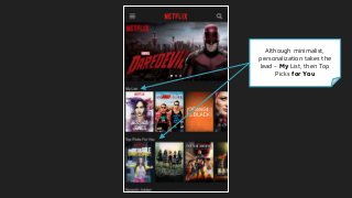
#7 Bam, content! One touch is all I need to start getting recommendations.
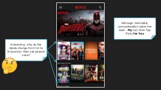
Although minimalist, everything this is here is personalized - My List, then Top Picks for You
Interesting, why does it change from 1st to 3rd person labelling?
Then passive voice - “Recently Added”
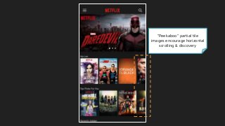
They’re using the masonry trick to encourage horizontal scrolling, just like Pinterest
Saves having to use valuable screen space for Next/Prev buttons
Same trick used w/ Recently Added - “Ooohh, what’s new??”
Opportunities
Really wish I could long-press to see clips or highlights of the shows - I’m a cynical millennial, I don’t trust the marketing posters ;)
Lots of horizontal scrolling is tiring - it’s easier to vertically scroll more frequently
#8 Bam, content! One touch is all I need to start getting recommendations.
Although minimalist, everything this is here is personalized - My List, then Top Picks for You
Interesting, why does it change from 1st to 3rd person labelling?
Then passive voice - “Recently Added”
They’re using the masonry trick to encourage horizontal scrolling, just like Pinterest
Saves having to use valuable screen space for Next/Prev buttons
Same trick used w/ Recently Added - “Ooohh, what’s new??”
Opportunities
Really wish I could long-press to see clips or highlights of the shows - I’m a cynical millennial, I don’t trust the marketing posters ;)
Lots of horizontal scrolling is tiring - it’s easier to vertically scroll more frequently
#9 Bam, content! One touch is all I need to start getting recommendations.
Although minimalist, everything this is here is personalized - My List, then Top Picks for You
Interesting, why does it change from 1st to 3rd person labelling?
Then passive voice - “Recently Added”
They’re using the masonry trick to encourage horizontal scrolling, just like Pinterest
Saves having to use valuable screen space for Next/Prev buttons
Same trick used w/ Recently Added - “Ooohh, what’s new??”
Opportunities
Really wish I could long-press to see clips or highlights of the shows - I’m a cynical millennial, I don’t trust the marketing posters ;)
Lots of horizontal scrolling is tiring - it’s easier to vertically scroll more frequently
#10 Bam, content! One touch is all I need to start getting recommendations.
Although minimalist, everything this is here is personalized - My List, then Top Picks for You
Interesting, why does it change from 1st to 3rd person labelling?
Then passive voice - “Recently Added”
They’re using the masonry trick to encourage horizontal scrolling, just like Pinterest
Saves having to use valuable screen space for Next/Prev buttons
Same trick used w/ Recently Added - “Ooohh, what’s new??”
Opportunities
Really wish I could long-press to see clips or highlights of the shows - I’m a cynical millennial, I don’t trust the marketing posters ;)
Lots of horizontal scrolling is tiring - it’s easier to vertically scroll more frequently
#11 Bam, content! One touch is all I need to start getting recommendations.
Although minimalist, everything this is here is personalized - My List, then Top Picks for You
Interesting, why does it change from 1st to 3rd person labelling?
Then passive voice - “Recently Added”
They’re using the masonry trick to encourage horizontal scrolling, just like Pinterest
Saves having to use valuable screen space for Next/Prev buttons
Same trick used w/ Recently Added - “Ooohh, what’s new??”
Opportunities
Really wish I could long-press to see clips or highlights of the shows - I’m a cynical millennial, I don’t trust the marketing posters ;)
Lots of horizontal scrolling is tiring - it’s easier to vertically scroll more frequently
#12 Bam, content! One touch is all I need to start getting recommendations.
Although minimalist, everything this is here is personalized - My List, then Top Picks for You
Interesting, why does it change from 1st to 3rd person labelling?
Then passive voice - “Recently Added”
They’re using the masonry trick to encourage horizontal scrolling, just like Pinterest
Saves having to use valuable screen space for Next/Prev buttons
Same trick used w/ Recently Added - “Ooohh, what’s new??”
Opportunities
Really wish I could long-press to see clips or highlights of the shows - I’m a cynical millennial, I don’t trust the marketing posters ;)
Lots of horizontal scrolling is tiring - it’s easier to vertically scroll more frequently
#13 Bam, content! One touch is all I need to start getting recommendations.
Although minimalist, everything this is here is personalized - My List, then Top Picks for You
Interesting, why does it change from 1st to 3rd person labelling?
Then passive voice - “Recently Added”
They’re using the masonry trick to encourage horizontal scrolling, just like Pinterest
Saves having to use valuable screen space for Next/Prev buttons
Same trick used w/ Recently Added - “Ooohh, what’s new??”
Opportunities
Really wish I could long-press to see clips or highlights of the shows - I’m a cynical millennial, I don’t trust the marketing posters ;)
Lots of horizontal scrolling is tiring - it’s easier to vertically scroll more frequently
#14 Bam, content! One touch is all I need to start getting recommendations.
Although minimalist, everything this is here is personalized - My List, then Top Picks for You
Interesting, why does it change from 1st to 3rd person labelling?
Then passive voice - “Recently Added”
They’re using the masonry trick to encourage horizontal scrolling, just like Pinterest
Saves having to use valuable screen space for Next/Prev buttons
Same trick used w/ Recently Added - “Ooohh, what’s new??”
Opportunities
Really wish I could long-press to see clips or highlights of the shows - I’m a cynical millennial, I don’t trust the marketing posters ;)
Lots of horizontal scrolling is tiring - it’s easier to vertically scroll more frequently
#15 I feel like I need me some HoC (need to get caught up before Season 5 comes out next month!) https://variety.com/2017/tv/news/house-of-cards-season-5-premiere-may-30-1201964931/
Notice how all personalization is stripped away now - the only thing they really want you to do is play the damn video, or take some other action
Same cutoff trick used for episode listings, although header is the only visual
#16 I feel like I need me some HoC (need to get caught up before Season 5 comes out next month!) https://variety.com/2017/tv/news/house-of-cards-season-5-premiere-may-30-1201964931/
Notice how all personalization is stripped away now - the only thing they really want you to do is play the damn video, or take some other action
Same cutoff trick used for episode listings, although header is the only visual
#17 I feel like I need me some HoC (need to get caught up before Season 5 comes out next month!) https://variety.com/2017/tv/news/house-of-cards-season-5-premiere-may-30-1201964931/
Notice how all personalization is stripped away now - the only thing they really want you to do is play the damn video, or take some other action
Same cutoff trick used for episode listings, although header is the only visual
#18 This interface is all business - again, all personalization is stripped away, leaving only functional elements
Famous salesman saying “Don’t sell past the close”
#19 This interface is all business - again, all personalization is stripped away, leaving only functional elements
Famous salesman saying “Don’t sell past the close”a
#20 The “post-play experience” - hook ‘em while the ciffhanger sets in, and the credits are still rolling
Encourages bingewatching
#21 The “post-play experience” - hook ‘em while the ciffhanger sets in, and the credits are still rolling
Encourages “just one more episode” bingewatching
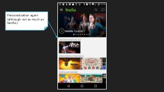
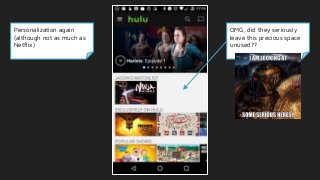
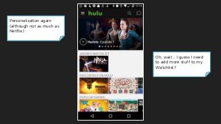
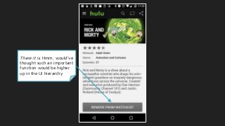
#23 Personalization again (although not as much as Netflix)
OMG, did they seriously leave this precious mobile screen space wide open??
Oh, wait… I need to add more stuff to my “Watchlist”, I guess?
What’s exactly is a watchlist, btw? I can take a guess, but would be nice to know, as a new user
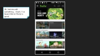
Ok, lemme add something… Oooh, I’ve heard Rick & Morty’s good, let’s add that
#24 Personalization again (although not as much as Netflix)
OMG, did they seriously leave this precious mobile screen space wide open??
Oh, wait… I need to add more stuff to my “Watchlist”, I guess?
What’s exactly is a watchlist, btw? I can take a guess, but would be nice to know, as a new user
Ok, lemme add something… Oooh, I’ve heard Rick & Morty’s good, let’s add that
#25 Personalization again (although not as much as Netflix)
OMG, did they seriously leave this precious mobile screen space wide open??
Oh, wait… I need to add more stuff to my “Watchlist”, I guess?
What’s exactly is a watchlist, btw? I can take a guess, but would be nice to know, as a new user
Ok, lemme add something… Oooh, I’ve heard Rick & Morty’s good, let’s add that
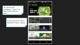
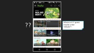
#26 I’ll just press the “Add” button… wait, where is it? How do I add to my watchlist?
I guess “Details”?
#27 I’ll just press the “Add” button… wait, where is it? How do I add to my watchlist?
I guess “Details”?
#28 I’ll just press the “Add” button… wait, where is it? How do I add to my watchlist?
I guess “Details”?
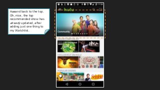
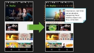
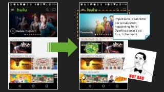
#30 Aaaand back to the top - oh, wait, the top recommended show has already updated, after adding just one show! Impressive real-time personalization
I checked, and Netflix doesn’t do this
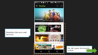
Let’s try Community, I’ve heard good things about that show
#31 Aaaand back to the top - oh, wait, the top recommended show has already updated, after adding just one show! Impressive real-time personalization
I checked, and Netflix doesn’t do this
Let’s try Community, I’ve heard good things about that show
#32 Aaaand back to the top - oh, wait, the top recommended show has already updated, after adding just one show! Impressive real-time personalization
I checked, and Netflix doesn’t do this
Let’s try Community, I’ve heard good things about that show
#33 Aaaand back to the top - oh, wait, the top recommended show has already updated, after adding just one show! Impressive real-time personalization
I checked, and Netflix doesn’t do this
Let’s try Community, I’ve heard good things about that show
#34 Aaaand back to the top - oh, wait, the top recommended show has already updated, after adding just one show! Impressive real-time personalization
I checked, and Netflix doesn’t do this
Let’s try Community, I’ve heard good things about that show
#35
Seems like a bit of wasted space up top, esp. b/c there’s no description of the show - have to click on “Details” to see it
This “Start Watching” tile doesn’t really show off the image underneath well - distracting?
This should be the whole point of the screen, right?
Same mosaic tile tricks being used here
Ok, I’m game - let’s play it!
#36
Seems like a bit of wasted space up top, esp. b/c there’s no description of the show - have to click on “Details” to see it
This “Start Watching” tile doesn’t really show off the image underneath well - distracting?
This should be the whole point of the screen, right?
Same mosaic tile tricks being used here
Ok, I’m game - let’s play it!
#37 Just like Netflix, it’s just the facts ma’am - only what absolutely needs to be there in the player
Kinda weird that there’s a share button here
Anyways, let’s see how they’ll keep me engaged
#38 Whoa, I had to wait through 3 back-to-back ads, plus all the show credits before they showed the post-play experience & autoplaying the next episode
This could be a big opportunity for retaining viewers
Interesting that the content they want me to watch is receded to the background, yet the content I just watched is the most prominent item on the screen… [chinstroke emoji]
Opportunities
Fix the play button! The overlay thing simply obscures the episode thumbnail & makes the CTA button less noticeable
Post-Play Experience could emphasize new content more than old
#39 Whoa, I had to wait through 3 back-to-back ads, plus all the show credits before they showed the post-play experience & autoplaying the next episode
This could be a big opportunity for retaining viewers
Interesting that the content they want me to watch is receded to the background, yet the content I just watched is the most prominent item on the screen… [chinstroke emoji]
Opportunities
Fix the play button! The overlay thing simply obscures the episode thumbnail & makes the CTA button less noticeable
Post-Play Experience could emphasize new content more than old
#40 Whoa, I had to wait through 3 back-to-back ads, plus all the show credits before they showed the post-play experience & autoplaying the next episode
This could be a big opportunity for retaining viewers
Interesting that the content they want me to watch is receded to the background, yet the content I just watched is the most prominent item on the screen… [chinstroke emoji]
Opportunities
Fix the play button! The overlay thing simply obscures the episode thumbnail & makes the CTA button less noticeable
Post-Play Experience could emphasize new content more than old
#42 Big, bold imagery
Interesting that show posters are a different ratio than movies - wonder if that’s intentional signaling to users
Not using the mosaic technique - could be missing out there
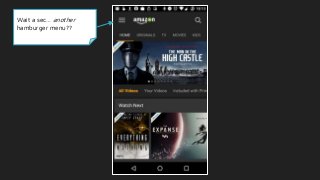
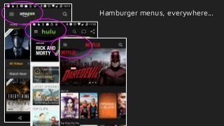
Hamburger menu in the top-left corner - wait a second...
#43 Big, bold imagery
Interesting that show posters are a different ratio than movies - wonder if that’s intentional signaling to users
Not using the mosaic technique - could be missing out there
Hamburger menu in the top-left corner - wait a second...
#44 Big, bold imagery
Interesting that show posters are a different ratio than movies - wonder if that’s intentional signaling to users
Not using the mosaic technique - could be missing out there
Hamburger menu in the top-left corner - wait a second...
#45 Big, bold imagery
Interesting that show posters are a different ratio than movies - wonder if that’s intentional signaling to users
Not using the mosaic technique - could be missing out there
Hamburger menu in the top-left corner - wait a second...
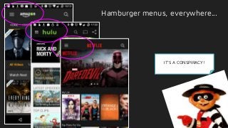
#46 It’s a conspiracy! [Scream emoji] [Hamburglar]
#47 It’s a conspiracy! [Scream emoji] [Hamburglar]
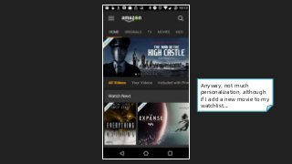
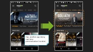
#48 Anyway, not much apparent personalization to the user, although if I add a new movie to my watchlist...
#49 It does appear to do real-time personalization (Goliath & Infiltrator)
#50 Nothing says “Let’s do this” like a giant green button ;)
Interesting that there’s literally no overall description of the show!
Social proof crammed in there, from other shoppers & IMDB for credibility
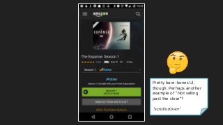
Pretty bare-bones UI here - perhaps another example of not “selling past the close”?
#51 Nothing says “Let’s do this” like a giant green button ;)
Interesting that there’s literally no overall description of the show!
Social proof crammed in there, from other shoppers & IMDB for credibility
Pretty bare-bones UI here - perhaps another example of not “selling past the close”?
#52 Nothing says “Let’s do this” like a giant green button ;)
Interesting that there’s literally no overall description of the show!
Social proof crammed in there, from other shoppers & IMDB for credibility
Pretty bare-bones UI here - perhaps another example of not “selling past the close”?
#53 Nothing says “Let’s do this” like a giant green button ;)
Interesting that there’s literally no overall description of the show!
Social proof crammed in there, from other shoppers & IMDB for credibility
Pretty bare-bones UI here - perhaps another example of not “selling past the close”?
#54 I take it all back - whoa, there’s a ton of content here - would’ve completely missed it, if I hadn’t scrolled past all the episodes
Great use of content partnership w/ IMDB (fun fact, it’s the oldest database-driven websites on the internet!)
The social proof is strong with this one - reviews, IMDB scores, trivia, and more
#55 I take it all back - whoa, there’s a ton of content here - would’ve completely missed it, if I hadn’t scrolled past all the episodes
Great use of content partnership w/ IMDB (fun fact, it’s the oldest database-driven websites on the internet!)
The social proof is strong with this one - reviews, IMDB scores, trivia, and more
#56 I take it all back - whoa, there’s a ton of content here - would’ve completely missed it, if I hadn’t scrolled past all the episodes
Great use of content partnership w/ IMDB (fun fact, it’s the oldest database-driven websites on the internet!)
The social proof is strong with this one - reviews, IMDB scores, trivia, and more
#57 I take it all back - whoa, there’s a ton of content here - would’ve completely missed it, if I hadn’t scrolled past all the episodes
Great use of content partnership w/ IMDB (fun fact, it’s the oldest database-driven websites on the internet!)
The social proof is strong with this one - reviews, IMDB scores, trivia, and more
#58 I take it all back - whoa, there’s a ton of content here - would’ve completely missed it, if I hadn’t scrolled past all the episodes
Great use of content partnership w/ IMDB (fun fact, it’s the oldest database-driven websites on the internet!)
The social proof is strong with this one - reviews, IMDB scores, trivia, and more
#59 Whoa, really busy player interface - wonder why all that info about the actors is there...
#60 Whoa, really busy player interface - wonder why all that info about the actors is there...
#61 Oh, ok, they’ve added tons of extra content in here!
Pretty genius engagement play through content partnership! Keep user in the app, even during those “Where do I know her from??” moments - super sneaky, Amazon!
Alright let’s see the post-play experience...
#62 Oh, ok, they’ve added tons of extra content in here!
Pretty genius engagement play through content partnership! Keep user in the app, even during those “Where do I know her from??” moments - super sneaky, Amazon!
Alright let’s see the post-play experience...
#63 Damn, they waste no time - again, had to wait till the credits finished, but as soon as the video was done, there’s that big green button again
Granted, this was for an episodic show - let’s see what they do at the end of a movie...
#64 Damn, they waste no time - again, had to wait till the credits finished, but as soon as the video was done, there’s that big green button again
Granted, this was for an episodic show - let’s see what they do at the end of a movie...
#65 I tried 3 other movies, and they all just dump the user back on the info page - no recommendations, no autoplay, etc.
Opportunities
This could be a huge retention dropoff point for Amazon
#66 I tried 3 other movies, and they all just dump the user back on the info page - no recommendations, no autoplay, etc.
Opportunities
This could be a huge retention dropoff point for Amazon


![Number_Guessing_Game_Dsbsbssbzboc[1].pptx](https://cdn.slidesharecdn.com/ss_thumbnails/numberguessinggamedoc1-251206215042-a076fc05-thumbnail.jpg?width=640&height=640&fit=bounds)


