Dexlab Analytics - How to Create a Speedometer Chart
•Download as PPTX, PDF•
2 likes•646 views

Watch this presentation to create a speedometer in MS Excel using simple charts. Stay tuned for more awesome tips and tricks in Excel. Visit us at the given link for information on MS Excel Certification: http://www.dexlabanalytics.com/courses/ms-excel-vba

Recommended
More Related Content
More from Dexlab Analytics
More from Dexlab Analytics (10)
Recently uploaded
Recently uploaded (20)
Dexlab Analytics - How to Create a Speedometer Chart
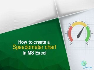
- 1. Speedometer chart In MS Excel How to create a
- 2. Do you think this speedometer looks cool?
- 3. You can learn to make it on your own Here’s how…
- 4. Creating a speedometer in Excel is fairly simple To make it one first has to create two different charts. Here is a sample data sheet: The first chart will include the following data.
- 5. This is the data that will be used to create this speedometer dial. The table will include 5 components to build the dial.
- 6. Explaining different parts of the dial: • The starting point will be Zero, and the point marked as ‘Initial = 15’ is the part marked in Red in the dial. • The ‘Middle = 45’ is the yellow part of the dial, starting from the end of ‘Initial = 15’ • The last part colored in green is written as ‘End = 100’ and forms the highest point of denomination in the dial of the speedometer.
- 7. Here is picture highlighting the areas of our speedometer dial:
- 8. The Max value is 100 which is the total speed that we are trying to achieve with this speedometer. This is the total of the three parts mentioned in the table.
- 9. The second part of the table is for pointer. The data given is explained herein: The Value row gives the number at the point where the pointer lies. One may also change the value by manually putting in the desired position of the pointer. The second entry written as “Pointer = 1”is actually the width of the needle. By increasing this value manually one can make the needle wider. The value 1 suggests that the needle is consuming 1 Cell to show the needle. The point marked as ‘End’ is actually to show the needle in a balanced position from the centre. This value is input using a formula which is “200 – (the sum of Value + Pointer)”. The formula is mentioned in the image attached.
- 10. Explaining the Pointer End formula: • The formula 200 – (the sum of Value + Pointer) is used as the sum of Speedometer values: Initial + Middle + End + Max = 200. • So, the End value of the pointer is the Total of [Initial + Middle + End + Max = 200] – the Total of [the sum of Value + Pointer].
- 11. Steps to create the speedometer dial: • First, click on Insert • Select a Doughnut chart from the options in Other Chart • Once the space for the chart appears drag it to the side where you need it and then click on data.
- 12. Here is a visual representation of the steps:
- 13. After clicking on data the following dialogue box will appear: Then click on the series from the cell where the Speedometer series starts and click on Add. The next step is to put in a series name which can be dubbed as Speedometer. The box for adding Series Value should contain all the numbers for the speedometer. Simply click and add them.
- 14. Here’s how…
- 15. The next step is to simply tweak the orientation to have a speedometer dial. • In order to do so, right click on the chart and select “Format Data Series” option from the list. • At the Rotation slider change the value manually to get an orientation that looks like this:
- 16. The final step is to simply hide the Blue area. • To do that, Click on Fill and Select the option “No Fill”.
- 17. Once done, you can change the colors as per the Speedometer with Green, Yellow and Red. We have also deleted the color index as it was unnecessary you can choose to keep it if needed or simply delete it.
- 18. Creating the pointer: • In order to add the pointer insert another doughnut chart and add the data of the pointer. • The Series name will be pointer and the series data will be the numbers in the Pointer table. • Once put click on Add and then on Ok • Then to turn this chart into a needle we need to change the outer chart’s type.
- 19. • Select the Chart Type as a Pie Chart. • Then change the orientation of the chart. The orientation has to be the same as the first doughnut chart. So, tweak it till the same value. • The next step is to hide the Green larger area so, click on it and go to “Fill” option. • Select “No Fill” and you will find your doughnut back. • Then follow the same steps to hide the Blue part. • And Voila! Now you have a Pointer and a Speedometer Dial. Then one can change the color and add a Data Label to the pointer.
- 20. Here’s what your final output should look like:
- 21. To reflect the pointer value as a variable based on its location • Go to the pointer data label • In the data entry bar • Input = and then simply copy paste the formula of the Cell which has the Pointer Value. • This is the on ->
- 22. Now you know how to create your own Speedometer chart DexLab Solutions Corp. M. G. Road, Gurgaon 122 002, Delhi NCR. +91 852 787 2444 +91 124 450 2444 DexLab Solutions Corp. Gokhale Road, Model Colony, Pune – 411016. +91 880 681 2444 +91 206 541 2444 Contact us: