Beginners Guide to TikTok for Search - Rachel Pearson - We are Tilt __ Bright...
Showtime online
1. Clothing sales were shrinking, while the home In an age of instant icons and endless media
décor market was growing. This was long before images, how can anyone predict what American
Donna Karan stepped into the home market, consumers will want next?
long before Kate Spade went from handbags to
tableware, Sude points out. “Fran has a God-given talent,” says Cathy Valent, the
Southeastern rep for Design Options, who was a
longtime colleague of
A feel for the future
Sude’s in the apparel
business.
Sude relies on
Fran Sude made her living for 30 years predicting researchers who “shoot
clothing colors and textures that would appeal to American and shop.” With no predetermined ideas, they
shoppers. One day she saw the writing on the wall. photograph whatever “they see.” Sude looks at the
images and decides which themes are commercially
viable and then the team goes back out to expand
“People were spending less on clothes after 9-11 on those themes. Ultimately her home furnishings
and nesting more.” clients end up looking at six lifestyle trends twice a
year. When a trend pops up overnight, triggered by
She took a leap of faith and extended her anything from Hollywood gowns to international
sought-after services for the apparel trade to events, Sude releases to clients what she calls a
include “lifestyle trends,” forecasting for the home “power palette.” One recent sudden sensation was
furnishings market. called “Seeing Red,” an arresting splash of color, and
another, called La Vida Mocha, featured soft browns
inspired by retro influences.
Laura Levinson, senior vice president of product
development and marketing for Valdese Weavers
Inc., subscribes to Design
Options services and says the
yarn colors are very saleable
and the products are user-
friendly.
The North Carolina-based
jacquard manufacturer
started dying colors the day
after it received its first color
palette, Levinson says.
“We have over 16 designers Cathy Valent
for contract and residential Design Options
clients and we use the colors
for all of them, to fill voids or augment our color
lines.” Valdese designers look at the trends for color
combinations and inspiration to use in their work,
Levinson says.
10 Showtime Magazine Winter 2006
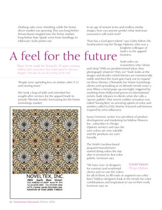
2. Design Options FALL/WINTER 2007 Shades of the season mimic the look of day
and nighttime illumination. Pastel tints seem to gleam as if enveloped by hazy rays of winter sun. Jewel tones sparkle like strings of party
lights. Each palette is used to create inviting living spaces. Tonal combinations enhance streamlined offices and luxurious master suites.
Rooms for work and relaxation are transformed when decorated with hues from opposite ends of the color spectrum. Carved wood, smooth
stones, and glistening pearl accents bring the best of nature to each personal sanctuary.
Soft Spot: On the spot…Soft Spot. Green and blue shades of secret garden and magical Successories: Tools for success…Successories. Brown and green tones of weathered bark
sky enliven supple suede upholstery. Plush velvet pillows and ottomans provide comfort for and dewy stem are combined on corduroy and linen bedding. Tables and chairs used for
winter nights spent by the fire. Glass and lacquer are combined to give living room accents dining are crafted from aged mahogany. Polished copper vases are placed throughout the
a modern flair. Pink and brown tints of mystical rose and enchanted forest outline blurred home for a touch of shine. Beige and silver tints of misted pebble and gentle rain highlight
geometric designs. Peach and yellow hues of beautiful blossom and gilded sunflower shade classic stripes. White and platinum hues of snow cloud and thunderstorm accent delicate
luxurious cashmere panels used as window treatments. The perfect spot…Soft Spot. floral and branch motifs. More than accessories…Successories.
Bright Living: On the bright side…Bright Living. Turquoise and ruby shades of chilled Natural Elements: Nature’s finest…Natural Elements. Blue and silver hues of
air and winter bloom are used to fill in bold awning stripes. Lively guests sit on cushions falling star and hidden moon cover calico squares and ticking stripes. Patchwork quilts
covered with playful tropical hibiscus prints. Frayed satin ribbons are transformed into are patterned after ancient mosaic tile designs. Swirling paisley and marbleized patterns
tiebacks for billowing curtains. Yellow and orange tones of distant sun and frozen poppy decorate rinsed chambray coverlets that double as wall hangings. Gold and tan tints
look fresh on throw rugs in polka dot shapes. Pink and purple hues of strawberry sangria of wheat field and earthenware color brushed plaid flannel. Green and purple tones of
and plum tart are just right on fluffy angora throw pillows. Living it up…Bright Living. sagebrush and fragrant lavender are alternated on tassels and braided trims. Elements of
style…Natural Elements.
Old World Charm: Turn on the charm…Old World Charm. Coral and pink tints of Point of View: The perfect view…Point of View. Silver and purple tones of morning
majestic dawn and prairie flower give wool blankets a feminine touch. Bedspreads made from whisper and floating plume are sophisticated on dupioni silks used as tablecloths. Lacquer
silk and chenille have enticing textural contrast. Wood beams accented with silver give favorite folding screens have the sheen of polished marble. Airbrushed designs on walls look like
spaces a rustic look. Purple and brown hues of lilac shadow and bird’s nest are mixed on slowly moving clouds. Lilac and mauve tints of echoing wind and highest mountain
distressed denim for added depth. Brown and rose tones of copper cinder and pressed petal are outline cracked resin coatings. Orange and indigo hues of flickering flame and lakeside
blended to create soothing ombré effects. Full of charm…Old World Charm. highlight faceted crystals and tiny shells that embellish each surface. Enjoy the view…
Point of View.
12 Showtime Magazine Winter 2006