4. Testing Drug Izitwerkin: Traffic Light
The predefined objectives
of the study are:
# 1 ……, #2…. #3….. #4….. #5…..
For X$ within Y months
Cut to the chase: we know
what are the objectives.
Did we meet them?
We need to make plans
for lunch…..
5. Testing Drug Izitwerkin: Green Light
Great, we can quit
early
& celebrate
over lunch
Met all predefined objectives
for efficacy, safety, etc.
And also budget, timelines,….
6. Testing Drug Izitwerkin: Red Light
Clearly failed on predefined
objectives for efficacy, safety,
budget, timeline, etc.
Which failed? ….
If it’s critical, we cancel the rest.
We’ll commiserate over lunch….
7. Testing Drug Izitwerkin: Yellow Light
Mostly met objectives, but….
Neither clear success
nor clear failure
But what? ….
Should we have had more patients?
A little over budget? A little late?
Some bad luck? Unusual circumstances?
What can we salvage?
What do we have to redo?
Get lunch delivered,
it’s going to be a long day…..
8. Targets: Testing Drug Izitwerkin
Multiple Objectives, Multiple Shots:
Timelines Budget
Adverse Events
Abnormal Lab Changes
Pain Relief
Drug Stability
Speed of Relief
Ready…..
9. Targets: Aiming for Multiple Objectives
Timelines Budget
Adverse Events
Abnormal Lab Changes
Pain Relief
Drug Stability
Speed of
Relief
FIRE!!!Aim…..
10. Targets: Traffic light color code
Timelines Budget
Adverse Events
Abnormal Lab Changes
Pain Relief
Drug Stability
Speed of
Relief
11. Targets: 1 Radial Axis per Objective
Timelines Budget
Adverse Events
Abnormal Lab Changes
Pain Relief
Drug Stability
Speed of
Relief
14. Tolstoy?
⇒Visual, rapid, high level understanding
without having to read & interpret
⇒ Click on each target to drill down for details
Happy
families
are all alike;
Every failed project
fails
in its own way.
--Not Tolstoy
Every unhappy
family
is unhappy
in its own way.
--Leo Tolstoy
(Anna Karenina)
Successful projects
are all alike;
16. Convention: The waterline
Above the waterline:
• Known unknowns
• Things we know
we don’t know
• Eg, efficacy
• Things to get us off the ground
(…MUST have some Green…)
Below the waterline:
• Unknown unknowns
• Things we don’t know
we don’t know
• Eg, safety
•Things to sink us
(…MUST NOT have any Red…)
18. Adding Confidence/Certainty Ranges
Elicited opinions,
Statistical Calculations
• Best Case
/Worst Case
• Hi/Med/Low
Uncertainty
• Best likely
/ Worst Likely
• Optimistic
/ Pessimistic
• Estimates
+ 95% Confidence Intervals
19. Piling on the Symbols
Circles
and pluses
and X’es,
oh my!
Perhaps:
● ⟶Splats are point estimates
O ⟶ Past Estimates
+ ⟶ Optimal (nice to have)?
X ⟶ The competition?
20. Extreme Example (24 axes x 6 values)
• Complex but
Interpretable
• Additional
Symbols take
some effort
• Splats aren’t
bad
• Use sparingly
● Point estimates
― Range
O Past Estimates
+ Optimal
X The competition
22. Comparing Projects in the ABC program
At a
glance,
can see
successes
& failures!
--And
Where!
Study ABC-OhNoStudy ABC-GoGo
Study ABC-GoSlo Study ABC-NoNo
23. Larger project with some issues –
apparently including damaged
equipment
Big Picture: Multiple Project Dashboard
(Randomly generated dredging examples)
Small project
with many
problems, but on
schedule and in
budget
Larger project with a
couple of possible
problems, but overall
doing well
Metrics for Dredging Projects
& Summary over all Projects
Bad weather, so a
little behind
schedule,
but in budget
Bars indicate range of metric over all projects
24. Mass Screening of Evolving Enzymes
Criteria:
At each step:
• Pick best candidates for each criteria
• Recombine those to generate new candidates
• Repeat until optimal
Alkalinity, Acidity, Yield, Salinity, Metal Tolerance,
Durability, Km (Michaelson’s constant)
T.Targets provide comprehensive & visual
feedback on process
GenerationX
Generation1
25. Ex. Transfusion Risks
Whole plot
≣ One Patient
Each Radial Axis
≣ Blood type Group
Each Dot
≣ Patient Risk
Green Dot Low Risk
⇒ Normal procedures
Red Dot High Risk
⇒ Clear & identified risk
⇒ Special Procedures
Yellow Dot Uncertain Risk
Moderate Risks
⇒ Caution
⇒ Further testing?
No Dot No Information
¡No confusion with Low Risk
!
26. Transfusion Risk of Multiple Patients
Risks for 16 patients
⟶ Each Legible
3 Redundancies:
• Color ≣ Traffic-Light
coding
{Red, Yellow, Green}
• Location ≣ Targets
Red on Rim, next to label
⟶ Easier to identify
• Size ≣ Proportional to Risk
The Tolstoy principal:
"All happy families are alike;
Every unhappy family is unhappy
in it's own way.” (Anna Karenina)
Low Risk patients look alike
High Risk patients are distinct!
⟶ What way & How much
27. Predicted Risks vs Outcomes
• Unclear connections between
Risks & Outcomes
• Add feedback on outcome
• Some risks may have a
stronger connection with bad
outcomes
Circle the target
(Same conventions)
Good Outcome ≣ Thin Green
Mixed outcome ≣ Yellow
Bad outcome ≣ Thick Red
Unknown outcome ≣ No Circle
Example: ―――⟶
One Bad Outcome
Patient with 2 risk factors
Mostly Good Outcomes
Even with Risk Factors
28. Assessment Scores
• For 12 patients
• Factor scores from
3 assessments
• Mania,
Depression,
Schizophrenia
• 3 Total Scores
+ 11 subscales
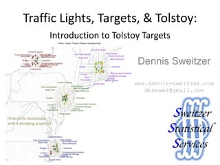
31. For more information, see my website:
www.dennis-sweitzer.com
My linked-In profile:
http://www.linkedin.com/in/dennissweitzer
Or email me:
denswei@gmail.com
Editor's Notes
“The History of every major Galactic Civilization tends to pass through three distinct and recognizable phases, those of Survival, Inquiry and Sophistication, otherwise known as the How, Why, and Where phases. For instance, the first phase is characterized by the question 'How can we eat?' the second by the question 'Why do we eat?' and the third by the question 'Where shall we have lunch?”
For pdf version (replaces previous 2 slides)
Mutated from WLGore’s management principals.
Plimsoll mark
Above & below the waterline is easy.
Is there any other ways to categorize? (say, left-right)
because as we know, there are known knowns; there are things we know we know. We also know there are known unknowns; that is to say we know there are some things we do not know. But there are also unknown unknowns - - the ones we don't know we don't know. And if one looks throughout the history of our country and other free countries, it is the latter category that tend to be the difficult ones. – Donald Rumsfield
Plimsoll mark
Above & below the waterline is easy.
Is there any other ways to categorize? (say, left-right)
These were just convenient to do in Excel.
Additional elements should be added sparingly
Very sparingly, as appropriate:
Say, O’s for last budget & Timelines, X’s for competitors in select outcomes +’s for ????
For epidemiology:
O’s might be observed parameters (infectivity, etc) for isolated cases,
Splats & bars might be
Abc-GoGo is a happy family: objectives were met.
Abc-GoSlo is pretty average. Got some issues
Abc-OhNo has some problems in some areas
Abc-NoNo has lots of problems
Evolving Enzymes
Must meet criteria for
Durability, Metal Tolerance, Salinity, Yield
Seek best criteria for
Acidity, Alkalinity, Km (Michaelson’s constant)
We had brainstormed about blood bank uses of the plot on my Business card, so I made a few to see how they would look. Attached are 3 4 5 figures, one with a single plot, two with 16, and one with 100. (here I explored about how to use them for transfusion risk, but they can be used in many ways) The basic plot for a transfusion candidate (below) has blood group typing systems on radial axes, with ABO and Rh on the horizontal axes for easy identifiably, less frequent ones below, and more frequent ones above. The interpretation of this is that: Green dots (toward the center) indicate normal procedures can be used with low risk to the patient, Red dots (outermost) indicate that special handling is required because of a clear & identified risk to the patients (say, known to be heterozygous), and Yellow dots (middle band) indicate there are risk factors (say, the patient is part of an at-risk ethnic group). NB: the plot would change for a patient as more information became known. An Rh- patient might automatically be in the yellow, and an Rh- patient who has been exposed to Rh antigens might automatically be classified in the red. There is also different levels within each band (3 risk bands x 3 levels each). For instance, on the ABO axis, an AB patient would be on the innermost level because they are "universal recipients", while an O patient would be on the outermost green level, an A or B type would be on the middle level, but an O patient exposed to A or B antigens might go into the Red. The 9 levels are relatively intuitive since people are conditioned to rate things on a scale of 0 to 10. I usually ask people to imagine the best possible outcome (score=0), the worst possible outcome (score = 0), where the subject falls among Good, Bad, and Mediocre (eg, Low, High, and Medium risk), and then how do they compare to others within the color category (so an extremely Low risk patient might score =1, while a relatively Low risk patient might score=3). Note that the size of the dot increases with the level of risk, so there is 3 redundancies in the ranking (color, location, and size) that make it very easy to rapidly interpret the plots: the color (Red, Yellow, Green, just like a traffic light); the distance from the center (like a target), and the size. Consequently, the highest risks cases are the most obvious, low risk cases are clearly seen as such, and there is little risk of confusing a lack of data (no dot) with a low risk case (small green dot). The graph also follows the Tolstoy principal: "All happy families are alike; Every unhappy family is unhappy in it's own way." (the 1st line of Anna Karenina). Panels of targets can present a rapid overview for many subjects, with the goal of identifying subjects that need special attention. The figure with 16 targets is fairly readable: you can still read off the blood group typing on the labels; in the figure with 100 targets, you can clearly see the category reds & yellows, and can still distinguish the Rh & ABO axes because they are horizontal. I envision a data display in which one clicks on a target out of 100's to drill down for a detailed examination. (It could also automatically select the high risk ones by various criteria). An attending physician might only need see the plot for an individual patient to get an immediate & intuitive grasp of there risks. The floor nurse might review a panel of all patients on the floor to identify those needing special attention; An administrator might review panels of dozens for QC purposes. The last figure includes the outcomes of the transfusion, in order to complete the picture of the represented cases. This might be used to refine the risk assessment process itself (perhaps a green dot should have been red or yellow), or to identify procedural problems (did the staff follow the proper procedures for a yellow dot case? Or was there a flaw in the procedures?). The figure follows the same conventions as the rest of the plot: a thin green line indicates a good outcome; a thick red one, bad; a yellow circle, a mixed outcome; no circle, no outcome. Additional information can be included on the plot, such a a solid line indicating the range of uncertainty in an estimate, circles for the last prior risk assessment (if it has changed), etc. This plot can be used in many other ways: For instance, in a plot of blood product supplies in the entire blood bank the axes could represent blood types & products, the dots represent current stocks, an overlaid circle could indicate predicted future stocks (perhaps several weeks ahead, taking into account expected needs & supplies), and confidence limits as an overlaid solid bar indicating the range of uncertainty in predicted future stocks (perhaps from simulations based on historical data. In this use, if a confidence limit enters a red band, contingency plans might be implemented to reduce that risk).
I envision a data display in which one clicks on a target out of 100's to drill down for a detailed examination. (It could also automatically select the high risk ones by various criteria). An attending physician might only need see the plot for an individual patient to get an immediate & intuitive grasp of there risks. The floor nurse might review a panel of all patients on the floor to identify those needing special attention; An administrator might review panels of dozens for QC purposes. The last figure includes the outcomes of the transfusion, in order to complete the picture of the represented cases. This might be used to refine the risk assessment process itself (perhaps a green dot should have been red or yellow), or to identify procedural problems (did the staff follow the proper procedures for a yellow dot case? Or was there a flaw in the procedures?). The figure follows the same conventions as the rest of the plot: a thin green line indicates a good outcome; a thick red one, bad; a yellow circle, a mixed outcome; no circle, no outcome. Additional information can be included on the plot, such a a solid line indicating the range of uncertainty in an estimate, circles for the last prior risk assessment (if it has changed), etc. This plot can be used in many other ways: For instance, in a plot of blood product supplies in the entire blood bank the axes could represent blood types & products, the dots represent current stocks, an overlaid circle could indicate predicted future stocks (perhaps several weeks ahead, taking into account expected needs & supplies), and confidence limits as an overlaid solid bar indicating the range of uncertainty in predicted future stocks (perhaps from simulations based on historical data. In this use, if a confidence limit enters a red band, contingency plans might be implemented to reduce that risk).
The last figure includes the outcomes of the transfusion, in order to complete the picture of the represented cases. This might be used to refine the risk assessment process itself (perhaps a green dot should have been red or yellow), or to identify procedural problems (did the staff follow the proper procedures for a yellow dot case? Or was there a flaw in the procedures?). The figure follows the same conventions as the rest of the plot: a thin green line indicates a good outcome; a thick red one, bad; a yellow circle, a mixed outcome; no circle, no outcome.
Row1, Col3: bad outcome in a patient with 2 red risks. Are either of those 2 risks particularly associated a bad outcome? * the upper right risk (red) also occurred in 2 other patients with good outcomes (row1, cols 1&2) * the upper left red risk occurred in 1 other patient with a mixed outcome (42, c2).
⟹ these 2 risk factors might be synergistic