The document discusses an advertisement for the band The xx. It notes that the advertisement uses a simple white background with the band's signature "X" symbol in vibrant colors in the center to draw attention. This minimalist design allows the symbol to stand out and is recognized by fans. The symmetrical placement of the single central image makes it easy to read. The document concludes it will use a similar straightforward design with a unique image for an advertisement of its own band.
1. Alexandra Austin
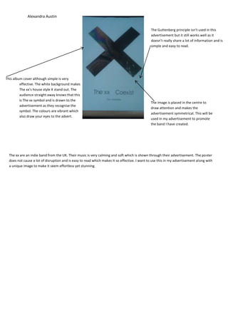
The Guttenberg principle isn’t used in this
advertisement but it still works well as it
doesn’t really share a lot of information and is
simple and easy to read.
This album cover although simple is very
effective. The white background makes
The xx’s house style X stand out. The
audience straight away knows that this
is The xx symbol and is drawn to the
The image is placed in the centre to
advertisement as they recognise the
draw attention and makes the
symbol. The colours are vibrant which
advertisement symmetrical. This will be
also draw your eyes to the advert.
used in my advertisement to promote
the band I have created.
The xx are an indie band from the UK. Their music is very calming and soft which is shown through their advertisement. The poster
does not cause a lot of disruption and is easy to read which makes it so effective. I want to use this in my advertisement along with
a unique image to make it seem effortless yet stunning.