The document discusses font, color, size, and style testing for movie titles. The author selected the "Witching Hour" font as it supports the horror genre with its sharp, jagged imagery evoking weapons and danger. They chose black text color as it symbolizes darkness and danger while reflecting how villains look in the movie introduction. Originally, the title was centered but unclear against footage, so the author moved it to a lighter gravel area for more focus and contrast. Well as testing fonts, wording was tested too, simplifying multiple similar titles to be more professional. The titles were imported from online as files and dragged onto the sequence strip in Premier Pro for adjustment.
ICT Role in 21st Century Education & its Challenges.pptx
Titles
1. Titles.
Whentyingto finda suitable font,colour,sizeandstyle formytitles,Iputthemall togetherto
compare.
I usedthiswebsite-http://www.1001fonts.com/search.html?search=Witching+hour&x=0&y=0
AndI finallydecidedthat‘WitchingHour’fontwasthe bestsuitedformygenre and film
introduction.Itsverysharpandjaggedimagingweaponsanddangerwhichsupportsmyhorror
genre.Ihad the choice to make it any colour.Blackor red are the mosteffectiveformygenre
howeverIstuckwithblackas it symboliseddarknessanddangerbutalsoitcan reflectthe darkness
of howthe villainlooksinmymovie introduction.
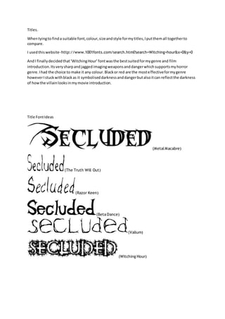
Title FontIdeas
(MetalMacabre)
(The Truth Will Out)
(Razor Keen)
(Beta Dance)
(Valium)
(Witching Hour)
2. Originally,Iwasgoingtohave my filmname title inthe centre of the screen,howeverthe mix of the
coloursinthe footage fromthe grass,gravel and roadmade itquite unclear.ThereforeImovedit
ontothe gravel track alone asit isthe lightestpartof the screenandgivesthe title more focusdue
to the contrast incolour.Thisway, the title isthe mainfocus,until itfadesoutand the car replacesit
and thenthe attentionisall onthe car, where mycharactersare.
As well astestingoutmultiple fonts,Ialsotestedouthow theyare worded.Insteadof having4titles
of ‘Filmedby’,‘Mary-Anne Upson’,‘Editedby’,‘Mary-Anne Upson’Iwouldsimplyhave twoof
‘FilmedandEditedby’‘Mary-Anne Upson’tomake itseema lot lessrepetative andmore
professional.
3. I put mytitlesinbysavingmy fontI got fromonline asan Adobe Fireworksfile.Ithenimported
themto PremierProanddraggedthemonto The sequence stripacrossthe bottom.Fromthere I
couldclick on the title inthe box and adjustthe size andwhere itis situated.
SCREEENSHOTS
ASKSIR